VCL
TMS Edit Controls Pack
A collection of supercharged edit and DB-aware edit controls.
Feature overview
TAdvTouchSpinEdit *Spin edit control with spin buttons left and right from the edit control to allow easy up/down button access from touch screens.
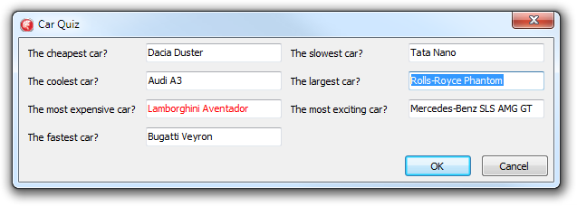
TAdvMultiInputQueryDialog *
- Multi input query dialog
- Multi column support
- Based on TAdvEdit for handling various input types
- Event for form customization
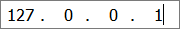
TAdvIPEdit
- Edit control with optional label for input of IP addresses
- Configurable IPv4 or IPv6 input
- Automatic mask
- Lots of extra features like flat look, focus color, auto focus inherited from TAdvEdit

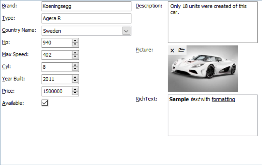
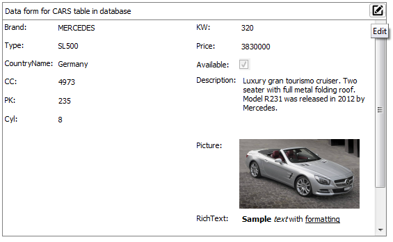
TAdvDBFormPanel
- Automatic DB form generation for connected dataset
- Can generate the DB form at design-time and/or at run-time
- DB form generation can be fully automatic or semi-automatic, assisted by collection of items that controls each DB control that will be generated
- Layout settings to control generation of the form in column or row mode
- Via layout, it can be controlled whether labels for each DB control are used or not
- Layout can be persisted in JSON format
- Configurable mapping of DB field types to DB class types
- Events are provided to control what DB fields are used on the form
- Events are provided to customize properties of generated DB controls
- Automatic switching between edit mode and browse mode with representation of DB values via label or not enabled DB controls in browse mode
TAdvDBFormBox
- Automatic DB form generation for connected dataset
- Can generate the DB form at design-time and/or at run-time
- DB form generation can be fully automatic or semi-automatic, assisted by collection of items that controls each DB control that will be generated
- Layout settings to control generation of the form in column or row mode
- Via layout, it can be controlled whether labels for each DB control are used or not
- Layout can be persisted in JSON format
- Configurable mapping of DB field types to DB class types
- Events are provided to control what DB fields are used on the form
- Events are provided to customize properties of generated DB controls
- Automatic switching between edit mode and browse mode with representation of DB values via label or not enabled DB controls in browse mode
- Caption area with optional buttons that can put the form in edit or browse mode
- Scrollable area for DB form to accommodate any space needed for the DB controls
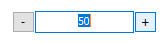
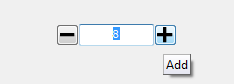
TAdvUpDownEdit
- Edit control with left & right increment / decrement button
- Configurable integer or float increment style
- Configurable integer or float min/max values
- Editor can be enabled or disabled
TAdvLabelEdit
- Label with hover and inplace editing on click
- Start editing can be programmatic, by click on Edit button or by click on label
- End of editing with OK/Cancel button

TAdvMultiButtonEdit
- Edit control with configurable number of buttons left and right from edit control
- Number of predefined button types : Ok,Cancel,Clear,Accept,Deny,Copy,Undo,Next,Previous
- Custom buttons with imagelist images can be added
- Hint, enabled state, flat look, image & position can be controlled per button
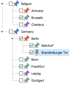
TAdvCheckTreeView
- Built-in capability to have a checkbox per node
- Configurable control over parent/child node checkbox control
- Fully interface compatible with the standard VCL TTreeView
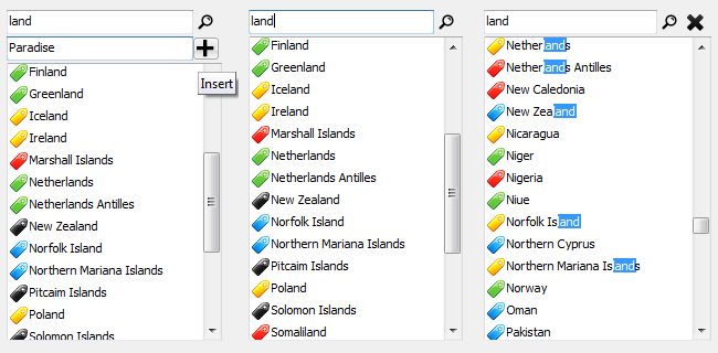
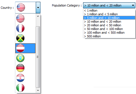
TAdvListBox & TAdvDBListBox
- Filter box to perform filtering of items in listbox
- Different configurable filter methods: starts with/contains/equal/ends with/not equal
- Filter box can be hidden and made visible with shortcut key
- Filter or search configurable: goto item found, highlight matching items, filter items
- Filter or search can be case sensitive of not
- List can have checkboxes or not with each item
- List can have an image or not with each item
- Insert box to perform inserting new items in the listbox
- Insert box can be hidden and made visible with shortcut key
- DB-aware version included
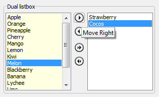
TAdvDualListBox
- Direct accessible left and right list
- Single or multi select can be selected
- Move or copy from left to right / right to left can be choosen
- Move or copy single, multiple or all items via buttons, arrow keys, drag & drop
- Left or right list color/font can be set
- Auto sort on left or right list can be enabled
- Events notify when items are moved from one list to the other list
TAdvListEditor
- Values can have a different display text from value text (name and email for example)
- Values can have an image
- Configurable lookup from first matching character or any character
- Appearance of values in normal and selected state can be configured
- Edit control can automatically size to the number of values added
- Can be set in read only mode
- Support for hints for each value

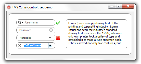
Curvy Controls
- Edit, ComboBox, Panel, Memo in macOS style with rounded corners
- Optionally single or multiple images/controls left,right from edit or combobox or left inside or right inside edit or combobox
- Optionally text hint in edit control
- Capability to add control with dropdown menu in edit or combobox
- Hints per control and optionally hover & down images for controls
TAdvComboBox
- Flat style
- Borderless combobox display
- Etched or simple flat combo dropdown button
- Focus border, focus border color, focus color
- Attached label
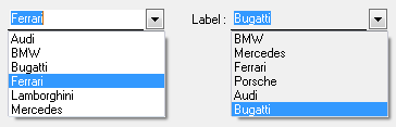
TAdvDBComboBox
- Can display text that represents a different DB-value
- Can display an imagelist image instead of the actual DB-value
- Design-time editor to set text or image representing DB-values
- Attached label can be set to different positions
- Attached label can be bound to a DB field
- Optional flat style
- Borderless combobox display
- Focus border, focus border color, focus color
- Auto focus on mouse over
- Configurable width of the dropdown list
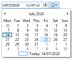
TAdvDateTimePicker & TAdvDBDateTimePicker
Makes editing a TDateTime much easier with the integrated datepicker and timepicker
- directly edit a full TDateTime value with one single component
- uses XP or Vista theme on Windows XP / Vista
- compatible with TDateTimePicker
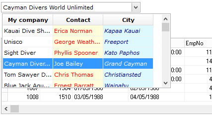
TAdvDBLookupCombobox
- Multi column DB lookup combobox
- Can perform type-ahead lookup on multiple columns
- Allows filtering of lookup listsource for limited selection lookups
- Allows sorting on columns in lookup dropdown
- Various settings for column display & dropdown behaviour
- Attached label with position control and optional display of listfield
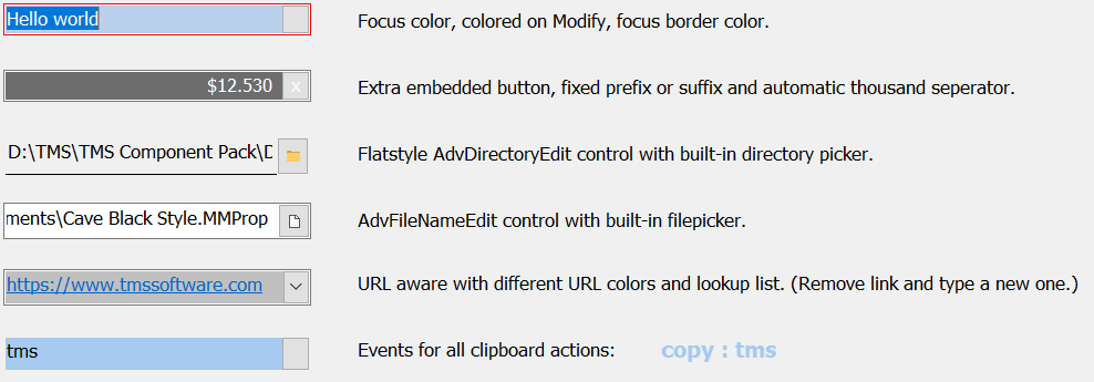
TAdvFileNameEdit & TAdvDirectoryEdit
Advanced edit control with built-in directory picker or built-in filepicker.

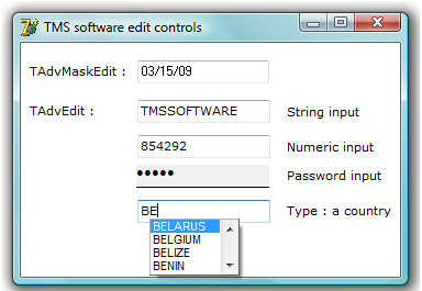
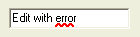
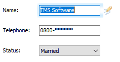
T(DB)AdvEdit & T(DB)AdvMaskEdit
- Edit controls with support for various types, color on focus, modify, error, different flat styles.
- Outlook style lookup popup with various settings to control look and behaviour.
- Includes an optional attached label with fine control on label position.
- DB-aware versions included.
TAdvLUEdit & TDBAdvLUEdit
An edit control with automatic lookup and lookup history. DB-aware versions link to a field of the database and can optionally load the lookup values from the database as well.
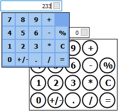
T(DB)AdvMoneyEdit & T(DB)MoneyEdit
- Edit control with attached dropdown calculator
- Calculator dropdown look fully customizable with a CalculatorLook property
- 4 custom calculator buttons can be added
- Calculation on inplace editing (ie. just type 100+15= to have 115)
- DB-aware version included
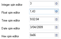
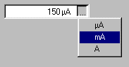
TAdvSpinEdit & TDBAdvSpinEdit
- Spin editor for various datatypes: integer, float, hex, time and date.
- Offers various styles and extra keyboard navigation capabilities and smart increment (Up/Down/Next/Prior/Home/End key handling).
- Optional attached label.
- DB-aware version included.
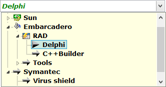
TAdvTreeComboBox
- Combobox with true hierarchical treeview dropdown
- Full keyboard support to traverse treeview
- Imagelist images can be added in the treeview
- Auto lookup of item in treeview upon dropdown
TCheckListEdit
Edit control with dropdown checklistbox.
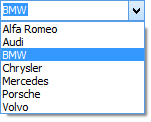
TColumnComboBox
A combobox control with an easy interface to display multiple columns, with their own color, font, alignment and with text or images. The selected item can be viewed in column style or just one column. The Combobox can have either the normal look or the flat Office 2000 look. Sorted & SortColumn property to allow sorting on any column. LookupIncr & LookupColumn property to allow (incremental) keyboard lookup on any column.
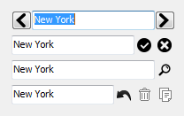
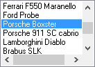
T(DB)LUCombo & T(DB)LUEdit
- Provides type-ahead like functionality while entering text in the edit field of the combobox, based on values in the list or on files/paths found.
- Includes a lookup edit control as well
- Automatic lookup history persistence
- Methods LoadPersist and SavePersist to save contents to INI file or registry
- With AutoSynchronize, the automatic lookup history list is updated between all lookup controls on the form with identical persistence settings
- Lookup combobox has flat style capabilities as well
- DB-aware versions link to a field of the database and can optionally load the lookup values from the database as well
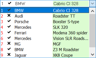
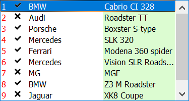
TColumnListBox
A listbox control with an easy interface to display multiple columns, with their own color, font, alignment and with text or images. Sorted & SortColumn property to allow sorting on any column LookupIncr & LookupColumn property to allow (incremental) keyboard lookup on any column
TEditBtn & TUnitEditBtn
- Edit control with extra button
- Edit control with extra button and separate place and selection for physical unit of edited text
- Flat and etched style edit button
TEditListBox
- Inplace editable, just like in Explorer
- Incremental key search and full key search to search for text not at start of items as well
- Horizontal scrollbar
- Flat & encarta style scrollbars (COMCTL32 v4.71+ required)
- Auto-insert and auto-delete of items with Ins/Del key
- Easy interface for controlling left & right aligned tab positions
- Hovering
- Focuscolor & return is tab functionality
- SelChange event
T(DB)AdvEditBtn & TUnitAdvEditBtn
Advanced edit control with inplace button.TUnitAdvEditBtn comprises an advanced edit control and extra edit for measurement unit selection via popup.
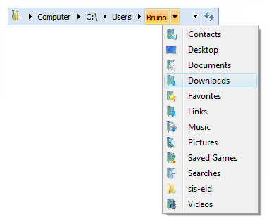
TAdvExplorerTreeview
- Direct Windows Vista folder selection replacement
- Supports restricted folder selection (folders hierarchically under selected folder only)
- Default Windows Vista as well as Office 2003 / 2007 style support
- Supports use of fully custom tree data
- Supports use of custom images
- Customizable lookup support
- Editable or readonly support
TAdvFocusHelper
- macOS style focus indication
- One single component, no code required
- Customizable focus color, blur, size
- Optional additional focus indicator image
- Single component can handle focus indication application wide or customizable per form
- Customizable focus indication appearance per form
- Configurable for what control focus indication should appear or not
TAdvQueryDialog
InputQuery like dialog with all edit control features of TAdvEdit
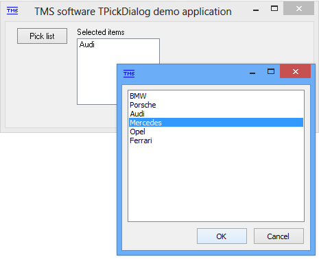
TPickDialog
TPickDialog behaves like a popup listbox from which you select items. Returns selected item or items in a property. Provides a fast and easy way to let users select from a list of items. Sizeable, toolwindow, stayontop style & events when item is clicked or double clicked.
TMS Advanced DropDown Controls
- Built-in Office/Windows styles
- Dropdown can have optional header or footer with HTML formatted text
- Dropdown can be sizeable
- Allows to add range of custom buttons in both header and footer
- Dropdown with any TCustomControl descendent
- Multi-column dropdown control included
- Google addressbar like detail dropdown list with support for HTML formatted text, images,...
- Different color picker dropdown controls
- Editor can be readonly or not
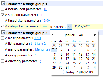
TMS Parameter Controls
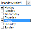
- Includes TParamTreeView, TParamLabel, TParamListBox, TParamCheckList components
- Treeview, label, listbox, Checklist where the user can easily set several parameters through inplace clicking, like in the Outlook rules wizard. Parameters can be set through a custom interface or through selection from a dropdown listbox or popup menu
* New components from Delphi XE & C++ Builder XE and newer available
Help
Trial Downloads
Site license
unlimited developers in the company
€ 575 yearly renewal *
€ 1295

Compatibility
- Delphi 7, 2007, 2010, XE, XE2, XE3, XE4, XE5, XE6, XE7, XE8, 10 Seattle, 10.1 Berlin, 10.2 Tokyo, 10.3 Rio, 10.4 Sydney, 11 Alexandria, C++Builder 2007, 2009, 2010, XE, XE2, XE3, XE4, XE5, XE6, XE7, XE8, 10 Seattle, 10.1 Berlin, 10.2 Tokyo, 10.3 Rio, 10.4 Sydney, 11 Alexandria, DXE15, CXE15, DXE16, CXE16 (Professional/Enterprise/Architect)
Licensing
- Licensing FAQ
- License for commercial use: Single developer license, Small team license, Site license
- Includes full source code
- Ask questions to our engineers related to purchased product via Support Center
- Free 1 year updates and new releases
- After 1 year, a discount renewal is offered for a 1 year extension. *
* offer valid for 30 days after end of license. Discount price is subject to change.
Tags
Bookmarks
×
![]()