Blog
All Blog Posts | Next Post | Previous Post

 Extend TMS WEB Core with JS Libraries with Andrew:
Basics Part 6: Links, Lists, Layouts, and Let
Tuesday, August 29, 2023

Links.
The very concept of "hypertext" - the H in HTML - is that elements on a page can be linked to other pages. A
global collection of such pages and their links might be one way to describe the internet as we know it today. Way back in 1991, the link tag, or "anchor" tag - <a> - was one of the first 18 tags included in the
original HTML
Tags document written by Tim Berners-Lee: <title>, <nextid>, <a>, <isindex>,
<plaintext>, <listing>, <p>, <h1>…<h6>, <address>, <hp1>,
<hp2>…, <dl>, <dt>, <dd>, <ul>, <li>, <menu> and <dir>. We'll
even cover a couple more of those in this post. Curiously, one of the most commonly used tags today, the
<div> tag, didn't make an official appearance until HTML 4.
Often, we want to direct our users to other content that is either elsewhere on the page they're
looking at, maybe elsewhere in our website (or web app), or perhaps somewhere else entirely. As a result, we
should have a solid understanding of how the <a> tag works in order to make the most of it. The anchor
tag is a standard HTML tag, so all the usual global attributes are available, such as the "style" attribute or
the "id" attribute. And while there are many additional attributes available, the two that we're most
interested in are the "href" and "target" attributes.
The "href" attribute indicates where the link is pointing - the page that will be loaded if we click on the
link - usually this is a fully qualified URL, including the https:// prefix. But it can also be used to specify different things. If it starts with a hash (#) symbol, this works
as an in-page link, meaning that the browser will scroll the page to show the element with the id specified. This can also be used in a URL if it is included at the end. More on that in a moment. It can be a relative link, meaning that it is pointing at another page within the same
web server that was used to serve up the current page. The browser will retrieve the new page using the current
page as the starting point if no leading "/" is specified, or using the root of the web server if it is.
The "target" attribute tells the browser where to open the new page. The main choices we're interested in here are "_blank" and "_self". The default, if the attribute is not specified, is "_self" - this will replace the current page (and our currently running web app!) with the new page. This is fine when browsing generally, but fairly undesirable when using links within a web app. Most of the time, we'll likely want to use target="_blank" for our links, so we don't accidentally leave our app without warning.
Where can we put these kinds of links? Anywhere that HTML can be inserted, such as in the HTML property of a
TWebLabel component, in the Caption property of a TWebButton component, or the HTML property of a TWebHTMLDiv
component. For example, the following will display a label that will then open a new browser tab with the page
linked.
<a href="https://www.tmssoftware.com" target="_blank">Link to TMS Software Home Page</a>
There is also the TWebLinkLabel component, intended for expressly this purpose. A new Target property was just added in TMS WEB Core 2.2.0.0. This
makes it possible to just set the Caption property to have a URL, and set the Target property to "ltNewTab" and
it will work just as if you had set the target attribute yourself. Handy.
Styling Links.
Once upon a time, pages routinely contained many links. When navigating around to different pages, it was helpful to style the links that had already been visited with a different color, so you didn't mistakenly visit the same page again, or perhaps so that you could more easily find your way to a page that you had indeed visited previously.
By default, browsers, even now, will present links as blue and underlined, and, once
visited, darker blue and still underlined. This link styling isn't generally as prevalent today, perhaps
because we have better ways of finding our way to the content we are after, and we're not always so reliant on this
kind of breadcrumb approach. And partly because blue underlined links might not fit in with a particular theme.
In CSS, the underlining is governed by the "text-decoration" property, which defaults to "underline" for
links. And while you can apply this property to other elements, generally it has only been used for links. What we're normally after is the ability to disable this mechanism, which we can do by applying the CSS property
"text-decoration: none". If you're using Bootstrap in your project, the class "text-decoration-none" can be
added to the ElementClassName of the component that you're using to accomplish the same thing.
For the link color, the variations can be handled by CSS as well. There are four different states
that a link can represent, and a separate CSS rule can be applied for each.
- A normal, unvisited link.
- A link that has been visited.
- A link that is under the mouse pointer currently.
- A link that has just been clicked.
Note that hovering doesn't generally apply to mobile browsers. The active state is, well, active for as long as the link (button, image, etc.) is pressed. To customize these, we can use the following CSS rules.
- a:link { color: red; }
- a:visited { color: green; }
- a:hover { color: blue; }
- a:active { color: magenta; }
With Bootstrap, there are a set of link-* classes that can be used to apply a Bootstrap color to a link, and can subsequently be styled in the same way.
Note that an anchor element will wrap around and be applied to whatever
is between the opening <a> and closing </a> tags, whether that is a label of some kind, a URL, an
image, or even an entire page.
Also, note that the contents of the href attribute don't have to be the same as what is contained between the anchor opening and closing tags. People figured out pretty quickly that you can put a link on a page displaying "www.example.com" but actually set the href attribute to point somewhere else, often someplace you might not really want to go.
As a result, links of this nature will show up in the browser status bar, showing the href attribute's
value, giving you at least the opportunity to decide whether you really want to click on that link or not. This
can often be undesirable, as the browser status bar is a difficult thing to hide, and sometimes it is
unnecessary or distracting, but this is the price we've paid for nefarious links. Attaching a JavaScript (or a Delphi
onClick) method to an element (eg: addEventListener) to handle navigation is an alternative if the browser status bar randomly appearing isn't something
you want to see.
Parameters and Routing.
While developing web apps using TMS WEB Core, or any number of other JavaScript frameworks, we can also make
use of links to solve some other problems.
For example, with Delphi VCL apps, it is not at all uncommon to have a set of parameters that we can
pass to an app when it first starts. Maybe a database name, or a fullscreen switch, or something more complex.
In a web app, the most common way to do this sort of thing is to add query parameters to the URL, which we can
then access from within our app. Query parameters are passed in a specific way usually, most often taking a
form like this.
The main thing to be aware of here is that these are all part of the URL and as a result, certain rules apply. No spaces or special characters can
be used - they need to be encoded in order to be included. Spaces are replaced with %20, that sort of thing. Within TMS WEB Core, and JavaScript itself, there is an encodeURIcomponent method for just this purpose, should
you want to create a URL at runtime. Perhaps to programmatically generate an anchor tag, for example. Similarly, there are the GetQueryParam and HasQueryParam functions available in TMS WEB Core which can be used to retrieve parameters from the URL when this convention is used.
One last item relating to the URL is that, in the most recent versions of TMS WEB Core, you can use the hash ('#") value to pass a Delphi Form name. The app can be configured to automatically load that Form when the app starts, using a mechanism called automatic routing.
For example, if you wanted to publish a link to a
contact page in your app, you could append "#ContactUs" to the end of your app's URL. Then the Form named
ContactUs would get loaded automatically. That sort of thing. This is a more complex topic, to be sure, but it
opens the door to other app functionality such as handling browser navigation (back and forward buttons) and
other aspects of the History API. A more in-depth look at that can be found in this blog post about the History
API and Routing.
Lists.
HTML list tags are primarily used to make it easier to add a bit of formatting to a page. List elements at one level usually have some amount of padding or offset from the previous level, and perhaps a bit of padding from the surrounding elements on the page as well. The padding used by browsers by default works reasonably well on a page of otherwise plain text, but as is often the case, we might want to make adjustments for our particular theme or situation. But before we get into all that, there are three kinds of HTML lists.
- Unordered lists are just lists with bullets beside them. No numbering is included. The choice of bullet can be adjusted.
- Ordered lists are just another way of saying numbered lists. The numbering system used can be adjusted.
- Descriptive lists are essentially just lists with titles instead of bullets or numbers.
Each of these list types can be nested arbitrarily deep and can contain other list types dispersed throughout as well. We most often recognize unordered and ordered lists, but descriptive lists work in the same way.
For unordered lists, we have the <ul> and </ul> HTML tags to specify that we are creating a list, and the <li> and </li> tags to wrap around each list item. These can be styled with CSS rules (as can any of the list tags we're using here), but what is most interesting is that we can change the type of bullets with the list-style-type CSS property.
For example, we could use "circle", "square", or "disc" (a
filled circle) for our bullets. We can also specify an image outright, by using the "list-style-image" property
to specify a URL to use for our bullet. Perhaps we've got something in our theme that would work well here, or
we just want to use something else like an arrow or an unfilled square. This can sometimes be a bit of a
challenge in terms of styling and image sizes. Using an SVG might work best given that it will scale without
any issues related to image artifacts.
For ordered lists, we can use the same list-style-type CSS property to define what kinds of numbers we want to
use. By default, a normal list of numbers is shown. Other options include "upper-roman" and "lower-roman" to
use Roman numerals, or "upper-latin" and "lower-latin" to use letters. There are many other choices here as
well, particularly options supporting other languages.
For descriptive lists, there are three sets of open/close tags. The <dl> and </dl> tags are used
for specifying a descriptive list. The <dt> and </dt> tags are used to set a title for the list. And the <dd> and </dd> tags wrap the content of each item in the descriptive list, similar to the
<li> and </li> tags in the other two list types.
Regardless of the type of list, there is also the list-position CSS property that determines whether the
numbers, bullets, or titles are shown outside the list or inside the list. This pertains generally to the
line-wrapping of longer list items. When wrapped, does the next line start at the beginning of the text of the
previous line, or does it start where the bullet or number is positioned? The default is for second and
subsequent lines to be indented.
Here's an example of a collection of lists that demonstrates how lists can be nested and styled just using
HTML. This has been added to the HTML property of a TWebHTMLDiv component dropped on the form.
<div style="font-size: 20px;">
  <dl>
    <dt style="font-weight:bold;">Unordered Lists</dt>
    <dd style="padding-top: 10px;">Different bullets can be applied to unorderd lists.
      <ul>
        <li>One</li>
        <li>Two</li>
        <li>Three</li>
      </ul>
      <ul style="list-style-type: square;">
        <li>One</li>
        <li>Two</li>
        <li>Three</li>
      </ul>
    </dd>
    <dt style="font-weight:bold;">Ordered Lists</dt>
    <dd style="padding-top: 10px;">Different numbering systems can be used with ordered lists.
      <ol>
        <li>One</li>
        <li>Two</li>
        <li>Three</li>
      </ol>
      <ol style="list-style-type: lower-roman;">
        <li>One</li>
        <li>Two</li>
        <li>Three</li>
      </ol>
    </dd>
  </dl>
</div>
This generates the following page content.
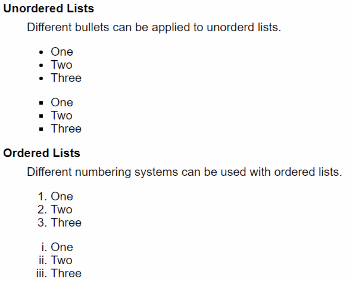
List Examples.
By default, the padding for indentation works pretty well, but as was shown above, it is easy enough to make
adjustments to any of the list elements directly, or by adding CSS rules. There also isn't any particular limit
to how much content can be included in a list item, how many items can be included in a list, or how deeply lists
can be nested.
Just for fun, after a little searching around, it turns out that nesting elements in HTML
generally don't appear to have a limit we're likely to hit in the normal course of things. Hundreds of levels
at a minimum, possibly hundreds of thousands of levels of nesting if your browser doesn't run out of resources
first!
Lists are so flexible that they sometimes appear in unexpected places. Some menu systems are constructed using
this list mechanism for example, where CSS rules are applied to unordered lists in such a way as to have the
main menu displayed horizontally, with subsequent nested menus displayed vertically, with arrows, hovering,
and the rest of what you'd expect from a fully-featured menu system. We'll have a look at that in just a
moment.
Layouts.
Let's say we've got a page with some lists on it - general content of some kind or other. But we're building a
bigger site and would like our page to have a header and a footer with various links, maybe a menu or two. A
sidebar perhaps. And of course, we'd like everything to fit nicely on the page, regardless of the size of the display used to view the page. In other words, we'd like it to be "responsive". And if the display is really small, like a mobile device,
we'd like to rearrange things so they fit that size as well without losing any of the content or capabilities
that we're working so hard to provide.
What we're talking about here of course is the layout of our page. A responsive layout implies that
the page will rearrange itself somehow to fit the dimensions of whatever browser it is being rendered in, and is
pretty much a standard requirement for most apps today. Note also that the dimensions of the page can change at
any time, such as when a user rotates their device or adjusts the zoom level.
When designing a page, or perhaps a Form in the case of Delphi and TMS WEB Core, there are quite a few ways to handle page layout. Always great to have lots of options, right? Well, in this case at least, having so many options can sometimes be a bit overwhelming even when just trying to figure out where to start. At a high level, there are a few very different ways to approach this topic.
- HTML Templates. If you're building something that is intended to look like a typical website, there
are numerous options for using HTML templates in a TMS WEB Core project. The basic idea is that you can
replace the Form's HTML content (say, Unit1.html) with the content from an HTML template from any number of
websites, free or otherwise. The elements found in the template (like a username or password field, or
perhaps a title or a list of some kind) can be mapped to TMS WEB Core components dropped on the Form. This allows you
to write your usual Delphi code to update those page elements without having to spend much effort worrying
about HTML or CSS or really even page layout - the HTML template has taken care of that for you. A previous
set of blog posts covered how to make use of the rather complex AdminLTE
template, using both TMS
WEB Core and TMS
XData to create a framework for a usable client/server-style project. The first
post of the Templates series deals with XData, but the second
post digs into using the template itself.
- Delphi Approach. If you're a longtime Delphi developer, you're likely already familiar with component layout mechanisms used in VCL apps, like client alignment, TPanel and TSplitter components, and so on. These are all available for use in TMS WEB Core. Using components like TWebPanel and TWebSplitter, it is possible to create interesting page layouts much in the same way as you would do in a VCL app. There are a few little differences. The idea that most components can automatically resize to fit their contents is perhaps something that will take a little getting used to. But for the most part, everything works as it does in the VCL, particularly if you're porting a VCL app to the web and you're trying to maintain a consistent interface.
- FNCResponsiveManager. Related to the above, a relatively new tool is the FNCResponsiveManager. This
component can help simplify having multiple sets of page layouts. The idea here is that a different layout
can be used when certain page dimensions are available, and the app will switch to the appropriate layout
automatically as the page dimensions change. For example, perhaps you have a particular layout that works
well for a desktop-class browser and a separate layout that works better on a much smaller mobile device.
Using this component, you can layout the Form components one way for the desktop users, and a completely
different way for the mobile users, without losing any content, all while keeping to the same Delphi layout
conventions we're accustomed to. TMS published
a video that shows how this works, and as a bonus, this works in VCL and FMX applications as well,
providing a code-free means to develop different page layouts. This component is included in the TMS
FNC Core product.
- Bootstrap Layout. One of the key aspects of Bootstrap that has contributed to its success relates to its grid layout system. Bootstrap, as we've covered previously, is essentially a set of CSS classes that we can assign to TMS WEB Core components, primarily using the ElementClassName property. Some components have more than one ClassName property, such as when the generated HTML contains a collection of elements. A TWebPanel component, for example, has an ElementClassName property and an ElementBodyClassName property. With Bootstrap added to the project, we can add classes to these properties that control the layout without necessarily having to deal with the underlying CSS itself. At times it seems that you have to know just as much about CSS to make the most of this approach, even if you're not writing CSS directly. The idea is that you can add components to the Form along with Bootstrap classes that help control how they are displayed. By default, Bootstrap uses a system based on 12 columns. Each component can be configured to fit a certain number of columns, and then grow, shrink, or wrap to fit the actual columns currently available on the page. A bit tricky at first, but an absolutely huge number of websites use exactly this layout technique.
- CSS Flex. Bootstrap is often used as shorthand for CSS, but you can just use CSS directly,
adding classes of your own to components on the Form in the same way, or in combination with Bootstrap
classes, without necessarily having to use their grid layout approach. Maybe using 12 columns doesn't work for your
scenario, or maybe you have something simpler (or more complex!) that doesn't lend itself particularly well to
the Bootstrap layout approach. Using CSS, you ultimately have by far the most control over the layout, but the
tradeoff is that this requires the most effort by the developer.
There are many nuances to each of these, with additional TMS WEB Core components available to help out,
regardless of which path you ultimately choose. And there are countless other ways to do this kind of thing as well - other frameworks, other techniques, and so on. Likely the biggest factor in making a choice, though, relates to
where your comforts are with respect to CSS and HTML generally, or perhaps more specifically, where your
aspirations are concerning CSS and HTML. If your project is a VCL port of some kind, one of the
Delphi-based approaches might work best for you. If you are after something with a bespoke look or you're after
a bit more control over everything, then something towards the CSS end of the pool (that'd be the deep end!)
might be more appropriate.
A CSS Flex Example.
Let's have a look at what a CSS layout might look like, with a bit of Bootstrap and other TMS WEB Core supporting components to help us out. What we're after is a header with a collapsible menu, a footer with a few sets of links, a right sidebar with some content, and a main page with our example of lists.
To start with, let's add a CSS file to our project using the "File | New" menu in the Delphi IDE. We'll call
it "layout.css" and we'll need to add it to our Project.html file. While we're at it, we can also add Bootstrap
if we didn't create our project using the Bootstrap template to begin with, such as when starting with the PWA template. Here are the latest links from the Bootstrap website as of this writing.
    <!-- Bootstrap 5 -->
    <link href="https://cdn.jsdelivr.net/npm/bootstrap@5.3.1/dist/css/bootstrap.min.css" rel="stylesheet" integrity="sha384-4bw+/aepP/YC94hEpVNVgiZdgIC5+VKNBQNGCHeKRQN+PtmoHDEXuppvnDJzQIu9" crossorigin="anonymous">
    <script src="https://cdn.jsdelivr.net/npm/bootstrap@5.3.1/dist/js/bootstrap.bundle.min.js" integrity="sha384-HwwvtgBNo3bZJJLYd8oVXjrBZt8cqVSpeBNS5n7C8IVInixGAoxmnlMuBnhbgrkm" crossorigin="anonymous"></script>

    <!-- Our own CSS file for this project -->
    <link href="layout.css" rel="stylesheet">
Our Unit1.pas Form (page) layout is going to be designed to use CSS Flex, so we can start by adding the "d-flex" class to our Form. And as the main sections (header, main, footer) are to be displayed in a column, we can add "flex-column" to the ElementClassList property as well, and maybe "p-3" to give us a bit of padding around the entire page.
Next, we can drop three TWebHTMLDiv components on the Form, and set their Name and ElementID properties to be
divHeader, divMain, and divFooter. We can drop two more TWebHTMLDiv components into the divMain component, one called divContent,
containing our list HTML from earlier, and one called divSidebar. In the Delphi IDE, we don't have to be
particularly worried about how things are aligned as we'll be using CSS and Bootstrap to take care of that for
us. Here's what it looks like in the IDE so far.
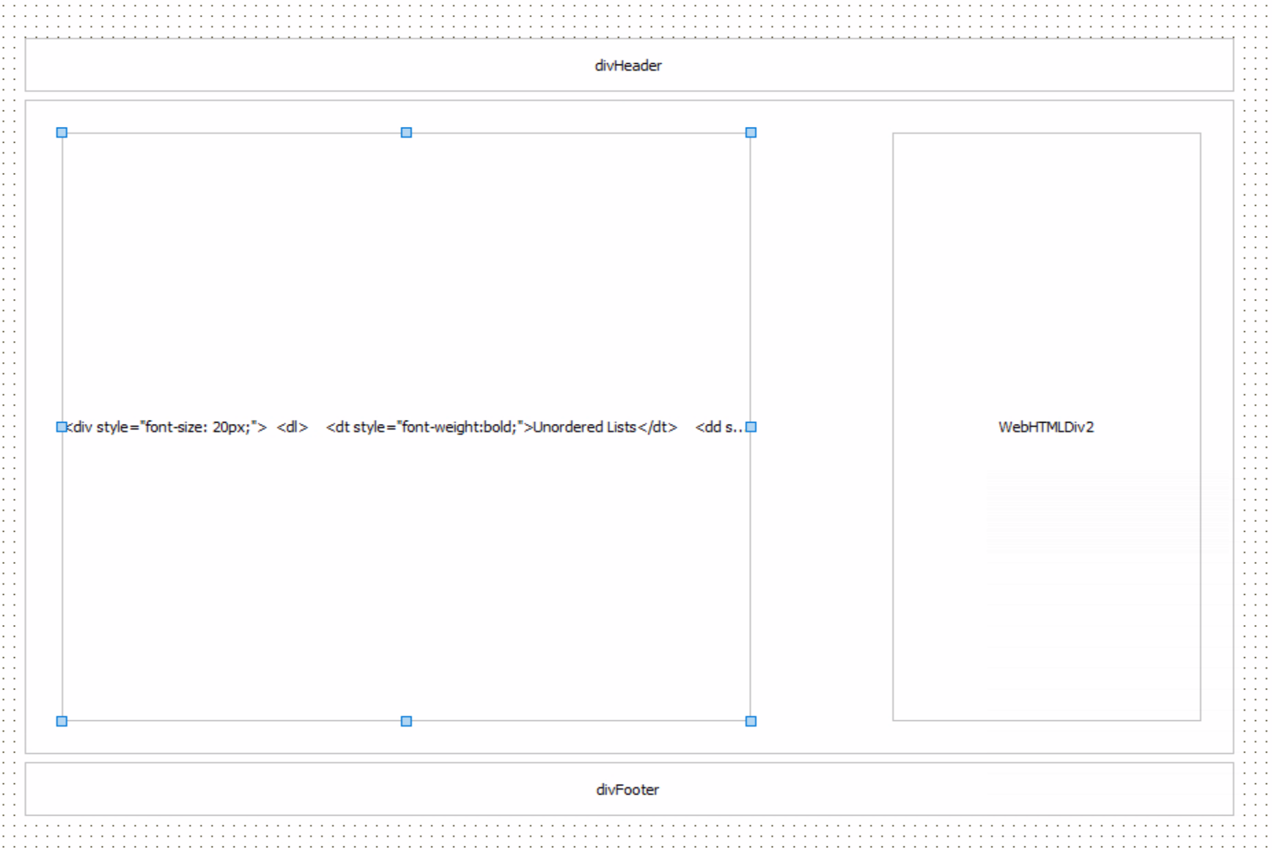
Page Layout in the Delphi IDE.
If we were to run the project now, we'd see the same thing as we saw earlier - the HTML lists example - as
we've not assigned any classes or added anything that would be rendered on the page differently.
For the header, let's start by adding a rounded border with a bit of margin and a bit of padding. In the ElementClassName property for divHeader, we can do this with Bootstrap classes by adding "rounded border border-secondary". Let's also set the HeightStyle to be "absolute" with a value of 50px. For the WidthStyle, let's use "percent" and set it to 100. We can add a menu using the TWebMainMenu component and set its Container property to divHeader.
Rounded corners are a bit of a headache at times, as child elements sometimes overflow their
container in useful ways, meaning that we can't just arbitrarily clip everything. Instead, we can try and add
rounding to the child elements directly. In the case of the main menu, this is what we'll need to do. Just a
bit of CSS to apply to the menu that is created.
#divHeader {
  background-color: #f0f0f0;
}
#divHeader > nav > ul > li:nth-child(1) > label {
  border-top-left-radius: var(--bs-border-radius);
  border-bottom-left-radius: var(--bs-border-radius);
}
#divHeader > nav > label {
    border-radius: var(--bs-border-radius);
}
If CSS is not your thing, don't worry. The above is all just about rounded corners. This is what was meant
by the tradeoff comment earlier - using CSS, we have the power to do whatever we like. However, the
more we stray from the defaults, the greater the workload on the part of the developer to ensure that
everything is styled properly. In this case, we want the background color of the menu to be the same as the menu
items. We want to round the first main menu item, but only the left side. Then, we also want to round the
collapsed menu that appears when we have less space available. But with that, we've got our header sorted. Here's what it looks like on a wide desktop.
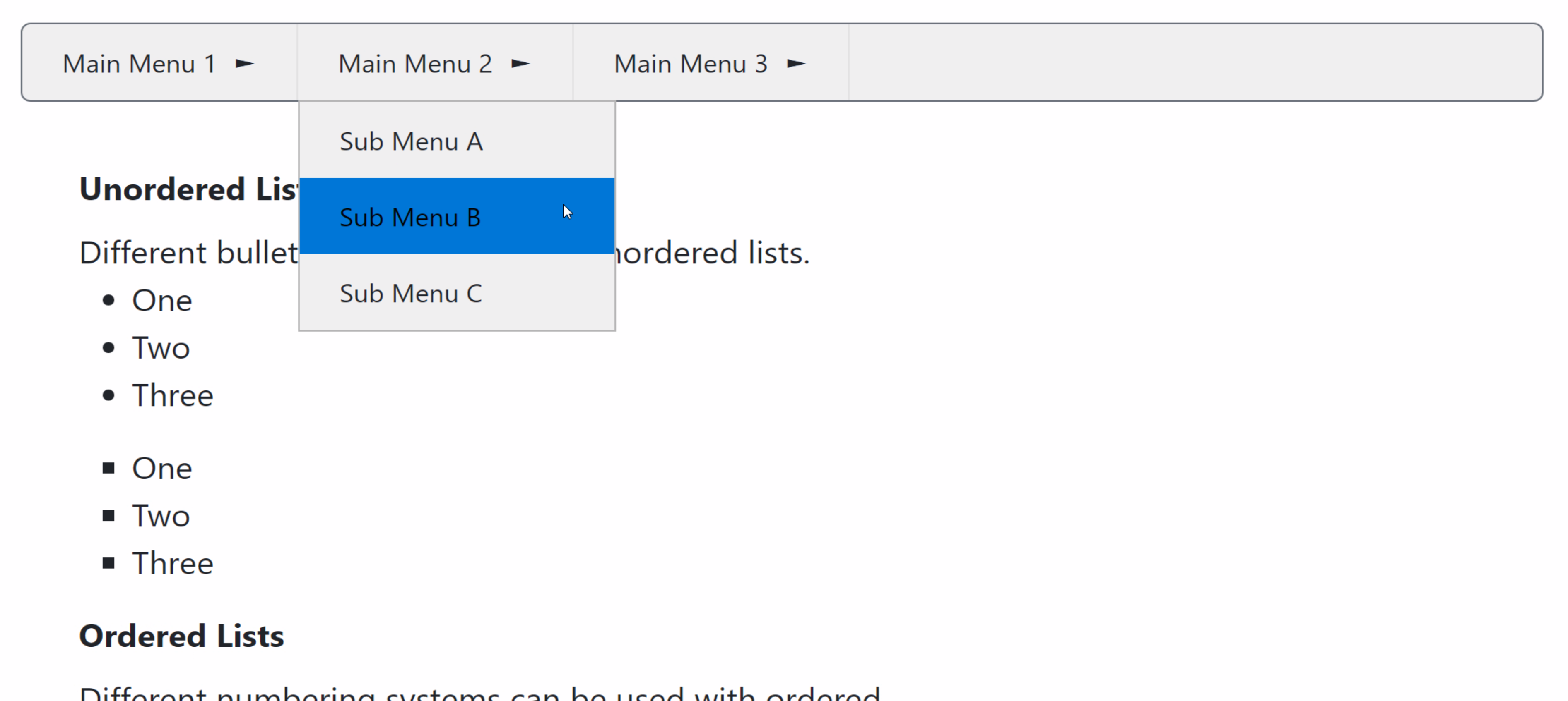
Main Menu Expanded on Wide Page.
Then, if we reduce the width, we can see that the TWebMainMenu is automatically converted into a dropdown
menu with the traditional "hamburger" icon indicating that a menu is present. If we were to look at the internal
HTML that is generated by the WebMainMenu component, we would see that the entire menu system is constructed using unordered list
elements with extra CSS added automatically to deal with this size change. Here's what the narrow version looks like.
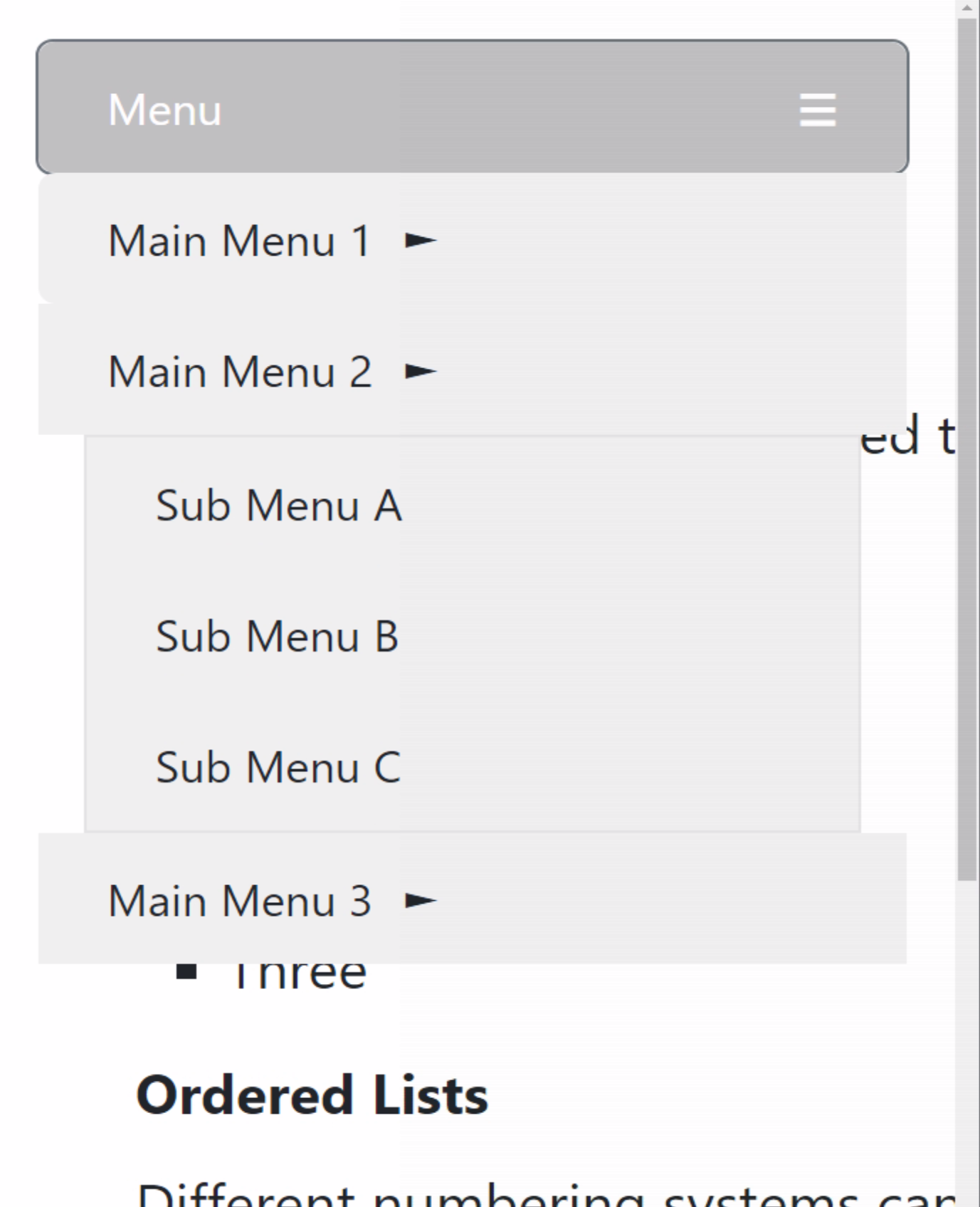
Main Menu Expanded on Narrow Page.
A bit more work could be done to add a bit more styling (and rounding) to the submenu items, maybe change the arrows and that kind of thing, but for now, this is
exactly what we want. A responsive layout without having to do too much work to get it.
For the footer, we can start with the same Bootstrap classes that we used for the header, adding "rounded border border-secondary" to the ElementClassName property of divFooter. For the WidthStyle, we'll use the same "percent" option, also set to 100. For the HeightStyle, we'll want this set to "auto" so that it resizes based on the content. In this case, we're going to add a few more sections that we want to layout with CSS Flex as well, so let's also add "d-flex flex-row" to the ElementClassName property.
Then, let's add three more TWebHTMLDiv components to the divFooter
component. In each one, we'll add a simple list to use what we learned previously. We can quickly change the
order that CSS Flex renders elements, our footer sections in this case, by using the CSS "order" property, or the Bootstrap "order-x" class names. Note that Bootstrap only provides shorthand for order values up to 5. This is related to the ChildOrder property of TMS WEB Core components, which is intended to determine the order in which components are created in the HTML that is generated, but CSS "order" can be used to override that property.
For spacing our footer sections, CSS Flex has many powerful capabilities. We'd like to space the sections
evenly, when space is available, or vertically when space isn't available. The "justify-content-evenly"
Bootstrap class, or CSS equivalent, works pretty well here. For each of our TWebHTMLDiv components, we can also
set the width to a fixed amount, say 250px, and have the height adjust automatically. We'll need a bit of CSS
to set the background color and also make our labels appear in bold, as an example of how CSS can be used in
this case.
#divFooter {
  background-color: #f0f0f0;
}
#divFooter > div > label {
  font-weight: bold;
}
For wide pages, we get something that looks like this.

Wide Footer.
For narrow pages, each section will wrap, and then the same justification is applied, giving us the desired
vertical orientation. By setting a fixed width for each section to something that is the width of the
minimum expected mobile display width, we get a pretty reasonable amount of spacing while not being obvious as to how it all
works.
Narrow Footer.
For the middle part of the page, something similar is done, with the sidebar configured to have a fixed width
and the content section taking up all the remaining available space. This one is a bit trickier in that we
want the entire width to be taken up, regardless of the contents.
For divMain, we've got the following Bootstrap classes: "d-flex flex-row flex-wrap justify-content-center gap-2 w-100". The "gap-2" class is used to give a bit of space between the content (left) and sidebar (right) sections. The "w-100" class ensures that the component takes up the full width available (width: 100%). Note also that divMain is serving as an otherwise invisible wrapper - there is no border set.
For divContent, nested inside of divMain, we've got these Bootstrap classes: "flex-grow-1 p-2 rounded border border-secondary". This
gives us our border, a bit of padding, and stretches the component to use up as much space as it can. The
contents are the same list examples we used originally. In addition, we've got a bit of CSS to again set the
background color.
#divContent {
  background-color: #f0f0f0;
}
And finally, for divSidebar, we've got these Bootstrap classes: "overflow-auto rounded border border-secondary". This sets the border as before, as well as configures this component to present scrollbars if the content overflows its boundaries. We've set a fixed width, using the WidthStyle of "absolute" and Width set to 430px. For CSS, we've placed some limits on the minimum and maximum height.
We need a minimum height so
that the component will appear on narrow screens. Without this, it would collapse to nothing. We've also set a
max height in case there is a lot of content. While we might want the sidebar to have any amount of content, we
don't want to have to scroll forever to get past it (to see the footer) if we're on a mobile device. More on that in just a moment.
#divSidebar {
  min-height: 400px;
  max-height: 2000px;
}
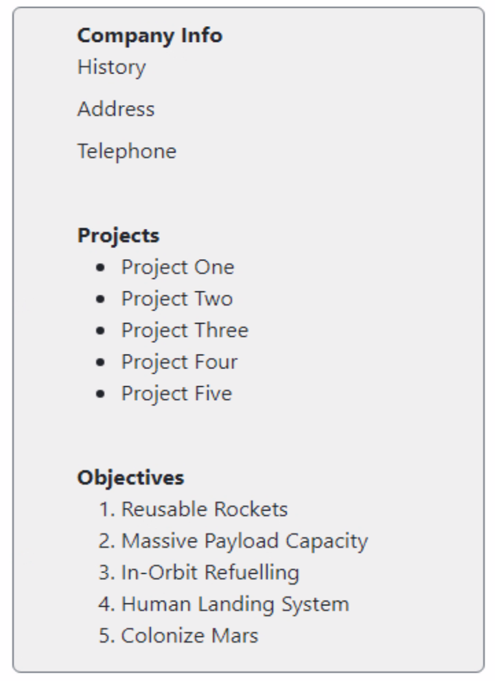
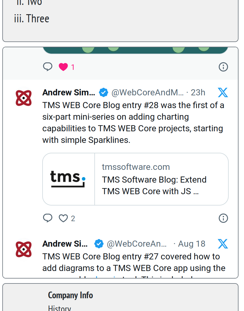
For the content of the sidebar, I've put together a block of HTML that will display an 𝕏 (formerly Twitter)
profile feed for my account: @WebCoreAndMore. The idea is that we want this sidebar to take up exactly as much space vertically as the content section, providing
scrollbars, if needed. This is a bit tricky in that we're using the divSidebar element to determine the
height (matching the height of divContent) but then using another <div> element to hold the entire feed.
Here's what the HTML looks like. The code within the anchor tag comes from the API they provide for just this purpose. Note that they also recently made a change where feeds like this are not displayed unless you're logged into your own account. An annoyance that will hopefully be addressed at some point. The width in this case was chosen to be wide enough that the title doesn't wrap, but could be adjusted if needed.
<div style="position:absolute; height: 100%; width:100%;">
  <a
    class="twitter-timeline"
    href="https://twitter.com/WebCoreAndMore?ref_src=twsrc%5Etfw"
    data-chrome="noborders"
    data-width="430"
  >
    X @WebCoreAndMore
  </a>
  <script async src="https://platform.twitter.com/widgets.js" charset="utf-8"></script>
</div>
Now, if we're on a regular desktop, we'll get the feed on the right side of the screen, set to the same height as divContent, and scrollable.
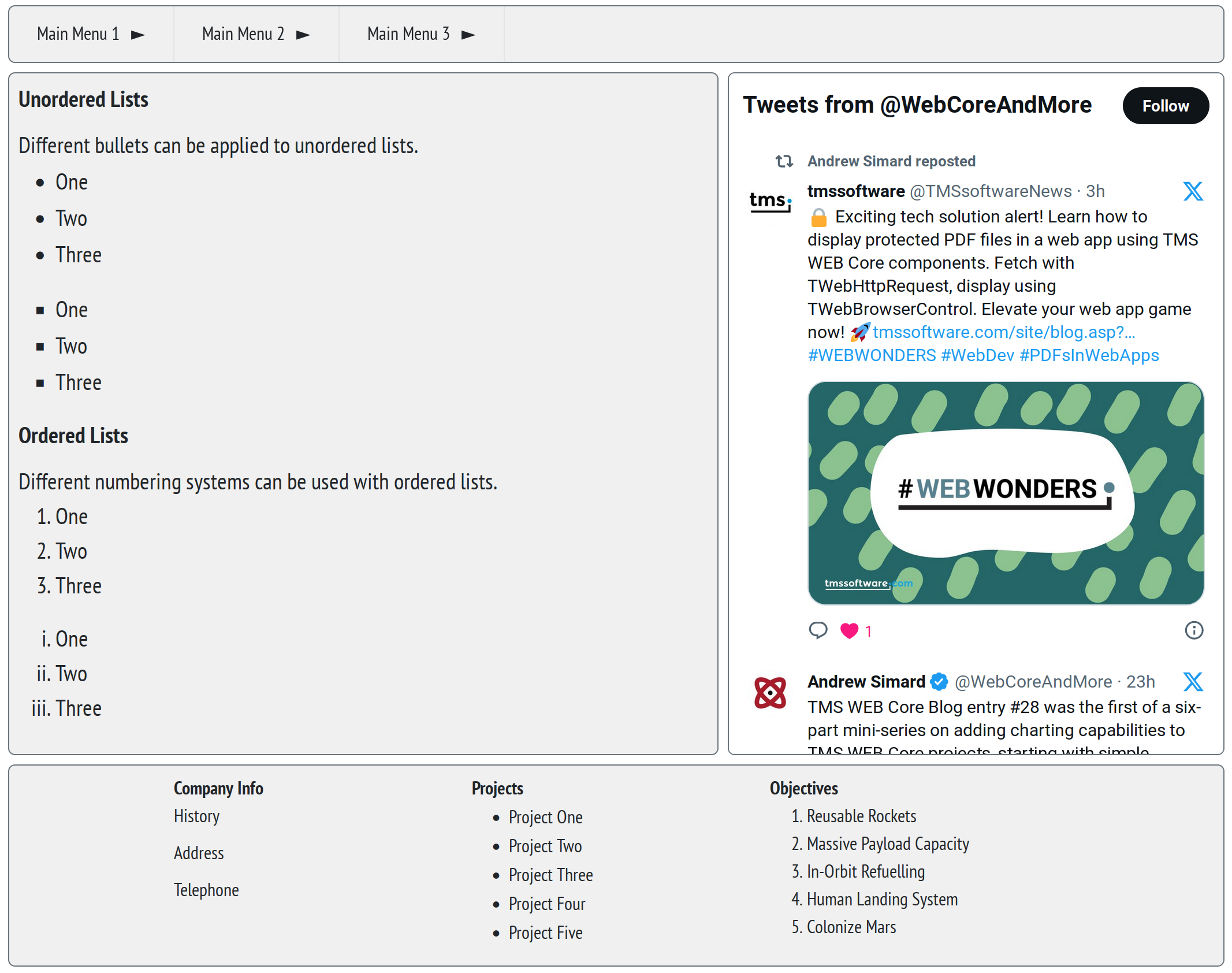
Layout Complete - Wide.
On a narrow page, the sidebar now appears in line with the rest of the page, and its height is determined by
the height value specified in the CSS above. Its contents can be scrolled as well, but the user can also
scroll down past that easily to get to the footer content.
Layout Complete - Narrow.
There are of course thousands of ways this layout could be adjusted further. Changing the dimensions of any of these
elements, adding extra headers or footers, more sidebars, theming, and so on. Endless, really. But hopefully
there is enough here to help you get your foot in the door and your project on its way.
"Let"'s Do Some JavaScript.
In each of these Basics posts, the idea is to do a little bit of HTML, a little bit of CSS, and a little bit of
JavaScript each time to nudge us a little further down the web developer path. We've had a fair bit of HTML and
CSS so far, but not really any JavaScript. Let's talk about "let".
Going back to the earliest days of Javascript, from its origins around 1995 until around 2015, declaring
variables was done with the "var" keyword. Sounds simple enough, particularly in a language like JavaScript
which isn't so strict about types. It has a few quirks, though. There's a concept called "hoisting",
which refers to how a variable can be declared anywhere in a code block, and it will be treated as if it was declared
at the beginning of that block. This has some curious implications, but mainly it means that code may work
unexpectedly. Or not. Take this code for example.
  asm
    var a;
    a = 1;
    console.log("a = "+a)

    b = 2;
    console.log("b = "+b)
    var b;

    c = 3;
    console.log("c = "+c)
  end;
The result is the following.
a = 1
b = 2
Uncaught ReferenceError: c is not defined
Maybe not much to be concerned about in a small snippet of code, but more problematic as the code gets longer.
Making things a little more fun, variables can be declared in different scopes, leading to even more confusion.
Try this example.
  asm
    var d = 100;
    d += 1;
    console.log("d = "+d);

    for (var d = 10; d < 13; d++) {
      console.log("d = "+d);
    }
    console.log("d = "+d);
  end;
One might have expected the value of d to be undefined in the last call to console.log, but that's not actually
the case.
d = 101
d = 10
d = 11
d = 12
d = 13
To help mitigate this kind of inconsistent behavior, JavaScript introduced the keywords "let" and "const" as
part of ES6 (2016-ish). And, for the most part, these completely remove the need for using "var" at all.
With "let", variables now have to be declared before they can be used, and cannot be redeclared in the same code block, unlike "var". Replacing "var" with "let" from our
previous example, we get the following code.
  asm
    let a;
    a = 1;
    console.log("a = "+a)

    b = 2;
    console.log("b = "+b)
    let b;

    c = 3;
    console.log("c = "+c)
  end;
Now when this runs, we get an error of a sort that gives us a little more confidence about how this all works.
a = 1
Unit1.pas:89 Uncaught ReferenceError: Cannot access 'b' before initialization
This is really what we'd rather prefer - we can catch a missing variable declaration much more easily. If we
do the same for the second example, we'll see that the scope now works the way we might have originally expected
it to.
  asm
    let d = 100;
    d += 1;
    console.log("d = "+d);

    for (let d = 10; d < 13; d++) {
      console.log("d = "+d);
    }
    console.log("d = "+d);
  end;
Here, the for loop declares d in a separate scope (so, a separate instance of d), and each instance of the d variable here is managed
separately.
d = 101
d = 10
d = 11
d = 12
d = 101
Thus we've got one less potential trouble spot for errors, and potentially much nicer code to review.
What about "const"? Well, this is another new declaration where its main appeal is that its value cannot be changed, and, like "let", it cannot be
redeclared in the same code block. Using our for loop example, one difference is that if you declare the iterator with const instead
of let, then the value is read-only in the body of the loop. Which is often (but not always) desirable. Probably a good idea most of the time.
Another curiosity is that you can declare an array variable with const, but the array itself can still be
changed.
  asm
    const a = 123;
// error:    a = 456
    console.log("a = "+a);

    const y = [1,2,3]
    y.push(4)
    console.log("y = "+y);
  end;
Array variables in JavaScript are handled are references. So while you can't change a value, whatever it is referencing can be changed.
a = 123
y = 1,2,3,4
Feedback.
Time once again to solicit some feedback! Did any of these topics help you? Are there other tips or topics that
might be beneficial to the new TMS WEB Core developer? As always, comments and questions are most welcome.
And please give some thought to joining the discussion on 𝕏! Of all the major social media sites, this seems to be the one with the most activity at the moment, at least in the web development arena. I've set up an account focused on our favorite web development framework, @WebCoreAndMore, and I've also created a private community just for us to help one another. The link to that is in the profile above.
Would love to hear about what you're working on, what you're struggling with, or what you've been pleasantly
surprised about when working with TMS WEB Core, TMS XData, or any other projects that might be of
interest. As a new community, there are only a handful of members so far, so nothing but relevant content. And as a private community, we can easily dispense with anyone spending too much time talking about Python.
Related Posts:
Basics Part 1: Consoles, Calls, Classes, CSS, and... CAPS-LOCK?
Basics Part 2: Files, Fonts, Flex, and FNC
Basics Part 3: Attributes, Animation, Async, and Await
Basics Part 4: Images, Icons, iFrames, and Initialization
Basics Part 5: d, div, debugger, Debug, and Deployment
Basics Part 6: Links, Lists, Layouts, and Let
Follow Andrew on 𝕏 at @WebCoreAndMore or join our 𝕏 Web Core and More Community.
Andrew Simard

This blog post has received 6 comments.
 2. Wednesday, August 30, 2023 at 11:07:11 PM
Thanks for the feedback! So many posts with no comments does make it a bit hard to gauge whether anyone is actually reading them.
2. Wednesday, August 30, 2023 at 11:07:11 PM
Thanks for the feedback! So many posts with no comments does make it a bit hard to gauge whether anyone is actually reading them.TMS XData does indeed make quick work of using JWTs to secure our TMS WEB Core apps, but there are indeed other scenarios, like we covered with the PHP uploading script, where JWTs might be useful. Even in combination with TMS XData. Will add it to the list. Thanks for the suggestion!
Andrew Simard
3. Thursday, August 31, 2023 at 3:24:34 PM
Hello Andrew,I read every one of your posts (tbh. I need&like to read them several times) and they are very valuable and interesting. I also find PHP on the server side of WebCore applications interesting. xData for sure is the most powerful option - but on some servers it is simply not possible/allowed to install, while PHP is available almost always.
Thanks for your effort !
Feichtenschlager Thomas
4. Thursday, August 31, 2023 at 10:27:36 PM
Thanks for the kind words. I wonder how many TMS WEB Core developers use PHP server-side? Maybe a question to add to the next TMS WEB Core survey! TMS XData works so well that I have perhaps overlooked using PHP. Will try and sort out something along these lines soon.
Andrew Simard
5. Thursday, August 31, 2023 at 11:56:08 PM
Still reading, Andrew. :) Every one drags me a bit further into the web world from my comfortable Delphi perch and lights a new corner. Like Thomas, I also need to re-read them.
Peterson Terry
6. Friday, September 1, 2023 at 12:37:47 AM
That is one of my goals.... to help Delphi folks make the trip from the VCL over to the Web without having to lose any of the speed or capabilities that they (like me) have built up over the past couple of decades (or longer!). It can be a bit of a speed bump initially, certainly, but once you get a bit of a footing, things accelerate quite quickly, leaving you with access to capabilities that were never possible with the VCL. And some of these posts are long (I know - try writing them!), but each has a story to tell. And even when I split them up (like with the Tabulator and Home Assistant posts), the individual parts end up being just as long somehow. Seems my submit button doesn''t work until I hit a certain length. Maybe I should have that looked at ?!
Andrew Simard
All Blog Posts | Next Post | Previous Post
Green Lawrence N