Blog
All Blog Posts | Next Post | Previous Post

 Extend TMS WEB Core with JS Libraries with Andrew:
Charting Part 1: Sparklines
Tuesday, August 16, 2022

Now that we've covered integrating images, maps, and diagrams into our TMS WEB Core projects, the next area to explore is charts. A big topic, to be sure. And with no shortage of options, either. There are numerous JavaScript libraries available that are quite capable in this regard, including of course TMS FNC Charts. Whether your charting needs are big or small, there is likely to be a charting tool well-suited to the task and even a few that are well-suited to nearly any task. But for this miniseries, we're going to have a look at a few scenarios where a more specific approach may be helpful. For example, we're going to start with Sparklines - very small charts where a full-blown charting package might be a little overwhelming.
Motivation.
Charts are a natural extension of data. As soon as you have to display more than a few numbers, having a more visual representation of the data may suddenly become very useful. But there are many situations where that representation can be extremely simple, which is where Sparklines come in. Sparklines are defined (according to Wikipedia) as "a very small line chart, typically drawn without axes or coordinates". One way to quantify that a bit further is to imagine a chart small enough to appear inline within a passage of normal text. For our purposes, we'll relax that definition a bit and just assume that it is a chart of any kind that typically displays only a single series of data, without any annotations (text) of any kind, and without any kind of interaction. Nothing stopping you from doing more than that, but that's roughly what we're expecting to work with when we think of Sparklines.
To implement Sparklines in our TMS WEB Core projects, one option is to use a JavaScript library. For example, Peity Vanilla, which is, as its name implies, a Vanilla JavaScript library closely modeled after Peity, a popular jQuery Sparklines library. If you're already using jQuery in your project, that may also be a good choice, or perhaps even better. And there are many other contenders, so if neither of these is particularly appealing style-wise, then the same approaches we're taking here to integrate them into TMS WEB Core projects could very likely apply equally well to a handful of similar JavaScript libraries. The attraction to this particular choice was primarily that (1) SVG images are created, which are easy to scale and otherwise work with and (2) support for a few other chart types (bar, pie, and donut charts) is also included.
Getting Started.
As usual, we can add a link to our Project.html from a CDN or add a link via the Manage JavaScript Libraries function of the Delphi IDE. In this case, there's only a single entry for the JavaScript library, as no CSS is required.
<script src="https://cdn.jsdelivr.net/npm/peity-vanilla@0.0.8/dist/peity-vanilla.min.js"></script>
To see it in action, we'll create the usual new TMS WEB Bootstrap Application using the available template. And
then add a TWebHTMLDiv component for each chart that we'd like to display. Let's put these on a background of some kind.
There are many approaches one might take in handling the numerous potential parameters, which are different for each type of Sparkline chart. One is to just pass them as parameters to a Delphi function, and just have different functions for each chart type, which is what we're going to do here, starting with the "line" type.
Depending on how many different charts and chart styles your project needs, you might want to define functions that have many of these parameters set separately, so you don't have to pass all of them all of the time.
procedure TForm1.Sparkline_Line(Chart: TWebHTMLDiv; ChartData: String; MinRange: String; MaxRange: String; Fill: String; Stroke: String; StrokeWidth: Integer);
var
  Element: TJSElement;
  Width: Integer;
  Height: Integer;

begin
  // Create a place to attach the Sparkline
  Chart.ElementHandle.innerHTML := '<span></span>';

  // Add data to this place
  Element := Chart.ElementHandle.firstElementChild;
  Element.innerHTML := ChartData;

  // Get dimensions from size of encompassing DIV
  Width := Chart.Width;
  Height := Chart.Height;

  asm
    if (MinRange == 'auto') {
      var arr =JSON.parse('['+ChartData+']');
      MinRange = Math.min(...arr);
    }
    if (MaxRange == 'auto') {
      var arr =JSON.parse('['+ChartData+']');
      MaxRange = Math.max(...arr);
    }

    peity(Element, "line", {
      width: Width,
      height: Height,
      min: MinRange,
      max: MaxRange,
      fill: Fill,
      stroke: Stroke,
      strokeWidth: StrokeWidth
    });

  end;
end;

procedure TForm1.WebButton1Click(Sender: TObject);
begin
  Sparkline_Line(
    LineChart1,       // TWebHTMLDiv
    '8,6,7,5,3,0,9',  // Data
    '0',              // Minimum
    '20',             // Maximum
    'transparent',    // Fill
    'yellow',         // Stroke
    2                 // StrokeWidth
  );

  Sparkline_Line(
    LineChart2,       // TWebHTMLDiv
    '8,6,7,5,3,0,9',  // Data
    '0',              // Minimum
    '30',             // Maximum
    'transparent',    // Fill
    'rgb(99,99,99)',  // Stroke
    3                 // StrokeWidth
  );

  Sparkline_Line(
    LineChart3,       // TWebHTMLDiv
    '8,6,7,5,3,0,9',  // Data
    'auto',           // Minimum
    'auto',           // Maximum
    '#7777FF',        // Fill
    'blue',           // Stroke
    5                 // StrokeWidth
  );

end;
Passing the same set of data, but adjusting the parameters, gives us something like the following. Note
the variations in how colors are being passed. Everything but Delphi TColors, but this is something that could be
handled without too much trouble. Also, we're changing the max values, which causes the chart to flatten (or not)
depending on the max value in the data.

Sparkline "Line" Examples.
Drawing bar charts involves basically the same approach but with the added "padding" parameter instead of the
Stroke parameters. Not entirely sure what the units are here, but a small decimal number seems to be called for,
with the default being 0.1. Also, the color (fill) is passed as an array, where adding colors allows for having
bars of different colors in the same chart, which are used in rotation if the number of bars exceeds the number
of colors in the array. A function can also be used if there are more complex criteria, like changing bars in a
certain value range to a certain color.
procedure TForm1.Sparkline_Bar(Chart: TWebHTMLDiv; ChartData: String; MinRange: String; MaxRange: String; Fill: String; Padding: Double);
var
  Element: TJSElement;
  Width: Integer;
  Height: Integer;

begin
  // Create a place to attach the Sparkline
  Chart.ElementHandle.innerHTML := '<span></span>';

  // Add data to this place
  Element := Chart.ElementHandle.firstElementChild;
  Element.innerHTML := ChartData;

  // Get dimensions from size of encompassing DIV
  Width := Chart.Width;
  Height := Chart.Height;

  asm
    if (MinRange == 'auto') {
      var arr =JSON.parse('['+ChartData+']');
      MinRange = Math.min(...arr);
    }
    if (MaxRange == 'auto') {
      var arr =JSON.parse('['+ChartData+']');
      MaxRange = Math.max(...arr);
    }
    console.log('Min:'+MinRange+' Max:'+MaxRange);
    peity(Element, "bar", {
      width: Width,
      height: Height,
      min: MinRange,
      max: MaxRange,
      fill: JSON.parse(Fill),
      padding: Padding
    });

  end;
end;

procedure TForm1.WebButton1Click(Sender: TObject);
begin
  Sparkline_Bar(
    BarChart1,        // TWebHTMLDiv
    '8,6,7,5,3,0,9',  // Data
    '0',              // Minimum
    '20',             // Maximum
    '["yellow"]',       // Fill
    0.2               // Padding
  );

  Sparkline_Bar(
    BarChart2,           // TWebHTMLDiv
    '8,6,7,5,3,0,9',     // Data
    '0',                 // Minimum
    '30',                // Maximum
    '["rgb(99,99,99)"]', // Fill
    0.3                  // Padding
  );

  Sparkline_Bar(
    BarChart3,           // TWebHTMLDiv
    '8,6,7,5,3,0,9',     // Data
    'auto',              // Minimum
    'auto',              // Maximum
    '["#7777FF"]',       // Fill
    0.4                  // Padding
  );

end;
For now, using the same set of data, we get similar bar charts.

Sparkline "Bar" Examples.
While pie charts aren't normally what comes to mind when we think of Sparklines, they work just as well. Here, we have a few ways to pass data. Either as a ratio (A/B) or as a list of slice sizes, where the total is determined by the sum of the pieces. Nothing really fancy or complex here, no pie pieces extending out or anything like that. Just a pie chart, plain and simple. As with the bar colors, the colors passed here are used to indicate the slice colors in the same order. For extra credit, we've also got an additional parameter to set the rotation, in case you don't want the first slice to start at the top.
procedure TForm1.Sparkline_Pie(Chart: TWebHTMLDiv; ChartData: String; Fill: String; Rotation: String);
var
  Element: TJSElement;
  Width: Integer;
  Height: Integer;

begin
  // Create a place to attach the Sparkline
  Chart.ElementHandle.innerHTML := '<span></span>';

  // Add data to this place
  Element := Chart.ElementHandle.firstElementChild;
  Element.innerHTML := ChartData;

  // Get dimensions from size of encompassing DIV
  Width := Chart.Width;
  Height := Chart.Height;

  asm
    peity(Element, "pie", {
      width: Width,
      height: Height,
      fill: JSON.parse(Fill)
    });

    Element.parentElement.lastElementChild.style.transform = ' rotate('+Rotation+')';
  end;
end;

procedure TForm1.WebButton1Click(Sender: TObject);
begin
  Sparkline_Pie(
    PieChart1,                           // TWebHTMLDiv
    '867/5309',                          // Data
    '["red","green","blue"]',            // Fill
    '0deg'                               // Rotation
  );

  Sparkline_Pie(
    PieChart2,                           // TWebHTMLDiv
    '867,5309',                          // Data
    '["red","green","blue"]',            // Fill
    '90deg'                              // Rotation
  );

  Sparkline_Pie(
    PieChart3,                           // TWebHTMLDiv
    '8,6,7,5,3,0,9',                     // Data
    '["red","green","blue","yellow"]',   // Fill
    '45deg'                              // Rotation
  );

  Sparkline_Pie(
    PieChart4,                           // TWebHTMLDiv
    '8.6,7.5,3.09',                      // Data
    '["#888","#BBB","#EEE"]',            // Fill
    '180deg'                             // Rotation
  );

  Sparkline_Pie(
    PieChart5,                           // TWebHTMLDiv
    '8.67,53.09',                        // Data
    '["#888","#BBB","#EEE"]',            // Fill
    '-45deg'                             // Rotation
  );

  Sparkline_Pie(
    PieChart6,                           // TWebHTMLDiv
    '8.67,5,3.09',                       // Data
    '["#888","#800","#EEE"]',            // Fill
    '-90deg'                             // Rotation
  );

end;
The rotation is achieved by applying a CSS transform to the <span> that is created, which contains the
generated SVG image. As it is a circle, rotating it does what we'd expect. It is also possible to manipulate the
display of the SVG in other ways if it needs to be resized or shifted around, for example, using plain old CSS.
Here's what our pie charts look like.

Sparkline "Pie" Examples.
And finally, donut charts are similar to pie charts, with an extra parameter available for the inner radius. It usually defaults to half the outer radius but we'll set it as a parameter to ensure that we can adjust as needed. We'll also add an extra parameter to display text in the donut, in case we want to use it as a progress indicator with a percentage, or something along those lines.
This could be wrapped in another function that does the math (for example, passing a percent number and setting the data to be "percent/100" sort of idea if this were to be used frequently in your project. Lots of options, as usual.
procedure TForm1.Sparkline_Donut(Chart: TWebHTMLDiv; ChartData: String; Fill: String; Rotation: String; InnerRadius: Double; DisplayText: String);
var
  Element: TJSElement;
  Width: Integer;
  Height: Integer;

begin
  // Create a place to attach the Sparkline
  Chart.ElementHandle.innerHTML := '<span></span>';

  // Add data to this place
  Element := Chart.ElementHandle.firstElementChild;
  Element.innerHTML := ChartData;

  // Get dimensions from size of encompassing DIV
  Width := Chart.Width;
  Height := Chart.Height;

  asm
    peity(Element, "pie", {
      width: Width,
      height: Height,
      fill: JSON.parse(Fill),
      innerRadius: InnerRadius
    });

    Element.parentElement.lastElementChild.style.transform = ' rotate('+Rotation+')';

    const newdiv = document.createElement("div");
    const newtxt = document.createTextNode(DisplayText);
    newdiv.appendChild(newtxt);
    newdiv.style.cssText = 'position:absolute; display:flex; align-items:center; justify-content:center; width:100%; height:100%; top:0px; left:0px; color:#fff; font-size:10px;';
    Element.parentElement.appendChild(newdiv);
  end;
end;

procedure TForm1.WebButton1Click(Sender: TObject);
begin
  Sparkline_Donut(
    DonutChart1,                         // TWebHTMLDiv
    '867/5309',                          // Data
    '["red","green","blue"]',            // Fill
    '0deg,',                             // Rotation
    20,                                  // Inner Radius
    ''                                   // Text
  );

  Sparkline_Donut(
    DonutChart2,                         // TWebHTMLDiv
    '867,5309',                          // Data
    '["red","green","blue"]',            // Fill
    '90deg',                             // Rotation
    10,                                  // Inner Radius
    ''                                   // Text
  );

  Sparkline_Donut(
    DonutChart3,                         // TWebHTMLDiv
    '8,6,7,5,3,0,9',                     // Data
    '["red","green","blue","yellow"]',   // Fill
    '45deg',                             // Rotation
    18,                                  // Inner Radius
    '2%'                                 // Text
  );

  Sparkline_Donut(
    DonutChart4,                         // TWebHTMLDiv
    '8.6,7.5,3.09',                      // Data
    '["#888","#BBB","#EEE"]',            // Fill
    '180deg',                            // Rotation
    18,                                  // Inner Radius
    'ABCD'                               // Text
  );

  Sparkline_Donut(
    DonutChart5,                         // TWebHTMLDiv
    '8.67,53.09',                        // Data
    '["#888","#BBB","#EEE"]',            // Fill
    '-45deg',                            // Rotation
    12,                                  // Inner Radius
    '41m'                               // Text
  );

  Sparkline_Donut(
    DonutChart6,                         // TWebHTMLDiv
    '8.67,5,3.09',                       // Data
    '["#888","#800","#EEE"]',            // Fill
    '-90deg',                            // Rotation
    15,                                  // Inner Radius
    '12%'                                // Text
  );
end;
It also shouldn't be any trouble at all to imagine how one might add additional parameters if the format of the
text inside the donut needs to be customized on a per-donut basis, or if you were interested in having multiple
lines of text or multiple colors, etc. The same applies to adding text outside of any of these charts - we're
just doing everything ourselves here, which is bad in that it takes more effort on our part, but also good in that
we don't have to fiddle with what someone else thinks might be a good font size or placement. Here's what we've
got so far in terms of donut charts.

Sparkline "Donut" Examples.
Moving Along.
So with that all sorted, we can now easily create line, bar, pie, and donut charts with a Delphi function call, so long as we have a TWebHTMLDiv component as a placeholder. This could be further refined by supporting other web controls as placeholders, other functions with fewer parameters (or more parameters!), or functions that do more of the work in terms of things like calculating percentages or colors or any of the other parameter elements that these charts use. Most of that will be specific to what kinds of charts your particular project uses or the kinds of variability you want to have in the charts that are displayed.The generated SVG files are also transparent by default, so they could be overlaid, or their transparency adjusted to bypass the idea that there can only be one data series displayed. For example, an inner donut and an outer donut might be used to display different bits of data. Or two line charts overlaid to show two series. Naturally the more complex the display, the more likely it is that it will need some additional data for reference. Keeping it simple is what Sparklines are all about, after all.
Another aspect of these kinds of charts is that they don't have to be static. A donut displaying a progress bar is one example of a "moving" chart. A bar chart that updates a stock value or a line chart that updates a heart rate might be other examples where a simple Sparkline can relay considerably more information. Using what we've got, along with a timer, we should be able to implement these kinds of things without too much effort.
For a progress bar, we'll have the timer call "UpdateProgress" with a value, and it will then pass the necessary values to redraw the chart.
procedure TForm1.UpdateProgress(Progress, Tasks: Double);
begin
  Sparkline_Donut(
    ProgressChart1,
    FloatToStr(Progress)+'/'+FloatToStr(Tasks),
    '["#800","#FFF"]',
    '0deg',
    18,
    FloatToStrF(100.0*Progress/Tasks,ffNumber,5,1)+'%'
  );
end;

procedure TForm1.WebTimer1Timer(Sender: TObject);
const
  tasks = 78;
begin
  WebTimer1.Tag := webTimer1.Tag + 1;

  UpdateProgress(WebTimer1.Tag, Tasks);

  if WebTimer1.Tag = Tasks
  then WebTimer1.Tag := 0;
end;
For a moving bar chart, let's use an example of just displaying a moving subset of the digits of Pi as a stand-in
for actual data. Our timer will in effect just display the next subset, one digit over, each time it is
updated. We'll make it a bit fancier by coloring every tenth bar a different color, so we should see a more
interesting animation.
procedure TForm1.WebTimer2Timer(Sender: TObject);
var
  chartvalues: String;
  chartcolors: String;
  i:integer;
begin
  WebTimer2.Tag := WebTimer2.Tag + 1;

  chartvalues := PiString[WebTimer2.Tag];
  for i := 1 to 100 do
    chartvalues := chartvalues+','+PiString[(WebTimer2.Tag + i) mod 1000];

  chartcolors := '[';
  for i := 0 to 9 do
    if ((webTimer2.Tag + i) mod 10) = 0
    then chartcolors := chartcolors+'"#F0F",'
    else chartcolors := chartcolors+'"#FFF",';
  chartcolors := Copy(chartcolors,1,length(chartcolors)-1)+']';

  Sparkline_Bar(
    MovingBarChart1,
    chartvalues,
    '0',
    '10',
    chartcolors,
    0.01
  );
end;
For a moving line chart, let's try to mimic a heartbeat. The hardest part is likely to find an ECG dataset that
looks interesting. A tiny subset of this
dataset is used here. The sample data in this case is loaded from a CSV file into a TStringList. Then, the
trick employed here is to just cycle through a subset of this data. To make it a little more interesting, another <div> element with an opacity gradient is overlaid on top of the chart to mimic the data fading out. Not necessarily
an efficient way to go about it, but it gets us the desired effect.
procedure TForm1.LoadHeartData;
begin
  HeartData := TStringList.Create;
  HeartData.LoadFromFile('heartdata.csv');
end;

procedure TForm1.WebTimer3Timer(Sender: TObject);
var
  DataSubset: TStringList;
  i: integer;

begin
  WebTimer3.Tag := WebTimer3.Tag + 5;

  DataSubset := TSTringList.Create;
  for i := 1 to 400 do
    DataSubset.Add(HeartData[(WebTimer3.Tag + i) mod HeartData.Count]);

  Sparkline_Line(
    ECGChart1,
    DataSubset.CommaText,
    '-3',
    '3',
    'transparent',
    'white',
    2
  );

  DataSubset.Free;
end;
The end result is that we've got some passable animations for our Sparkline charts. Here's what they look like.
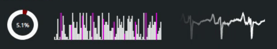
Animated Sparklines.
Next Steps.
That about covers Sparklines, at least for now. Any kind of implementation beyond this, involving interactivity or more complex displays of data, is likely moving well beyond what Sparklines are intended to do. There are other charting libraries better suited to those sorts of things, and we'll be looking at them in some of the upcoming posts. The attached project file contains everything we've covered here, including the sample ECG data used in the above animation.
Related Posts
Charting Part 1: Sparklines
Charting Part 2: Chart.js
Charting Part 3: D3.js Introduction
Charting Part 4: D3.js Interaction
Charting Part 5: D3.js Animation
Charting Part 6: Tag Clouds
Follow Andrew on 𝕏 at @WebCoreAndMore or join our 𝕏 Web Core and More Community.
Andrew Simard

This blog post has not received any comments yet.
All Blog Posts | Next Post | Previous Post