Blog
All Blog Posts | Next Post | Previous Post

 Extend TMS WEB Core with JS Libraries with Andrew:
Charting Part 3: D3.js Intro
Tuesday, August 30, 2022

We've covered Sparklines and Chart.js so far in our miniseries on adding charting capabilities to our TMS WEB Core projects. These have been great for adding either really simple charts (Sparklines) or what might be thought of as traditional charts (Chart.js), and have the benefit of being quick to implement. But what if you're looking for something a little more bespoke? Maybe more animations other than just the initial display? Or perhaps more interaction than simple pan and zoom? Then D3 (Data-Driven Documents) might be something to consider. It is more complex than the charting JS libraries we've been exploring so far, but the tradeoff is that it can do a great deal more. For a quick look at D3, here's a link to Fireship's D3.js in 100 seconds, a fun overview of what we're going to very lightly introduce in this blog post.
Motivation.
Sometimes there's a need for more than a traditional chart, particularly if you're displaying something other than traditional data. Sometimes there are better ways to visualize data or interact with data than panning and zooming around a typically static chart. D3 takes a different approach where HTML, CSS, and JS can be combined to create data that has functions embedded within it, allowing for a number of different visualization and interaction capabilities that are not likely to be found elsewhere. Unless you're looking at a library that uses D3 as its base, of which there are quite a few.
The other key differentiator here, compared with Chart.js for example, is that D3 utilizes SVG for its rendering, rather than <canvas> elements. The Sparklines JS library that we looked at did this as well, so hopefully not something that will slow us down.
A Very Brief History.
There are other resources that talk about the history of D3. For our purposes, there are only a few main items of interest. First, it was created over a decade ago, specifically to bring data visualization to web browsers. Since then, it has evolved considerably and enjoys a very broad level of support in all modern browsers. It has been updated regularly (and recently). In terms of platforms, it is available for use in Vanilla JS projects, which is all we're interested in here. It is also rather popular in the GitHub community (more than 100,000 stars and counting) and has more than 100 contributors. A pretty respectable JavaScript library by almost any definition.
Getting Started.
As is our custom, we can add this to our project by adding links to our Project.html file or via the Delphi Manage
JavaScript Libraries function.
<script src="https://cdn.jsdelivr.net/npm/d3@7/dist/d3.min.js"></script>
Then we'll set up a new project using the TMS WEB Core Bootstrap Application template, with a TWebHTMLDiv
component to hold our first chart, with the usual Bootstrap styling we've been using in the past couple of posts.
We'll start by displaying a simple pie chart. D3 needs an SVG to work with, so we can define one inside the
TWebHTMLDiv's HTML property easily enough.
<svg id="d3Chart1" width=500 height=400></svg>
From here, we can create a basic pie chart by doing something like the following. This code was adapted from the example shown here.
procedure TForm1.WebFormCreate(Sender: TObject);
begin

  asm

    // Pie chart data - total is the sum of the slices
    var data = [1,2,3,4,5,6,7];

    // Kind of like jQuery - find an element to work with.
    // In this case, using the ID.  Then set the dimensions from that
    // and position the chart in the middle of the selected SVG element
    var svg = d3.select("#d3Chart1"),
        width = svg.attr("width"),
        height = svg.attr("height"),
        radius = Math.min(width, height) / 2,
        g = svg.append("g").attr("transform", "translate(" + width / 2 + "," + height / 2 + ")");

    // Pick some colors to use for the pie slices
    var color = d3.scaleOrdinal([
      '#333','#555','#777','#999','red','green','blue'
    ]);

    // Generate the pie chart
    var pie = d3.pie();

    // Define a pie slice as an arc
    var arc = d3.arc()
                .innerRadius(0)
                .outerRadius(radius);

    // Create an arc for each data element
    var arcs = g.selectAll("arc")
                .data(pie(data))
                .enter()
                .append("g")
                .attr("class", "arc")

    // Draw slices and 'fill' using color array
    arcs.append("path")
        .attr("fill", function(d, i) {
            return color(i);
        })
        .attr("d", arc);

  end;
end;
And we end up with the following chart.
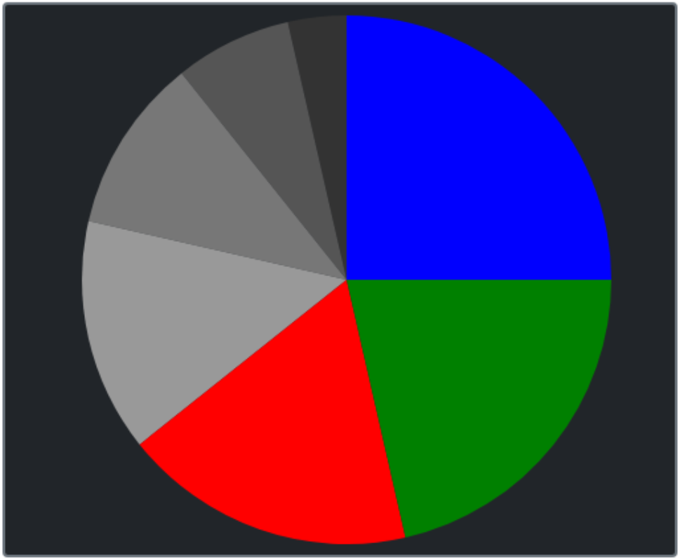
D3 Pie Chart.
Not terribly difficult, but a bit more work than we've been accustomed to. So what is this doing, really? It
is manually constructing an SVG image, using D3 functions to greatly simplify the coding needed when creating the
SVG contents. Here's what the SVG file actually looks like.
<svg id="d3Chart1" width="500" height="400">
  <g transform="translate(250,200)">
    <g class="arc">
      <path fill="#333" d="M-44.50418679126292,-194.98558243636472A200,200,0,0,1,-3.6739403974420595e-14,-200L0,0Z"></path>
    </g>
     <g class="arc">
     <path fill="#555" d="M-124.69796037174675,-156.36629649360594A200,200,0,0,1,-44.50418679126292,-194.98558243636472L0,0Z"></path>
    </g>
    <g class="arc">
      <path fill="#777" d="M-194.98558243636472,-44.50418679126285A200,200,0,0,1,-124.69796037174675,-156.36629649360594L0,0Z"></path>
    </g>
    <g class="arc">
      <path fill="#999" d="M-156.36629649360594,124.69796037174672A200,200,0,0,1,-194.98558243636472,-44.50418679126285L0,0Z"></path>
    </g>
    <g class="arc">
      <path fill="red" d="M44.50418679126289,194.98558243636472A200,200,0,0,1,-156.36629649360594,124.69796037174672L0,0Z"></path>
    </g>
    <g class="arc">
      <path fill="green" d="M200,0A200,200,0,0,1,44.50418679126289,194.98558243636472L0,0Z"></path>
    </g>
    <g class="arc">
      <path fill="blue" d="M1.2246467991473532e-14,-200A200,200,0,0,1,200,0L0,0Z"></path>
    </g>
  </g>
</svg>
Not really where anyone wants to spend their development time, but it is pretty clear the level we're working at
here. Pretty low-level, and not super-friendly to start with, but a solid start. Naturally, we'll want to create
a few Delphi functions as we've done before to help make this all a little more accessible while getting all the
benefits of D3 at the same time.
Simple Donut Chart and Pie Chart.
We can create pie charts easily enough by adding parameters to the code we've just seen. One
extra parameter for the inner radius turns our pie chart into a donut chart. We can also just use the same
approach we used last time, creating the SVG and its contents entirely within a TWebHTMLDiv component,
which can then be positioned wherever we like. Or this code can be altered to reference existing components if
the placement is already taken care of.
function TForm1.CreateD3PieChart(X, Y, Width, Height, InnerRadius, OuterRadius: Integer; Data: array of Integer; Colors: String): Integer;
var
  NewChart: TWebHTMLDiv;
  ChartID: String;
begin

  SetLength(Charts,Length(Charts)+1);
  Result := Length(Charts) - 1;
  ChartID := 'D3Chart-'+IntToStr(Result);

  NewChart := TWebHTMLDiv.Create(Self);
  NewChart.Parent := Self;
  NewChart.ElementID := 'div'+ChartID;
  NewChart.ElementClassName := 'rounded border border-secondary border-2 bg-dark';
  NewChart.Left := X;
  NewChart.Top := Y;
  NewChart.Width := Width;
  NewChart.Height := Height;
  NewChart.HTML.Text := '<svg id="'+ChartID+'" width='+IntToStr(Width)+' height='+IntToStr(Height)+'></svg>';

  asm
    var svg = d3.select("#"+ChartID),
        width = svg.attr("width"),
        height = svg.attr("height"),
        radius = OuterRadius,
        g = svg.append("g").attr("transform", "translate(" + width / 2 + "," + height / 2 + ")");

    var color = d3.scaleOrdinal(JSON.parse(Colors));
    var pie = d3.pie();
    var arc = d3.arc()
                .innerRadius(InnerRadius)
                .outerRadius(OuterRadius);

    var arcs = g.selectAll("arc")
                .data(pie(Data))
                .enter()
                .append("g")
                .attr("class", "arc")

    arcs.append("path")
        .attr("fill", function(d, i) {
            return color(i);
        })
        .attr("d", arc);

  end;
end;
From here, we can create pie charts or donut charts just by passing parameters.
procedure TForm1.WebFormCreate(Sender: TObject);
begin
  CreateD3PieChart( 10,10,400,400,  0,180,[1,2,3,4,5,6,7],'["#333","#555","#777","#999","#AAA","#CCC","EEE"]');
  CreateD3PieChart(420,10,400,400, 50,180,[1,2,3,4,5,6,7],'["#333","#555","#777","#999","#AAA","#CCC","EEE"]');
  CreateD3PieChart(840,10,400,400,100,180,[1,2,3,4,5,6,7],'["#333","#555","#777","#999","#AAA","#CCC","EEE"]');
end;
This generates the following charts.
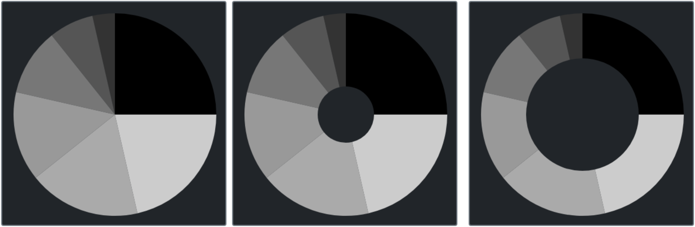
D3 Pie and Donut Charts Via a Custom Delphi Function.
Note that the chart background and border are just what is behind the SVG. In our example, this is set via the
Bootstrap classes added to the ElementClassName of the surrounding TWebHTMLDiv that we are dynamically creating.
Plenty of ways to customize this further, either in the ElementClassName property as was done above or by adding
in a background property or other content within the HTML tag, being sure to carefully place the SVG with respect
to any other elements that might be added in this way.
Simple Bar Chart.
The same idea is used here, but there are a number of other D3 helpers that we'll need, particularly related to
the x-axis and y-axis setup.
function TForm1.CreateD3BarChart(X, Y, Width, Height: Integer; XData: String; YData: String; Colors: String): Integer;
var
  NewChart: TWebHTMLDiv;
  ChartID: String;
begin

  SetLength(Charts,Length(Charts)+1);
  Result := Length(Charts) - 1;
  ChartID := 'D3Chart-'+IntToStr(Result);

  NewChart := TWebHTMLDiv.Create(Self);
  NewChart.Parent := Self;
  NewChart.ElementID := 'div'+ChartID;
  NewChart.ElementClassName := 'rounded border border-secondary border-2 bg-dark';
  NewChart.Left := X;
  NewChart.Top := Y;
  NewChart.Width := Width;
  NewChart.Height := Height;
  NewChart.HTML.Text := '<svg id="'+ChartID+'" width='+IntToStr(Width)+' height='+IntToStr(Height)+'></svg>';

  asm

    // Setup Chart
    var svg = d3.select("#"+ChartID),
        width = svg.attr("width")-50,
        height = svg.attr("height")-60,
        g = svg.append("g").attr("transform", "translate(" + width / 2 + "," + height / 2 + ")");

    // Prepare Colors
    var color = JSON.parse(Colors);

    // Set chart within area (kind of like margin)
    var g = svg.append("g").attr("transform", "translate(25,25)");

    // Setup x-axis
    var xdat = JSON.parse(XData);
    var xScale = d3.scaleBand().range([0, width]).padding(0.5);
    xScale.domain( xdat );
    g.append("g")
     .attr("transform", "translate(0," + height + ")")
     .call(d3.axisBottom(xScale));

    // Setup y-axis
    var ydat = JSON.parse(YData);
    var yScale = d3.scaleLinear().range([height, 0]);
    yScale.domain([0, Math.max(...ydat)]);
    g.append("g")
     .call(d3.axisLeft(yScale));

    // Change the axes to be white
    d3.select("#"+ChartID)
      .style("color","#fff")

    // Draw the bars
    // function(d,i) - interates data elements - d=data i=index
    // We're just iterating and using i to lookup xdat[i] and ydat[i] values
    g.selectAll(".bar")
     .data(xdat)
     .enter()
     .append("rect")
     .attr("class", "bar")
     .attr("x", function (d,i) { return xScale(xdat[i]); })
     .attr("y", function (d,i) { return yScale(ydat[i]); })
     .attr("width", xScale.bandwidth())
     .attr("height", function (d,i) { return height - yScale(ydat[i]); })
     .attr("fill", function (d,i) { return color[i] })

  end;
end;
The axis definitions are a bit obscure, certainly. For the x-axis, we're just passing it an array of values. For
the y-axis, we're setting it to 0-max(data) - the maximum value in the array passed. Then to draw the bars,
we use the index to find the appropriate values. The xScale() and yScale() functions are used to determine
the appropriate x and y values, whereas the xScale.bandwidth() function determines the bar width. The bar height
is calculated here as well, as can be seen above. Lots of manual work, but the result is as we'd expect.
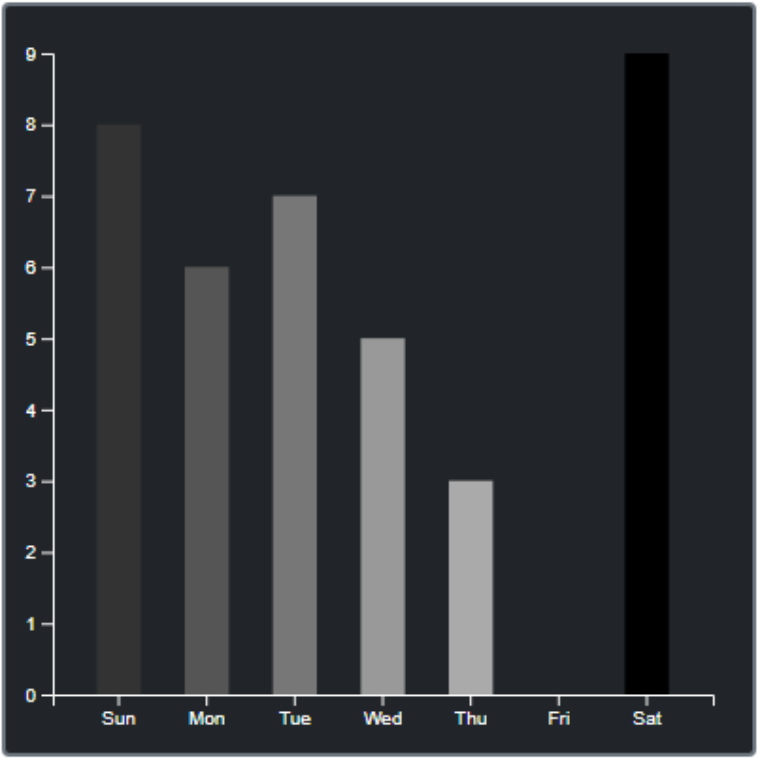
D3 Bar Chart.
Creating bar charts is then a matter of passing in arrays. This could be rearranged to pass an array of
[x,y] values instead, just as easily, or an array that combines the data and the color values as well. Here are some examples of what the function calls from Delphi might look
like.
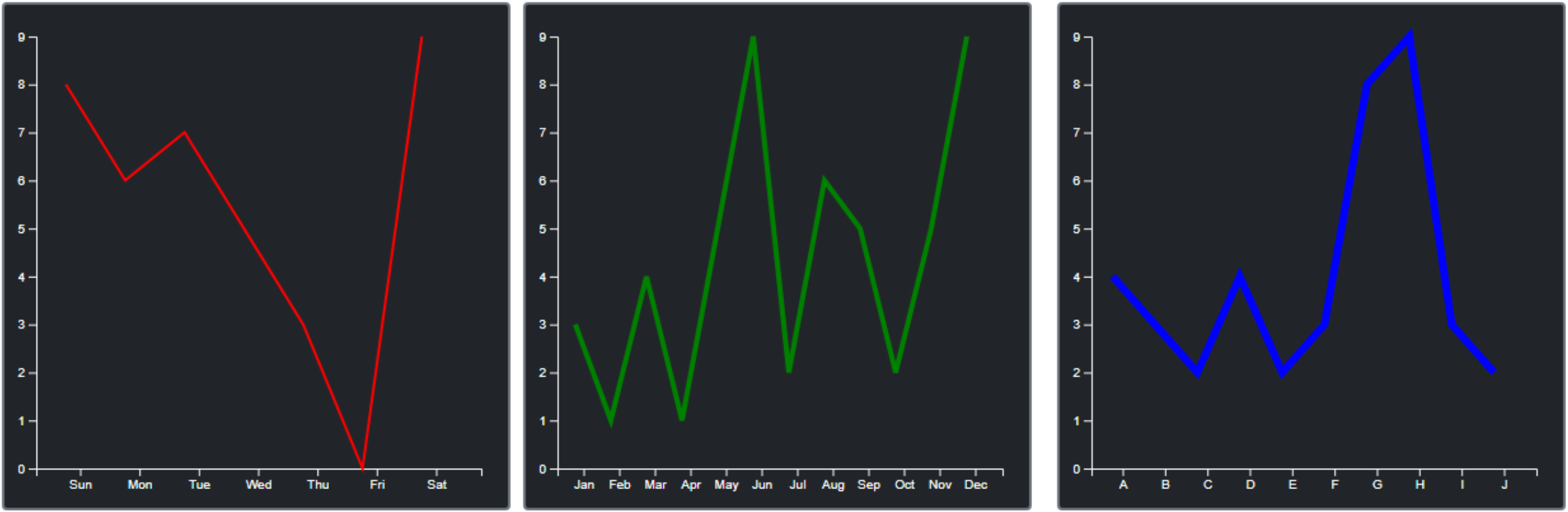
CreateD3BarChart( 10,420,400,400,
    '["Sun","Mon","Tue","Wed","Thu","Fri","Sat"]',
    '[8,6,7,5,3,0,9]',
    '["#333","#555","#777","#999","#AAA","#CCC","EEE"]'
  );
  CreateD3BarChart( 420,420,400,400,
    '["Jan","Feb","Mar","Apr","May","Jun","Jul","Aug","Sep","Oct","Nov","Dec"]',
    '[3,1,4,1,5,9,2,6,5,2,5,9]',
    '["red","blue","green","yellow","orange","cyan","purple","brown","gold","gray","crimson","pink"]'
  );
  CreateD3BarChart( 840,420,400,400,
    '["A","B","C","D","E","F","G","H","I","J"]',
    '[4,3,2,4,2,3,8,9,3,2]',
    '["#777","#777","#777","#777","#777","#777","red","red","#777","#777"]'
  );
These calls will generate the following bar charts.
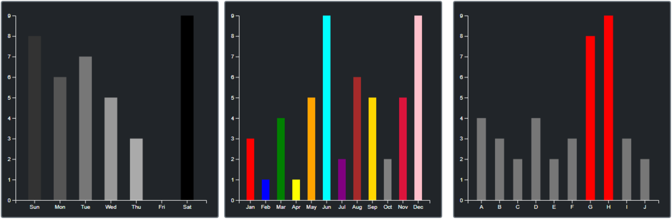
More D3 Bar Charts.
Simple Line Chart.
This is almost identical to the bar chart code, but instead of drawing bars, we're just drawing lines. In an SVG,
lines are referred to as paths. Everything else stays the same, except that instead of passing a color array,
we'll pass a color and a line width instead.
    // Draw the Lines
    // function(d,i) - interates data elements - d=data i=index
    // We're just iterating and using i to lookup xdat[i] and ydat[i] values
    g.append("path")
     .datum(xdat)
     .attr("fill", "none")
     .attr("stroke", Colors)
     .attr("stroke-width", LineWidth)
     .attr("d", d3.line()
       .x(function(d,i) { return xScale(xdat[i]); })
       .y(function(d,i) { return yScale(ydat[i]); })
     )
Passing the same sets of data, but with the color and width parameters, we can easily generate the following line
charts.
D3 Line Charts.
Next Steps.
As we can see, the code to generate SVGs isn't so complicated after all. And once wrapped in a Delphi function, they're just as easy to use here as they have been in the other JavaScript libraries that we've looked at. And this is just the very tiniest tip of the D3 iceberg. It is not a great leap to imagine how we might combine charts in the same SVG, even charts of different types. Or draw more complex chart types using the same kind of approach.
It should also be readily apparent that the elements of the chart are all accessible, either via the code that is used to generate the SVG or by applying CSS rules to the classes that are created directly within the SVG itself. This opens the door to considerably more functionality, as we can also start connecting functions to individual data points, letting them literally take on a life of their own.
Next time out we'll have a look at a few more complex examples, with a little bit more interaction and a bit more variation in the kinds of data we can visualize.
Download the sample project here.
Related Posts
Charting Part 1: Sparklines
Charting Part 2: Chart.js
Charting Part 3: D3.js Introduction
Charting Part 4: D3.js Interaction
Charting Part 5: D3.js Animation
Charting Part 6: Tag Clouds
Follow Andrew on 𝕏 at @WebCoreAndMore or join our 𝕏 Web Core and More Community.
Andrew Simard

This blog post has not received any comments yet.
All Blog Posts | Next Post | Previous Post