Blog
All Blog Posts | Next Post | Previous Post

 Extend TMS WEB Core with JS Libraries with Andrew:
HexaGongs Part 3 of 5: Options (Edits, Memos, Buttons, Colors, Trackbars)
Wednesday, June 14, 2023

Contents.
- The Dialog Window.
- Resize and Drag.
- TWebPageControl.
- Storing Options.
- TWebLabel and TWebEdit.
- TWebMemo.
- Custom Scrollbars.
- Radio Buttons.
- Color Picker.
- Trackbars.
- Custom CSS Backgrounds.
- Deleting HexaGongs.
- Cloning HexaGongs.
- Next Time.
The Dialog Window.
There are plenty of ways to create dialogs. If the plan is to have the same dialog accessible multiple times, then creating a separate Form, to be able to create multiple instances as pop-ups, is certainly a solid approach. There are some components that create dialogs of their own. For example, date pickers and color pickers.
In our project, we're after a more complex dialog, but we'll only need one at a time. And as our main form isn't overly complicated so far (just a couple of TWebHTMLDiv components, one containing all 16 TWebButtons plus our cursor TWebButton), we can just create another TWebHTMLDiv component that can be shown or hidden as needed, with its contents updated to reflect the currently selected (or new) HexaGong that we're working with.
Naturally, we're
not going to just display a rectangle. We'll want to add something to the corners so that it has a hexagonal
look to it. And we'll want it to be resizable and draggable. And translucent, so we can see the background
animation that we put so much effort into. Let's start with the border. In the last couple of posts, we've used a CSS clip-path rule to draw our hexagon
shapes. For example, something like this.
.Gong {
  clip-path: polygon(25% 5%, 75% 5%, 100% 50%, 75% 95%, 25% 95%, 0% 50%);
}
This generates a perfectly lovely hexagon, but we're just after the hexagon corners, not a hexagon with equal sides. As it turns out, not only can a CSS polygon be defined by a series of sides expressed as percentages, it can also include calculations related to the width and height of the element. This means we can define specific offsets from each of the edges, and craft something that gives us our hexagon look but also that can be scaled without having the corners scaled as well. This is what we're after, and we'll be using it quite a lot. The idea, then, is to define some CSS classes specifically for these kinds of things and then apply them as needed.
For example, for our main Options dialog, we'll want a hexagon-styled border. We can do this with two
TWebHTMLDiv components, one inside the other. There are a couple of variations of the hexagon classes, but
let's try this out. We'll have a "HexOuter" class for the outermost shape, and within that, a HexTallInner
class, for elements where they might be taller than, say, a regular TWebEdit component - we'll use the HexInner class
for that. Here's what the CSS looks like for these special Hex classes.
.HexOuter {
  width: calc(100% - 42px) !important;
  clip-path: polygon(0px 20px, 10px 2px, calc(100% - 10px) 2px, 100% 20px, 100% calc(100% - 20px), calc(100% - 10px) calc(100% - 2px), 10px calc(100% - 2px), 0% calc(100% - 20px));
}
.HexTallInner {
  top: 2px !important;
  left: 2px !important;
  width: calc(100% - 4px) !important;
  clip-path: polygon(0px 30px, 16px 1.8px, calc(100% - 16px) 1.8px, 100% 30px, 100% calc(100% - 30px), calc(100% - 16px) calc(100% - 1.8px), 16px calc(100% - 1.8px), 0% calc(100% - 30px));
}
To draw the border for our Options dialog, we'll have a bit more CSS. The first of three nested TWebHTMLDiv components is called divOptions. This is the main container for everything else, and it is transparent. Inside of that, we've got the divOptionsBGBorder component, which is assigned the HexOuter class above via its ElementClassName property, and within that, the divOptionsBG component, which is assigned the HexTallInner class in the same fashion. We'd like the Options dialog to initially pop up in the middle of whatever particular page orientation we have. This can also be done via CSS. Here's what we've got.
#divOptions {
  position: absolute;
  width: 40%;
  height: 75%;
  left: 50%;
  top: 50%;
  transform: translate(-50%,-50%);
  min-width: 400px;
  min-height: 400px;
  z-index: 20;
  opacity: 0;
  transition: opacity 500ms;
  visibility: hidden;
}
#divOptionsBGBorder {
  position: absolute;
  top: 0px;
  left: 0px;
  right: 0px;
  bottom: 0px;
  background: white;
  opacity: 0.2;
  z-index: -2;
  width:100% !important;
}
#divOptionsBG {
  position: absolute;
  top: 2px;
  left: 2px;
  right: 2px;
  bottom: 2px;
  background: black;
  opacity: 0.8;
  z-index: -1;
}
This gets us the following Options dialog base to work from. We could also draw the border in a completely different way. Use the clip-path to draw a cut-out that does what our two <div> elements are doing, but at the same time. This can be achieved by taking our outer clip-path and continuing along in the reverse direction, but offset 2px inside the same path, back to the starting point. As usual, there are many ways to achieve the same result.
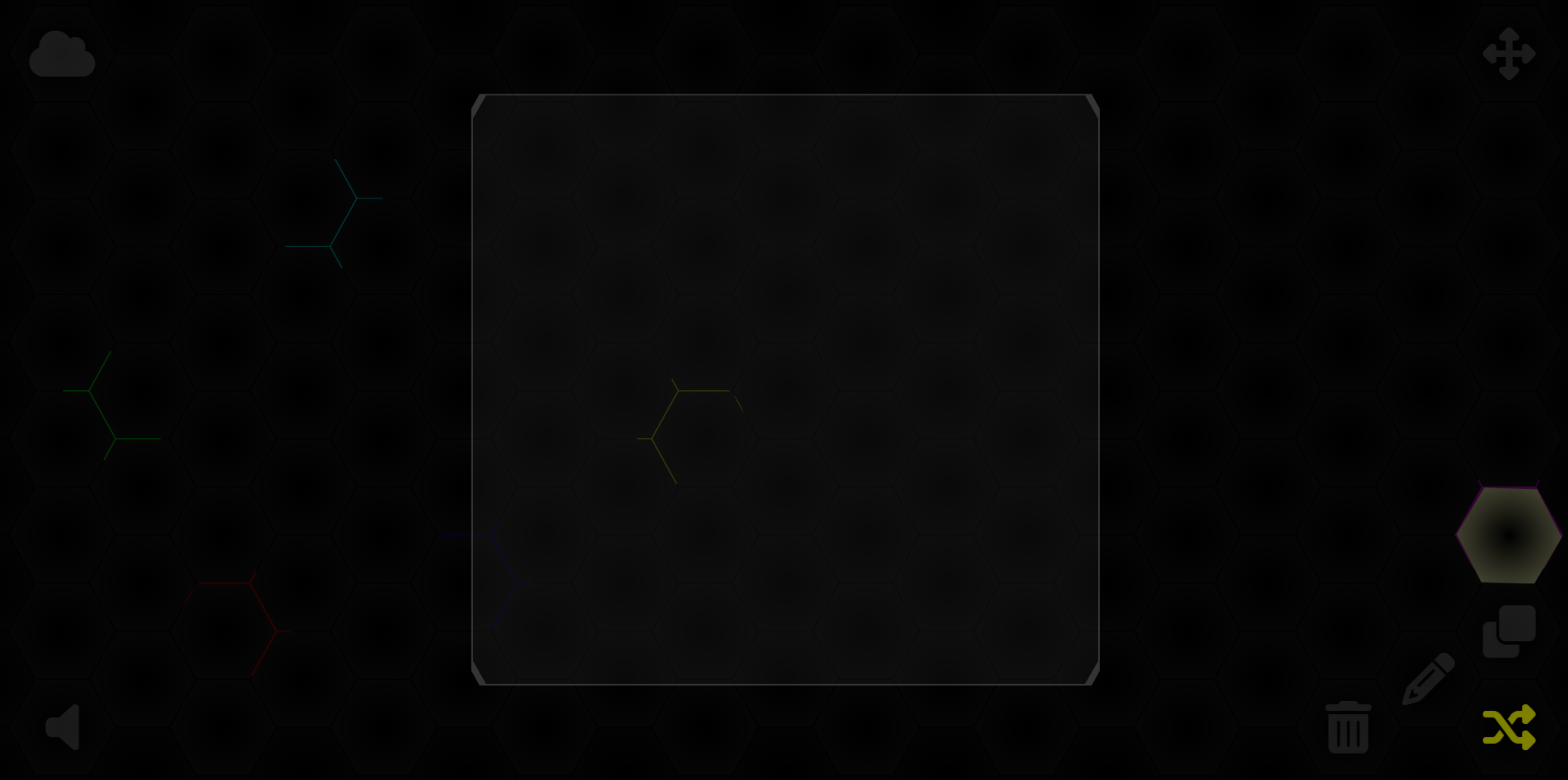
Options Dialog Base.
Note that by having the main component, divOptions, transparent, we can set the background and border to
whatever opacity we like, and then add in other components on top of them, rather than inside them, as we don't
really want that same level of opacity applied to the contents of the Options dialog - just the background.
Resize and Drag.
Initially, the CSS for the Options dialog will set a default width and height, centered within the page, based
on the dimensions of the page (40% of the width, 75% of the height). But we'd like to have the ability to
resize and drag the Options dialog. We've already got what we need for this in our project with InteractJS,
which we used extensively in the last post. This time around, things are quite a bit simpler - very close to what was provided on the InteractJS website originally. We'll need
another class created, "resize-drag", that we can apply to the main divOptions component.
    interact('.resize-drag')
      .resizable({
        edges: { left: true, right: true, bottom: true, top: true },
        margin: 30, // size of resizing boundary interaction area
        listeners: {
          move (event) {
            var target = event.target
            var x = (parseFloat(target.getAttribute('data-x')) || -divOptions.getBoundingClientRect().width/2)
            var y = (parseFloat(target.getAttribute('data-y')) || -divOptions.getBoundingClientRect().height/2)
            target.style.width = event.rect.width + 'px'
            target.style.height = event.rect.height + 'px'
            x += event.deltaRect.left
            y += event.deltaRect.top
            target.style.transform = 'translate(' + x + 'px,' + y + 'px)'
            target.setAttribute('data-x', x)
            target.setAttribute('data-y', y)
            pas.Unit1.Form1.UpdateOptionsCursor();
            pas.Unit1.Form1.UpdateColorPickerSize();
          }
        },
        ignoreFrom: '.nointeract, .simplebar-track'
      })
      .draggable({
        listeners: { move: dragMoveListenerOptions },
        ignoreFrom: '.nointeract, .simplebar-track'
      })
      .pointerEvents({
        ignoreFrom: '.nointeract, .simplebar-track'
      });

    function dragMoveListenerOptions (event) {
      var target = event.target
      var x = (parseFloat(target.getAttribute('data-x')) || -divOptions.getBoundingClientRect().width/2) + event.dx
      var y = (parseFloat(target.getAttribute('data-y')) || -divOptions.getBoundingClientRect().height/2) + event.dy
      target.style.transform = 'translate(' + x + 'px, ' + y + 'px)'
      target.setAttribute('data-x', x)
      target.setAttribute('data-y', y)
    };
    window.dragMoveListenerOptions = dragMoveListenerOptions
There are two things to note here. First, we're going to have a lot of components in our Options dialog, many
of which we don't want InteractJS to interfere with, such as TWebMemo components s or various scrollbars (we'll get to those
in a little bit). For elements that we want to exclude from InteractJS' interactions, we can add the
"nointeract" class, or whatever other classes we want to exclude. We'll cover the "simplebar-track" situation in a little bit.
Second, as CSS is used to determine the starting position of our Options dialog, we'll have to get that starting position explicitly when setting the defaults for InteractJS. InteractJS adds its own data-x and data-y attributes to the element it is attached to. If the element hasn't been interacted with, it will set its own defaults (usually 0).
If we don't set these to reflect the starting position, the Options window will initially "jump" the first time we try to resize or drag it. As can be seen in the above code, we can retrieve the actual positioning information from an element on the page using the getBoundingClientRect() method. This conveniently returns fractional pixel values that allow for precise adjustments.
TWebPageControl.
As we're going to have more than a few options available for each HexaGong, we can use a TWebPageControl component to group similar options together, and then have separate pages to help keep things under control. As we're going for a hexagon-styled look, the default tab controls for the TWebPageControl component aren't really what we're after, and similar components that have angled tabs aren't really going to cut it either, so let's just not use those and instead set up a column of TWebButton compnents that we can style however we like.
To do this, we'll need another
TWebHTMLDiv component to hold them. We can use CSS flex to help align and distribute the buttons vertically so
that they're evenly spaced. This can be done by adding a few more Bootstrap classes to the ElementClassName of
this particular component.
d-flex flex-column justify-content-evenly align-items-center
In the Delphi IDE, we can add as many buttons as we need. The available options aren't changing, so a static collection of TWebButton components works fine here. We'll need a bit of CSS to get them into a hexagon shape as we've been doing elsewhere. We can also add a bit of fancy styling by adding a drop-shadow to the icons that we'll be adding to these buttons.
.OptionsButton {
  clip-path: polygon(25% 5%, 75% 5%, 100% 50%, 75% 95%, 25% 95%, 0% 50%);
  border: 1px;
  width: 64px !important;
  height: 64px !important;
  color: silver;
  transition: color 300ms;
}
.OptionsButton > i {
  filter: drop-shadow(0px 0px 1px black) drop-shadow(0px 0px 1px black);
}
.OptionsButton:hover {
  color: white;
}
For the button colors, we can set up a few CSS classes to help with this. All we need to do is add the class
name to the TWebButton component's ElementClassName property to have it pick up the color. In this case, we're opting
for a radial-gradient background effect with these colors. There are other colors defined the same way, where a
solid color or a linear-gradient is used in the same way, with the same set of colors.
.WhiteR       { background: radial-gradient(#00000000,white)       !important;}
.GrayR        { background: radial-gradient(#00000000,gray)        !important;}
.RedR         { background: radial-gradient(#00000000,red)         !important;}
.OrangeR      { background: radial-gradient(#00000000,orange)      !important;}
.YellowR      { background: radial-gradient(#00000000,yellow)      !important;}
.GreenR       { background: radial-gradient(#00000000,green)       !important;}
.BlueR        { background: radial-gradient(#00000000,blue)        !important;}
.RoyalBlueR   { background: radial-gradient(#00000000,royalblue)   !important;}
.IndigoR      { background: radial-gradient(#00000000,indigo)      !important;}
.VioletR      { background: radial-gradient(#00000000,violet)      !important;}
In order to highlight what page we're currently on, we'll also add an extra element to serve as an "Options cursor" of sorts. When we switch pages, we'll have to move this cursor element to the appropriate spot and change its color to match the color of the current page/button. In order to get this alignment to work when CSS flex is moving things around all on its own, we'll have to make use of that getBoundingClientRect() function again. This also gets us the precision we need to ensure that the cursor is perfectly aligned with the button beside it.
procedure TForm1.UpdateOptionsCursor;
var
  CursorHeight: Double;
  CursorWidth: Double;
  CursorTop: Double;
  CursorLeft: Double;
  CursorColor: String;
  CursorLink: TWebButton;

begin

  if      pageControl.tabIndex = 0 then CursorLink := btnOptionsName
  else if pageControl.tabIndex = 1 then CursorLink := btnOptionsBackground
  else if pageControl.tabIndex = 2 then CursorLink := btnOptionsImage
  else if pageControl.tabIndex = 3 then CursorLink := btnOptionsAudio
  else if pageControl.tabIndex = 4 then CursorLink := btnOptionsSettings;

  CursorTop := CursorLink.ElementHandle.getBoundingClientRect.top - divOptionsList.ElementHandle.getBoundingClientRect.top;
  CursorLeft := CursorLink.ElementHandle.getBoundingClientRect.left + 20 - divOptionsList.ElementHandle.getBoundingClientRect.left;
  CursorWidth := CursorLink.ElementHandle.getBoundingClientRect.width;
  CursorHeight := CursorLink.ElementHandle.getBoundingClientRect.height;

  divOptionsCursor.ElementHandle.style.setProperty('top',FloatToStrF(CursorTop,ffGeneral,8,5)+'px');
  divOptionsCursor.ElementHandle.style.setProperty('left',FloatToStrF(CursorLeft,ffGeneral,8,5)+'px');
  divOptionsCursor.ElementHandle.style.setProperty('width',FloatToStrF(CursorWidth,ffGeneral,8,5)+'px');
  divOptionsCursor.ElementHandle.style.setProperty('height',FloatToStrF(CursorHeight,ffGeneral,8,5)+'px');

  divOptionsCursor.ElementHandle.style.setProperty('background',window.getComputedStyle(CursorLink.ElementHandle).getPropertyValue('background'));

end;
Not too complicated at all, really. We can even just copy the background color directly from the button that corresponds to the current page. In order to draw our cursor, we're going to use yet another clip-path CSS rule. In this case, we're drawing something more like a chevron rather than a hexagon, but using the same proportions so that they fit together nicely.
#divOptionsCursor {
  clip-path: polygon(50% 5%, 75% 5%, 100% 50%, 75% 95%, 50% 95%, 75% 50%);
  position: absolute;
  border: 1px;
}
And with that, we've got our TWebPagControl buttons all sorted out. In this screenshot, we can easily see that the second option is currently selected, even though the page content is not yet visible.
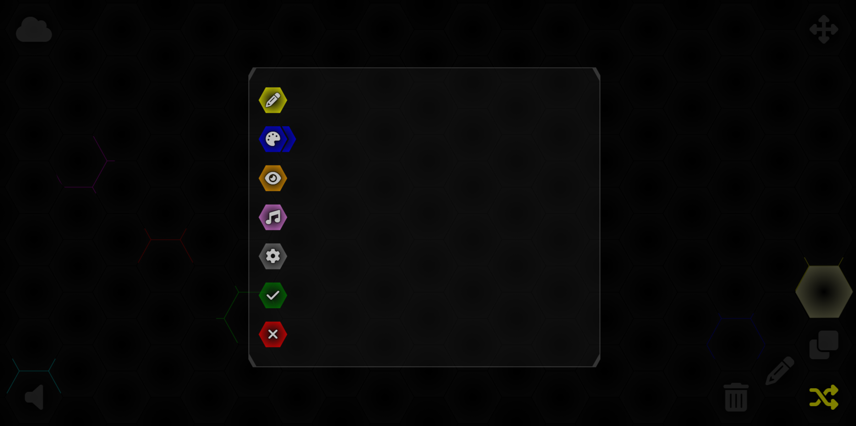
TWebControl Page Buttons.
Switching pages normally involves just setting the TWebPageControl component's TabIndex property. In our case, we're
opting to be a little fancier by adding a quick transition fade in/out between pages (not a cross-fade, sadly).
This involves a bit of timing as well as the use of the transition CSS property applied to the opacity of a
page. Each TWebTabSheet component has the "Page" class assigned in its ElementClassName property.
.Page {
  position: absolute;
  top: 0px;
  left: 0px;
  right: 0px;
  bottom: 0px;
  background: transparent;
  overflow: auto !important;
  opacity: 0;
  transition: opacity 200ms;
}
To change pages, we'll need to adjust the opacity but also update our Options cursor to the new position as
well.
procedure TForm1.btnOptionsBackgroundClick(Sender: TObject);
begin
  if (PageControl.TabIndex <> 1) then
  begin
    PageControl.ActivePage.ElementHandle.style.setProperty('opacity','0');
    asm await sleep(200); end;
  end;

  pageControl.TabIndex := 1;
  UpdateOptionsCursor;
  pageBackground.ElementHandle.style.setProperty('opacity','1');
end;
That's about it for the TWebPageControl customizations. What we're left with is a set of five buttons corresponding to pages, as well as "ok" and "cancel" buttons that are used to potentially save the changes and then close the Options dialog. Our five buttons correspond to the following pages.
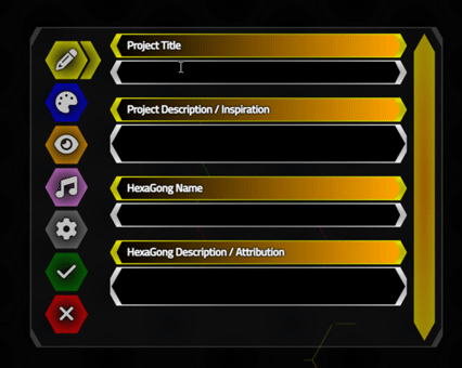
- Names. This tab will contain the TWebEdit and TWebMemo components that we can use to set names and descriptions, both at the HexaGongs Project level and the individual HexaGong level.
- Background. Used to set the background color of an individual HexaGong.
- Image. An icon or other image placed at the center of the HexaGong.
- Audio. The audio clip (or sequence of clips), to be played when clicking on the HexaGong.
- Settings. Other options, like the number of background animated elements.
While all of these Options are simple enough to understand and even implement, many have been further
customized to have a hexagon look or to override the default browser behavior, so a little extra attention (or a lot in some cases) is
needed.
Storing Options.
The Options values themselves are stored in a JSON object called GongData, originally declared in the Form as a JSValue. When the Options dialog is presented, the contents of this JSON object are used to populate the various components found on all of the different pages. When the Options dialog is closed with the "check" button, the values from these same components are then used to update the GongData JSON object. Nothing too fancy about that, other than it is all done in JavaScript rather than using the TJSONObject from Delphi.
This JSON object has at least a couple of top-level elements that are set when a HexaGongs project is first created. This includes the project title and description. It then has a 'HexaGongs' JSON array which contains the
Options set for each HexaGong individually. This JSON array should have a 1:1 relationship with the other
dynamic arrays in Delphi that we've been using already, such as Gongs and GongsP. These could, in theory, all
be combined into one JSON array if one was so inclined. In WebFormCreate, we initialize GongData so that we've
got something to work with when the Options dialog is first opened.
  asm
    this.GongData = {};
    this.GongData['HexaGongs Project Title'] = "New Project";
    this.GongData['HexaGongs Project Description'] = 'No Description';
    this.GongData['HexaGongs'] = [];
  end;
When we create a new HexaGong, we will then have to create a new element in the JSON array, populating it with
defaults of some kind. This could be adjusted as more options are added, but initially, it might look something
like this.
      asm
        this.GongData['HexaGongs'].push({});
        this.GongData['HexaGongs'][this.GongID]['Name'] = 'New HexaGong '+(this.GongID + 1);
        this.GongData['HexaGongs'][this.GongID]['Description'] = 'No description';
        this.GongData['HexaGongs'][this.GongID]['BG Style'] = 1;
        this.GongData['HexaGongs'][this.GongID]['BG Color 1'] = '#00000080';
        this.GongData['HexaGongs'][this.GongID]['BG Color 2'] = '#FFFFFF80';
        this.GongData['HexaGongs'][this.GongID]['BG Custom'] = '';
      end;
And as we're creating proper HexaGong elements now, we don't need to include the number in the HTML.Text property as we were doing previously - we'll rely on the colors and icons to help identify them. If we're editing an existing HexaGong (or a newly created one - doesn't really matter) we can then extract the values we need, sometimes into Form values and sometimes directly into our component values. For our first Options page, we've got a couple of TWebEdit and TWebMemo components, so we can set their 'text' properties directly from the JSON array like this.
    // pageName
    asm
      this.editTitle.SetText(this.GongData['HexaGongs Project Title']);
      this.memoProjDesc.FLines.SetTextStr(this.GongData['HexaGongs Project Description']);
      this.editHexName.SetText(this.GongData['HexaGongs'][this.GongID]['Name']);
      this.memoHexDesc.FLines.SetTextStr(this.GongData['HexaGongs'][this.GongID]['Description']);
    end;
When we're done, the reverse happens - taking the values from our components and updating the JSON array elements. Here, the same properties above are written back to the GongData JSON object.
procedure TForm1.btnOptionsOKClick(Sender: TObject);
begin
  asm
    this.GongData['HexaGongs Project Title'] = this.editTitle.GetText();
    this.GongData['HexaGongs Project Description'] = this.memoProjDesc.GetText();
    this.GongData['HexaGongs'][this.GongID]['Name'] = this.editHexName.GetText();
    this.GongData['HexaGongs'][this.GongID]['Description'] = this.memoHexDesc.GetText();
  end;

  btnOptionsCancelClick(Sender);
end;
Other Options values follow the same pattern, storing background colors, image data, audio data, and so on. Showing and hiding the Options Dialog also includes another TWebHTMLDiv component - divShade - that is used to obscure everything behind the Options dialog. The CSS for divShade is relatively simple.
#divShade {
  z-index: 15;
  position: absolute;
  top: 0px;
  left: 0px;
  right: 0px;
  bottom: 0px;
  opacity: 0;
  transition: opacity 500ms;
  background: black;
  opacity: 0;
  visibility: hidden;
}
Showing the Options dialog is then a matter of fading in the divShade and divOptions element, while setting the values as above, all handled in the same btnEditClick event we've been using.
    // Display Options dialog in a predetermined state
    divShade.ElementHandle.style.setProperty('visibility','visible');
    divShade.ElementHandle.style.SetProperty('opacity','0.5');
    divOptions.ElementHandle.style.setProperty('visibility','visible');
    divOptions.ElementHandle.style.SetProperty('opacity','1');

    pageControl.TabIndex := 0;
After the settings are written back to the GongData JSON object (or the "cancel" button is clicked), we need to
do the reverse to hide the divShade and divOptions elements. Here, we first change the opacity to 0, which has
a transition attached to it so it is a gradual process, and then very shortly afterward they are set to
invisible so they can no longer be interacted with.
procedure TForm1.btnOptionsCancelClick(Sender: TObject);
var
  HexaGongString: String;
begin
  divShade.ElementHandle.style.setProperty('opacity','0');
  divOptions.ElementHandle.style.setProperty('opacity','0');
  asm
    setTimeout(function() {
      divShade.style.setProperty('visibility','hidden');
      divOptions.style.setProperty('visibility','hidden');
    },500);
  end;
end;
All that's left, then, is the job of crafting individual Options pages, ideally with hexagonal styling, that best suits whatever values we're making available to the user.
TWebLabel and TWebEdit.
The first page, Names, involves a couple of TWebEdit and TWebMemo components as we've seen in our examples above. One pair is used at the project level, and the other is used at the individual HexaGong level. There's also a TWebLabel for each of them (set to render as a <span> element). To achieve our hexagonal look, we can apply the same CSS classes by assigning them to the ElementClassName property of these components. We can also adjust the colors using some of the CSS color work we did previously as well.
And because we sometimes go a little crazy with the Bootstrap classes, in addition
to not putting much effort into keeping any separation between our CSS file and our component ElementClassName
properties, we can end up with a bit of a convoluted set of CSS properties being assigned in several places. For example, our TWebLabel components have been placed in their own TWebHTMLDiv component (even though they have their own
label child element) with the following ElementClassName property.
HexOuter YellowR w-100 mt-2
This draws a yellow outer hexagon with a radial-gradient background that stretches to fit the width of the TWebTabSheet component that we're working within, and adds a bit of top margin. Then, in the TWebLabel's ElementClassName property, we have this.
Title HexInner YellowL ps-3 pt-1
This draws another yellow hexagon with a different linear-gradient background and a bit of nudging for the positioning of the label text. The Title in this case refers to yet another bit of CSS.
.Title > span,
.Title > label {
  color: white;
  font-weight: bold;
  filter: drop-shadow(0px 0px 1px black) drop-shadow(0px 0px 1px black);
}
The drop-shadow here helps make it easier to read white text on whatever color background we happen to be using. This could all be handled differently. For example, the Bootstrap classes could be dispensed with and handled directly in the CSS file. Or the CSS contents could be assigned to more generic class names (like text-shadow or something like that) and included that way instead of using Title as a class. Lots of options. There's even a TWebCSSClass component that can be dropped on the Form to create new CSS classes with custom properties directly using the Delphi IDE Object Inspector.
While a more strict approach might be beneficial, the main takeaway here is that you can specify CSS rules in
many places, and the "cascading" nature of CSS makes it easy to mix and match classes to get the desired styling
onto the page. We'll see an example of what this all looks like in just a moment. The same approach is used with the TWebEdit components. An enclosing TWebHTMLDiv component is used to host the outer
hexagon, and the inner hexagon is applied to the TWebEdit component directly. We can apply custom CSS there as
well.
.EditText {
  color: white;
  border: none;
}
In our Options dialog, everything that the user can interact with is white, and everything else is set to the same color as the button for the page, hopefully consistently. One of the side-effects of applying a CSS clip-path against a TWebEdit component (an HTML <input> element, ultimately) is that we lose the input focus rectangle, as it is outside of the clip-path boundary. This isn't all bad, particularly as we're being so very rectangle-averse at the moment, but also because sometimes those focus rectangles can be really difficult to get rid of! But if you want them in your own project, perhaps another layer of background elements would be needed with a larger clip-path boundary, where that focus styling could be shown.
TWebMemo.
We'll follow this same approach with the TWebMemo components, but these present a few significant additional challenges due to their variable height. If we limit the height, we could end up with scrollbars in the TWebMemo component. If we don't limit the height, we could end up with scrollbars in the TWebTabSheet that we're on. Scrollbars seem to be unavoidable!
While much of this can be handled with resizing and scrollbar components provided, often automatically, by the browser, this often ends up with UI elements that are completely inconsistent with the rest of our styling. Yuck! Worse still, we're venturing into territory where browsers don't behave consistently, so while a particular styling technique might look great in Chrome, it might not even work at all in Firefox or Safari.
As we add lines, it would be ideal if the TWebMemo component automatically stretched vertically to accommodate the new text, so as to avoid any scrollbars there. Likewise, if we resize the Options dialog in a way that the text in the TWebMemo wraps to create more (or fewer) lines, we'd like the TWebMemo height to automatically adjust to that as well.
TWebMemo components, once translated to the page, end up as <textarea> HTML elements, which are
notorious for not following the rules that other HTML elements do in this regard. To get around that, we can add
a little JavaScript to smooth things out a little (attribution).
  asm
    function addAutoResize() {
      document.querySelectorAll('[data-autoresize]').forEach(function (element) {
        element.style.boxSizing = 'border-box';
        var offset = element.offsetHeight - element.clientHeight;
        element.addEventListener('input', function (event) {
          event.target.style.height = 'auto';
          event.target.style.height = event.target.scrollHeight + offset + 'px';
          event.target.parentElement.style.height = event.target.scrollHeight + offset + 4 + 'px';
          pas.Unit1.Form1.OptionsNamesScroll.recalculate();
        });
        element.removeAttribute('data-autoresize');
      });
    }
    memoHexDesc.setAttribute('data-autoresize','');
    memoHexDesc.setAttribute('rows','1');
    memoProjDesc.setAttribute('data-autoresize','');
    memoProjDesc.setAttribute('rows','1');
    addAutoResize();
  end;
Here, we specifically attach this code to the TWebMemo components we want to resize automatically by first adding the 'data-autoresize' HTML attribute to them, and then by calling addAutoResize(). This could also be used in more dynamic environments, as it will only impact those elements that have this attribute, and this attribute is removed once it is finished setting up the addEventListener() call.
This mechanism works by a kind of sleight-of-hand trick - it
resizes the <textarea> element by first setting its height to "auto". It then looks at the size after
that change and then sets it to that size. This happens so quickly that you don't see it in the browser.
We've amended this slightly to apply the same height (with the extra border allotment) to the parent element, so
our hexagon styling adjusts at the same time.
There are situations where a given TWebMemo might be populated in code, such as when loading the Options dialog with data from an existing HexaGong. In this case, the TWebMemo will have more content, but nothing triggered the above event to resize it. So we'll have to give it a bit of a helping hand.
We could also do this with
different events in the addEventListener call, but this is a handy thing to have in our toolbox in any event. Here, we're just triggering (dispatching in JavaScript terminology) the event that we're listening for above. This can be added to the buttons that we use to switch pages, so that the page content is updated when it is shown.
  asm
    memoHexDesc.dispatchEvent(new Event('input'));
  end;
Note that in the case of the TWebMemo components, we've set their initial height (and minimum height) to allow for two rows of text. This is to avoid the situation where the HexTallInner clip-path is reduced vertically so much that the corners start to overlap. This could probably be sorted out by using a bit more logic in the clip-path calculations but displaying the extra space also gives a clear indication that more than one line of text can be included. That's my excuse for being lazy, in any event!
This nicely takes care of the height of the TWebMemos, completely avoiding any scrollbars there. But if there is a lot of text added to the TWebMemo, it is going to overflow the TWebTabSheet and generate a scrollbar there. Fortunately, we can style that one a lot more easily than the <textarea> scrollbars.
Custom Scrollbars.
Scrollbar rendering is one of the last hold-outs when it comes to variations in how browsers render content. We've seen some examples of how to override this rendering in past projects, usually with just a bit of CSS, but this is a hit-or-miss affair, depending on the browser, and ultimately doesn't give us all the flexibility we need in terms of styling, shapes, and so on. This time out, we're going to use another JavaScript library, SimpleBar, to solve this once and for all! And the best part? The scrollbars appear on Firefox as well.
And, just to be clear, the web styling trend generally has been to make scrollbars as unobtrusive as possible. Firefox makes them almost invisible, even when using them. Safari hides them when they are not being interacted with. But somewhere along the line perhaps they forgot that scrollbars can impart useful information in whatever state they are in. So we won't hide or obscure them in any way.
To get started with SimpleBars, we'll need our usual CDN link. Or use
the Manage JavaScript Libraries feature of the Delphi IDE. Or download the JavaScript and CSS files and include
them directly in your project.
    <!-- Simplebar -->
    <link rel="stylesheet" href="https://cdn.jsdelivr.net/npm/simplebar@latest/dist/simplebar.css" />
    <script src="https://cdn.jsdelivr.net/npm/simplebar@latest/dist/simplebar.min.js"></script>
To attach SimpleBar to one of our page elements, we have at least a couple of choices. One is just to add an HTML attribute, 'data-simplebar', to any HTML element, and SimpleBar will be applied to that element using all of the SimpleBar defaults. Which are great, but not what we're after. Another option is to call SimpleBar directly, passing in the element we want it to attach to, along with any options. In our case, we want the scrollbar to be visible all the time, and we don't want it to disappear after we've used it. So our initialization call looks like this, added to WebFormCreate.
  asm
    this.OptionsNamesScroll = new SimpleBar(document.getElementById('pageName'), {
      forceVisible: 'y',
      autoHide: false
    });
  end;
Here, the element we're targetting is "pageName" - the first page of our TWebPageControl component. We're assigning the result of this call to a Form variable, OptionsNamesScroll (declared as a JSValue) so that we can refer to it later, as we've done in the code previously, calling its recalculate() method whenever our TWebMemo component height changes. For styling SimpleBar scrollbars, we can use whatever CSS we like. Including, as you might've guessed, clip-path elements.
.simplebar-wrapper {
  height: 100%;
}
.simplebar-track {
  background: radial-gradient(darkorange,yellow);
  opacity: 0.6;
  width: 32px !important;
  clip-path: polygon(0px 30px, 16px 1.8px, calc(100% - 16px) 1.8px, 100% 30px, 100% calc(100% - 30px), calc(100% - 16px) calc(100% - 1.8px), 16px calc(100% - 1.8px), 0% calc(100% - 30px));

}
.simplebar-scrollbar::before {
  background: radial-gradient(black,maroon);
  width: 22px !important;
  left: 5px !important;
  margin: 8px 0px !important;
  clip-path: polygon(0px 20px, 10px 2px, calc(100% - 10px) 2px, 100% 20px, 100% calc(100% - 20px), calc(100% - 10px) calc(100% - 2px), 10px calc(100% - 2px), 0% calc(100% - 20px));
}
All-in, we've now applied hexagon-like styling to everything on this first page, and it has been done in such a way that it can be resized or dragged around, with SimpleBar taking care of our rather pointy scrollbars when needed.
SimpleBar and Hexagons for everyone.
This first page isn't all that interesting - just a set of text input fields. These values aren't normally
visible in the HexaGongs that are displayed, but perhaps they'll be added to the title attributes so the names
will appear when hovering over them, as tooltips. Perhaps. The other pages are a little more involved in terms
of what they're adding to the HexaGong display.
Radio Buttons.
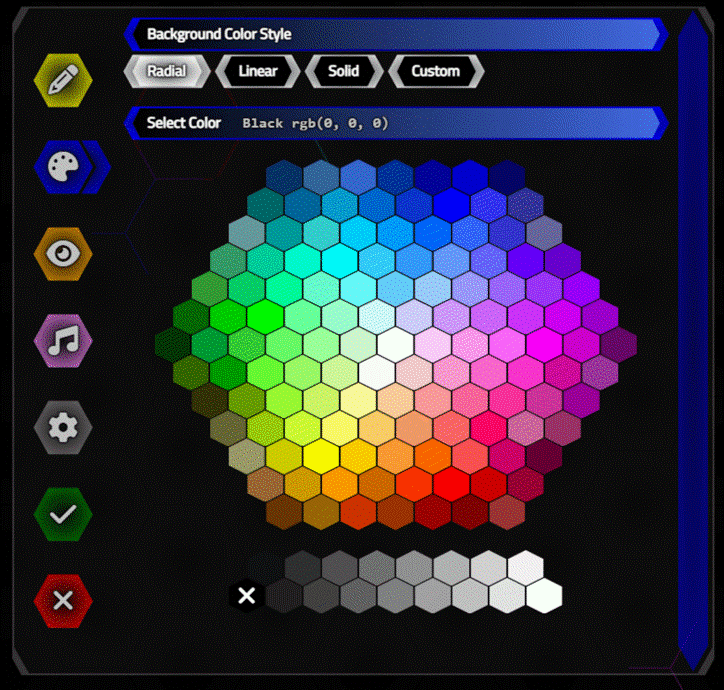
Starting on our second Options page, the Background page, what we're primarily after is just a way to select a color for the background of different HexaGongs. If we had a collection of animal sounds, for example, perhaps farm animals might have a yellowish background, water animals might have a blueish background, safari animals might have a greenish background, and birds might have a pinkish background. Doesn't really matter - just something the user can set if they wish.
We'd also like to have a few options around how the chosen colors are actually applied. Our background hexagons already use a radial-gradient background that we created in our first post, as does the main cursor we created in the second post. So we'd like that to be an option. But a linear gradient might work well, as would a simple solid color. Or maybe someone has a clever custom CSS background that they want to use - so let's leave the door open for that option as well. This means that the first item calls for a set of mutually exclusive buttons - a radio button group as it were.
TMS WEB Core has components for these kinds of things already - TWebRadioGroup and TWebRadioButton components. Which work great. But as with everything else we're using, it doesn't quite fit with the style we're after. And this isn't a very complicated situation, so we'll just do it manually instead.
To set these up, we'll use the same hexagon styling we're using for the TWebLabel components. This time, though, we'll set them to a specific width and
add them to a TWebHTMLDiv component where we can again use CSS flex to get them to wrap on the page if we only
have a limited amount of space. Here's the ElementClassName for that outer component, with a mouthful of Bootstrap classes.
HexHolder d-flex flex-row gap-1 mb-3 flex-wrap
This is combined with a bit of fancy CSS.
.HexHolder {
  width: calc(100% - 42px) !important;
  height: auto !important;
}
What's that about? Well, we want this to fill the available with, but we want to leave room for the SimpleBar scrollbar on the right, which we'll be using on all of the pages. This gives us a bit of space to allow for that before the contents of this element get wrapped on the page. The height rule is what allows this container to grow as the page width shrinks - enabling the buttons to wrap to a second line.
We can treat the labels as buttons just by defining the cursor type in the Object Inspector, and
by adding a click event. All we're doing here is changing the background of the label, from black to
white on the selected button, and white to black on the others. All while maintaining a Form variable that tracks
our currently selected button.
procedure TForm1.divOptionsBGRadialClick(Sender: TObject);
begin
  OptionsBGStyle := 0;
  divOptionsBGRadialLabel.ElementHandle.style.setProperty('background','radial-gradient(#00000000,white)');
  divOptionsBGLinearLabel.ElementHandle.style.setProperty('background','black');
  divOptionsBGSolidLabel.ElementHandle.style.setProperty('background','black');
  divOptionsBGCustomLabel.ElementHandle.style.setProperty('background','black');

  divCUstomCSSHolder.Visible := False;
  divCustomCSSTitle.Visible := False;

  divSelectColor.Visible := True;
  divColorPicker1.Visible := True;
  divColorPicker2.ElementHandle.classList.Replace('d-none','d-flex');
  UpdateColorPickerSize;
  UpdatecolorPickerHexagon;
  UpdateColorPickerRGB;
end;
While we're at it, we can also show or hide any other components that might be specific to the currently
selected "Background Style" or OptionsBGStyle that is currently selected. For example, if we've chosen the
"Custom CSS" style, we'll show a TWebMemo component where we can enter whatever CSS we like, which will then be
applied to the background of the HexaGong. In most cases, though, we'll be showing a color picker, which is what all that other code relates to.
Color Picker.
The next item on the list, then, is a color picker. Certainly no shortage of those available in TMS WEB Core directly, via FNC components, or even on GitHub. And color pickers come in all shapes and sizes, from a simple TWebEdit component where a hex RGB value can be entered, to multi-tab forms supporting every color system imaginable. We've had a look a the color picker web component included in the Shoelace JavaScript library in this post, and even added it to the Home Assistant/Catheedral project (with some customizations) in this post.
For our project today, we'll need something hexagonal of course, which is also not new or unique. Credit goes to this post for one approach to creating a Vanilla JavaScript color picker. We'll take a slightly different approach here, using our same clip-path CSS code for the hexagon itself, but using the color array (and color picker dimensions) from that post to build something very similar.
The main part of the color picker is just a set of hexagons arranged in a hexagon pattern. The main problem is positioning the hexagons relative to one another. But as this is a fixed arrangement, we can define some arrays for the colors as well as the X and Y coordinates. The idea is to lay out a grid of hexagons with a radius of 1 unit, and then scale that to whatever we need for our color picker.
Horizontally, this means that we'll need
hexagons spaced 3 units apart, with alternate rows offset by half that amount, so 1.5 units. The vertical
separation (checking my math) is Sqrt(3)/2, so we just need to bump up the values by that amount for each row.
We can even arrange our code to look like the hexagonal grid to make it a little more obvious what we're doing.
We'll also need a couple of rows to show the gray values, which we can just add below the main grid.
    // Standard color array from https://medium.com/weekly-webtips/build-a-hexagonal-color-picker-with-css-vanilla-javascript-36e62d10527
    const COLOR_RGB =      [                              '#003366','#336699','#3366CC','#003399','#000099','#0000CC','#000066',                               // 7
                                                     '#006666','#006699','#0099CC','#0066CC','#0033CC','#0000FF','#3333FF','#333399',                          // 8
                                                '#669999','#009999','#33CCCC','#00CCFF','#0099FF','#0066FF','#3366FF','#3333CC','#666699',                     // 9
                                           '#339966','#00CC99','#00FFCC','#00FFFF','#33CCFF','#3399FF','#6699FF','#6666FF','#6600FF','#6600CC',                // 10
                                      '#339933','#00CC66','#00FF99','#66FFCC','#66FFFF','#66CCFF','#99CCFF','#9999FF','#9966FF','#9933FF','#9900FF',           // 11
                                 '#006600','#00CC00','#00FF00','#66FF99','#99FFCC','#CCFFFF','#CCCCFF','#CC99FF','#CC66FF','#CC33FF','#CC00FF','#9900CC',      // 12
                            '#003300','#009933','#33CC33','#66FF66','#99FF99','#CCFFCC','#FFFFFF','#FFCCFF','#FF99FF','#FF66FF','#FF00FF','#CC00CC','#660066', // 13
                                 '#336600','#009900','#66FF33','#99FF66','#CCFF99','#FFFAFA','#FFCCCC','#FF99CC','#FF66CC','#FF33CC','#CC0099','#993399',      // 12
                                      '#333300','#669900','#99FF33','#CCFF66','#FFFF99','#FFCC99','#FF9999','#FF6699','#FF3399','#CC3399','#990099',           // 11
                                           '#666633','#99CC00','#CCFF33','#FFFF66','#FFCC66','#FF9966','#FF6666','#FF0066','#CC6699','#993366',                // 10
                                                '#999966','#CCCC00','#FFFF00','#FFCC00','#FF9933','#FF6600','#FF5050','#CC0066','#660033',                     // 9
                                                     '#996633','#CC9900','#FF9900','#CC6600','#FF3300','#FF0000','#CC0000','#990033',                          // 8
                                                          '#663300','#996600','#CC3300','#993300','#990000','#800000','#993333',                               // 7

                                                     '#101010','#303030','#505050','#707070','#909090','#B0B0B0','#D0D0D0','#F0F0F0',                          // 8
                                                '#000000','#202020','#404040','#606060','#808080','#A0A0A0','#C0C0C0','#E0E0E0','#FFFFFF'                      // 9
                           ];

    // Increase X by 3, each layer offset by 1.5
    const COLOR_X = [                          9.000, 12.000, 15.000, 18.000, 21.000, 24.000, 27.000,                          // 7
                                           7.500, 10.500, 13.500, 16.500, 19.500, 22.500, 25.500, 28.500,                      // 8
                                       6.000,  9.000, 12.000, 15.000, 18.000, 21.000, 24.000, 27.000, 30.000,                  // 9
                                   4.500,  7.500, 10.500, 13.500, 16.500, 19.500, 22.500, 25.500, 28.500, 31.500,              // 10
                               3.000,  6.000,  9.000, 12.000, 15.000, 18.000, 21.000, 24.000, 27.000, 30.000, 33.000,          // 11
                           1.500,  4.500,  7.500, 10.500, 13.500, 16.500, 19.500, 22.500, 25.500, 28.500, 31.500, 34.5000,     // 12
                       0.000,  3.000,  6.000,  9.000, 12.000, 15.000, 18.000, 21.000, 24.000, 27.000, 30.000, 33.000, 36.000,  // 13
                           1.500,  4.500,  7.500, 10.500, 13.500, 16.500, 19.500, 22.500, 25.500, 28.500, 31.500, 34.5000,     // 12
                               3.000,  6.000,  9.000, 12.000, 15.000, 18.000, 21.000, 24.000, 27.000, 30.000, 33.000,          // 11
                                   4.500,  7.500, 10.500, 13.500, 16.500, 19.500, 22.500, 25.500, 28.500, 31.500,              // 10
                                       6.000,  9.000, 12.000, 15.000, 18.000, 21.000, 24.000, 27.000, 30.000,                  // 9
                                           7.500, 10.500, 13.500, 16.500, 19.500, 22.500, 25.500, 28.500,                      // 8
                                               9.000, 12.000, 15.000, 18.000, 21.000, 24.000, 27.000,                          // 7

                                           7.500, 10.500, 13.500, 16.500, 19.500, 22.500, 25.500, 28.500,                      // 8
                                       6.000,  9.000, 12.000, 15.000, 18.000, 21.000, 24.000, 27.000, 30.000                   // 9
                    ];
    // Increase Y by sqrt(3)/2
    const COLOR_Y = [                          0.000,  0.000,  0.000,  0.000,  0.000,  0.000,  0.000,                          // 7
                                           0.866,  0.866,  0.866,  0.866,  0.866,  0.866,  0.866,  0.866,                      // 8
                                       1.732,  1.732,  1.732,  1.732,  1.732,  1.732,  1.732,  1.732,  1.732,                  // 9
                                   2.598,  2.598,  2.598,  2.598,  2.598,  2.598,  2.598,  2.598,  2.598,  2.598,              // 10
                               3.464,  3.464,  3.464,  3.464,  3.464,  3.464,  3.464,  3.464,  3.464,  3.464,  3.464,          // 11
                           4.330,  4.330,  4.330,  4.330,  4.330,  4.330,  4.330,  4.330,  4.330,  4.330,  4.330,  4.330,      // 12
                       5.196,  5.196,  5.196,  5.196,  5.196,  5.196,  5.196,  5.196,  5.196,  5.196,  5.196,  5.196,  5.196,  // 13
                           6.062,  6.062,  6.062,  6.062,  6.062,  6.062,  6.062,  6.062,  6.062,  6.062,  6.062,  6.062,      // 12
                               6.928,  6.928,  6.928,  6.928,  6.928,  6.928,  6.928,  6.928,  6.928,  6.928,  6.928,          // 11
                                   7.794,  7.794,  7.794,  7.794,  7.794,  7.794,  7.794,  7.794,  7.794,  7.794,              // 10
                                       8.660,  8.660,  8.660,  8.660,  8.660,  8.660,  8.660,  8.660,  8.660,                  // 9
                                           9.526,  9.526,  9.526,  9.526,  9.526,  9.526,  9.526,  9.526,                      // 8
                                              10.392, 10.392, 10.392, 10.392, 10.392, 10.392, 10.392,                          // 7

                                          12.124, 12.124, 12.124, 12.124, 12.124, 12.124, 12.124, 12.124,                      // 8
                                      12.990, 12.990, 12.990, 12.990, 12.990, 12.990, 12.990, 12.990, 12.990                   // 9
                    ];
Is there a term for code that "looks" like the UI that it is implementing? Not likely all that common
perhaps. We'd also like to include the common CSS color names for the various RGB values as tooltips. Such a list, already
formatted as an array, can be found on GitHub (attribution)
and it looks something like this.
    const CSS_COLOR_NAMES = {
      AliceBlue: '#F0F8FF',
      AntiqueWhite: '#FAEBD7',
      Aqua: '#00FFFF',
      Aquamarine: '#7FFFD4',
      Azure: '#F0FFFF',
...

      White: '#FFFFFF',
      WhiteSmoke: '#F5F5F5',
      Yellow: '#FFFF00',
      YellowGreen: '#9ACD32',
    };
Sadly, the colors chosen for the hexagon grid only cover about ten of the standard CSS colors. Might be time to come up with an updated array of color choices using just the CSS colors. In any event, we can combine them together by adding the names as tooltips to the hexagons in the color picker and also include them when displaying the selected color in the label that appears above the color picker. To generate all this, we can create <div> elements as we've been doing already, and assign the necessary properties to get them aligned.
    var colorpicker = '';
    for (var i = 0; i < COLOR_RGB.length; i++) {
      var colorvalue = COLOR_RGB[i];
      var colorname = COLOR_RGB[i];
      Object.entries(CSS_COLOR_NAMES).forEach(([name, rgbvalue]) => {
        if (rgbvalue == colorvalue) {
          colorname = name;
        }
      });
      colorpicker += '<div class="ColorHexagon" '+
                        'title="'+colorname+'" '+
                        'data-bs-toggle="tooltip" '+
                        'data-bs-custom-class="ColorTooltip" '+
                        'colorindex="'+i+'" '+
                        'style="top: '+25.981*COLOR_Y[i]+'px; '+
                               'left: '+10*COLOR_X[i]+'px; '+
                               'background-color: '+colorvalue+'"'+
                     '></div>';
    }
    divColorPicker1.innerHTML = colorpicker;

    const tooltipTriggerList = document.querySelectorAll('[data-bs-toggle="tooltip"]');
    const tooltipList = [...tooltipTriggerList].map(tooltipTriggerEl => new bootstrap.Tooltip(tooltipTriggerEl));
Here we've also added the tooltips using the latest and greatest Bootstrap tooltips, so a little bit fancier.
And, conveniently, automatically positioned directly above each hexagon. A little extra CSS was needed to achieve this look, both for the tooltips and for the color swatches themselves. Note that we added some extra math
in the positioning for the CSS top and left properties (25.981 is a multiple of Sqrt(3)/2) to size the whole
thing into something usable.
#divColorPicker1 {
    width: 440px !important;
    height: 370px !important;
    transform-origin: top left;
}
.ColorHexagon {
  position: absolute;
  width: 29px;
  height: 29px;
  margin-left: 25px;
  margin-top: 2px;
  cursor: pointer;
  clip-path: polygon(0% 25%, 50% 0%, 100% 25%, 100% 75%, 50% 100%, 0% 75%);
}
.ColorTooltip {
  --bs-tooltip-bg: #202020;
}
That completes the "look" of our color picker, but what happens when we click on it? Like our divBackground component with many hexagons, we don't want to add an event listener to each one, but rather to the element that is holding all of these. When we've clicked on one, we'd like to mark it somehow, and also update other parts of our interface.
We can also, at the same time, clear out any previously selected color and look up the CSS
color name in the rare instance that we've selected one. Then, we can call a regular Delphi function with the
parameters of what we're dealing with - the name of the color, the RGB value, and even where it appears in the
hexagon array.
    divColorPicker1.addEventListener('click', (event) => {
      if (event.target.classList.contains('ColorHexagon')) {
        var colors = divColorPicker1.querySelectorAll('.ColorHexagon');
        colors.forEach(hex => {
          if ((hex == event.target) || (event.target.getAttribute('data-bs-original-title') == hex.getAttribute('data-bs-original-title'))) {
            hex.innerHTML = '<i class="pe-none d-flex justify-content-center align-items-center Picked fa-solid fa-xmark fa-lg"></i>';
            pas.Unit1.Form1.ColorSelected(event.target.getAttribute('data-bs-original-title'),event.target.style.getPropertyValue('background-color'),parseInt(event.target.getAttribute('colorIndex')));
          }
          else {
            hex.innerHTML = '';
          }
        });
      }
    });
To highlight the color we've selected, we're just going to drop a fancy X into the selected hexagon, which we can ensure is visible with our usual approach of loading it up with enough drop-shadow to give a nice outline.
.Picked {
  width: 29px;
  height: 29px;
  color: white;
  filter: drop-shadow(0px 0px 1px black) drop-shadow(0px 0px 1px black)  drop-shadow(0px 0px 1px black);
}
Once a color has been selected, we can then update our UI or do whatever it is we want to do with the
selection. Initially, this is just going to involve displaying the selected value, but we'll store this along
with the style of background in the GongData JSON object if the changes are saved.
procedure TForm1.ColorSelected(ColorName, ColorValue: String; ColorIndex: Integer);
begin
  labelSelectColor.HTML := 'Select Color <span style="padding-left: 20px; color: silver; font-family: var(--bs-font-monospace)"> '+ColorName+'   '+ColorValue+'</span>';
end;
What about the size of the color picker? We're trying to be responsive here, so we'll need a way to adjust the size. Rather than trying to adjust the size of the individual elements, we're just going to scale the entire divColorPicker component that contains the hexagon grid.
With the values we calculated above, we end up with a
hexagon that is about 440px wide before any scaling is applied. So we use that as the scale factor, while also limiting the size to a maximum
of 1.5x so it doesn't get super crazy if you happen to be using a larger display. Note that in the CSS above,
we also set the transform-origin to be the top left corner, so this scaling works from there. By default, it is
the center of the element, which works but doesn't flow the way we'd like.
procedure TForm1.UpdateColorPickerSize;
var
  avail: Double;
  scale: Double;
  space: Double;
begin
  avail := divSelectColor.ElementHandle.getBoundingClientRect.Width;
  scale := Min(avail / 440.0,1.5);
  space := scale*370.0;
  divColorPicker1.ElementHandle.style.setProperty('transform','scale('+FloatToSTrF(scale,ffGeneral,8,5)+')');
  divColorPicker1.ElementHandle.style.setProperty('height',FloatToSTrF(space,ffGeneral,8,5)+'px','important');
end;
And with all that in place, we end up with a reasonable hexagonal color picker. Here's what it looks like.
Color Picker Interaction.
Note that if there are duplicate colors (like White), all of them will be selected. And if you wanted to use a
different set of preset colors, all you have to do is change the hex RGB values in the array to something else,
and everything will still work the same way.
Trackbars.
Of course, we can't have a color picker without RGB sliders, can we? We've covered range sliders in the Shoelace post as well (sometimes referred to as trackbars, sliders, or range sliders), and we'll be using them here, overriding the default look with hexagons.
This is another browser item where things are arbitrarily complicated, so we'll
do what we did in that post, adding an element over the slider that is styled how we like, ignoring the
fact that there is another one below it. To get this working, we'll first need the Shoelace JavaScript library
in place. As we're only using the range slider, we can just include that component (what Shoelace refers to as cherry-picking), or we could include the whole thing.
    <!-- All of Shoelace -->
    <link rel="stylesheet" href="https://cdn.jsdelivr.net/npm/@shoelace-style/shoelace@latest/dist/themes/light.css" />
    <script type="module" src="https://cdn.jsdelivr.net/npm/@shoelace-style/shoelace@latest/dist/shoelace.js"></script>
Or...
    <!-- Just the Range Slider -->
    <link rel="stylesheet" href="https://cdn.jsdelivr.net/npm/@shoelace-style/shoelace@latest/dist/themes/light.css" />
     <script type="module" data-shoelace="https://cdn.jsdelivr.net/npm/@shoelace-style/shoelace@latest/dist">
      import '@shoelace-style/shoelace/dist/components/range/range.js';
    </script>
To add Shoelace range sliders to our project, we can drop another TWebHTMLDiv component on our form, divColorPicker2, and then add HTML code to the component's HTML.Text property.
As a side note, I've encountered issues with Shoelace (primarily in Firefox) - errors related to a call to "unobserve" a non-existent element. This appears to be a timing issue - perhaps the Shoelace code hasn't had a chance to initialize before some of its methods are called. Not entirely sure. So there's a bit of a hack in place where the HTML in the project lists <slX-range> elements (and thus invisible to Shoelace). After our form is up and running, these are replaced with the proper <sl-range> elements which Shoelace can then interact with. This is done with a simple StringReplace against the TWebHTMLDiv HTML.Text properties for components that contain these range sliders. Seems to have addressed the problem.
Here we'll define range sliders
for the three RGB values. Both the thumb and the hexagonal border are drawn in separate
<div> elements, and plenty of CSS and Bootstrap have been thrown in for good measure. Here's the HTML included for
just the first (red) range slider.
<div id="divColorRed" style="position:relative;">
  <sl-range
      id="ColorRed"
      max="255"
      class="RGB HexSliderH"
      tooltip="none"
      style="--track-height: 36px; --thumb-size: 33px; --track-color-active:maroon; --track-color-inactive: black;"
    >
  </sl-range>
  <div id="ThumbRed" class="HexSliderThumb RedW pe-none d-flex justify-content-center align-items-center"></div>
  <div id="BorderRed" class="HexOuter RedR pe-none" style="position:absolute; top:2px; height:40px; width: 100%;"></div>
</div>
Here, we're setting the range as 0-255, and defining the extra <div> elements for the thumb and border. The thumb will also have some text, hence the extra Bootstrap classes. Note that the thumb that we're drawing has a "pe-none" class included - meaning that it is "invisible" to the mouse - we're relying on the Shoelace thumb beneath it to handle our interaction, just as we did in previous posts. This time, it happens to be obscured completely. We're using the same Hex classes to give a bit of styling to the border. We've still got quite a bit of supporting CSS to get this to work just right.
.HexSliderH {
  top: 4px !important;
  left: 10px !important;
  width: calc(100% - 62px) !important;
  position: relative;
  z-index: 1;
  clip-path: polygon(0px 18px, 8px 1.8px, calc(100% - 8px) 1.8px, 100% 18px, 100% calc(100% - 18px), calc(100% - 8px) calc(100% - 1.8px), 8px calc(100% - 1.8px), 0% calc(100% - 18px));
}
.RGB::part(input) {
  cursor: pointer;
  background-image: linear-gradient(
      to right,
      var(--track-color-inactive) 0%,
      var(--track-color-inactive) min(var(--percent), var(--track-active-offset)),
      var(--track-color-inactive) min(var(--percent), var(--track-active-offset)),
      var(--track-color-active) max(var(--percent), var(--track-active-offset)),
      var(--track-color-inactive) max(var(--percent), var(--track-active-offset)),
      var(--track-color-inactive) 100%
    );
}
.HexSliderThumb {
  width: 44px;
  height: 44px;
  position: absolute;
  top: 0px;
  clip-path: polygon(0% 25%, 50% 0%, 100% 25%, 100% 75%, 50% 100%, 0% 75%);
  z-index: 2;
}
.ThumbLabel {
  -webkit-user-select: none; /* Safari */
  -ms-user-select: none; /* IE 10 and IE 11 */
  user-select: none; /* Standard syntax */
  color: white;
  font-weight: bold;
  filter: drop-shadow(0px 0px 1px black) drop-shadow(0px 0px 1px black);
}
The most troublesome part involved getting the "active" area to be a gradient instead of a solid color. Here, we're taking the "RGB::part(input)" from the Shadow DOM element generated by the Shoelace component and adjusting it ever so slightly to get the desired effect. The original CSS looks like this. Can you spot the difference?
  background-image: linear-gradient(
      to right,
      var(--track-color-inactive) 0%,
      var(--track-color-inactive) min(var(--percent), var(--track-active-offset)),
      var(--track-color-active) min(var(--percent), var(--track-active-offset)),
      var(--track-color-active) max(var(--percent), var(--track-active-offset)),
      var(--track-color-inactive) max(var(--percent), var(--track-active-offset)),
      var(--track-color-inactive) 100%
    );
With the CSS in place, we've still got a bit of work to do in order to get our custom thumbs placed in the right spot. We'll have to do this whenever someone interacts with the component and also whenever we want to set the values explicitly, like when clicking on one of the elements in the hexagonal grid. To deal with the range slider interactions, we can add an event listener to the divColorPicker2 component that holds all of the range sliders, and then check which one has changed. In this case, we're not listening for a "click" event but rather the Shoelace-generated "sl-input" event.
    divColorPicker2.addEventListener('sl-input',function(e){
      var range = divColorPicker2.getBoundingClientRect().width - 86;
      if (e.target.id == "ColorRed") {
        ThumbRed.style.setProperty("left",range * (e.target.value / 255) +'px');
        ThumbRed.innerHTML = "<div class='ThumbLabel'>"+e.target.value+"</dvi>";
      }
      else if (e.target.id == "ColorGreen") {
        ThumbGreen.style.setProperty("left",range * (e.target.value / 255) +'px');
        ThumbGreen.innerHTML = "<div class='ThumbLabel'>"+e.target.value+"</dvi>";
      }
      else if (e.target.id == "ColorBlue") {
        ThumbBlue.style.setProperty("left",range * (e.target.value / 255) +'px');
        ThumbBlue.innerHTML = "<div class='ThumbLabel'>"+e.target.value+"</dvi>";
      }
      pas.Unit1.Form1.OptionsBGColor2 = 'rgb('+ColorRed.value+', '+ColorGreen.value+', '+ColorBlue.value+')';
      pas.Unit1.Form1.UpdateColorPickerHexagon();
    });
When selecting a color from the hexagonal grid, we get an RGB value expressed in the format "rgb( 255, 255, 255)". We can make quick work of this to get our separate R, G, and B values and then reconfigure or range sliders to match. We'll also need to do this whenever the page size changes, and when the Options dialog is resized, so we'll set up a function for this and then drop it in wherever it is needed - typically the same places where the UpdateColorPickerSize function is called.
procedure TForm1.UpdateColorPickerRGB;
begin
  asm
    var range = divColorPicker2.getBoundingClientRect().width - 86;
    var r = parseInt(this.OptionsBGColor2.replace('rgb(','').replace(')','').split(',')[0]);
    var g = parseInt(this.OptionsBGColor2.replace('rgb(','').replace(')','').split(',')[1]);
    var b = parseInt(this.OptionsBGColor2.replace('rgb(','').replace(')','').split(',')[2]);

    if (r !== ColorRed.value) {
      ColorRed.setAttribute('value',r);
      ThumbRed.innerHTML = "<div class='ThumbLabel'>"+r+"</dvi>";
    }
    ThumbRed.style.setProperty("left",range * (r / 255) +'px');

    if (g !== ColorGreen.value) {
      ColorGreen.setAttribute('value',g);
      ThumbGreen.innerHTML = "<div class='ThumbLabel'>"+g+"</dvi>";
    }
    ThumbGreen.style.setProperty("left",range * (g / 255) +'px');

    if (b !== ColorBlue.Value) {
      ColorBlue.setAttribute('value',b);
      ThumbBlue.innerHTML = "<div class='ThumbLabel'>"+b+"</dvi>";
    }
    ThumbBlue.style.setProperty("left",range * (b / 255) +'px');

  end;
end;
We'll also need to do the reverse - select a color in the hexagonal grid when we've made a change to the range sliders. For example, when the Options dialog opens after selecting an existing HexaGong to edit.
procedure TForm1.UpdateColorPickerHexagon;
begin
  asm
    var colors = divColorPicker1.querySelectorAll('.ColorHexagon');
    var colorname = '';
    var i = 0;
    var s = -1;
    colors.forEach(hex => {
      if (this.OptionsBGColor2 == hex.style.getPropertyValue('background-color')) {
        colorname = hex.getAttribute('data-bs-original-title');
        hex.innerHTML = '<i class="pe-none d-flex justify-content-center align-items-center Picked fa-solid fa-xmark fa-lg"></i>';
        s = i;
      }
      else {
        hex.innerHTML = '';
      }
      i = i + 1;
    });

    if (colorname == '') {
      var r = parseInt(this.OptionsBGColor2.replace('rgb(','').replace(')','').split(',')[0]);
      var g = parseInt(this.OptionsBGColor2.replace('rgb(','').replace(')','').split(',')[1]);
      var b = parseInt(this.OptionsBGColor2.replace('rgb(','').replace(')','').split(',')[2]);
      colorname = '#'+r.toString(16).padStart(2,'0')+g.toString(16).padStart(2,'0')+b.toString(16).padStart(2,'0');
    }
    pas.Unit1.Form1.ColorSelected(colorname,this.OptionsBGColor2,s);

  end;
end;
Lots of work, but we end up with our hexagon color picker integrated with our RGB color picker, where changing one
also updates the other.
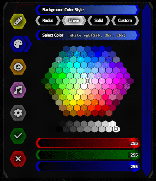
RGB Color Picker.
It would have been nice to have the range sliders change in a more animated fashion (with a quick but gradual transition), but that's perhaps a task
for another day. Overall, this works as intended, scales to the size of the Options dialog we're using, and of course,
generates the color data we're after.
Custom CSS Backgrounds.
If the user wants to do something more complex, more specific, or just wants to manually enter a color value, the last option is to have a Custom CSS Background memo field. In this case, we don't use the color data at all, and just bravely copy whatever CSS they've entered into the CSS for the HexaGong element.
Ideally, we would check this for errors, and limit what CSS could be entered here (a sanity filter of some kind) but as this is all contained within a HexaGong element already, there's not (hopefully?!) too much harm in letting the user put in whatever they want. If it is in some way invalid, well, it should be contained enough to not cause any problems.
Using this feature, we can copy and paste CSS backgrounds from other places, like the Hero
Patterns website we've used in other posts. This works largely the same way as it does in our Home Assistant/Catheedral project. For example, we can use the following to get a hexagon pattern
background, in case we feel we haven't quite hit our limit for hexagons just yet.
background-color: #6600ff;
background-image: url("data:image/svg+xml,%3Csvg xmlns='http://www.w3.org/2000/svg' width='28' height='49' viewBox='0 0 28 49'%3E%3Cg fill-rule='evenodd'%3E%3Cg id='hexagons' fill='%23ffffff' fill-opacity='0.45' fill-rule='nonzero'%3E%3Cpath d='M13.99 9.25l13 7.5v15l-13 7.5L1 31.75v-15l12.99-7.5zM3 17.9v12.7l10.99 6.34 11-6.35V17.9l-11-6.34L3 17.9zM0 15l12.98-7.5V0h-2v6.35L0 12.69v2.3zm0 18.5L12.98 41v8h-2v-6.85L0 35.81v-2.3zM15 0v7.5L27.99 15H28v-2.31h-.01L17 6.35V0h-2zm0 49v-8l12.99-7.5H28v2.31h-.01L17 42.15V49h-2z'/%3E%3C/g%3E%3C/g%3E%3C/svg%3E");
Even this CSS can be customized, changing colors and so on, but the Custom CSS Background mechanism allows us a
great deal more freedom if this is important for our particular application.
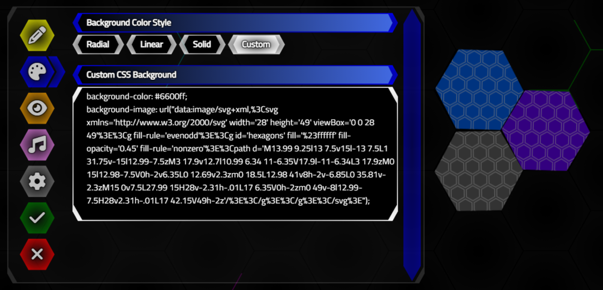
Custom CSS Backgrounds.
This could even be used to set brand themes, watermarks, or even nothing at all, for example. CSS backgrounds
can be arbitrarily complex.
Deleting HexaGongs.
Before we wrap up this post, just a couple of more administrative functions that we'll need. Deleting
HexaGongs is not super-complicated, but we do have to be mindful to clear out array references and be sure that
it is entirely removed from the page. We do something similar when adding a new HexaGong, if we opt to cancel the addition
instead of accepting it after the Options dialog is presented.
procedure TForm1.btnTrashClick(Sender: TObject);
var
  CursorPosition: Integer;
  Ref: Integer;
begin
  // Remove a HexaGong
  CursorPosition := StrToInt(btnCursor.ElementHandle.getAttribute('position'));
  Ref := PositionsG[CursorPosition];

  if Ref <> -1 then
  begin
    Gongs[Ref].HTML.Text := '';
    Gongs[Ref] := nil;
    GongsP[Ref] := -1;
    PositionsG[CursorPosition] := -1;
    asm
      this.GongData.HexaGongs[Ref]['Deleted'] = true;
      document.getElementById('Gong-'+Ref).remove();
    end;
  end;
end;
Note that in the case of the GongData array, we're not removing the array entry directly, but rather marking it as 'Deleted'. Similarly, with the other arrays, we're not reducing the size of the array as we do in the canceled new HexaGong scenario as this would involve making changes to potentially many array elements. In an upcoming post, when we look at loading and saving these arrays, we'll make more of an effort to toss these elements, so that they don't end up growing endlessly as the project is edited over time.
Cloning HexaGongs.
The hardest part here is finding a place to put the new HexaGong. Fortunately, we've got all of our arrays to help us - just a matter of finding a spot. We're just looking for the next available spot, in numerical hexagon (Positions) order - to the right, for example. If we get to the end of the available Positions without finding a spot, then we start again and head towards the beginning, and don't continue if we don't find a suitable target Position.
Once we've got one, we can just
create a new HexaGong similar to the way we normally do, with the extra step of copying the contents from the currently selected
HexaGong, and updating whatever we like. Prefixing the name with "Clone of", for example.
procedure TForm1.btnCloneClick(Sender: TObject);
var
  CursorPosition: Integer;
  Ref: Integer;
  i: Integer;
begin
  // Remove a HexaGong
  CursorPosition := StrToInt(btnCursor.ElementHandle.getAttribute('position'));
  Ref := PositionsG[CursorPosition];

  if Ref <> -1 then
  begin
    i := CursorPosition + 1;
    while ((PositionsT[i] = False) or (PositionsG[i] <> -1)) and (i < length(PositionsT)) do
      i := i + 1;

    if i = Length(PositionsT) then
    begin
      i := CursorPosition - 1;
      while  ((PositionsT[i] = False) or (PositionsG[i] <> -1)) and (i > -1) do
        i := i - 1;
    end;

    if (i >= 0) and (i < Length(PositionsT)) then
    begin
      GongID := Length(Gongs);
      SetLength(Gongs, GongID + 1);
      SetLength(GongsP, GongID + 1);
      GongsP[GongID] := i;
      PositionsG[i] := GongID;

      Gongs[GongID] := TWebHTMLDiv.Create('Gong-'+IntToStr(GongID));
      Gongs[GongID].Parent := divButtons;

      Gongs[GongID].ElementHandle.setAttribute('gongid',IntToStr(GongID));
      Gongs[GongID].ElementHandle.setAttribute('position',IntToStr(i));
      Gongs[GongID].ElementHandle.setAttribute('row',IntToStr(PositionsR[i]));
      Gongs[GongID].ElementHandle.setAttribute('column',IntToStr(PositionsC[i]));

      Gongs[GongID].ElementHandle.classList.Add('Gong','d-flex','justify-content-center','align-items-center','dragswap');

      Gongs[GongID].ElementHandle.style.setProperty('top','0px');
      Gongs[GongID].ElementHandle.style.setProperty('left','0px');
      Gongs[GongID].ElementHandle.style.setProperty('width',FloatToStrF(HexRadius * 2,ffGeneral,5,3)+'px');
      Gongs[GongID].ElementHandle.style.setProperty('height',FloatToStrF(HexRadius * 2,ffGeneral,5,3)+'px');
      Gongs[GongID].ElementHandle.style.setProperty('z-index','10');
      Gongs[GongID].ElementHandle.style.setProperty('background',Gongs[Ref].ElementHandle.style.getPropertyValue('background'));
      Gongs[GongID].ElementHandle.style.setProperty('font-size',IntToStr(Trunc(HexRadius))+'px');

      document.getElementById('BG-'+IntToStr(i)).appendChild(Gongs[GongID].ElementHandle);
      (document.getElementById('BG-'+IntToStr(i)) as TJSHTMLElement).style.setProperty('animation-name','jiggle');

      // Set default values for new HexaGong
      asm
        this.GongData['HexaGongs'].push({});
        this.GongData['HexaGongs'][this.GongID] = this.GongData['HexaGongs'][Ref];
        this.GongData['HexaGongs'][this.GongID]['Name'] = 'Clone of '+this.GongData['HexaGongs'][Ref]['Name'];
      end;
    end;
  end;
end;
With this in place, it is also a bit easier to test various boundary conditions, like too many HexaGongs in the spaces available, or resizing such that there are more HexaGongs than can fit on the page. Mostly we're just trying to make sure there are no errors, and that operations are reversible. So, for example, if you clone a bunch of HexaGongs in the bottom row, and then reduce the number of columns of hexagons displayed, they'll disappear. But if you increase the number of columns of hexagons back to what it was, they'll reappear. Likely the best we can do at the moment. And that also wraps up the first two sets of buttons - the top right and the bottom right buttons.
Next Time.
This post covered quite a lot of work around the various hexagon-related customizations to components we likely
use on a regular basis. Next time, we'll have a look at handling image and audio data in each HexaGong, and get
us to our ultimate goal of having the audio clips played as we click on the various HexaGongs in our project.
HexaGongs website.
HexaGongs repository on GitHub.
HexaGongs XData repository on GitHub.
Related Posts.
HexaGongs Part 1: Background
HexaGongs Part 2: Interface
HexaGongs Part 3: Options (Edits, Memos, Buttons, Colors, Trackbars)
HexaGongs Part 4: Options (Image and Audio)
HexaGongs Part 5: Deployment
Follow Andrew on 𝕏 at @WebCoreAndMore or join our 𝕏 Web Core and More Community.
Andrew Simard

This blog post has not received any comments yet.
All Blog Posts | Next Post | Previous Post