Blog
All Blog Posts | Next Post | Previous Post

 TMS WEB Core and More with Andrew:
Working with Home Assistant - Part 3: WebSockets
Monday, February 6, 2023

Continuing along in our Home Assistant miniseries, we've just had a look at talking to Home Assistant using its built-in REST API. This has a few limitations though. In particular, we don't have a good mechanism for Home Assistant to tell us that something has changed. This is important as things change continuously within Home Assistant throughout the day, as lights are switched on and off, temperatures change, and so on. We can poll the Home Assistant server to see if something has changed since last we checked, but that's not ideal. And when something changes, like someone turning on a light switch, we don't really want to have any kind of delay.
This time out, we're going to look at a solution to that problem, and several others, by using another Home Assistant mechanism - its built-in WebSockets API. This facilitates a bi-directional
communications stream, where we can send commands asking for data from Home Assistant, as well as listen in
on events generated by Home Assistant as it goes about its business. We'll also get started on a new TMS
WEB Core app, designed using the Miletus
Framework, with the ultimate goal of running it as a native Raspberry Pi application.
The Bigger (Little) Picture.
The Home Assistant Dashboard is quite flexible, allowing for a wide variety of "cards" containing useful interactive displays of virtually anything Home Assistant has access to. Plugins allow for more advanced visuals as well, using charting tools like Grafana or ApexCharts to display historical data in the Home Assistant database, for example, in addition to the built-in charting tools. Plenty of theming options are also available, allowing you to endlessly customize the Dashboard interface to your liking.
On top of that, the Home Assistant Companion app brings all this flexibility to your mobile device. And, with a bit
of effort, you can have access to everything that Home Assistant provides even while away from your smart home
(or smart office).
This might all sound ideal, and it is for many scenarios. However, it is a little limiting in a few respects. While the card system works great, and there are various add-ons and tweaks for changing how cards are laid out,
ultimately you're still stuck with cards. What if you wanted to start with a blank slate? And put charts or
buttons or bits of text in specific places at specific sizes? What if you had a fixed display and wanted to
make the most of the available, but very limited, space? What if you didn't want to have your web browser be
the main interface, but rather something that can be more carefully controlled? Ultimately, what if you wanted
to craft a better user experience?
That's what we're going to get started on in this post, the first of many. What we're really after is perhaps something like an appliance or kiosk that could be mounted to a wall, much like a fancy thermostat or an interactive alarm panel - a control panel for your home. Perhaps just one, or maybe even several, all linked to an underlying Home Assistant server to get you the information and control over the most frequently accessed elements within your home.
This is not a new idea, of course. There are plenty of commercially available
wall-mount panels from various home automation vendors. And even a few Home Assistant projects designed with
this in mind. There are plenty of hardware options for mounting something like an iPad or a Raspberry
Pi-equipped touch-screen directly into a wall with all the necessary power and safety considerations. Well,
maybe not always as many safety considerations, but some at least.
So why bother? Well, Home Assistant can contain a lot of information about your home, but also any other data you wish to provide, as we saw in the last post. It follows, then, that such a display could also be used to navigate this other information, or even bring in yet more information from elsewhere, such as sensors connected to a Raspberry Pi. Data that might well not be available with these other projects. Or such a panel could find its way into other applications, such as controlling other hardware (or software!) in other settings.
And, for some people, existing solutions are just not quite there in terms of what they want or how they'd want them to work, or even at a price that makes any sense at all. As developers, these are all things we can help address, either for our own interests or when building products for others. And a TMS WEB Core app makes this pretty easy to do, and with all of its deployment options, we should be able to make something pretty comprehensive that will run easily on any devices you might have laying about. But we're also interested in building something that we want to use ourselves, so let's set about building a great one, and try and show off what TMS WEB Core is really capable of!
Setting Boundaries.
Our goal for this project is to create a bespoke UI that will ultimately run natively on a Raspberry Pi, as well as every other Miletus-supported platform, which currently also includes Windows, Linux, and macOS. Not that long ago, we covered a bit of Raspberry Pi content here and here.
One of the items I picked up when I first got the Raspberry Pi was a little 1280x400 7.9-inch touch display
(seen in the second post). Let's say we want to use that to display some Home Assistant data and interact with
it, imagining perhaps that this would be an in-wall UI type of application. Or maybe a desktop gadget of some kind. This means that we'll need an app
running at a fixed 1280px (wide) by 400px (tall) resolution. So that's what we'll plant for, to
start with anyway. We'll have a post about "deployment" later in this miniseries where we'll go into more
detail about what this might look like.
There is naturally some sense in making an app that is more "responsive" in this regard, but if we put a bit of thought into the design as we go along, we'll be able to make that leap without too much trouble later. One approach to this is to try and include as much of the layout and formatting as CSS, making it easy to adjust later. For now, we're all about optimizing the interface for this particular display. Forcing this as a somewhat artificial constraint will help ensure that we've got a design that makes the most of a limited amount of space without having to get too hung up on making it work for every device size immediately.
Later, when this
constraint is revisited, we'll be in a much better position, or at least more well-informed, when extending the
project to support other device sizes and other platforms. Not something to get hung up on at the moment - this
part of the project would proceed largely the same regardless. By fixing a size in this way, it may also seem
that we're just creating the same Home Assistant "cards" in a different setting. A fair comment. But no
limitations here on anything to do with the layout.
Next, we'd like the application to pick up as much information as possible from Home Assistant, using it as its main source of data whenever possible. The thinking here is that this would make having multiple such applications (devices) running in the same home network run in a more seamless and efficient manner. Essentially, it creates a bit of a client/server sort of arrangement.
There are some limits here though. We'll need to have a local means of
storing some settings. And we'd still like to show custom content (via <iframe> elements) that aren't
part of Home Assistant necessarily. And we'd like the app to be able to update itself. So it isn't entirely
dependent on Home Assistant. It could even be used to a limited degree without access to Home Assistant at all.
But what we're after is to make this application as useful to as many people as possible - we should be able to
point it at any Home Assistant server and have it at least start running without any obvious problems other than a
lack of data.
The idea, really, is to create a complete and comprehensive project, end-to-end, with everything we'll need to produce a useful, marketable, and hopefully popular (?!) product. With that in mind, it is always nice to give projects a name, maybe even a logo, to start with. Picking a name is sometimes a bit of a chore as it would be nice to get a matching domain name as well. All regular words were registered long ago, so the trend for some time now has been to take a regular word and then add, remove, or change a letter or two to come up with something familiar yet unique.
For this project, let's go with "Catheedral". For a logo, let's try and
encapsulate the main part of the UI. This hasn't been shown here yet (think of it as foreshadowing!) but this
has been bouncing around my head long enough that I know what it is going to look like. And we'll need some
standard color variations of course.
Catheedral Artwork.
With that, we can now set about building our new TMS WEB Core project without any further delay.
Baby Steps.
Let's start out with a new TMS WEB Core app, and we'll use the Miletus template this time out. This will give us an app that can be run the same way as a traditional Delphi VCL app - an executable. This will also make it easy to run on whatever Miletus platform we build for. In the case of Raspberry Pi, this means we don't have to try and fiddle with having it launch a kiosk-mode Chrome browser instance - we can just launch our app and have it running full-screen by default.
We can set a few Form properties in the Object Inspector, to run the app at a fixed size (1280x400) without any window borders or buttons, positioned in the middle of the display, with a black background. Not much to look at initially, of course.
I'm still working through my Bootstrap/Font Awesome/Tabulator addictions, so we'll need those added to the project, initially. And sure, let's use the
Google Font "Cairo" again, as I've not seen anyone complaining about it yet! And as we'll spend a lot of
time with CSS, we'll also add a custom CSS style sheet as well. Oh, and Luxon. Everything in Home Assistant is
stored as ISO UTC strings, so we can use that to convert those into something a little more friendly.
<!-- Bootstrap -->
<link href="https://cdn.jsdelivr.net/npm/bootstrap@5.2.3/dist/css/bootstrap.min.css" rel="stylesheet" integrity="sha384-rbsA2VBKQhggwzxH7pPCaAqO46MgnOM80zW1RWuH61DGLwZJEdK2Kadq2F9CUG65" crossorigin="anonymous">
<script src="https://cdn.jsdelivr.net/npm/bootstrap@5.2.3/dist/js/bootstrap.bundle.min.js" integrity="sha384-kenU1KFdBIe4zVF0s0G1M5b4hcpxyD9F7jL+jjXkk+Q2h455rYXK/7HAuoJl+0I4" crossorigin="anonymous"></script>
<!-- FontAwesome 6 Free -->
<link href="https://cdn.jsdelivr.net/npm/@fortawesome/fontawesome-free@6/css/all.min.css" rel="stylesheet"/>
<!-- Google's Cairo Font -->
<link href="https://fonts.googleapis.com" rel="preconnect"/>
<link crossorigin href="https://fonts.gstatic.com" rel="preconnect"/>
<link href="https://fonts.googleapis.com/css2?family=Cairo&display=swap" rel="stylesheet"/>
<!-- Luxon -->
<script src="https://cdn.jsdelivr.net/npm/luxon@latest/build/global/luxon.min.js"></script>
<!-- Tabulator -->
<script src="https://cdn.jsdelivr.net/npm/tabulator-tables@5/dist/js/tabulator.min.js"></script>
<link href="https://cdn.jsdelivr.net/npm/tabulator-tables@5/dist/css/tabulator.min.css" rel="stylesheet"/>
<!-- Catheedral Custom CSS -->
<link href="catheedral.css" rel="stylesheet"/>
These are all things we've seen many times before in previous blog posts, and they'll each have important roles
to play here, as well. There are many more previously covered as well as new JavaScript libraries we'll be
using throughout this miniseries, but we'll save those for a bit later when the need will be more
obvious.
In terms of app design, we're not doing anything too complicated, at least initially. To start with, we can set the Form to have the dimensions of our desired output device - 1280x400. We'll use a TWebPageControl component to handle the UI internally, with many pages. A few pages for Configuration, to start with, as well as a Home page and some Help pages.
However, it won't look anything like a page control in the actual UI. This is more to
help with development. We can use the TWebPageControl component to manage what appears on each page. Clicking on certain
elements will switch pages, so we can have a little bit of fun (only a little though!) by laying out controls in
some sensible way to navigate around this bespoke UI. Let's assume that the TWebPageControl component will take up all of the available space, so we'll be more or less free to lay out each page in any way that we like.
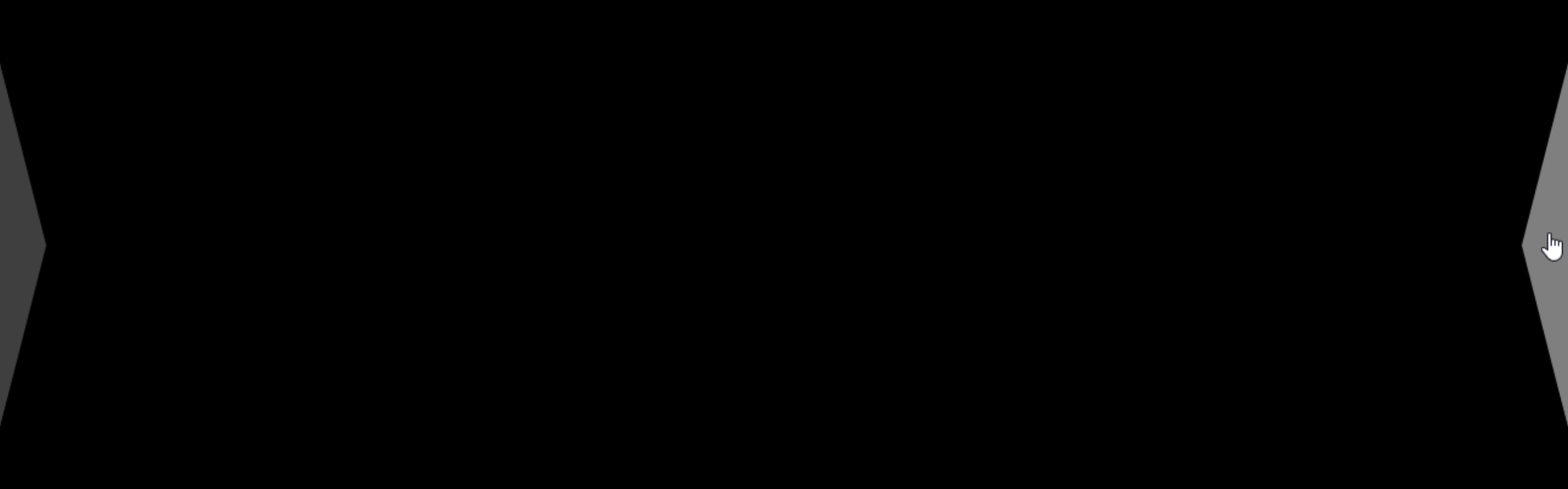
Main Navigation Arrows.
We'll need a couple of navigation controls for moving left and right between pages, which we'll position over the TWebPageControl component, but not directly within it as they should be visible/accessible at all times. We want to be a little bit fancy here, so let's add some CSS to create the navigation controls.
Using the CSS
"clip-path" attribute, we can draw an arbitrary shape. And we can nest shapes, as well, and set colors, and so
on. All we're really after is a triangle on the left and right to indicate that we want to go to the previous
or next page (even if it might not technically be the previous or next page in the TWebPageControl component). Let's draw
two triangles, a white triangle embedded in a black triangle so we get a border of sorts. We'll have a look at
why we would want such a thing shortly. In the IDE, this is just one TWebHTMLDiv component contained within another, with
the ElementClassName properties set to indicate which triangle we're drawing.
All of the interesting bits are handled in the CSS. To start with, we've got some CSS rules for the overall application, and then a couple of stanzas that relate to the TWebPageControl component and the individual pages. These are linked by assigning "pages" as the ElementID for the main TWebPageControl component and then "Page" to the ElementClassName of the individual pages.
Not sure if I'll get it right all the time, but my intent is to
capitalize (and CamelCase) the class names that we use. ElementID properties will most likely be set to the
same as the Delphi names (lowercase first word, CamelCase the rest). Maybe it will help, at least a little. Also, this means that accessing an element in JavaScript can be handled by using the same name as Delphi. As we
only have one Form in this app (that's the plan at the outset, anyway...) this doesn't pose any particular challenges. If we
had multiple Delphi Forms, things might not be so neat and tidy in this respect.
html, body {
  background: black;
  font-family: "Cairo" !important;
  overflow: hidden;
}

/* Make sure error messages appear on top of everything else */
/* so that they can both be seen and be dismissed */
#tmserrormessage {
  z-index: 9999999 !important;
}


/* Main TWebPageControl Component */
#pages {
  transition: opacity 1.5s ease;
}

/* Individual TWebTabSheet Components */
.Page {
  top: 0px !important;
  left: 0px !important;
  width: 1280px !important;
  height: 400px !important;
  overflow: hidden;
  background: transparent;
  transition: opacity 0.4s ease;
}

/*  Main Left/Right Page Navigation Components */
.Nav {
  z-index: 10;
  background: black;
  width: 40px;
  height: 300px;
  opacity: 0.25;
  left: 0px;
  transition: left 1.4s ease;
}
.NavLeft {
  left: -40px;
  clip-path: polygon(0% 0%, 100% 50%, 0 100%);
}
.NavRight {
  left: 1320px;
  clip-path: polygon(100% 0%, 0% 50%, 100% 100%);
}
.Nav:hover {
  opacity: 0.5;
}
.NavLeftInner {
  top: 1px !important;
  left: 0px !important;
  width: 38px !important;
  height: 299px !important;
  background: white;
  clip-path: polygon(0% 0%, 100% 50%, 0 100%);
}
.NavRightInner {
  top: 1px !important;
  left: 2px !important;
  width: 38px !important;
  height: 299px !important;
  background: white;
  clip-path: polygon(100% 0%, 0% 50%, 100% 100%);
}
The z-index attribute in the main .Nav section is used to ensure that these appear above everything else we're working with, but primarily the TWebPageControl component itself. There's also a rule for ensuring that any error messages that appear during testing (visible with the "debug" builds) also appear above everything. Including, in particular, the navigation controls as they otherwise rather inconveniently overlap the "close" button on the error messages.
The opacity is used to both help lighten the look of the navigation controls and to help obscure them a little if you've got an interesting background displayed. More on that shortly, as well.
And with the CSS
clip-path attribute, you can draw a polygon of arbitrary shape, using (X,Y)=(top,left)=(0,0) as the coordinate
system. Here, we just need to supply the first three points to get our triangle. Note that the inner triangle is
offset ever so slightly from its parent. But with that in place, we've got the very beginnings of our
app. We'll address the "transition" rules in just a moment.
Main Navigation Arrows.
Just to wrap up the navigation topic for now, the outer TWebHTMLDiv component is what has the "onclick" event
handler. The inner TWebHTMLDiv components have the "pe-none" Bootstrap class set (pointer-events: none) in
their ElementClassName property, so any clicks go to the outer TWebHTMLDiv component only. The hover attribute
is used to highlight the triangle by adjusting its opacity upwards. This works really well. The hover only
kicks in (along with its clickability) when the triangle itself is involved, not the outer border of the
TWebHTMLDiv, which is different than if we had used a button or image of some kind instead of our fancy
clip-path arrangement.
Main Navigation Buttons.
There are human interface guidelines floating around for many projects. These recommend (or mandate, in some cases) the minimum sizes for certain elements, maybe even minimum font sizes and that sort of thing. We'll just have a general rule of thumb that something should be a minimum of 40px wide or tall if we want someone to click on it, using our little 7.9-inch display. And a font size of at least 24px if we expect someone to be able to read it.
With a generic browser web page, this isn't all that different, though the font size is likely a little
large (default is usually closer to 16px and often a little smaller than that). But with a generic browser
page, the visitor can easily scale the page to better suit their needs. Not as much flexibility for that here. Our navigation controls are 40px wide at the peak, so just barely squeak by there. Think of these more like suggestions rather than hard rules for this project, I suppose.
This brings us to the main navigation buttons for our UI. One for each corner. Let's have buttons for "Help",
"Change", "Home", and "Configuration" to start with.

Main Navigation Buttons.
Given our limited real estate, each button will have a main icon and at least one alternate icon, to represent
different functions in different contexts. Nothing complicated here, just a little extra UI feedback to help
make the most of the space available.
- The Help button will normally display a help page related to the current page being displayed. It
will switch to a "back" button to return the user to the original page when they're done with the Help Page. This
will also happen automatically after a period of inactivity.
- The Change button will normally allow changes to whatever page is currently displayed, such as rearranging a button layout or changing a color, that kind of thing. It will switch to a "refresh" button when on a configuration page, which will cause
the entire application to be reloaded. On pages displaying remote content, it will also change to a "refresh"
button, but will only reload the remote content for that particular page.
- The Home button, when on the Home page, will show the status of the Home Assistant server
connection, with a lightning bolt signifying a good connection. If the connection is lost, a yellow warning
triangle will be displayed instead. Tapping the lightning bolt will also reset the Home Assistant connection
(without reloading the application). At all other times, it displays the "Home" icon (as above), allowing the
user to immediately return to the Home page from anywhere.
- The Configuration button will bring up the main Configuration page. When on the main Configuration page, it will change to an "off" button, allowing you to exit the application. As this is not intended to be a regular web app, having an "off" button does make a little bit of sense. As a small aside, to exit a Miletus app, "Halt" and "Application.Terminate" aren't available, but just closing the main form achieves the desired result.
In most cases, we'd like our UI to seem fluid in nature - elements should fade in/out as needed, and nothing should be changing abruptly if we can avoid it. These buttons are no exception. So when a button changes from one icon to another, we'd like them to fade in/out.
To see how this works, we'll have a look at the Configuration button. We can actually define multiple icons at once, using CSS classes to ensure that only one is visible at any given time. Here, we've set the Caption class of a TWebButton component as follows, using two Font Awesome icons.
<i class="fa-solid fa-gear fa-2x icon-default"></i><i class="fa-solid fa-power-off fa-2x icon-alternate"></i>
The "icon-default" and "icon-alternate" classes are used to differentiate the two icons (or "icon-third" when we have three), and the default CSS sets only "icon-default" as visible. Note that the button click event for this button doesn't use this - it's the same button - just that the icon changes for different contexts. The CSS then looks like this.
 /* Main Buttons */
.MainButton {
  opacity: 0;
  color: white !important;
  padding: 0px !important;
  transition: opacity 0.4s ease, left 1.5s ease, top 1.5s ease;
  filter: drop-shadow(0px 0px 2px black) drop-shadow(0px 0px 2px black);
}
.MainButton:hover {
  color: white !important;
  opacity: 0.5 !important;
}
.MainButton > i,
.MainButton > div {
  position: absolute;
  display: flex;
  top: 0;
  left: 0;
  width: 100%;
  height: 100%;
  justify-content: center;
  align-items: center;
}
.icon-default {
  transition: opacity 1s ease;
}
.icon-alternate {
  opacity: 0;
  transition: opacity 1s ease;
}
.icon-third {
  opacity: 0;
  transition: opacity 1s ease;
}
The opacity here is initially set to zero for the second and third icons. The stanza covered by ".Mainbutton
> div, .MainButton > i" is intended to deal with icons of different sizes and types by ensuring everything
is centered within the TWebButton <div> that is created. Probably overkill. But as we'll be using Font
Awesome icons mixed in with other icons, as well as our own PNG icon for the "Home" button (shown above), this
helps ensure everything is lined up properly. This is particularly important when a pair of icons fade in/out
of the same space. Within our app, we can switch between icons by doing something like this.
    asm
      btnConfiguration.firstElementChild.style.setProperty('opacity','0');
      btnConfiguration.lastElementChild.style.setProperty('opacity','1');
    end;
For the Home button, we've got three states to deal with, so we can do this instead.
    asm
      btnHome.firstElementChild.style.setProperty('opacity','0');
      btnHome.firstElementChild.nextElementSibling.style.setProperty('opacity','0');
      btnHome.lastElementChild.style.setProperty('opacity','1');
    end;
In each case, we're just changing the opacity to hide one icon and show another, without really changing
anything else about the button itself - it is enabled and visible all the time, just with a different icon to
indicate that its function has changed.
This brings us to transitions. With CSS, you can assign a "transition" rule that defines a property to
change, a duration, and a timing function for the transition. In the above CSS, we've got a few transitions being
used. One is for "opacity". This means that whenever the opacity property of the object is changed, the change
will transition from the old value to the new value over a period of time (1s) using a function (ease, the
default). Transitioning from an opacity of 0.0 to 1.0 will "fade in" an element, and similarly, transitioning
from 1.0 to 0.0 will "fade out" an element. In the ":hover" stanza, the object's opacity is altered, but with a
slight transition so that it "fades" into its new opacity level a little more gently.
The same transition mechanism is applied to the "left" and "top" properties of the buttons. Normally they're
just sitting there in the corners. But to make it a little more fun, at application start, they are shifted into
place, one from each side. And when shutting it down, they are shifted out in the opposite direction. The same
is done with the navigation controls on the left and right. This is the look we're after. Note that we don't
have to do a thing really in our TMS WEB Core app to get this transition effect working. This is all handled with CSS.

Startup Animation.
The other CSS item of interest is that there's a filter applied - drop-shadow. We'll be using it a lot. Both
because it's currently my favorite CSS attribute and because it helps address a certain problem which we'll get
to in a little bit. This adds a drop-shadow, or an outline, depending on how it is defined, around whatever
element it is attached to. Adding multiple drop-shadow values in the same CSS rule compounds the effect, much
like the regular CSS box shadows. And it works with icons, text, and even SVG files! Which we'll be needing in a
couple of posts from now.
Configuration Page.
In order to get any data from Home Assistant, we'll first need a bit of information to be able to establish a connection. Specifically, the URL to use for the Home Assistant server, and the same Long-Lived Access Token that Home Assistant uses for authentication. We covered both of these items in the last post, so be sure to check that out for more information.
This time, we'll include a spot directly in the UI where these can be entered, and then save them locally so that we can enter them just once and have them loaded automatically afterward. We'll put these on a "Configuration" page along with a few other basic options to get us started.
We'll also need some buttons to link to other configuration items, and maybe a little bit of an informational
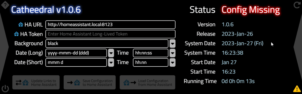
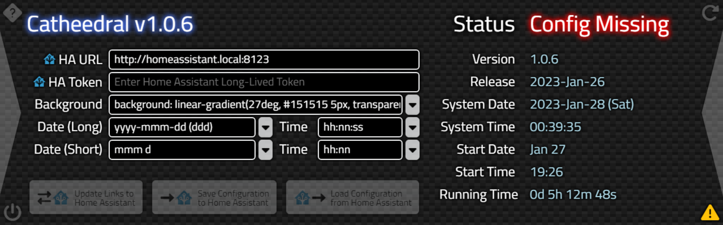
display to show the impact of the choices being made. When launching Catheedral for the very first time, we'll
end up with something that looks like this. Here you can also see a few of the alternate icon choices.
Initial Configuration Page.
At the very top, we've got some titles - the main application title on the left, and the current status on the
right. A bit of extra effort has been put into having different colors for the status, depending on whether the
connection to the Home Assistant server has been established or not. We'll be setting up a "splash" page a bit
later, and it will use the same kinds of CSS that we're using here, so we might as well deal with that at the
same time. Note that we want the overflow to be visible here mostly because our fancy filter:drop-shadow
property tends to generate shadows that overflow the <div> they are in, not because we expect the text
itself to overflow.
/* Title Text */
.Title {
  overflow: visible;
  font-size: 40px;
  padding: 2px 8px 2px 8px;
  color: white;
  filter: drop-shadow(0px 0px 4px royalblue) drop-shadow(0px 0px 4px royalblue);
}
.Title.Status {
  filter: drop-shadow(0px 0px 4px black) drop-shadow(0px 0px 4px black);
}
.Title.StatusGood {
  filter: drop-shadow(0px 0px 4px green) drop-shadow(0px 0px 4px green);
}
.Title.StatusBad {
  filter: drop-shadow(0px 0px 4px red) drop-shadow(0px 0px 4px red);
}
.Title.Splash {
  opacity: 0;
  transition: opacity 2.5s ease;
}
.Title.SplashSub {
  opacity: 0;
  font-size: 20px;
  transition: opacity 3.5s ease;
  filter: drop-shadow(0px 0px 4px black) drop-shadow(0px 0px 4px black);
}
.Title.SplashEnd {
  opacity: 1;
  font-size: 20px;
  transition: opacity 3.5s ease 1.5s;
  filter: drop-shadow(0px 0px 4px black) drop-shadow(0px 0px 4px black);
}
The left side of the Configuration page lists the various items that we can configure initially. These are simple TWebEdit components with a bit of styling for the "input" tag to make things a little nicer. It would have been handy to have something like an editable combo box available, but this isn't all that easy in HTML as the default controls don't readily support such a thing.
Instead, a button is paired with a TWebListBox component to get more or less the same result. On the right side, we just have a bunch of labels and values showing. At the bottom are some disabled buttons, but we'll get to those in the next post. Plenty of styling is needed to get a consistent look across all these elements.
/* Configuration Page Styles */
.ConfigEdit {
  font-size: 20px;
  margin: 3px;
  height: 36px !important;
  padding-left: 8px;
  padding-bottom: 5px;
  border: 2px solid var(--bs-light);
  border-radius: 6px;
  background: black;
  color: white;
  overflow-x: hidden !important;
  filter: drop-shadow(0px 0px 2px black) drop-shadow(0px 0px 2px black);
}
.ConfigDropdown > input {
  font-size: 20px;
  margin: 3px;
  padding-left: 8px;
  border: 2px solid white;
  border-radius: 6px;
  background: black;
  color: white;
}
.ConfigList {
  font-size: 20px;
  margin: 3px;
  padding-left: 8px;
  border: 2px solid var(--bs-light);
  border-radius: 6px;
  background: black;
  color: white;
  overflow-x: hidden !important;
  filter: drop-shadow(0px 0px 2px black) drop-shadow(0px 0px 2px black);
  opacity: 0;
  transition: height 0.4s ease, opacity 0.4s ease;
}
.ConfigListButton {
  width: 25px !important;
  height: 36px !important;
  padding: 0px !important;
  margin: 3px 0px 0px 8px !importAnt;
  font-size: 22px;
  filter: drop-shadow(0px 0px 2px black) drop-shadow(0px 0px 2px black);
}
.ConfigListButton > i {
  transition: transform 0.4s ease;
}
.ConfigButton {
  filter: drop-shadow(0px 0px 2px black) drop-shadow(0px 0px 2px black);
}
.Label {
  overflow: visible;
  font-size: 24px;
  padding: 2px 8px 2px 8px;
  color: white;
  filter: drop-shadow(0px 0px 2px black) drop-shadow(0px 0px 2px black);
}
For the dropdown controls, we'd like to make them a little fancier. First, we'll need to make the scroll bars
and scroll buttons a little bigger to have any hope of it being usable on such a small screen. This can be done
via CSS and as we're using the Miletus Framework, we don't have to worry about someone using a different
browser. Like Firefox, which has barely visible scroll bars without an obvious means to change them.
/* Customize scrollbars */
::-webkit-scrollbar {
  width: 30px;
  height: 30px;
}
::-webkit-scrollbar-corner {
  background-color: #00000040;
}
::-webkit-scrollbar-track {
  background-color: #00000040;
  border-radius: 200px;
}
::-webkit-scrollbar-thumb {
  background-color: #4169E1B0; /* royal blue @ 75% */
  border-radius: 200px;
  border: 3px solid #00000080;
}
Next, we'd also like to have both the arrow and the list box animated. We've already got the transition rules in the CSS above for these properties. Note that for the button, we're just after animating the icon in the button, not the button itself. Clicking on a button, then, involves changing the rotation of the icon, and displaying the list at a set height. The height is stored in the Tag value of the list, and the visibility of the list is stored in the Tag property of the button.
Kind of a mess and a solid candidate for refactoring as the code for each button has just been duplicated, with the necessary edits. When a different list is selected, we'd like any other exposed list to be reverted back using the same mechanism. Here's what we've got for code to handle one of the buttons.
procedure TForm1.btnListDatesShortClick(Sender: TObject);
begin
  if (Sender is TWebButton) and (Sender = btnListDatesShort)
  then btnlistDatesShort.Tag := (btnlistDatesShort.Tag + 1) mod 2
  else btnListDatesShort.Tag := 0;

  if btnListDatesShort.Tag = 1 then
  begin
    asm
      btnListDatesShort.firstElementChild.style.setProperty('transform','rotate(180deg)');
    end;
    listDatesShort.ElementHandle.style.setProperty('height',IntToStr(listDatesShort.Tag)+'px');
    listDatesShort.ElementHandle.style.setProperty('opacity','1');
  end
  else
  begin
    asm
      btnListDatesShort.firstElementChild.style.setProperty('transform','rotate(0deg)');
    end;
    listDatesShort.ElementHandle.style.setProperty('height','0px');
    listDatesShort.ElementHandle.style.setProperty('opacity','0');
  end;

  if (Sender is TWebButton) and (Sender = btnlistDatesShort) then
  begin
    btnListBackgroundsClick(Sender);
    btnListDatesLongClick(Sender);
//    btnListDatesShortClick(Sender);
    btnListTimesLongClick(Sender);
    btnListTimesShortClick(Sender);
    exit;
  end;

  ResetInactivityTimer(Sender);
end;
Just for fun, let's have a look at what that looks like when it gets transpiled into JavaScript. We can see this
in the Debug build by looking at the "Sources" tab of the developer tools and searching for the name of the
function.
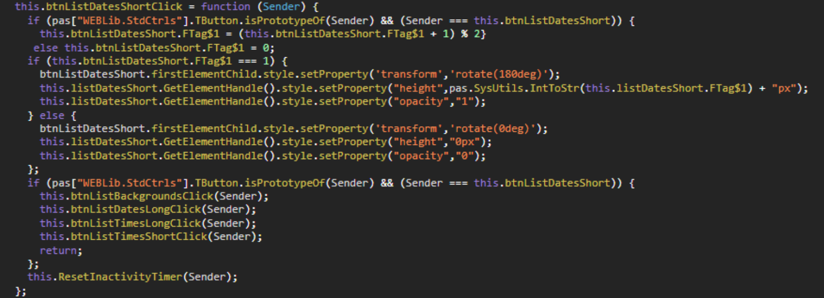
Delphi Transpiled into JavaScript.
The main thing I was interested in seeing is the difference between referencing the CSS properties using ElementHandle versus through an asm...end block. Naturally, things are simpler here as everything is in
JavaScript so no back-and-forth is required code-wise. For the most part, the transpilation results in code
that very closely mimics what we're doing in Delphi. Mostly with just replacing Delphi objects with JavaScript
equivalents, and the asm...end blocks being inserted with no changes at all.
In any event, with that in place
for all the buttons, we end up with a UI that looks like this, which is exactly what we were after.
Editable Combo Boxes.
All of the fields allow for free-form text entry, and each has a range of choices defined in the
usual TWebListBox Items property. For the date and time formats, the Delphi FormatDateTime function is used,
with the data on the right shown using whatever formats have been selected (System = long formats, Start = short
formats), including an "Invalid Format" message if something has been entered that FormatDateTime can't properly
deal with. This brings up another small diversion.
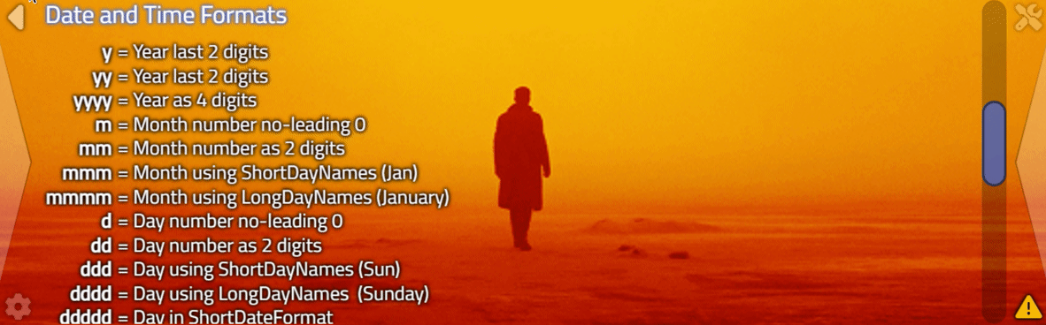
Help.
Most people wouldn't normally be familiar with the Delphi conventions for date/time formatting, so a Help page is available. Help pages are just straight-up HTML content that is loaded at run-time into TWebHTMLDiv components, each on its own page within the main TWebPageControl component.
Help files are loaded based on
the language-country values that come from Home Assistant, or from "en-CA" if either the language-country pairing isn't
yet available (like when the Home Assistant connection isn't available) or when the corresponding Help file for
the detected language-country pairing is not available. Here's an example of what the Help looks like for the main
Configuration page. Note the scroll bar on the right.
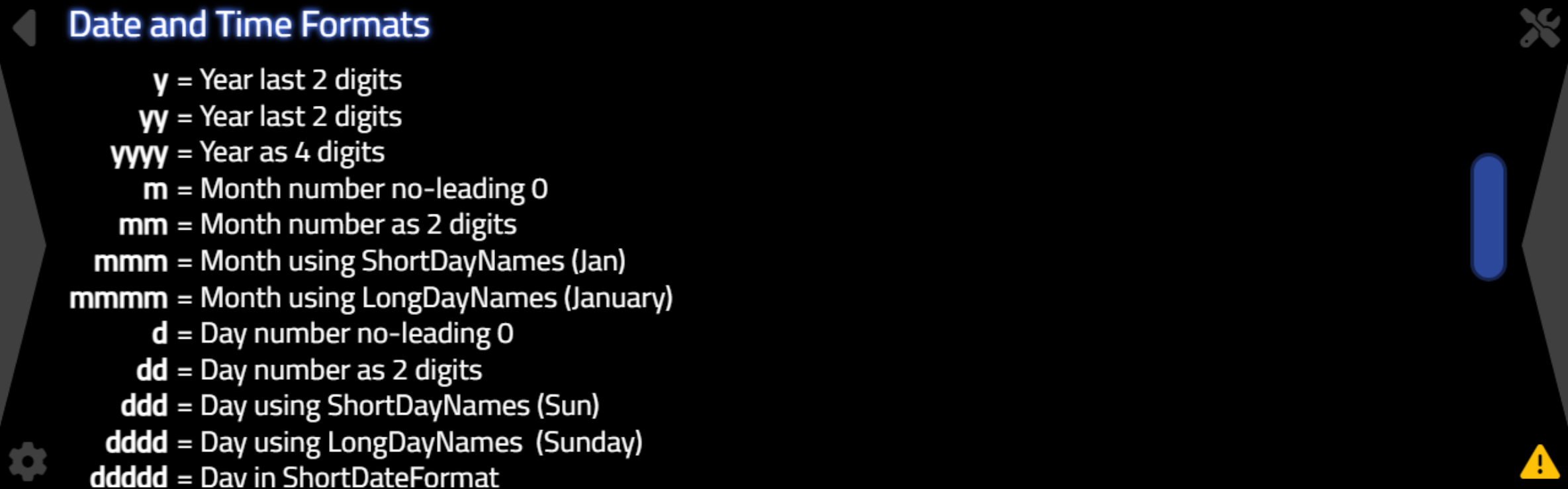
Example Help for Configuration Page.
To help with the formatting, just a few extra CSS classes are used to ensure a consistent look.
/* Help System */
.Help {
  top: 2px !important;
  left: 40px !important;
  width: 1190px !important;
  height: 396px !important;
  overflow-x: hidden !important;
  overflow-y: auto !important;
}
.HelpTitle {
  padding: 0px 4px 8px 16px;
  color: white;
  font-size: 30px;
  width: 100%;
  filter: drop-shadow(0px 0px 2px royalblue) drop-shadow(0px 0px 2px royalblue);
  white-space: normal;
}
.HelpBody {
  padding: 0px 4px 8px 16px;
  font-size: 24px;
  line-height: 1.15;
  white-space: normal;
  color: white;
  filter: drop-shadow(0px 0px 2px black) drop-shadow(0px 0px 2px black);
}
.HelpHighlight {
  font-weigth: 700;
  color: royalblue;
}
Loading up the Help files dynamically might be a little bit tricky. We want them loaded from the same place as
our main application which, normally, would be from a URL on a web server. Miletus abstracts this away in many
respects but we're still doing the same thing here.
The normal (modern?) way to do this in JavaScript is to use fetch() to load a text file or a JSON file. Text in this case is fine. We'll want to have a mechanism for defaulting to a backup Help file if the language-country value is not defined or the Help file is otherwise not available. When we get the file, we want to drop it into a TWebHTMLDiv component, specifically its HTML value which translates into the "innerHTML" property of a <div>.
But first, we need to find the Help pages we
want to populate. We can assign a class to each of the relevant TWebHTMLDiv components that need populating.
And we can then find those at runtime using a bit of JavaScript.
    asm
      const helpcontent = document.querySelectorAll('.Help');
      helpcontent.forEach(help => {
        pas.Unit1.Form1.LoadHelp(help.id);
      });
    end;
This finds all the TWebHTMLDiv components (aka <div> elements) that have "Help" in their ElementClassName properties. This then calls another Delphi function (LoadHelp) and passes it the ID. In this case, the ID (the ElementID property of the TWebHTMLDiv component) will be used to construct the filename for the Help content that we'll be loading.
procedure TForm1.LoadHelp(HelpDIV: String);
var
  HelpFile: String;
  HelpFileAlt: String;
begin
  HelpFile := 'help/'+HALanguage+'-'+HACountry+'/'+HelpDIV+'.html';
  HelpFileAlt := 'help/en-CA/'+HelpDIV+'.html';
  asm
    var Help = document.getElementById(HelpDIV)
    fetch(HelpFile)
      .then(
        function(response) {
          if (response.status !== 200) {
            fetch(HelpFileAlt)
              .then(
                function(altresponse) {
                  if (altresponse.status !== 200) {
                    Help.textContent = 'Help File Missing: '+HelpFileAlt;
                  }
                  altresponse.text().then(function(AltHelpData) {
                    Help.innerHTML = AltHelpData
                  })
                }
              )
              .catch(function(err) {
                console.log('Error ['+err+'] Loading Help: '+HelpDIV)
              })
          }
          response.text().then(function(HelpData) {
            Help.innerHTML = HelpData
          })
        }
      )
      .catch(function(err) {
        console.log('Error ['+err+'] Loading Help: '+HelpDIV)
      })
  end;
end;
This then does what we're after. It tries to load the Help content from a file corresponding to the
language-country values provided by Home Assistant, and if it can't, it then tries to load the "en-CA"
language-country combination. If even that fails, the Help content will indicate that the Help file is simply
missing. This shouldn't happen if there is default Help content created for each page within the "help/en-CA"
folder.
Ultimately, the idea is that Help content in different languages can be contributed by others and
simply added to the appropriate folder, rather than having to incorporate something in the main project files to
accommodate this same kind of mechanism. Everything gets compiled down into a single executable file as a
Miletus project anyway, but this approach is considerably less work to maintain.
Switching Pages.
Before we get back to our Configuration options, let's also cover another small diversion - switching pages. We'll define a bit of CSS to cover both the TWebPageControl component and the individual TWebTabSheet pages. We
touched upon a couple of these earlier with respect to naming conventions, but let's have a closer look at what
they're doing.
/* Background
** Generally, this will only work when the background changes from one image to another
** or from one color to another.  Switching from image to color, or color to image
** does not get the benefit of the transition.  But its fun when it works.
*/
#divBackground {
  opacity: 0;
  transition: background-image 0.4s ease, background-color 0.4s ease, opacity 1.5s ease;
}

/* Main TWebPageControl Component */
#pages {
  transition: opacity 1.5s ease;
}
/* Individual TWebTabSheet Components */
.Page {
  opacity: 0;
  top: 0px !important;
  left: 0px !important;
  width: 1280px !important;
  height: 400px !important;
  overflow: hidden;
  transition: opacity 1s ease 0.1s;
}
The first, #divBackground, is a TWebHTMLDiv component that is at the "bottom" of the z-order, below the
TWebPageControl component and everything else on the page. This is literally the background element. Then there is
#pages, referencing the main TWebPageControl component, and really just defines a transition for when the component first
appears on the page. It normally doesn't have a background at all anyway. And finally, we have .Page, applied to
the individual TWebTabSheet components - the individual pages, essentially. Here, again, there is normally no
background, so ultimately whatever is in #divBackground will be the background of whatever is on the individual
pages - switching pages only changes what is displayed in terms of elements on the specific page. Handy.
The only thing we're really doing that is maybe interesting is defining the transitions. This gives us a nice
fade effect when switching from one page to another. The #divBackground component has a more complex transition
value in order to support different kinds of backgrounds that it might end up with, with the small caveat that
the transitions work only when transitioning between the same types of backgrounds. More on backgrounds in just a
moment. First, though, let's have a look at what our transitions look like.

Page Transitions.
We'll use this same page transition everywhere. While it might be tempting to have some kind of cross-fade where both the before and after pages might briefly blend together, we're going to use that transition time to try and make sure that the page we're transitioning to is already updated before it starts to appear, so we don't end up with any kind of "jumping" effect as values on the page update if they haven't been visible for a time.
We also
use the page transition as an opportunity to update the Main Button icons to correspond to the page they are on. In order for this to occur in the right sequence, we use one of a number of timers. This means that we set the opacity of the outgoing page to zero, and set the timer to the same
delay used by that transition. Once the outgoing page is invisible and the timer fires, the new page opacity is set to 1 and starts to
fade in. And by the time it is visible, any updates to the page should already be complete.
procedure TForm1.SwitchPages(StartPage, EndPage: Integer);
begin
  // Fadeout CurrentPage
  if (StartPage <> EndPage)
  then pages.ActivePage.ElementHandle.style.setProperty('opacity','0');

  tmrSwitchPage.Tag := EndPage;
  tmrSwitchPage.Enabled := True;
end;

procedure TForm1.tmrSwitchPageTimer(Sender: TObject);
var
  StartPage: Integer;
  EndPage: Integer;
  CustomRefresh: String;
begin
  tmrSwitchPage.Enabled := False;
  StartPage := pages.TabIndex;
  EndPage := tmrSwitchPage.Tag;

  // Alright, back to what we were doing.

  // Switch the page
  pages.TabIndex := EndPage;

  // Help button is either Hand or Back depending on whether on Help page or not
  if pos('Help',pages.ActivePage.ElementID) > 0 then
  begin
    pages.ActivePage.Tag := StartPage;
    asm
      btnHelp.firstElementChild.style.setProperty('opacity','0');
      btnHelp.lastElementChild.style.setProperty('opacity','1');
    end;
  end
  else
  begin
    asm
      btnHelp.firstElementChild.style.setProperty('opacity','1');
      btnHelp.lastElementChild.style.setProperty('opacity','0');
    end;
  end;
end;
We'll be doing many other things in this tmrSwitchPageTimer event, but the idea is the same - update everything we need to update in preparation for the page to appear. In the transition rule for .Page, note that there is a third parameter, after "ease", which indicates how long before the transition starts. This gives us an extra 100ms to figure out what to do about the page contents before we actually display anything. Fortunately, we can get quite a lot done in 100ms.
Backgrounds.
Alright, back to the Configuration page. Being able to personalize or customize the background is a pretty
common thing to want to do. In CSS, there are a handful of "background" properties that can impact how the
background of a web page is rendered. All we're really doing is providing the means to pass values to set these
properties and apply them to the #divBackground element that sits under the TWebPageControl element. There
are a lot of ways we could approach this, but what I'm after here is something simple when it comes to the UI.
Ideally, we'd like to just have a single field to fill in whatever we like. So let's just do that!
First, we can just take the value of the field and pass it directly to the "background" property directly. CSS
already accepts colors using names (a comprehensive list can be found here),
or values can be entered as RGB values (using rgb(128,0,0) for example) or HEX values (using #800000 for
example), where both of those values correspond to "maroon".
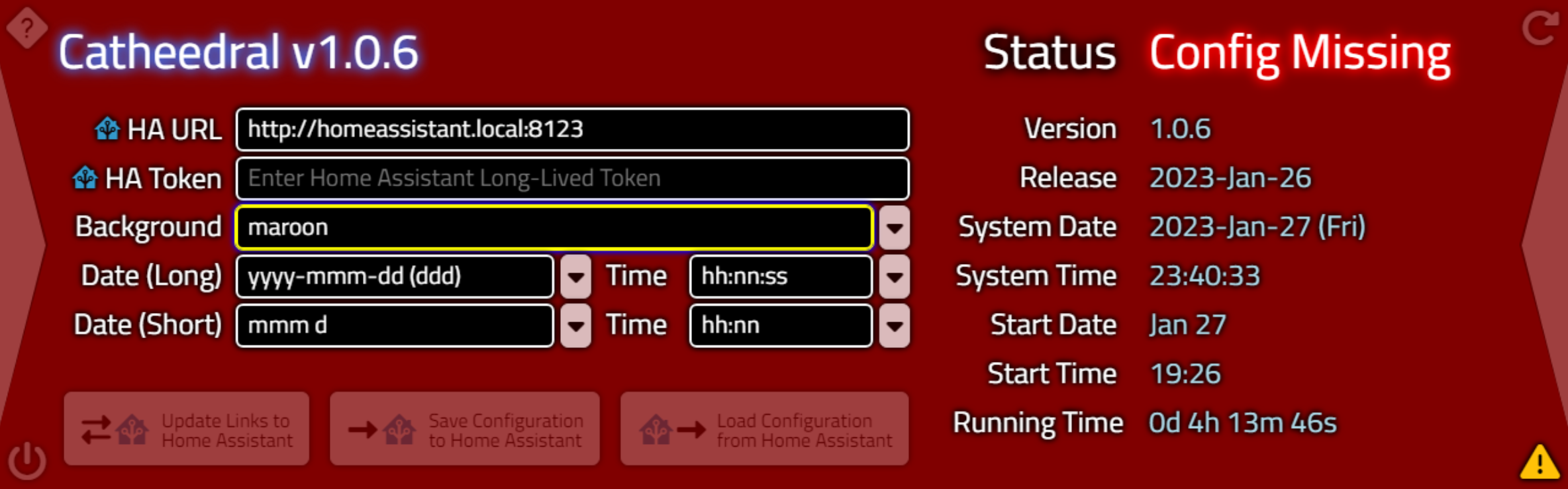
Background Colors.
Linear and radial gradients are also supported directly in CSS. There are many websites available to help with
crafting CSS gradients, such as https://cssgradient.io/. And there's no particular limit to the length of the string that can be added to our background field in the
UI. So we can just copy and paste from another website directly into our application.
linear-gradient(30deg, rgba(255,0,0,1) 0%, rgba(0,0,0,1) 20%, rgba(255,0,0,1) 40%,rgba(0,0,0,1) 60%, rgba(255,0,0,1) 80%, rgba(0,0,0,1) 100%)
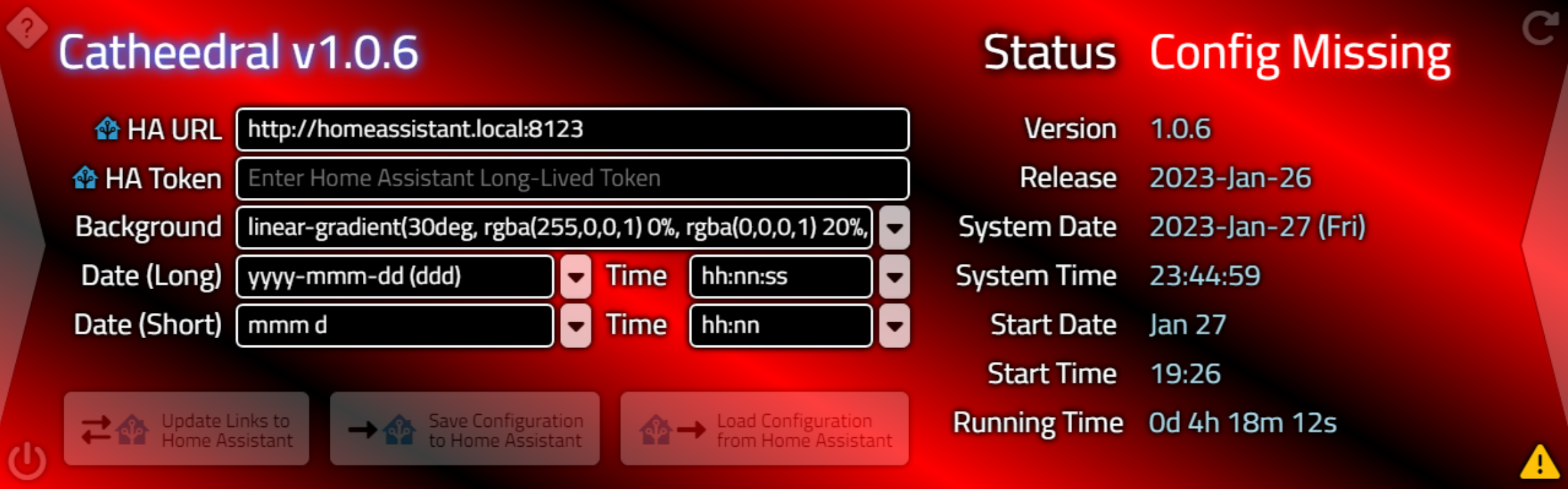
Background Gradients.
Beyond just CSS gradients, any kind of background CSS patterns can be used. And yes, there are plenty of
websites with amazing examples of patterns that can be copied and pasted directly into the Background field in
their entirety without having to do anything else. For example, there is a set of CSS background patterns here.
Looking at the first "carbon" pattern, we get this block of CSS.
background:
linear-gradient(27deg, #151515 5px, transparent 5px) 0 5px,
linear-gradient(207deg, #151515 5px, transparent 5px) 10px 0px,
linear-gradient(27deg, #222 5px, transparent 5px) 0px 10px,
linear-gradient(207deg, #222 5px, transparent 5px) 10px 5px,
linear-gradient(90deg, #1b1b1b 10px, transparent 10px),
linear-gradient(#1d1d1d 25%, #1a1a1a 25%, #1a1a1a 50%, transparent 50%, transparent 75%, #242424 75%, #242424);
background-color: #131313;
background-size: 20px 20px;
"Carbon" CSS Pattern.
Another example comes from Hero
Patterns which includes options for setting colors. Red and black are my favorite colors, and using these
with their "Signal" pattern gets us a block of CSS that looks like this.
background-color: #000000;
background-image: url("data:image/svg+xml,%3Csvg width='84' height='48' viewBox='0 0 84 48' xmlns='http://www.w3.org/2000/svg'%3E%3Cpath d='M0 0h12v6H0V0zm28 8h12v6H28V8zm14-8h12v6H42V0zm14 0h12v6H56V0zm0 8h12v6H56V8zM42 8h12v6H42V8zm0 16h12v6H42v-6zm14-8h12v6H56v-6zm14 0h12v6H70v-6zm0-16h12v6H70V0zM28 32h12v6H28v-6zM14 16h12v6H14v-6zM0 24h12v6H0v-6zm0 8h12v6H0v-6zm14 0h12v6H14v-6zm14 8h12v6H28v-6zm-14 0h12v6H14v-6zm28 0h12v6H42v-6zm14-8h12v6H56v-6zm0-8h12v6H56v-6zm14 8h12v6H70v-6zm0 8h12v6H70v-6zM14 24h12v6H14v-6zm14-8h12v6H28v-6zM14 8h12v6H14V8zM0 8h12v6H0V8z' fill='%23ff0000' fill-opacity='0.4' fill-rule='evenodd'/%3E%3C/svg%3E");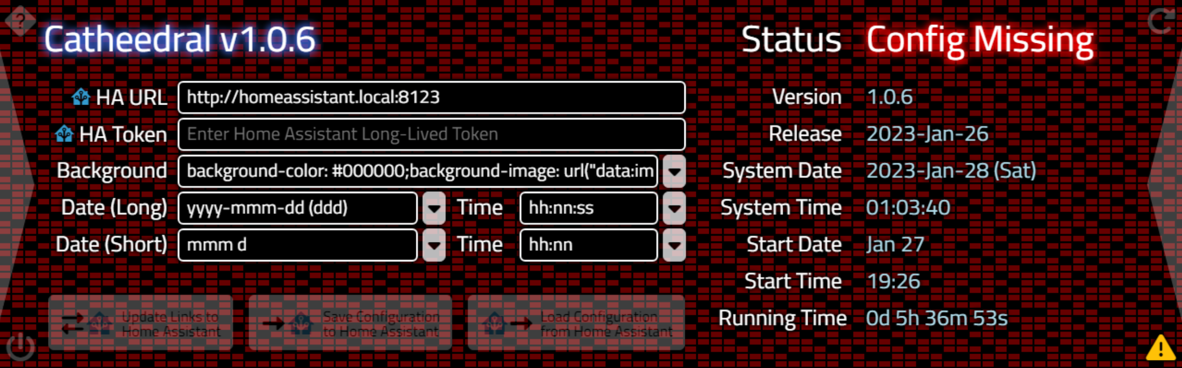
"Signal" CSS Pattern.
We can of course also specify an image. Images can even be included in the project directly. If we put images
in an "images" folder, we could reference them directly using "images/background.jpg" for example. Plenty of
image formats are supported, though JPG and PNG are the most common. The URL can even be a remote website,
assuming that the Catheedral app is running on a device with internet access. The size should naturally match
the display, so 1280px x 400px. But if you pass something else, it will still try and display it using the
"background-size" of "cover" so that it fills the available space.
A couple of backgrounds with this resolution have been included in the project in the images folder. For example, here is one that comes courtesy of the JWST, already scaled and cropped to the desired size.
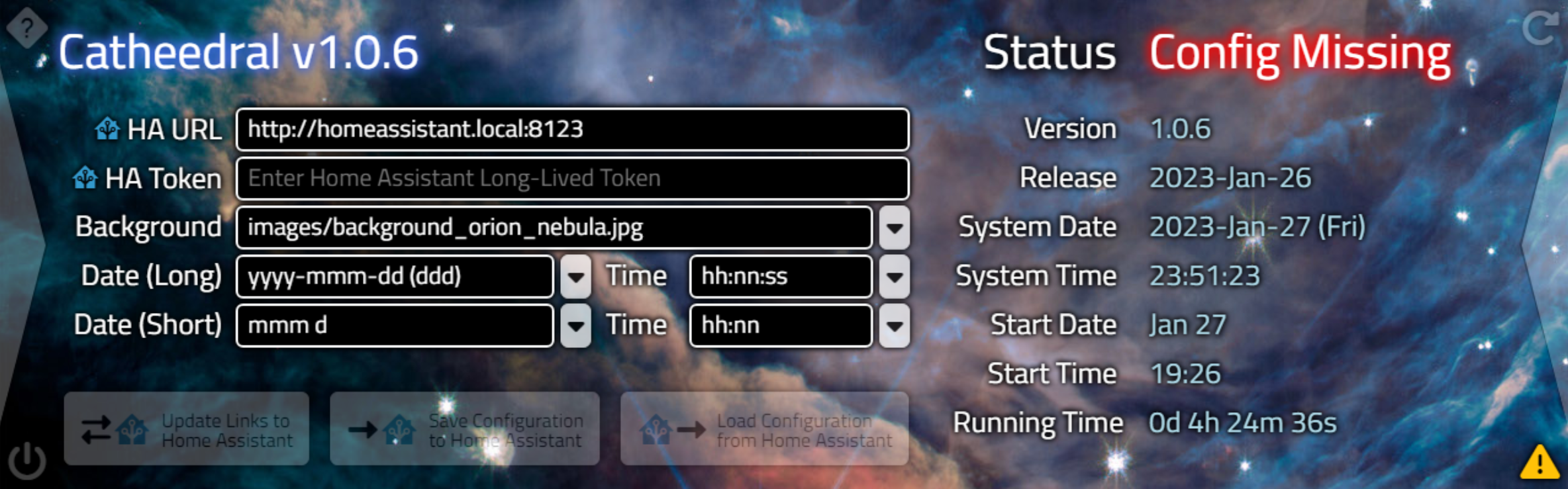
Background Images.
Other images could be added to the project if you had a specific brand that was being promoted or a company
theme of some kind. Including images in the project directly in this fashion ensures that they'll be available
even on devices that are standalone, without access to the internet. It is possible to even use Home Assistant
to serve up images, something we'll be exploring a bit later, but as that's just another URL, it doesn't really
get us anything different.
What can be fun, though, is displaying an animated GIF as a background. This works just the same, and you can find animated GIFs all over the place. This does present two challenges, however.
First, finding an animated GIF that you'd actually want to use as a background isn't an easy thing, particularly given the dimensions at play here. Second, browsers render pages in a single thread. And JavaScript itself isn't multi-threaded. Animated GIFs by default run at something like 10fps, typically, which means that the browser needs to devote a lot of CPU cycles just to rendering. This is great if you have CPU cycles to spare, but not so great if you don't.
One way to get around that is to reduce the framerate of the Animated GIF considerably. An example is
included that someone had captured from Blade Runner 2049, which I've slowed down to 10% of its original speed. This still results in a CPU hit, but not nearly as bad as the regular speed version. Here the background is
shown with the Help screen so it won't be as obscured.
Animated Background.
And one final note about backgrounds, related to all that filter:drop-shadow business. One of the main reasons
to add so much drop-shadow everywhere is to ensure that the UI is usable regardless of the background chosen. Even if someone chooses a white background. Likewise, the tiniest of black borders on the Navigation Controls,
and the filter applied to the Main Buttons help ensure that these are visible as well.
White Background.
This is also a good way to check and make sure all of the elements have "overflow: visible" set, as otherwise
the shadows would be clipped when they reached the edge of their constraining <div> boundaries. All of
the examples shown here, and a handful more, have been included in the project and are available in the
"Background" dropdown list. This can be customized by editing the TWebListBox component's Items property, as
with the others on this page. Here's the code that is used to take the value from this field and apply it to
#divBackground.
procedure TForm1.editConfigBACKGROUNDChange(Sender: TObject);
begin
  editConfigChange(nil);
  if (Trim(editConfigBACKGROUND.Text) <> '') and (LowerCase(Trim(editConfigBACKGROUND.Text)) <> 'none') then
  begin
    AppBackground := editConfigBACKGROUND.Text;
    if Pos(';', AppBackground) > 0
    then divBackground.ElementHandle.style.cssText := AppBackground
    else if ((Pos('.png', AppBackground) > 0) or
             (Pos('.gif', AppBackground) > 0) or
             (Pos('.webp', AppBackground) > 0) or
             (Pos('.svg', AppBackground) > 0) or
             (Pos('.jpg', AppBackground) > 0) or
             (Pos('.jpeg', AppBackground) > 0)) and
             (Pos('url', AppBackground) = 0) then
         begin
           divBackground.ElementHandle.style.setProperty('background', 'url('+AppBackground+')');
           divBackground.ElementHandle.style.setProperty('background-size', 'cover');
           divBackground.ElementHandle.style.setProperty('background-position', 'center');
         end
         else divBackground.ElementHandle.style.setProperty('background', AppBackground);
    divBackground.ElementHandle.style.setProperty('top', '0px');
    divBackground.ElementHandle.style.setProperty('left', '0px');
    divBackground.ElementHandle.style.setProperty('width', IntToStr(PanelWidth)+'px');
    divBackground.ElementHandle.style.setProperty('height', IntToStr(PanelHeight)+'px');
    divBackground.ElementHandle.style.setProperty('opacity', '1');
  end;
end;
It checks if there's a ";" found in the text, implying that it is a block of CSS, which then uses the
cssText property to pass a complete block of CSS rules to the element. If it looks like an image, with
a handful of typical image file extensions, it positions and sizes the image to fit the space available.
Otherwise, it just passes whatever it finds (like a regular CSS color value). Once this is done, it sets a
handful of properties to ensure that the background is where it is supposed to be, deliberately overriding any of
these values that might have been passed previously.
Configuration Persistence.
Alright, enough fun with the backgrounds. Once we've filled in some of the values on the Configuration page, we'd very much like to save them for future use. As we're using a Miletus app, we can't use the normal browser-based localStorage method. But we can use an old-fashioned INI file, made that much easier with the help of the TMiletusINIFile component. The configuration values we're dealing with are all strings. Each time we change a configuration value, we can just write out all the values at once, making this a simple matter. The INI file is named the same as the executable file, and it is stored in the same location.
The extra bit of
string handling is just to get rid of the "exe" in the filename if running this on Windows platforms.
Non-Windows platforms generate executables without an ".exe" extension, so we add ".ini" to the regular
executable's filename. It could be that such a file should be stored elsewhere, or with different permissions
and so on, just as we're accustomed to dealing with when handling Delphi VCL apps and INI files normally, but for
now this works just as well.
procedure TForm1.editConfigChange(Sender: TObject);
var
  AppINIFile: TMiletusINIFile;
begin
  AppINIFile := TMiletusINIFile.Create(StringReplace(ParamStr(0),'.exe','',[])+'.ini');

  // One function to save all the options
  AppIniFile.WriteString('Configuration', 'URL', editConfigURL.Text);
  AppIniFile.WriteString('Configuration', 'TOKEN', editConfigTOKEN.Text);
  AppIniFile.WriteString('Configuration', 'BACKGROUND', editConfigBACKGROUND.Text);
  AppIniFile.WriteString('Configuration', 'LONGDATE', editConfigLONGDATE.Text);
  AppIniFile.WriteString('Configuration', 'LONGTIME', editConfigLONGTIME.Text);
  AppIniFile.WriteString('Configuration', 'SHORTDATE', editConfigSHORTDATE.Text);
  AppIniFile.WriteString('Configuration', 'SHORTTIME', editConfigSHORTTIME.Text);

  // Done with this for now
  AppIniFile.Free;
end;
Reading the values at startup is much the same process, but with an extra bit of code to deal with the async
nature of these calls. Note that because this procedure uses "await", it must have [async] added to its
declaration.
procedure TForm1.LoadConfiguration;
var
  AppINIFile: TMiletusINIFile;
  StoredValue: String;

begin

  //  Console.log('Loading configuration');
  AppINIFile := TMiletusINIFile.Create(StringReplace(ParamStr(0),'.exe','',[])+'.ini');

  // Read in the Configuration Page values individually
  StoredValue := await(String, AppINIFile.ReadString('Configuration', 'URL', ''));
  if StoredValue <> '' then editConfiguRL.Text := StoredValue;

  StoredValue := await(String, AppINIFile.ReadString('Configuration', 'TOKEN', ''));
  if StoredValue <> '' then editConfigTOKEN.Text := StoredValue;

  StoredValue := await(String, AppINIFile.ReadString('Configuration', 'BACKGROUND', ''));
  if StoredValue <> '' then editConfigBACKGROUND.Text := StoredValue;

  StoredValue := await(String, AppINIFile.ReadString('Configuration', 'LONGDATE', ''));
  if StoredValue <> '' then editConfigLONGDATE.Text := StoredValue;

  StoredValue := await(String, AppINIFile.ReadString('Configuration', 'LONGTIME', ''));
  if StoredValue <> '' then editConfigLONGTIME.Text := StoredValue;

  StoredValue := await(String, AppINIFile.ReadString('Configuration', 'SHORTDATE', ''));
  if StoredValue <> '' then editConfigSHORTDATE.Text := StoredValue;

  StoredValue := await(String, AppINIFile.ReadString('Configuration', 'SHORTTIME', ''));
  if StoredValue <> '' then editConfigSHORTTIME.Text := StoredValue;

  // Cleanup
  AppINIFile.Free;

end;
That covers items found on the Configuration page so far. We'll get to what is hiding behind those bottom three
buttons in the next post, but we really should get on with the main event.
WebSockets 101.
Using the Home Assistant REST API, we can send a request to the server via one of its many endpoints (functions). Many of these accept parameters. These calls can be used to both send data to Home Assistant as well as to retrieve data from Home Assistant. But it is a decidedly one-sided affair. There isn't a mechanism where we can be notified of events, nor do we have any ability to tell if anything has changed since we last made contact. At best, we can periodically ask for the same data again and see if something has changed (aka polling).
This isn't particularly efficient and also doesn't lend itself to building a UI that responds nicely to the continually changing conditions at the Home Assistant server. For example, if you poll the server once a minute (which is a bit excessive normally), you'd only know that a light was switched on, on average, 30 seconds after the fact. Not good.
The Home Assistant WebSockets API provides a solution to this problem, while also offering up more data than what can be accessed from the REST API. The basic idea is that there is a connection established between our application and the Home Assistant server. We can submit requests over this connection. And the Home Assistant server can respond to those requests.
It can also send data over whenever it likes. We can, in effect, tell the Home Assistant server that we want to be notified when certain things change, right when they are changed, not some random time later. So when a light is switched on, we can get notified immediately and take appropriate action in our user interface.
To implement this kind of connection, we can use the TWebSocketClient component, already included as part of TMS WEB Core. All it needs to get started is a URL, a Port, a PathName (sort of like a REST API endpoint), and optionally an indication of whether SSL will be used.
We've already got everything we need to get started,
using the URL from our Configuration page. By parsing that value, checking for http vs. https, grabbing the
port number at the end, and assuming that the default PathName of "/api/websocket" hasn't changed on the Home
Assistant end. Using a TWebTimer to handle retries, this can be implemented using something like the following.
procedure TForm1.tmrConnectTimer(Sender: TObject);
begin

  if (HAWebSocket.Active = False) then
  begin

    if tmrConnect.Tag = 0 then
    begin
      tmrConnect.Enabled := False;
      dataConfigSTATUS.Caption := 'Connecting';
      tmrConnect.Tag := 15;

      if (editConfigURL.Text = '') or (editConfigTOKEN.Text = '') then
      begin
        dataConfigSTATUS.Caption := 'Config Missing';
      end
      else
      begin
        HAWebSocket.HostName := Copy(editConfigURL.Text, pos('://', editConfigURL.Text)+3,length(editConfigURL.Text));
        if Pos(':',HAWEBSocket.Hostname) > 0
        then HAWebSocket.Hostname := Copy(HAWebSocket.Hostname,1,Pos(':', HAWebSocket.Hostname)-1);

        HAWebSocket.PathName := '/api/websocket';

        HAWebSocket.Port := 8123;
        if Pos(':', RightStr(Trim(editConfigURL.Text),6)) > 0
        then HAWebSocket.Port := StrToIntDef(Trim(Copy(editConfigURL.Text, LastDelimiter(':', editConfigURL.Text)+1, 5)),80);

        HAWebSocket.UseSSL := False;
        if Pos('https:', editConfigURL.Text) > 0
        then HAWebSocket.UseSSL := True;

        HAWebSocket.Active := True;
        tmrConnect.Enabled := True;
      end;
    end
    else
    begin
      tmrConnect.Tag := tmrConnect.Tag - 1;
      dataConfigSTATUS.Caption := 'Retry in '+IntToStr(tmrConnect.Tag)+'s';
    end;
  end;
end;
The TWebSocketClient component gives us three events to work with.
- OnConnect is fired when a connection to the server is established. We'll use this to kick off the
rest of the conversation with the Home Assistant server.
- OnDataReceived is fired when the Home Assistant server sends us something back, unsolicited or otherwise.
- OnDisconnect is fired when the connection to the Home Assistant server is dropped for any reason.
This might not seem like much, but there is enough here to handle everything we'll ever need when dealing with the Home Assistant server.
OnConnect.
If the connection succeeds, we'll have to start the authorization process. The OnConnect event doesn't really
help us much other than to say that we've got a connection. The Home Assistant server will send us a request
that we'll have to handle in the OnDataReceived event. The OnConnect event just gives us a bit of an
opportunity to update the UI.
procedure TForm1.HAWebSocketConnect(Sender: TObject);
begin
  dataConfigSTATUS.Caption := 'Connected';
  ShowConnected;
end;

procedure TForm1.ShowConnected;
begin
  btnHome.ElementHandle.style.setProperty('opacity','0.25');
  if (pages.TabIndex = 1) or (pages.TabIndex = 11) then
  begin
    asm
      btnHome.firstElementChild.style.setProperty('opacity','0');
      btnHome.firstElementChild.nextElementSibling.style.setProperty('opacity','0');
      btnHome.lastElementChild.style.setProperty('opacity','1');
    end;
  end
  else
  begin
    asm
      btnHome.firstElementChild.style.setProperty('opacity','1');
      btnHome.firstElementChild.nextElementSibling.style.setProperty('opacity','0');
      btnHome.lastElementChild.style.setProperty('opacity','0');
    end;
  end;

  btnHALinks.Enabled := True;
  btnHALoadConfiguration.Enabled := True;
  btnHASaveConfiguration.Enabled := True;
  btnHALinks.ElementHandle.ClassList.Replace('opacity-25','opacity-75');
  btnHALoadConfiguration.ElementHandle.ClassList.Replace('opacity-25','opacity-75');
  btnHASaveConfiguration.ElementHandle.ClassList.Replace('opacity-25','opacity-75');
end;
Here, we're swapping the icons as we showed previously, and we're enabling the three buttons at the bottom of
the Configuration page. Which we're still not talking about.
OnDisconnect.
The OnDisconnect event is also easy to deal with - we just kick off that timer to try and connect again.
procedure TForm1.HAWebSocketDisconnect(Sender: TObject);
begin
  HAWebSocket.Active := False;

  // If previously connected, then retry connection
  if dataConfigSTATUS.Caption = 'Connected' then
  begin
    dataConfigSTATUS.Caption := 'Not Connected';
    tmrConnect.Tag := 15;
    tmrConnect.Enabled := True;

    ShowDisconnected;
  end;
end;

procedure TForm1.ShowDisconnected;
begin
  asm
    btnHome.style.setProperty('opacity','1');
    btnHome.firstElementChild.style.setProperty('opacity','0');
    btnHome.firstElementChild.nextElementSibling.style.setProperty('opacity','1');
    btnHome.lastElementChild.style.setProperty('opacity','0');
  end;


  btnHALinks.Enabled := False;
  btnHALoadConfiguration.Enabled := False;
  btnHASaveConfiguration.Enabled := False;
  btnHALinks.ElementHandle.ClassList.Replace('opacity-75','opacity-25');
  btnHALoadConfiguration.ElementHandle.ClassList.Replace('opacity-75','opacity-25');
  btnHASaveConfiguration.ElementHandle.ClassList.Replace('opacity-75','opacity-25');
end;
This largely just mirrors what we did with the OnConnect event.
OnDataReceived.
The bulk of the work, then, is handled in the OnDataReceived event. As this is the same event that is triggered for anything coming from the Home Assistant server, we've got to have a way of filtering the incoming data stream. Anything passed back and forth with the Home Assistant server is packaged up as JSON. This means that a piece of data could contain one field or hundreds or even thousands of bits of data. Handy, but a bit of work sometimes to figure out what has landed.
The general protocol we'll follow is that whenever a request is sent to Home
Assistant, an integer "id" field is passed along as part of the JSON request. This id should be continually
incremented, as it needs to be unique for each request. When the Home Assistant server responds to the request,
it includes the very same id, so it can be paired with the original request. There is also a "type" value
included in the JSON to indicate what is being requested (or returned) in the data.
But before we can start that back-and-forth exchange, we first need to get authenticated. That process starts
when the Home Assistant server sends the first JSON data over our newly established WebSocket connection, where
it simply contains a "type" value of "auth_requested". We need to respond to that arrival by sending back our
credentials, using a "type" value of "auth" and including our "access_token". If everything checks out, we'll
get another response from the Home Assistant server, with a type of "auth_ok". If the credentials were
rejected, we'll instead receive "auth_failed".
procedure TForm1.HAWebSocketDataReceived(Sender: TObject; Origin: string; SocketData: TJSObjectRecord);
var
  ResponseType: String;
  ResponseID: Integer;
begin
  ResponseType := 'unknown';

  if (dataConfigSTATUS.Caption <> 'Connected')
  then dataConfigSTATUS.Caption := 'Processing';

  asm
    var hadata = JSON.parse(SocketData.jsobject);
    ResponseType = hadata.type;
  end;

  // Server asking to authenticate
  if (ResponseType = 'auth_required') then
  begin
    if (dataConfigSTATUS.Caption <> 'Connected')
    then dataConfigSTATUS.Caption := 'Authenticating';
    dataConfigSTATUS.ElementLabelClassName := 'Title StatusGood';
    HAWebSocket.Send('{"type": "auth","access_token":"'+editConfigTOKEN.Text+'"}');
  end

  // Authentication Successful
  else if (ResponseType = 'auth_ok') then
  begin
    dataConfigSTATUS.Caption := 'Connected';
    dataConfigSTATUS.ElementLabelClassName := 'Title StatusGood';
    tmrConnect.Enabled := False;

    // We're in business.
    HAID := HAID + 1;
    HAGetConfig := HAID;
    HAWebSocket.Send('{"id":'+IntToStr(HAID)+',"type": "get_config"}');
    HAID := HAID + 1;
    HAGetStates := HAID;
    HAWebSocket.Send('{"id":'+IntToStr(HAID)+',"type": "get_states"}');
    HAID := HAID + 1;
    HAGetEvents := HAID;
    HAWebSocket.Send('{"id":'+IntToStr(HAID)+',"type": "subscribe_events", "event_type":"state_changed"}');

  end

  // Failed to login with a valid token
  else if (ResponseType = 'auth_invalid') then
  begin
    dataConfigSTATUS.Caption := 'Invalid Token';
    dataConfigSTATUS.ElementLabelClassName := 'Title StatusBad';
    tmrConnect.Enabled := False;
  end

end;
Once we've authenticated, we can then fire off all kinds of requests and let the Home Assistant respond in
kind. Each time we send a request, we increment the HAID value (the "id" referred to earlier). We keep
track of what each HAID value is requesting by having some additional variables, one for each type of request. What we're most often interested in are the responses to the Home Assistant WebSocket API calls to "get_states",
"get_config", and "subscribe_events", so we have variables for HAGetStates, HAGetConfig, and HAGetEvents.
Now, when data arrives from the Home Assistant Server, we can check its "id" value and see if it matches up with
something we've requested. In the case of "subscribe_events", all subsequent responses will come back with the
same "id" value. In the case of "get_config" and "get_states", we're really only expecting to get one result
set returned, each, but this will make it easier to tell which is which.
Home Assistant Configuration Data.
Now that we've connected, authenticated, and updated our UI, we'll have to wait for the Home Assistant to respond to our initial requests. We won't have to wait long though. It is likely that the results will come back immediately, even for a large and complex Home Assistant setup.
For now, we're going to have a look at the
results returned from our "get_config" request. This returns JSON with a type of "result" and with
whatever our HAGetConfig value was passed when the request was made. When responses come in, we'll need to
keep an eye out for that. When we've got a request that is a "result" with a matching "id" to our HAGetConfig
value, we can then go about processing the data returned. Here's what it looks like in the browser developer
console, which is available when running debug builds.
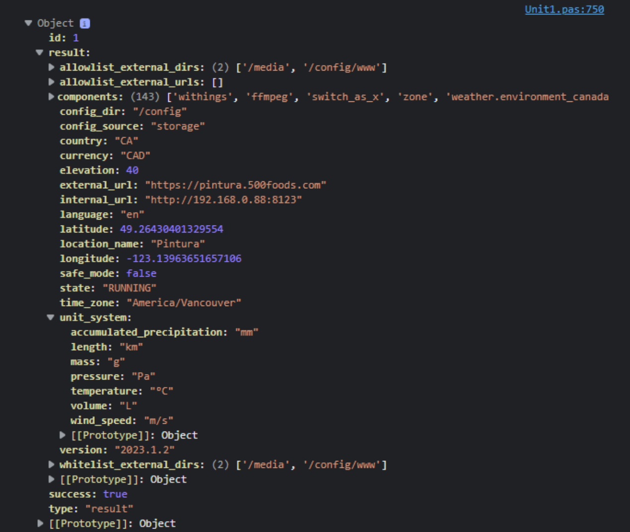
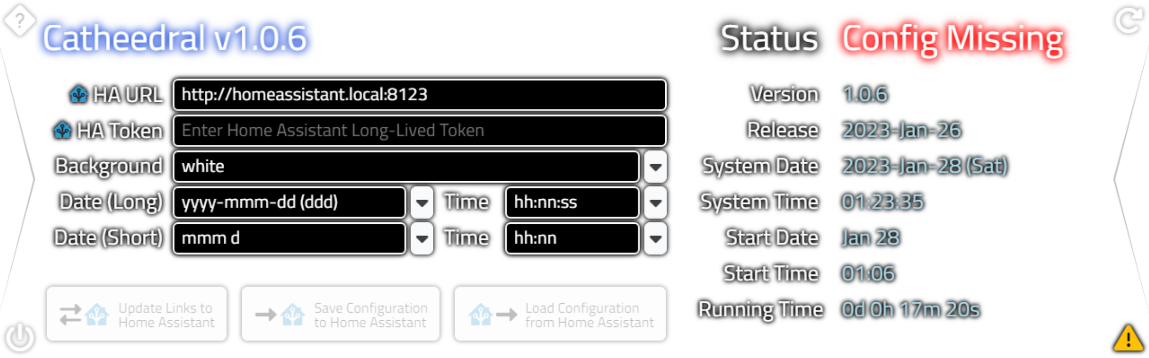
Home Assistant get_config Output.
At startup, this is the first request made, so an "id" value of "1" is expected, but if we ever lose a
connection to the Home Assistant server, the same request may be made again with a different number. The JSON
returned contains a lot of bits of information, like the aforementioned name of the Home Assistant installation
(under "location_name").
Various units are indicated, as well as location information, version information, and
so on. It is even possible to tell what components have been installed within Home Assistant. We don't need to
go into that level of detail (hopefully!) but we can make use of the rest of the data. Here's how we can
extract the necessary bits from the JSON returned. This is added to the asm...end block at the beginning of the
OnDataReceived event.
   asm

    var hadata = JSON.parse(SocketData.jsobject);
    ResponseType = hadata.type;

    if ((ResponseType == 'result') && (hadata.success == true)) {
      ResponseID = hadata.id;

      // Results from get_config
      if (hadata.id == this.HAGetConfig) {

        // Let's have a look at it, shall we??
//        console.log('Config Information: '+SocketData.jsobject.length+' bytes');
//        console.log(hadata);

        this.HASystemName = hadata.result.location_name;
        this.HATimeZone = hadata.result.time_zone;
        this.HALanguage = hadata.result.language;
        this.HACountry = hadata.result.country;

        // We don't really care quite as much about these, but record them anyway
        dataInfoSystem.firstElementChild.innerHTML = hadata.result.location_name;
        dataInfoHAVersion.firstElementChild.innerHTML = hadata.result.version;
        dataInfoLatitude.firstElementChild.innerHTML = hadata.result.latitude.toFixed(5);
        dataInfoLongitude.firstElementChild.innerHTML = hadata.result.longitude.toFixed(5);
        dataInfoElevation.firstElementChild.innerHTML = hadata.result.elevation;
        dataInfoCountry.firstElementChild.innerHTML = hadata.result.country;
        dataInfoTimeZone.firstElementChild.innerHTML = hadata.result.time_zone;
        dataInfoInternal.firstElementChild.innerHTML = hadata.result.internal_url;
        dataInfoExternal.firstElementChild.innerHTML = hadata.result.external_url;
        dataInfoLanguage.firstElementChild.innerHTML = hadata.result.language;
        dataInfoCurrency.firstElementChild.innerHTML = hadata.result.currency;

        // We might care about these more than the others
        this.HATemperatureUnits = hadata.result.unit_system.temperature;
        this.HAPressureUnits = hadata.result.unit_system.pressure;

        // Display the rest anyway
        dataInfoTemperature.firstElementChild.innerHTML = hadata.result.unit_system.temperature;
        dataInfoMass.firstElementChild.innerHTML = hadata.result.unit_system.mass;
        dataInfoDistance.firstElementChild.innerHTML = hadata.result.unit_system.length;
        dataInfoVolume.firstElementChild.innerHTML = hadata.result.unit_system.volume;
        dataInfoPressure.firstElementChild.innerHTML = hadata.result.unit_system.pressure;
        dataInfoPrecipitation.firstElementChild.innerHTML = hadata.result.unit_system.accumulated_precipitation;
        dataInfoWindSpeed.firstElementChild.innerHTML = hadata.result.unit_system.wind_speed;
      }
    }
  end;
Most of this is informational in nature and is displayed more as a way of indicating how the Home Assistant server has been set up. Any changes required here will need to be made on the Home Assistant server, and then the connection can be refreshed to see those changes.
Some of these values, like the temperature units, we'll be using frequently so we'll create a Form variable when that situation arises. We can also see the "en" and "CA" values for the language and country that we're using to determine which set of Help files to load.
A "Configuration
Information" page is used to show all this information at once. This can be accessed by clicking the left
Navigation Control when looking at the Configuration page, or by clicking on the Home Assistant server name that appears at the top of the Configuration
page after a connection has been established.
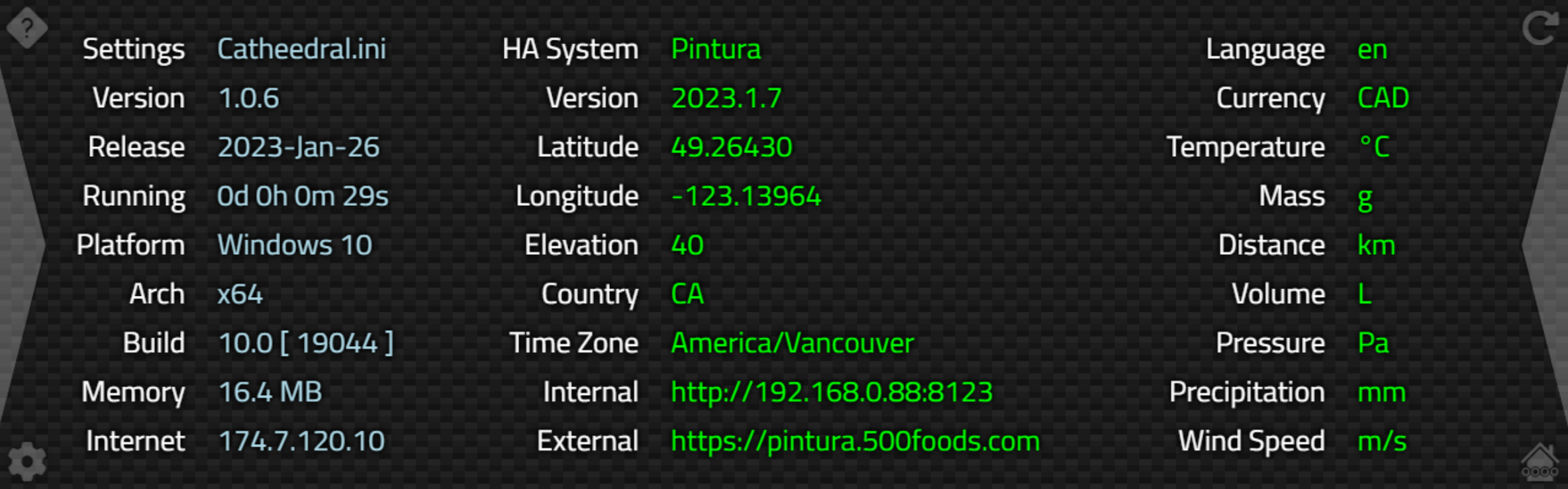
Home Assistant Configuration Data.
The values in the middle and right columns are coming directly from the JSON returned by "get_config". The
first column is available even when there is no Home Assistant connection, as it just shows information about
the local app environment (Miletus in this case). Here's an example of how that data is derived, which has been
added to our previous LoadConfiguration function.
procedure TForm1.LoadConfiguration;
var
  os: TMiletusOSVersion;
  Internet: string;
const
  arches: TArray<String> = ['x86', 'x64','arm32','arm64'];
begin
  os := Await(TMiletusOSVersion, GetOSVersionP);
  dataInfoPlatform.Caption := os.Name;
  dataInfoArch.Caption := arches[Integer(os.Architecture)];
  dataInfoBuild.Caption := IntToSTr(os.Major)+'.'+IntToStr(os.Minor)+' [ '+IntToStr(os.Build)+' ]';

  Internet := 'Unknown';
  asm
    var ipdata = await fetch('https://ipapi.co/json/').then(function(response) {return response.json()});
    Internet = ipdata.ip
  end;
  dataInfoInternet.Caption := Internet;

end;
The IP information is retrieved without needing an API key, but naturally, an internet connection is required. For a kiosk type of situation, this kind of thing might not be of much value. Elsewhere, we get a few more
bits of information. These change more frequently than what is dealt with by LoadConfiguration.
    dataInfoRunning.Caption := IntToStr(Trunc(Now-AppStarted))+'d '+FormatDateTime('h"h "n"m "s"s"', Now-AppStarted);
    asm
      memory = performance.memory.totalJSHeapSize;
    end;
    dataInfoMemory.Caption := FloatToStrF(memory / (1024 * 1024), ffNumber, 6,1)+' MB';
The memory usage value is what is generated by the browser engine, and isn't supported on all browsers. And it really isn't the greatest value to use, particularly as it doesn't include the browser application that might be running in a separate process. But it is something at least. Seems an area of JavaScript that is curiously more difficult to get at than it should be.
Why do we care? Well, as this is an app potentially running in a kiosk-type
environment, we'd like to know if there is some kind of memory leak or anything that might prevent it from
running successfully over a very long period of time without restarts. A day, minimum, for example.
Next Time.
And with that, we've gone from nothing to having our WebSocket API up and running, with data flowing into our
application from the Home Assistant server. Next time, we'll have a look at actual sensor data - the results
being returned by get_states and subscribe_events, that we can use to tell what is going on in our home. We'll
also work on finishing up quite a few other UI elements we didn't get to in this post.
Follow Andrew on 𝕏 at @WebCoreAndMore or join our 𝕏 Web Core and More Community.
Andrew Simard

This blog post has not received any comments yet.
All Blog Posts | Next Post | Previous Post