Blog
All Blog Posts | Next Post | Previous Post

 Extend TMS WEB Core with JS Libraries with Andrew:
Font Awesome
Tuesday, April 19, 2022

This time out, we are exploring Font Awesome, another wildly popular JavaScript library. Like Bootstrap last week, Font Awesome requires no JavaScript coding knowledge and very little in the way of HTML or CSS knowledge either. And while it does have a lot to do with fonts, and is indeed truly awesome, the main benefit we're going to get from FontAwesome in terms of our TMS WEB Core projects is its enormous icon library.
Great. More Icons.
Last week, we touched briefly on the topic of Bootstrap Icons. 1,600 or so freely usable icons that you can directly use in your projects. There are also Google Material Icons. Several thousand more icons that also come in five different styles. The Google Material Icons library is even included in the JavaScript Library Manager in the Delphi IDE, so getting started is easy enough. If you've used one of these sets of icons previously in your projects, you might be reluctant to switch to something else. The look of the Google icons will be familiar to many and might be somewhat of a safe choice, particularly if you're building apps for Android devices.
Long-time developers might feel a bit of a chill when reflecting back on icons of ages past. There was a time when you could pretty accurately guess what tools were used to create an app based entirely on how audacious the icons were. Like acid-wash jeans and tie-dye shirts, these are thankfully well behind us and we now have mostly sane choices to pick from. Also long gone are less-than-fun topics like multi-res bitmaps, bmp-vs-ico, transparency issues, and anything to do with scaling. I suspect our children will never care what a pixel is because they won't actually be able to see any individual pixels anywhere without a microscope.
Back to the topic at hand. Like Google Material Icons, FontAwesome has a handful of different styles to choose from. And I personally much prefer FontAwesome styles to the Google equivalents, but there's more to the story than just the look of the icons. Much more.
Making Your Project (Font) Awesome.
The FontAwesome library was recently added to the "Manage JavaScript Libraries" list, sometime around TMS WEB Core 1.9.8 or so. It lists both Font Awesome 4 and Font Awesome 5. Font Awesome 6 also came out a couple of months ago. We'll run into some of the differences closer to the end of this article. But I think everything we're going to cover today will work the same in any version unless otherwise noted.
One thing that is different between versions is the icons themselves - new icons are added and occasionally icons are changed or removed or, more likely, renamed or redesigned. This can even happen mid-version, so something to keep an eye out for, particularly if you want to use the very latest icons. If your project doesn't already use Font Awesome, just pick the highest version available from the "Manage JavaScript Libraries" list and you're done!
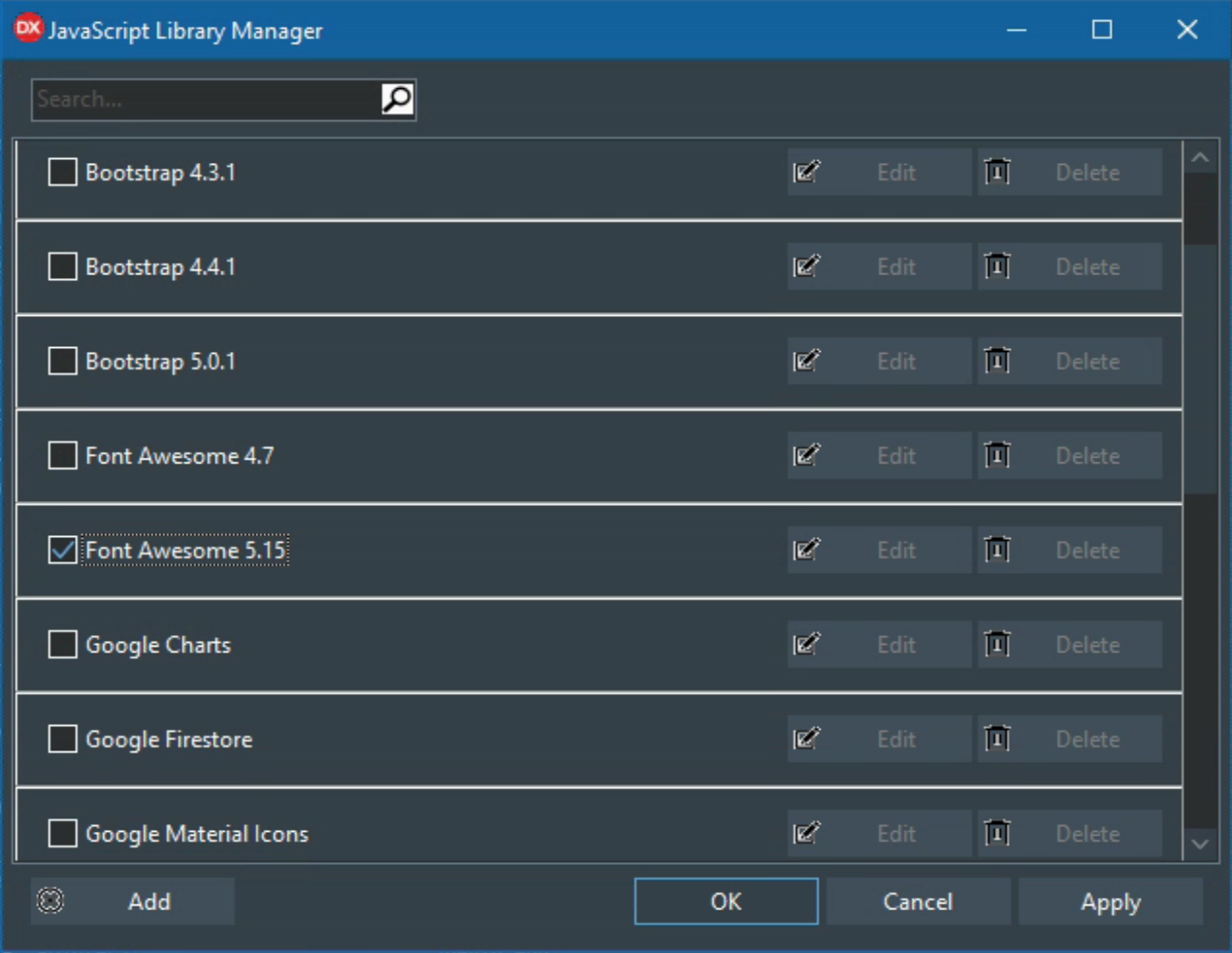
Manage JavaScrpt Libraries Interface.
If you'd like to use a particular version of the Font Awesome library, or a particular CDN, or even host the libraries yourself, then the usual approach of adding files to your Project.html file works just fine as well. Or you can use the JavaScript Library Manager to update the list to suit your particular needs. Both Font Awesome themselves as well as any reputable CDN will have a wide array of versions available. For example, in our Sample Project, I've got the following, as provided by the JavaScript Library Manager.
<link href="https://cdnjs.cloudflare.com/ajax/libs/font-awesome/5.15.0/css/all.min.css" rel="stylesheet"/>
Alright. So how do you know that it is working? Create a TWebButton (using perhaps Bootstrap classes, added to the ElementClassName property, like btn btn-primary fs-2 px-4 rounded-pill) and set the caption to include a Font Awesome icon, like one of the following. If FontAwesome is installed and working, you'll end up with something that looks like one of these.
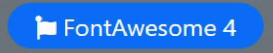
<i class='fa fa-font-awesome'></i> FontAwesome 4
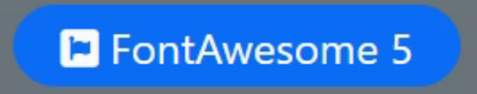
<i class='fab fa-font-awesome'></i> FontAwesome 5
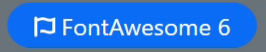
<i class='fab fa-font-awesome'></i> FontAwesome 6
If you don't see a flag of some kind, it could be that you put in an icon value for a different version of Font Awesome. For example, the fab style wasn't part of FontAwesome 4, so if you try to use it you'll get either a blank space where an icon should be, or an empty rectangle or something else that is telling you that it isn't working. Generally, once you see that you've got an icon, you're all set.
A Free (Car) Icon For You. And For You. And You Too.
Before we get any further, let's quickly talk about the free-ness of Font Awesome. Like many other projects, there is a free tier and not-free tiers. The first not-free tier is $99/year (USD). For some (me included) that's a lot of cash for icons. Fortunately, the free tier offers a huge number of icons. Curiously, there are 1,600 icons in FontAwesome 5 (the same as the number of Bootstrap Icons), but 2,000 in FontAwesome 6. Much of the functionality we're going to cover works the same regardless of tier. So for a great many projects, this is likely to work really, really well. No need to even consider anything more.
But what does the cash buy you? Well, there are quite a few things. First, a pretty significant bump up in the number of icons. More than 7,800 in the case of Font Awesome 5 and (checks notes again...) more than 16,000 in Font Awesome 6. Note that when searching for icons, be sure to click the "Free" option to hide all the rest and you'll be a much happier person. Less an issue about the constant reminder that you're using free icons and more an issue about icons that are missing because you put in one that was on the non-free list. Or if you're like me you'll eventually be worn down and find yourself one day looking at a receipt for all the icons you never knew you needed in your life.
Another key difference is in the style of icons available between the Free and Pro versions. The styles on offer include Solid, Regular, Light, DuoTone, and, as of FontAwesome 6, Thin. The Free tier is mostly just the Solid icons as well as some Regular icons. Which are great, no question, and easily worth the (free) price of admission. On my main website (https://www.500foods.com which is a Drupal / PHP site) I use these extensively and they work just great.
When it comes to web applications though, I've found that I'm rather smitten by their Duotone icons (for example, https://www.everydayipm.com which is 100% TMS WEB Core). And the satisfaction that when I find that perfect icon, I know I can use it without having to see if it is part of the free set. Note that there are also Brand icons available in the free tier, but these generally don't help much in the way of application design. Unless you're using products or services from those brands, of course.
The only other difference worth mentioning at this stage is that Font Awesome now offers more specialized "kits" to help make deploying icons to your website easier. Well, it's already pretty easy so that might seem like a tough sell. But there are other things that go into kits, such as custom icons, traffic limits, and different technologies that raise the level of appeal somewhat. It might also depend on the scale of your project. If you've got a handful of daily visitors, it doesn't really matter. But as that number increases, these kinds of things become more relevant.
Adding Icons
Well, that's why we're here after all. Time to roll up our sleeves a bit and see what these fancy icons can do. As we've already shown, it is easy enough to just add an icon to many Caption properties of components in TMS WEB Core. In the case of TWebLabel, there is a separate HTML property. This can be handy if you want to add text that looks like HTML without it being converted to HTML. Icons can be inserted just by adding the HTML for the icon. And you can add more than one icon if you're so inclined. The general format is as follows.
<i class="fas fa-address-book"></i> Address Book
The fas bit refers to the style. In this case, it is short for Font Awesome Solid. Other options include far, fal, and fad (Regular, Light, and Duotone). There is also fab which is short for Font Awesome Brands. And if you're using FontAwesome 6 Pro, then yes, indeed, the Thin style is actually fat. Funny. Anyway, you can also use the long-form classes of fa-solid, fa-regular, fa-light, fa-thin, fa-duotone, and fa-brands in Font Awesome 6. We'll just be concerned with fas for our purposes here. And even though I adore many of their Duotone icons, I often still go with the solid variant because sometimes they're a little too creative.
The fa-address-book is of course a reference to the actual icon in question. They all have an fa- prefix, and often you can just switch between fas and far or any of the other types to get the same icon with a different look. Not all icons are duplicated in every style but certainly many are. In Font Awesome 6, they all are. There are so many icons that you can often just guess a name and find one, but their icon page is just a couple of clicks away. Good to check for similar icons as well when searching as they often have several options for the same thing. But their search doesn't always find related matches very well so it is good to search for different terms if you don't immediately find what you're looking for.
The non-HTML part of the example above is of course just the text that will appear beside the icon on your TWebButton or TWebLabel or wherever else you're using these. Something to remember, which I am guilty of forgetting at times, is that these are treated like fonts so they do in fact change sizes and colors when your font sizes and colors change. And through the magic of modern technology, they tend to always look pretty great at all sizes.
What's So Awesome About That?
So far, this is the same approach you would use if you were using other sets of icons. For example, with Bootstrap Icons you might use something like <i class="bi bi-person-lines-fill"> <i> or perhaps in Google Material Icons you would use <span class="material-icons-outlined">contacts</span>. Neither one of which looks like an address book, oddly enough. Where things start to get interesting is that you can add a host of other classes as well. In fact, you can even add Bootstrap classes and just have a field day doing things to icons that mother nature never intended. Here are some of the classes I find myself using frequently.
- ms-1 Adds a bit of spacing before the icon, if it comes after the text. Can also use ms-2, etc.
- me-1 Adds a bit of spacing after the icon, if it comes before the text. Can also use me-2, etc.
- fa-fw Makes the icon fixed-with. Useful when icons appear in a column. Like in menus, for example.
- fa-sm When the icon needs to be smaller than the font used.
- fa-lg When the icon needs to be larger than the font used.
Sizing options changed slightly between versions, so be sure to use the appropriate values. In Font Awesome 5 these include fa-xs, fa-sm, fa-lg, fa-2x, fa-3x, fa-5x, fa-7x, and fa-10x. In FontAwesome 6 these are now relative sizes of fa-2xs, fa-xs, fa-sm, fa-lg, fa-xl, and fa-2xl and then absolute sizes of fa-1x, fa-2x, fa-3x, fa-4x, fa-5x, fa-6x, fa-7x, fa-8x, fa-9x and fa-10x. The baseline for these is normally a 16px font. Note that in either version you can also explicitly set the font-size property as part of the HTML style element.
Additional Bootstrap classes may also help if you find yourself in a situation where the icon isn't aligned perfectly. Nudging the icon up or down a bit, using classes like mt-1 or mb-1 might help. Sometimes adjusting the line height with lh-1 makes all the difference. If you have a really big icon and not as big text, you can try adding align-middle to get things looking better. Similarly, you can change the color of the icon separately from the label by adding any of the Bootstrap colors, like text-warning or something similar. Regardless, there's always something that can be done to get your icon positioned and styled exactly where and how you want it.
Take It Out For A Spin.
So we can place icons precisely, and size them and all that fun-yet-boring stuff, sure. Not impressed yet? Alright. Well, the next item on the list is animating icons. Specifically spinning icons. But here, too we have choices. Font Awesome has a category of icons just for "spinners". But any icon will work in the same way. Just add the fa-spin class and voila! A spinning icon.
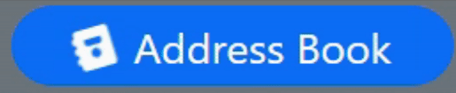
<i class="fas fa-address-book me-2 fa-spin"></i> Address Book
So why would you want an icon to spin? Well, they make for pretty good indicators that something is going on, particularly given the asynchronous nature of TMS WEB Core applications in general. One day we might cover the insanity that is progress bars. But for now, let's just stick with spinners. For example, a button can be set up with an icon that is not spinning. When you click it, It starts spinning to indicate to the user that some asynchronous operation has started. And then that operation stops it spinning when it is done. If only everything else was so simple. It might look a bit like this, if you were updating an address book, for example.
WebButton1.Caption := '<i class="fas fa-address-book me-2 fa-spin"></i> Address Book';

results := await(...some call to an XData server perhaps...);

WebButton1.Caption := '<i class="fas fa-address-book me-2"></i> Address Book';
The idea is that the icon will spin while the operation is being performed. And then stop (and be put back in the right orientation) when the operation completes. How fun is that? It's fun, trust me. And you're not limited to just spinning. In the latest Font Awesome 6, there are a bunch of animation types including fa-beat, fa-fade, fa-beat-fade, fa-flip, fa-bounce, and fa-shake. Each of these animation types can be adjusted so if you'd like your icon to spin faster or slower, or even backward, you've got plenty of options. I've got a project where an icon spins in one direction while a form is loading, and then in the other direction while its WebFormCreate method is being executed. See? Fun. Just like I said.
Still Not Impressed?
Sizing and Animation are just two out of fourteen style customization sections on the Font Awesome 6 website. They've even got a cheatsheet to help make it easier. Here are some other ideas that could take advantage of the more advanced options.
- Add Text or Counters. When an operation completes, you could update the icon with a representative value. Like the bubble showing the count on a new messages indicator. Maybe show how many records were returned, or the time taken, or something else entirely.
- Layers. Icons can be combined in several ways. Simple layers, more complex masks, and different colors can be used to convey lots of things. For example, overlaying a flag on a user account to indicate a certain status or adding a big red circle with a line through it over top of an icon representing a function that is off-limits at the moment.
- Lists. Better bullets, bullets that can be animated showing that they're in progress, that kind of thing. Could likewise be used in menus in the same way.
There should be something there for everything icon-related that you can think of!
Sample Project v2
Last time out a simple Sample Project was provided where you could simply type in some Bootstrap classes and see how they'd look when applied to a TWebLabel or a TWebEdit component. Nothing too fancy. Well, now that we've covered Font Awesome, we can add it to the project and spruce things up a bit. As we go through different JavaScript libraries, the intent is to add them to the project in some way. Both to show how the JavaScript library works and also to give a live working example of the many different things that a TMS WEB Core developer is likely to run into. Even with just Bootstrap and FontAwesome on our plate, we can do some fancy stuff.
Sample Application.
The most obvious upgrade is that I've added a good chunk of the Bootstrap classes (I won't say all because I'm sure I've overlooked a few) as buttons that you can use to quickly toggle classes and see how they look. I won't be so bold as to even hint that anything in the code is considered "best practices". Rather, think of the Sample Project as just that - a sample of how to do things. Not always the best way. Hopefully not the worst way. I'm sure any part of it can be picked apart and improved. Over time, that's all part of the plan. If you've got some feedback on the project, feature requests, or things of that nature, by all means, please post a comment below. Here's a summary of things you might run across in the latest version.
- Theme switcher. In the top-right corner are a few buttons that allow you to swap themes. All the theme-related work happens via CSS, so check out the included samplestyle.css file for the gritty details.
- Dynamic Buttons. The Bootstrap class buttons are all created at run-time. So you can see one way to do that. Clicking a button will toggle that class in the ElementClassName property. Similarly, changing the ElementClassName property will highlight the class buttons.
- Drag and Drop. The buttons can be dragged over the ElementClassName field or any other class-related field if available. Like ElementLabelClassName in the case of TWebLabel.
- Font Awesome Icon Picker. A row for FontAwesome has been added and includes just the Font Awesome 5 Free icons. Choose the icon attributes you want and then click on the icon button or drag it into one of the Caption or HTML properties to add it.
- Loading Progress. When the app starts, it takes a bit of time initially to create all the buttons and to populate the lists of icons, so a Loading Progress mechanism was added. Would be better to improve the performance of those operations, but in the interim, this is one way to improve the user experience rather than just blocking the page while the operation runs.
The initialization step was particularly troublesome as I wanted to be able to display an updating message as the various steps were completed. But unless you give the browser a chance to refresh the page, it will happily chug away and NOT update the page at all. So the initialization was split into a bunch of pieces and then some TWebTimer components were used to insert tiny delays into the overall process, allowing for the browser to do its refresh. This gives the result I was looking for. I'm curious how others might have tackled the same problem?
Download the sample project here.
But Wait. There's More!
Well, yes there indeed is more to Font Awesome, but that's all we're going to cover today. A future article in this series will revisit Font Awesome to cover a few more aspects. Like FontAwesome Kits. Why all the excitement about SVG. Fun with CORS. And so on. But until then, I'd love to hear about any icon-related shenanigans you've run across or about any problems that we might be able to address. And if you were one of the developers of those apps years ago with an absolutely absurd set of icons, well, I forgive you 😁
Follow Andrew on 𝕏 at @WebCoreAndMore or join our 𝕏 Web Core and More Community.
Andrew Simard

This blog post has not received any comments yet.
All Blog Posts | Next Post | Previous Post