Blog
All Blog Posts | Next Post | Previous Post

 Extend TMS WEB Core with JS Libraries with Andrew:
FlatPickr (Part 2 of 2)
Tuesday, May 17, 2022

Last time out, we looked at how to incorporate FlatPickr into a TMS WEB Core project. We had taken what might be considered the manual approach. A link to a CDN or other source for the library was added to the Project.html file, and then a little JavaScript code was used to manually link the library's code to an element that had been placed on a TWebForm. This worked quite well and is typically how I use this and many other JavaScript libraries in my projects.
But there is another way that might be more consistent with how Delphi is used much of the time - by using components. So in this post, we'll revisit the same JavaScript library, but we'll walk through how to create a component that will appear on the Delphi IDE's Component Palette. From there, we will be able to add FlatPickr controls to any TWebForm or wherever we need the component to appear, just as easily as we do with a TWebLabel or a TWebEdit. And we'll be able to adjust many of the options that we want to pass to FlatPickr by setting properties in the Delphi IDE Object Inspector.
Motivation.
Beyond just making it easier to use FlatPickr in a TMS WEB Core application, the idea of this post is to get a handle on how to create a Delphi package that can include many such controls. As we make our way through more JavaScript Libraries and their controls in the posts to come, we'll hopefully be able to upgrade this package with those new controls as well, and maybe even toss in some others along the way. This package can then be installed by anyone working on TMS WEB Core projects and thus get easier access to all the JS Libraries we're covering in one simple step.
Note that if you're using a JavaScript Library in a one-off kind of situation, the work needed to create a component wrapper is likely to be substantially more work than the manual approach. But there is the potential to save time and effort in (at least) the following scenarios.
- When you want to use many instances of a component, perhaps in multiple forms.
- When you want to use the same component in multiple projects.
- When you don't want to have to meddle with JavaScript or the nuances of the underlying JS Library.
- When you want to create something to be used by others, saving them time and effort.
- When someone has already created the component for you.
By having these kinds of controls in Delphi, you can simply work away as you normally would without even really having to know that you're using a JavaScript library.
Creating a Package.
But before we run off creating components, the first thing we're going to do is create a package to hold these kinds of components. Right out of the gate, we've got a few things to cover. Writing TMS WEB Core applications in Delphi means that we're using the Delphi IDE to do part of the work, and then transpiling our code using pas2js behind the scenes to produce the final code that runs in a browser.
But the Delphi IDE doesn't know all that much about JavaScript or HTML or CSS or things like that - it is a Delphi environment, after all. And once the application is running in a browser, it has largely forgotten about anything related to Delphi or Pascal.
When we develop components, we also need to straddle this divide, and we do this by essentially providing two versions of the component - one that keeps the Delphi IDE happy (the design-time version) and one that keeps the pas2js compiler happy (the run-time version). We see this within TMS WEB Core itself, where there are two sets of code.
- The Component Library Source folder contains all the components, but many of the functions and procedures are just stubs - commented out. There's enough there to enable functional code completion in the Delphi IDE, provide properties via the Object Inspector, and maybe even some icons for the Component Palette. But not much more than that.
- The Core Source folder contains all the same components, but a separate implementation of all the functions and procedures, classes and so on that need to be compiled into the final application.
Problems can arise if there are any discrepancies between the stubs in the Component Library Source folder and their equivalents in the Core Source folder. It is often a source of confusion (some might say alarm!) when looking at code in the Component Library Source, only to find nothing but stubs. Something that catches many of us off guard (myself included) the first time we go looking at this code.
Configuring Delphi to use this arrangement of folders isn't difficult - the TMS WEB Core installer does this for you by default. But if you're the tinkering type, making changes to how these are presented to Delphi is a pretty solid way to cause problems. When developing components, we have to keep this arrangement in mind as well, however. We'll also need two sets of code - one for the design-time IDE environment and one for the run-time JavaScript environment.
Our (eventual) suite of components is going to be known as the JSExtend Package. So we'll start by creating a JSExtend folder in our usual Delphi Projects folder. And then within this folder, we'll create a separate Design-Time and a Run-Time folder to follow the same approach as the Component Library Source and Core Source folders. The Design-Time folder will then contain everything we'll be needing within the Delphi IDE, and the Run-Time folder will contain everything we'll be needing when compiling the final JavaScript application.
...\Projects\JSExtend
...\Projects\JSExtend\Design-Time
...\Projects\JSExtend\Run-Time
Design-Time Package.
Let's deal with the Design-Time package first. This is what will be used within the Delphi IDE. Starting from nothing, the first step is to use the Delphi New/File menu to create a new package. Note that I'm using Delphi 10.3.2 for this (and TMS WEB Core 1.9.8.3), so it may not look the same if you're using a different version of Delphi. When working on TMS WEB Core applications within Delphi, it is more or less a VCL environment. So we don't have to do anything initially that is specific to TMS WEB Core here, just create a new Delphi Package.
After creating the Delphi Package, saving it will prompt you for a folder to put it in (JSExtend/Design-Time), then the project name (JSExtend), and the project group name (JSExtend Group). If you then build the project, it doesn't really do very much. But it also shouldn't have any errors, warnings, or hints at this stage. You could even install it, but as it doesn't have any components, this will not be of much use.
Creating A Component.
The very, very, very last section in the TMS WEB Core documentation covers creating four different kinds of components.
- Non-visual components.
- HTML components.
- FNC components.
- jQuery components.
Non-visual components might be useful for situations where there are just data types or functions that need to be packaged up into a component. We'll try this approach out when we get to Luxon, for example, which has no visual elements. Any JavaScript library that isn't a Control might fall into this kind of component.
HTML components are used when you want to use some kind of HTML element as the base for your component. This is exactly what we're after. But let's quickly look at the other kinds of components just to be sure this is the best one.
FNC components are great for when you want to have a component that works across all the platforms that FNC supports, such as WEB, VCL, FireMonkey, iOS, Android, and so on. It is perhaps more applicable when you want to actually draw the control yourself. In HTML, this likely means making heavy use of <canvas> elements, which allow you to closely mirror how you might draw the same controls in a VCL environment. All good, but not particularly what we're trying to do here. FlatPickr can look after drawing itself. And I'm no fan of the <canvas> tag as it tends to interfere with theming efforts. There are plenty of other solid reasons to use FNC though, and there's not necessarily a requirement to use <canvas> so something to consider, particularly if you want to create multi-platform components.
jQuery components are a natural fit of course for when you're wanting to make a Delphi component that uses a JavaScript jQuery library. In our case, as FlatPickr doesn't itself require jQuery, there's little sense in introducing jQuery as a dependency just to use it as a component. If jQuery is already a part of your project, then by all means that approach may work best. There are also quite a few jQuery components that are included by default with TMS WEB Core that are worth checking out, both for use in your own projects as well as examples of component authoring.
For our purposes, #2 seems to be the best match - HTML components. FlatPickr does need an HTML element to bind to, and not much else to start with.
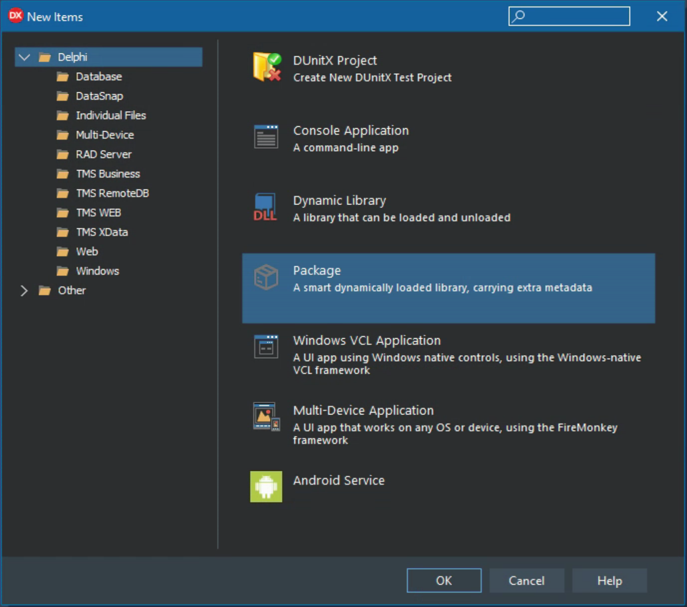
Creating a component starts with selecting Components/New Component... from the Delphi IDE menu. For the very first screen, we're going to pick VCL but a bit later we'll need to make some changes to make sure this component is available within a TMS WEB Core application.
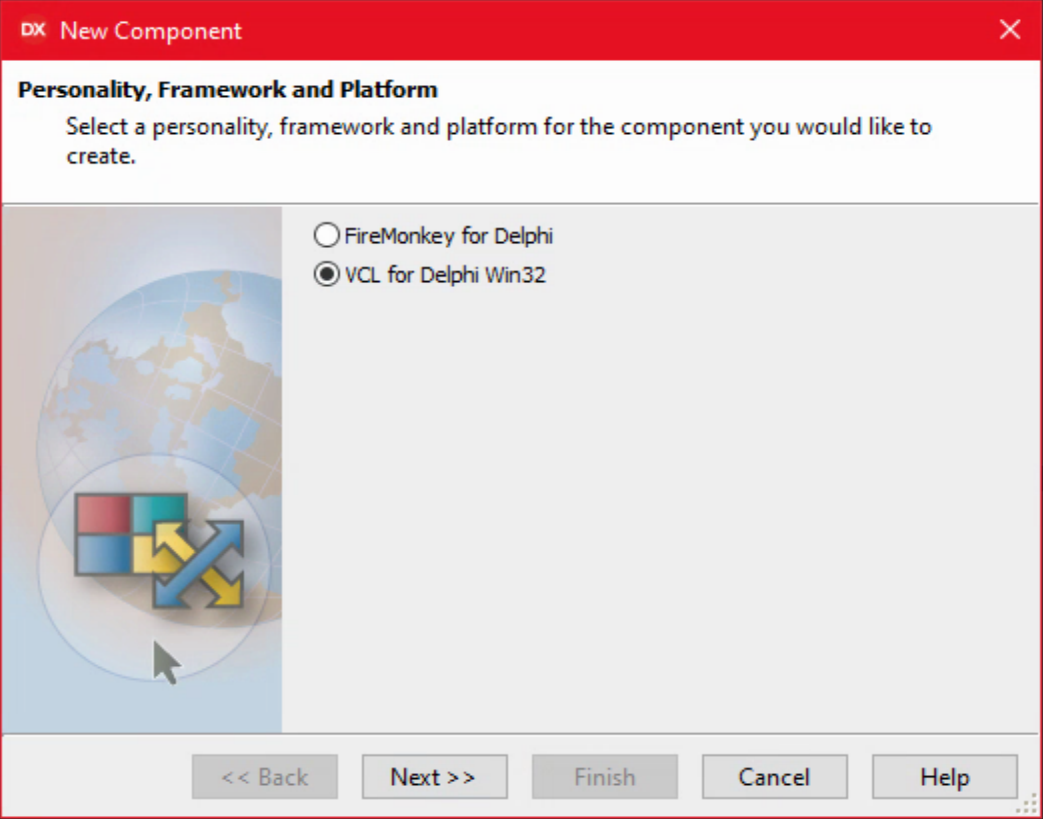
Delphi's New Component Interface.
As we're working with TMS WEB Core, the ancestor class we want to use is TWebCustomComponent.
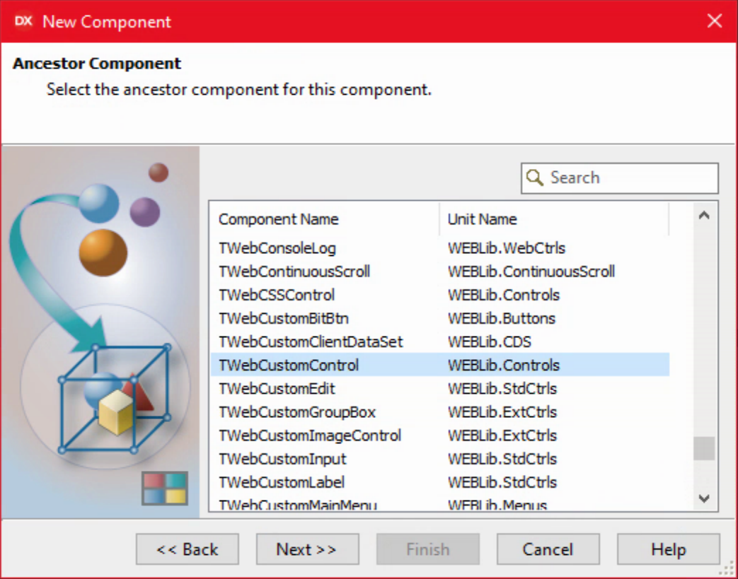
Delphi's New Component Interface - Ancestor Selection.
The next page asks a few more questions. We'll want these components gathered together in their own group in the Delphi Component Palette, for example.
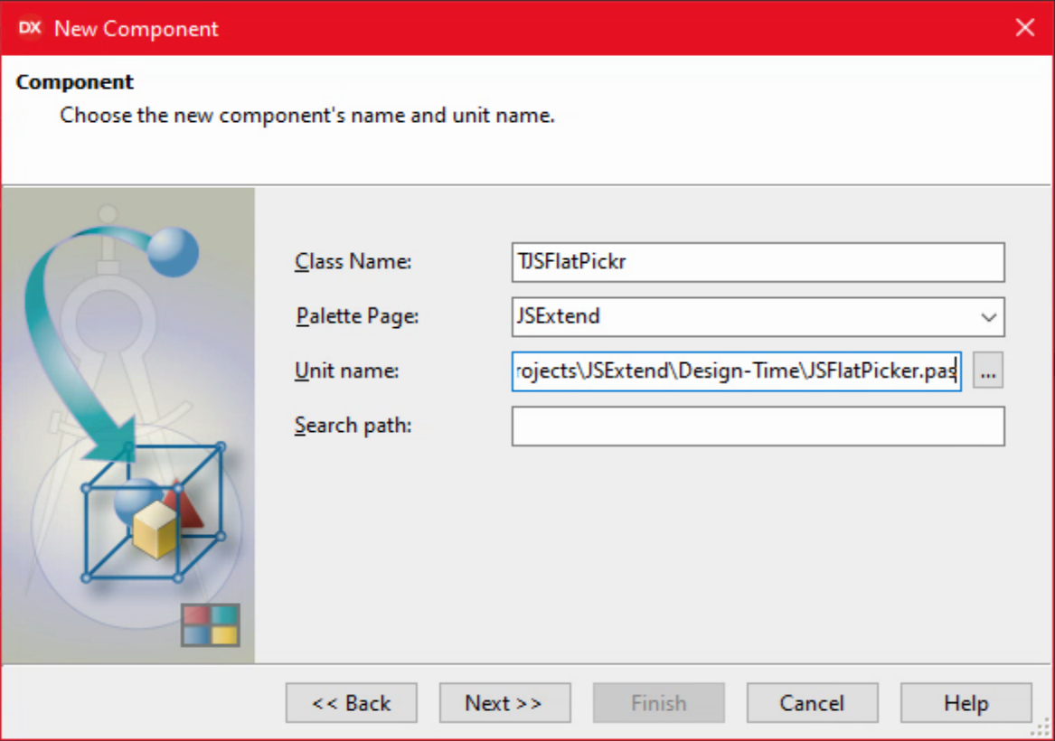
Delphi's New Component Interface - Options.
The last page asks about where to create the unit for this component. A few options are available, but as we just created a package for this purpose, we're going to use that.
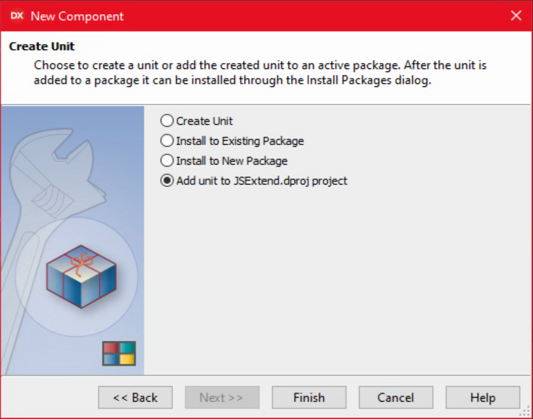
Delphi's New Component Interface - Creating the Unit.
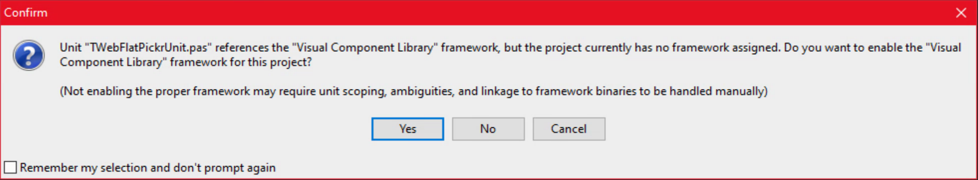
This is followed by a dialog asking where to save the unit. It will go into the Design-Time folder. Another message may also appear. Here I just said "Yes". We'll be addressing the issue the message is talking about in just a moment.
Delphi's New Component Interface - Additional Message.
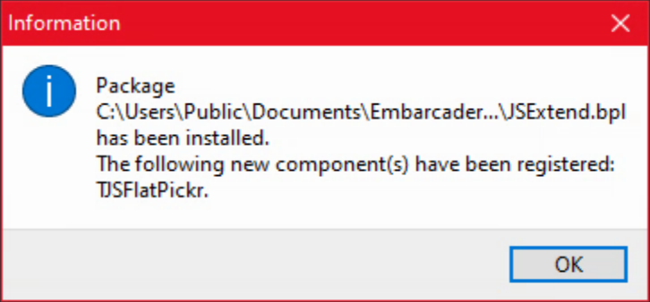
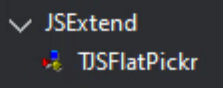
With that out of the way, we now have a new component to work with. Saving and building the project should not generate any errors, warnings, or hints. In fact, if you installed the package, it should work. Right-click on JSExtend.bpl in the Project Manager window and select Install. This should be the result. All good so far!
New Component Insatallation.
But of course, we don't want to really do that just yet. This is just a default VCL component. We'll need to do a bit more work to get it into shape for our purposes.
Component Palette Icon.
Components appearing in the Component Palette typically have an icon. Sometimes they don't, and you end up with the default icon, like this.
Default Component Palette Icon.
That's rather boring but easily fixed. You'll need a BMP image (not an ICO, JPG or PNG) to start with. Then in the Project menu, choose Resources and Images... and add the bitmap. The 'trick' here is that the name of the resource should be the same as the name of the component, but all uppercase. I don't know if the image size matters much (I tried a few) but it seems to scale reasonably well. If you're using an older version of Delphi, this process may not be as pleasant and you'll likely need to use a Bitmap of a specific size. 24px x 24px is probably where you'll want to start.
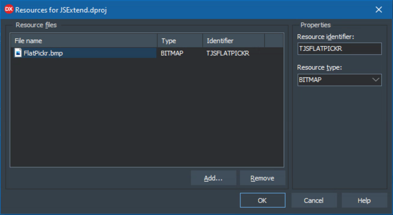
Adding an Icon as a Resource.
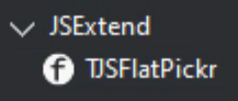
Re-installing the package updated the icon. No trouble at all.
Component with Custom Icon.
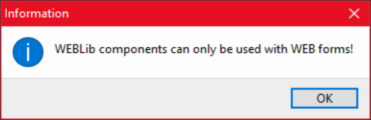
Note that in order to see the component in the Component Palette, I had to be working with a TForm. If I was working on a TWebForm or some other bit of Delphi that didn't have a form, then this component would not appear in the Component Palette. So let's tackle that next.
Component Platforms.
So far, we've got a component in our package that, when installed, will appear in the list of components for a TForm. But in order for it to be available as a component for a TWebForm, the kind of form used by TMS WEB Core, we need to add an attribute to our class, [ComponentPlatforms(TMSWebPlatform)]. Our (blank) component source now looks like the following.
unit JSFlatPickr;

interface

uses
  System.SysUtils, System.Classes, Vcl.Controls, WEBLib.Controls;

type
  [ComponentPlatforms(TMSWebPlatform)]
  TJSFlatPickr = class(TWebCustomControl)
  private
    { Private declarations }
  protected
    { Protected declarations }
  public
    { Public declarations }
  published
    { Published declarations }
  end;

procedure Register;

implementation

procedure Register;
begin
  RegisterComponents('JSExtend', [TJSFlatPickr]);
end;

end.
Installing (or re-installing) the component after this change should mean that if we're editing a TWebForm in the IDE, the component shows up as expected, typically at the very bottom of the Component Palette list. It still should also show up when working with a VCL TForm, but if you try to add it to the form you'll likely get the following message. Which is exactly what we want to happen.
Confirming our Component is Specific to TMS WEB Core.
NOTE: Depending on the order that you do things, this may or may not go smoothly. Turns out that Delphi has a "Package Cache" in the Windows Registry that doesn't necessarily get updated when making certain kinds of changes. And adding an attribute in this fashion seems to qualify. So while I could still see the component on TForms, it wasn't initially visible when working with TWebForms after adding the attribute, even when reinstalling the package. Restarting the IDE didn't help either. What did seem to work were the following steps. Could probably skip some of them, but this only takes a moment either way.
- Project/Build All/
- Uninstall package using Project Manager.
- Close Delphi.
- Start RegEdit.
- Search Regedit for the class (TJSFlatPickr in this case).
- Delete entire Package key that appears under Package Cache eg: Delete HKEY_CURRENT_USER\SOFTWARE\Embarcadero\BDS\20.0\Package Cache\JSExtend.bp.
- Close RegEdit.
- Start Delphi.
- Project/Build All.
- Install package using Project Manager.
After that, the component showed up as expected. Kind of a pain, but this was the only situation where that was needed. If I hadn't installed the component in the previous step and had instead installed it after adding the attribute, this likely would not have been an issue at all.
What's the Metric Equivalent of Inching Forward?
Small steps here, either way. So up next then is to add some properties to our control, just to test the waters a little bit. We can set the default size of the control when it is dropped on a form, for example. One of the properties we're definitely going to need is "inline" - a boolean option that determines whether the whole FlatPickr calendar is visible or whether it is just an input field that has a calendar dropdown. Another boolean option is whether to "enableTime" in the control. Eventually, we'll get to the entire list of options that is on the FlatPickr website, but let's try these out first.
For properties to be accessible from the IDE, they need to be added to the published declarations of the unit. These first parameters are of type Boolean and should have a default value of False. You could change the defaults here if you'd prefer something different, like having the "inline" version of the datepicker shown by default. We'll stick with whatever FlatPickr has chosen for its own defaults. And, just to be annoying, we can't use "inline" as it is a reserved keyword. So we'll go with "CalendarInline" instead. The values of these properties also need to be stored somewhere. A little off-topic at this point, but we'll define some fields as part of the class, and then reference them in the property declaration. The 'F' prefix is intended to be a reminder that these are "fields" and not "variables".
Our new component is built off of a TWebCustomComponent, so it already has quite a bit of structure to it. The only thing we're going to do is just adjust the size of the control when it is dropped on the form. Not for any particular reason other than as a reminder that it will need to somehow fit into the page layout. The final size will depend on many things that are well beyond the scope or control of the IDE.
Code in the Design-Time package (what we're dealing with here) is only used while in the IDE, so there's really not much to do here unless you want more things to happen when you change properties while in the IDE. In other environments (like the VCL) this is a powerful way for you to get a preview of what the control will look like when the app is running. But in our case, the IDE doesn't render HTML or CSS so there's not much we can do in this regard. Instead, we'll just use the IDE portion as a blocking tool of sorts - so we'll know how much space it is expected to take up but not really much else. The result of these changes is then the following.
unit JSFlatPickr;

interface

uses
  System.SysUtils, System.Classes, Vcl.Controls, WEBLib.Controls;

type
  [ComponentPlatforms(TMSWebPlatform)]
  TJSFlatPickr = class(TWebCustomControl)
  private
    { Private declarations }
    FCalendarInline: Boolean;
    FEnableTime: Boolean;
  protected
    { Protected declarations }
  public
    { Public declarations }
    constructor Create(AOwner: TComponent); override;
  published
    { Published declarations }
    property CalendarInline: Boolean read FCalendarInline write FCalendarInline default False;
    property EnableTime: Boolean read FEnableTime write FEnableTime default False;
  end;

procedure Register;

implementation

procedure Register;
begin
  RegisterComponents('JSExtend', [TJSFlatPickr]);
end;

constructor TJSFlatPickr.Create(AOwner: TComponent);
begin
  inherited;
  Width := 200;
  Height := 30;
end;

end.
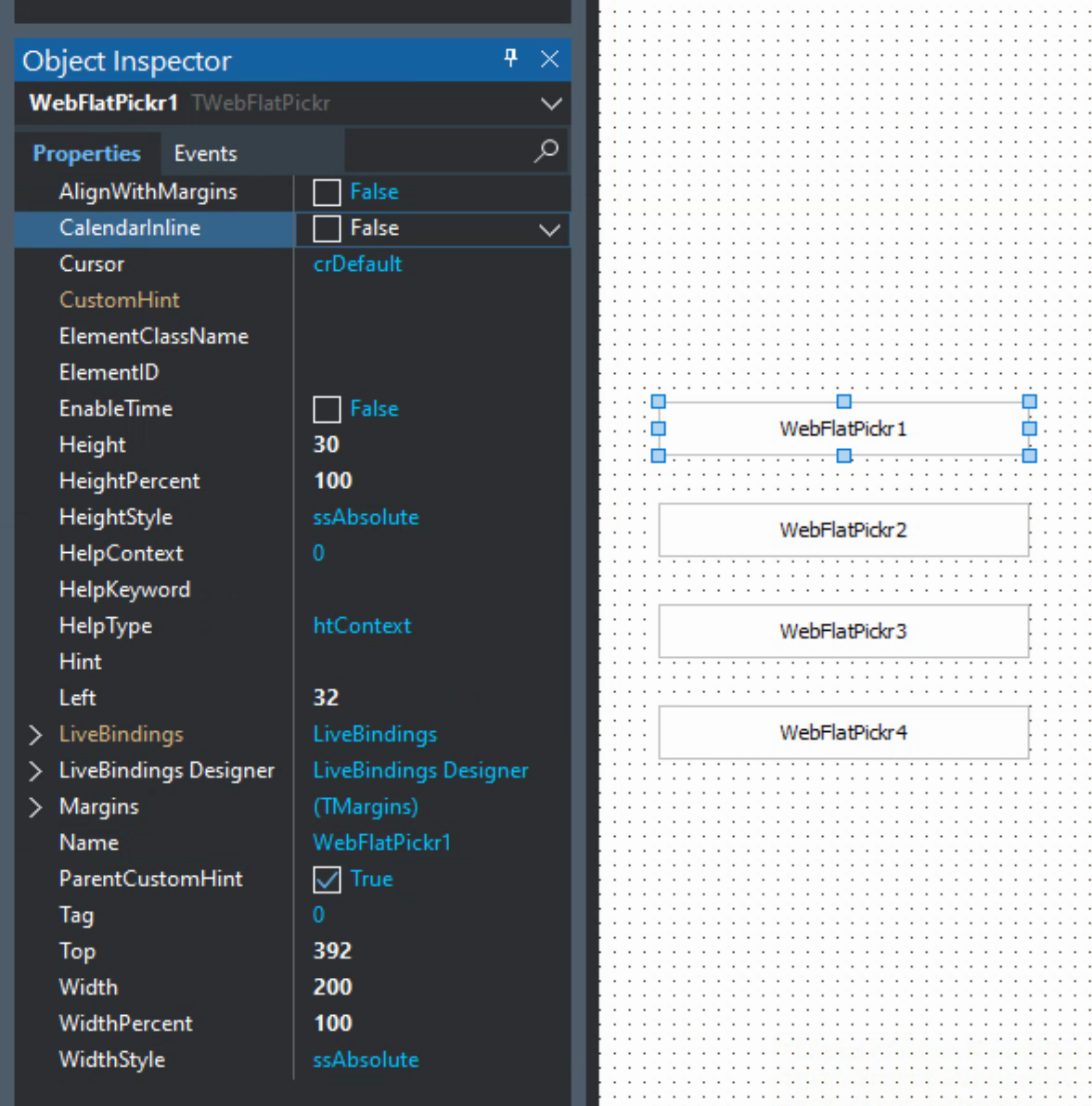
All good. Now when the package is reinstalled, adding a TJSFlatPickr component to a TWebForm works as expected. The default size of the component is 200x30, and there are two new properties, CalendarInline and EnableTime, both set to False by default. We'll add four just to try out the four combinations of our two boolean properties in a little bit, but note that there is no visible change in the components on the form when these properties are changed. Here's what it looks like.
Components Dropped on the Form.
Categorize That Property.
When using the Object Inspector, properties can be categorized. Anything unexpected automatically appears under Miscellaneous. As we've got a lot of properties here, we'll create a FlatPickr category to put them in. Of course, if you don't view the list of properties in its categorized form, this will have little relevance to you.
When dealing with packages, getting this to work requires adding DesignIntf to the uses clause of our TJSFlatPickr unit, as well as adding designide.dcp to the requires clause of the package. With those in place, we can use something like this to categorize the properties. We'll do this for all of the FlatPickr properties.
procedure Register;
begin
  RegisterComponents('JSExtend', [TJSFlatPickr]);
  RegisterPropertiesInCategory('FlatPickr', TJSFlatPickr, ['CalendarInline', 'EnableTime']);
end;
Property Functions.
The properties at the moment just reference their corresponding fields and do not make use of any get or set functions. This might be a little different from the many examples floating around where functions are used to perform other related tasks. In this case, I've not done this (yet) just to keep things simple. At the outset, we're just wanting to use these properties when initializing the FlatPickr control. We'll change this later so that components created at run-time can also be managed by changing properties as well.
Note, however, that in the case of FlatPickr, and likely in many other cases, some properties cannot be changed after the control has been created. This is the case for both of the properties we've created and is a 'limitation' of FlatPickr, not of Delphi nor of TMS WEB Core. So having the flexibility of set/get functions may be of little help here, and also complicates the Run-Time generation of controls where the control might be created with an unsuitable default. We'll need a way to work around that, which we'll get to in due course.
Run-Time Source.
Alright. We have everything on the Design-Time side working just as we'd like. Now we need to do something similar to implement the Run-Time side.
In the case of TMS WEB Core applications, we don't need to go through the work of installing a Run-Time package separately but we do need to tell it where to find the code so that it can be compiled into the project. This can be done using the options found via the Tools/Options... menu, and then under TMS WEB / Options / Library Path. This is the equivalent of how the components included with TMS WEB Core are split between two different folders. Alternatively, you can just add files to your project directly, so it will know where to look by virtue of having the reference to it in the project itself.
The code in question is just the JSFlatPickr.pas unit. In the Design-Time package, everything is just a wrapper for this unit. In the Run-Time version, all we really need is the unit itself. So it is the location of this file (and later, other units in the same folder) that Delphi needs to be aware of - by either using the Library Path mentioned above or by adding the unit(s) to your project.
The Run-Time version of JSFlatPickr.pas should largely mimic the Design-Time version, particularly in terms of properties. But we don't need to concern ourselves with registering components. We just want to be sure that whatever values we've set up in the IDE or in the Object Inspector are accessible here at run-time. Here's what we've got to start.
unit JSFlatPickr;

interface

uses
 Classes, WEBLib.Controls, Web;

type
  TJSFlatPickr = class(TWebCustomControl)
  private
    { Private declarations }
    FInitialized: Boolean;
    FCalendarInline: Boolean;
    FEnableTime: Boolean;
  protected
    { Protected declarations }
    function CreateElement: TJSElement; override;
    procedure Loaded; override;
  public
    { Public declarations }
  published
    { Published declarations }
    property CalendarInline: Boolean read FCalendarInline write FCalendarInline default False;
    property EnableTime: Boolean read FEnableTime write FEnableTime default False;
  end;

implementation

function TJSFlatPickr.CreateElement: TJSElement;
begin
  Result := document.createElement('DIV');
end;

procedure TJSFlatPickr.Loaded;
var
  elDIV: TJSElement;
  elINPUT: TJSElement;
begin
  inherited Loaded;

  if not(FInitialized) then
  begin
    FInitialized := True;

    // Creating this structure:
    // <DIV>
    //   <INPUT>
    // </DIV>

    elDIV := document.getElementById(ElementID);
    elINPUT := document.createElement('INPUT');
    elDIV.appendChild(elINPUT);

    // Attaching FlatPickr to the INPUT element
    // Setting properties as assigned in the IDE
    asm
      flatpickr(elINPUT, {
        inline: this.FCalendarInline,
        enableTime: this.FEnableTime
      })
    end;

  end;
end;

end.
There are a few things going on here that are a little different. First off, the CreateElement function will be called as each instance of a TJSFlatPickr component is found on the TWebForm. However, this is called before the properties from the TWebForm (the .DFM) are loaded, so all we're doing at this point is creating the initial <div> element.
The Loaded procedure gets called when all the properties for a component have been loaded. It might (or rather, it very likely will) get called more than once, so we've added a FInitialized field to the component to help make it easy to ensure that we only do the setup work one time for each component. Could probably do the same thing by checking whether ElementID has a value or not, but doing it this way is easy to follow as well.
The ancestor of our TJSFlatPickr component is a TWebCustomControl, so it has all the usual properties like ElementID and ElementClassName. When we set up a new TJSFlatPickr control, what we're actually creating is a little bit of HTML, and then running some JavaScript that is pointed at a particular piece of that HTML, as shown in the code above. Nothing too fancy in this case, but it is easy to see how this could be expanded to handle more complex scenarios without too much trouble at all.
And finally, we get to the point of all of this, which is the code that initializes the FlatPickr control. The two options we've chosen to start with, inline and enableTime, are just boolean options that are passed in when the FlatPickr JavaScript object is first created. We have to prefix our fields with 'this.' to work in the JavaScript block, but as we're just dealing with boolean values, nothing else is required in terms of converting Delphi Object Inspector properties to JavaScript object options. We won't be so lucky with all the properties, but to start with this works pretty well.
After rearranging the component layout and setting the different combinations of CalendarInline and EnableTime properties, it isn't really much to look at in the IDE. Note that that's all we've really done here for a demo application. Create a new TMS WEB Core application. Drop four TJSFlatPickr controls on the form and arrange them. Set the two properties. Add the FlatPickr JS and CSS links to Project.html. And then run.
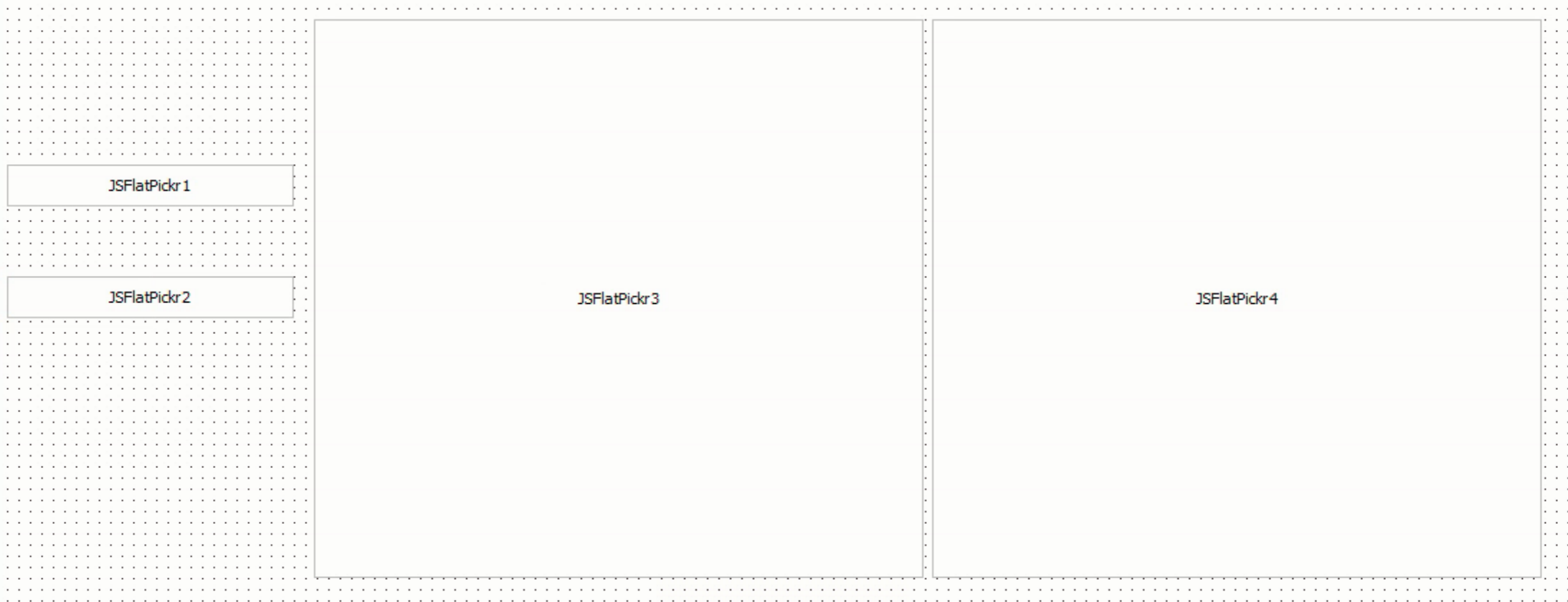 Demo of Using TJSFlatPickr Components in the Delphi IDE.
 But once the app is launched, it comes to life! No JS coding in the demo application at all, and no real indication that JavaScript is even part of the equation.
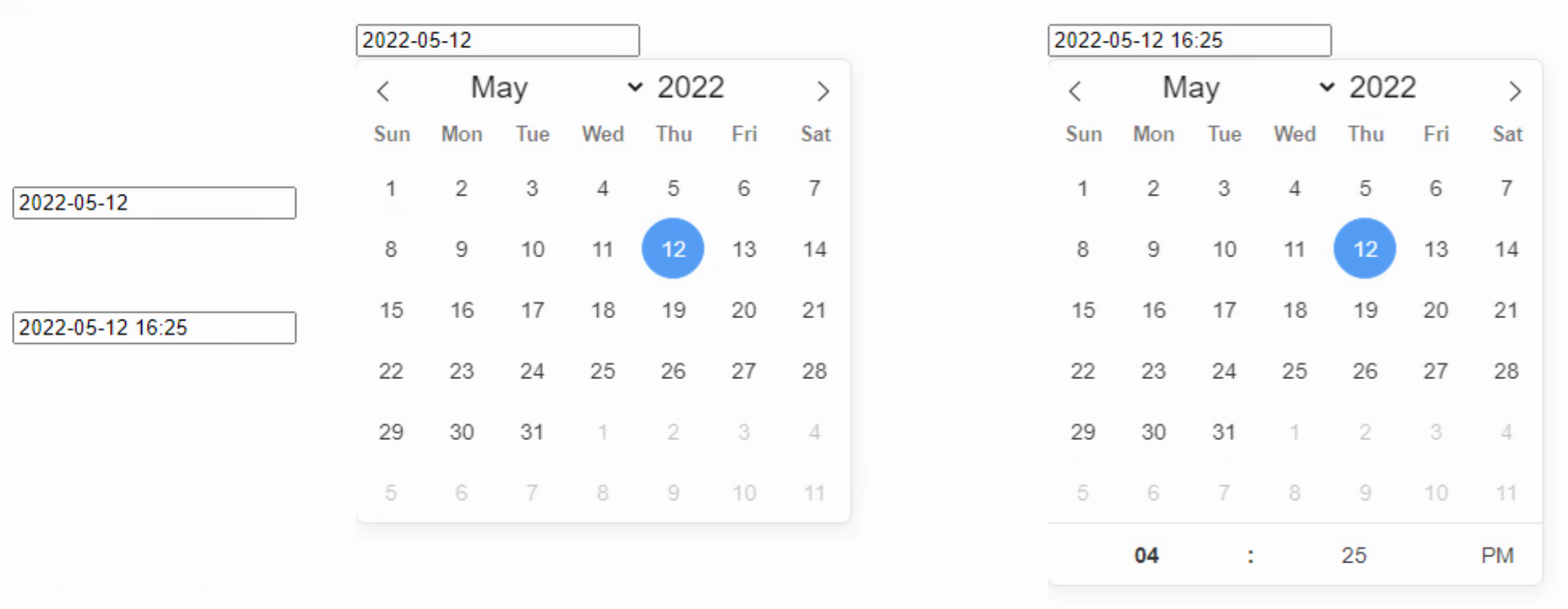
Demo Project Runtime.
More Options Please.
What's left? Well, there are dozens of options that can be passed to a FlatPickr instance when it is being created, and at least eight different events that it can communicate with. Some of these aren't particularly interesting or relevant to a TMS WEB Core application, but we do need a bunch more to make this a viable component. With our structure in place, some of these will be trivial to implement. We'd also want options to be set at runtime, where possible, so we'll rearrange the code to use the get/set functions to accomplish this. So let's tackle the easy bits first - the simple option types.
There are a good number of boolean options. We've already covered two of them, so adding the rest is pretty easy. The only things I'm thinking about here are keeping the names of the options as close as possible to what is on the FlatPickr website, and ensuring that the defaults are the same. Here's the complete list of boolean options.
- altInput (False)
- allowInput (False)
- allowInvalidPreload (False)
- animate (True)
- clickOpens (True)
- disableMobile (False)
- enableTime (False)
- enableSeconds (False)
- inline (False)
- noCalendar (False)
- shortHandCurrentMonth (False)
- static (False)
- time_24hr (False)
- weekNumbers (False)
- wrap (False)
The two that aren't going to work (because they are Delphi reserved keywords) will get a Calendar prefix, so we'll call them CalendarInline and CalendarStatic. Otherwise, these just follow the same pattern that we've used already. Could just as easily use a suffix or any other name.
Next up is the integer fields. Not as many of these, but still useful. We're not going to do too much about error-checking here, so if you want to set them to something ridiculous, I'm sure you'll be rewarded in kind. There is not much different about implementing properties that are integer instead of boolean. Defaults still apply. Generally speaking, the fewer bits of code that we place between the component and the actual JS library, the better, as we'll have less work to do to keep this implementation current as FlatPickr evolves on its own over time. Here's what we've got for integer options at the moment. Fortunately, none of these are Delphi-reserved keywords.
- defaultHour (12)
- defaultMinute (0)
- hourIncrement (1)
- minuteIncrement (5)
- showMonths (1)
The next most difficult type to tackle is a string. There are no defaults for string properties - the default is automatically "". But we can set defaults when the component is created, just like we do when we set the Width and Height. In the list of FlatPickr options, there are a handful of simple strings that we can set up here. There are also a few that are listed as strings but are really a set of fixed choices. And then there are some that are something else entirely. So we'll get to those in a moment. The simple strings are as follows.
- altFormat ("F j, Y")
- altInputClass ("")
- ariaDateFormat ("F j, Y")
- conjunction ("")
- dateFormat ("Y-m-d")
- nextArrow (">")
- prevArrow ("<")
Note that when it comes to date formatting tokens, we're not in Delphi anymore. FlatPickr has its own surprisingly short list that you can find here. I personally like the defaults (aside from the time - that really should be 24hr by default) as it is usually the nicer version of ISO8601, like 2022-02-22 22:22:22, for example. But if you prefer something else, either for input or for display, you've got plenty of options. We'll have a deeper dive into this topic when we cover Luxon.
- appendTo ()
- positionElement ()
These last couple of items, appendTo and positionElement, are a little special in that we'll use whatever string is provided (if any) as a lookup for the HTML element value.
Several of the options are of type string, but they're really more like a list of choices. Not really an enumerated type as they are actually strings, but in the Object Inspector we'd prefer that the options available be limited to the list that FlatPickr is expecting, so, well, enumerated types. Here's what we're dealing with.
- mode ("single", "multiple", or "range")
- position ("auto", "above", "below", "auto left", "auto center", "auto right", "above left", "above center", "above right", "below left", "below center", "below right")
- monthSelectorType ("dropdown", "static")
The way this has been set up is to define a separate type for each of these (TJSFPmode, TJSFPposition, TJSFPmonthselector), and then let the Object Inspector do the hard work of making combo boxes and the rest of it.
Next up, ironically enough, we'll need to deal with some properties that relate to dates. The Delphi Object Inspector has a nice way of dealing with TDate properties (yay!) but seemingly not for TDateTimes or TTimes (boo!). Fortunately, we'll be able to get by with just TDate for the minDate and maxDate options. It is possible to make a custom TDateTime property editor - and I was tempted - but there actually isn't much of a justification for it here.
Note however that we have to convert from Delphi TDates into JavaScript dates, which is the opposite of what we covered last time. The 'gotcha' here is that the JavaScript code that generates dates (using a decoded TDateTime) uses zero-based months.
Aside from the options relating to functions, we're down to the last three - defaultDate, enabled, and disabled. These are a bit tricky as they can all be arrays of dates. And there are some crazy ways that arrays can be supplied here, well beyond anything the Object Inspector (or any UI, really) could be expected to handle.
In the case of defaultDate, the value can be an actual date, like the default value of Today() or perhaps Now() if we want to include the time. But it can also be arrays indicating what dates are initially selected. And "arrays" is plural here, meaning you can pass FlatPickr multiple arrays. Similarly, enabled and disabled refer to arrays of dates that are either enabled or disabled in the calendar. We're going to need different names for those of course, but how to deal with an array of dates?
For defaultDate, the thinking here is that the vast majority of the time this is either going to be set to the current date/time or it is going to be set to a specific date. We're not removing options here - there is always the possibility of using JavaScript to make changes to the FlatPickr instance directly, even after it has been created. It is just a question of how much can be crammed into the Object Inspector and still be useful.
We'll tackle this one with three properties. The first, defaultDate will be an enumerated list TJSFPdefault(Now, Today, Custom). Both defaultDateStart and defaultDateEnd end will be TDates. If defaultDate is Now or Today, Now() or Today() will be assigned. If defaultDate is Custom, then defaultDateStart will be assigned. For enabled and disabled, we'll just assume that it is a range that is needed, so we'll have enabledStart, enabledEnd, disabledStart, and disabledEnd which helps with the reserved keyword problem and gives some flexibility. If any of these are not set, then the option is not set.
There are some instances where one option can impact another. For example, if you set a range of enabled dates, but then set the defaultDate to be something outside of that range, the control won't normally accept it (see allowInvalidPreload if you actually want to do this). We're not going to do much about any of that, leaving it to FlatPickr to sort out its own affairs in this regard.
The goal is to have a new control work with the default settings when a component is first dropped on the form. But it doesn't take much fiddling to introduce oddities into the mix. We'll kind of "look the other way" for the moment and just assume that the developer is setting properties to values that don't break things unnecessarily. After adding in all the options as properties, here's where we're at.
unit JSFlatPickr;

interface

uses
  Classes, WEBLib.Controls, Web, SysUtils;

type
  TJSFPmode = (mdSingle, mdMultiple, mdRange);
  TJSFPposition = (poAuto, poAbove, poBelow, poAutoLeft, poAutoCenter, poAutoRight, poAboveLeft, poAboveCenter, poAboveRight, poBelowLeft, poBelowCenter, poBelowRight);
  TJSFPmonthselectortype = (msDropDown, msStatic);
  TJSFPdefaultdate = (ddNow, ddToday, ddCustom);

  TJSFlatPickr = class(TWebCustomControl)
  private
    { Private declarations }
    FInitialized: Boolean;
    // Boolean Properties
    FAltInput: Boolean;
    FAllowInput: Boolean;
    FAllowInvalidPreload: Boolean;
    FAnimate: Boolean;
    FClickOpens: Boolean;
    FDisableMobile: Boolean;
    FEnableSeconds: Boolean;
    FEnableTime: Boolean;
    FCalendarInline: Boolean;
    FNoCalendar: Boolean;
    FShortHandCurrentMonth: Boolean;
    FCalendarStatic: Boolean;
    FTime_24hr: Boolean;
    FWeekNumbers: Boolean;
    FWrap: Boolean;
    // Integer Properties
    FDefaultHour: Integer;
    FDefaultMinute: Integer;
    FHourIncrement: Integer;
    FMinuteIncrement: Integer;
    FShowMonths: Integer;
    // String Properties
    FAltFormat: String;
    FAltInputClass: String;
    FAriaDateFormat: String;
    FConjunction: String;
    FDateFormat: String;
    FNextArrow: String;
    FPrevArrow: String;
    FAppendTo: String;
    FPositionElement: String;
    FMode: TJSFPmode;
    FPosition: TJSFPposition;
    FMonthSelectorType: TJSFPmonthselectortype;
    // Date Properties
    FMinDate: TDate;
    FMaxDate: TDate;
    FDefaultDate: TJSFPdefaultDate;
    FDefaultDateStart: TDate;
    FDefaultDateEnd: TDate;
    FDisabledStart: TDate;
    FDisabledEnd: TDate;
    FEnabledStart: TDate;
    FEnabledEnd: TDate;
  protected
    { Protected declarations }
    function CreateElement: TJSElement; override;
    procedure Loaded; override;
  public
    { Public declarations }
  published
    { Published declarations }
    // Boolean Properties
    property AltInput: Boolean read FAltInput write FAltInput default False;
    property AllowInput: Boolean read FAllowInput write FAllowInput default False;
    property AllowInvalidPreload: Boolean read FAllowInvalidPreload write FAllowInvalidPreload default False;
    property Animate: Boolean read FAnimate write FAnimate default True;
    property ClickOpens: Boolean read FClickOpens write FClickOpens default True;
    property DisableMobile: Boolean read FDisableMobile write FDisableMobile default False;
    property EnableSeconds: Boolean read FEnableSeconds write FEnableSeconds default False;
    property EnableTime: Boolean read FEnableTime write FEnableTime default False;
    property CalendarInline: Boolean read FCalendarInline write FCalendarInline default False;
    property NoCalendar: Boolean read FNoCalendar write FNoCalendar default False;
    property ShortHandCurrentMonth: Boolean read FShortHandCurrentMonth write FShortHandCurrentMonth default False;
    property CalendarStatic: Boolean read FCalendarStatic write FCalendarStatic default False;
    property Time_24hr: Boolean read FTime_24hr write FTime_24hr default False;
    property WeekNumbers: Boolean read FWeekNumbers write FWeekNumbers default False;
    property Wrap: Boolean read FWrap write FWrap default False;
    // Integer Properties
    property DefaultHour: Integer read FDefaultHour write FDefaultHour default 12;
    property DefaultMinute: Integer read FDefaultMinute write FDefaultMinute default 0;
    property HourIncrement: Integer read FHourIncrement write FHourIncrement default 1;
    property MinuteIncrement: Integer read FMinuteIncrement write FMinuteIncrement default 5;
    property ShowMonths: Integer read FShowMonths write FShowMonths default 0;
    // String Properties
    property AltFormat: String read FAltFormat write FAltFormat;
    property AltInputClass: String read FAltInputClass write FAltInputClass;
    property AriaDateFormat: String read FAriaDateFormat write FAriaDateFormat;
    property Conjunction: String read FConjunction write FConjunction;
    property DateFormat: String read FDateFormat write FDateFormat;
    property NextArrow: String read FNextarrow write FNextArrow;
    property PrevArrow: String read FPrevArrow write FPrevArrow;
    property AppendTo: String read FAppendTo write FAppendTo;
    property PositionElement: String read FPositionElement write FPositionElement;
    property Mode: TJSFPMode read FMode write FMode default mdSingle;
    property Position :TJSFPPosition read FPosition write FPosition default poAuto;
    property MonthSelectorType: TJSFPmonthselectortype read FMonthSelectorType write FMonthSelectorType default msDropDown;
    // Date Properties
    property MinDate: TDate read FMinDate write FMinDate;
    property MaxDate: TDate read FMaxDate write FMaxDate;
    property DefaultDate: TJSFPdefaultDate read FDefaultDate write FDefaultDate default ddNow;
    property DefaultDateStart: TDate read FDefaultDateStart write FDefaultDateStart;
    property DefaultDateEnd: TDate read FDefaultDateEnd write FDefaultDateEnd;
    property DisabledStart: TDate read FDisabledStart write FDisabledStart;
    property DisabledEnd: TDate read FDisabledEnd write FDisabledEnd;
    property EnabledStart: TDate read FEnabledStart write FEnabledStart;
    property EnabledEnd: TDate read FEnabledEnd write FEnabledEnd;
  end;

implementation

function TJSFlatPickr.CreateElement: TJSElement;
begin
  Result := document.createElement('DIV');

  // Boolean Defaults
  FClickOpens := True;
  FAnimate := True;
  // Integer defautls
  FDefaultHour := 12;
  FDefaultMinute := 0;
  FHourIncrement := 1;
  FMinuteIncrement := 5;
  FShowMonths := 1;
  // String Defaults
  FAltFormat := 'F j, Y';
  FAriaDateFormat := 'F j, Y';
  FDateFormat := 'Y-m-d';
  FNextArrow := '>';
  FPrevArrow := '<';
  FMode := mdSingle;
  FPosition := poAuto;
  FMonthSelectorType := msDropDown;
  // Date Defaults
  FDefaultDate := ddNow;
end;

procedure TJSFlatPickr.Loaded;
var
  elDIV: TJSElement;
  elINPUT: TJSElement;

  jsmode: String;
  jsposition: String;
  jsmonthselectortype: String;

  minYear, minMonth, minDay :Word;
  maxYear, maxMonth, maxDay :Word;
  ddStartYear, ddStartMonth, ddStartDay, ddStartHour, ddStartMin, ddStartSec, ddStartMSec: Word;
  ddEndYear, ddEndMonth, ddEndDay, ddEndHour, ddEndMin, ddEndSec, ddEndMSec: Word;

  jsdefaultdate: String;

  jsenabled: String;
  enStartYear, enStartMonth, enStartDay: Word;
  enEndYear, enEndMonth, enEndDay: Word;

  jsdisabled: String;
  disStartYear, disStartMonth, disStartDay: Word;
  disEndYear, disEndMonth, disEndDay: Word;

begin
  inherited Loaded;

  if not(FInitialized) then
  begin
    FInitialized := True;

    // Creating this structure:
    // <DIV>
    //   <INPUT>
    // </DIV>

    elDIV := document.getElementById(ElementID);
    elINPUT := document.createElement('INPUT');
    elDIV.appendChild(elINPUT);

    // Convert Mode enumerated type to string
    if      FMode = mdSingle   then jsmode := 'single'
    else if FMode = mdMultiple then jsmode := 'multiple'
    else if FMODe = mdRange    then jsmode := 'range';

    // Convert Position enumerated type to string
    if      FPosition = poAuto         then jsposition := 'auto'
    else if FPosition = poAbove        then jsposition := 'above'
    else if FPosition = poBelow        then jsposition := 'below'
    else if FPosition = poAutoLeft     then jsposition := 'auto left'
    else if FPosition = poAutoCenter   then jsposition := 'auto center'
    else if FPosition = poAutoRight    then jsposition := 'auto right'
    else if FPosition = poAboveLeft    then jsposition := 'above left'
    else if FPosition = poAboveCenter  then jsposition := 'above center'
    else if FPosition = poAboveRight   then jsposition := 'above right'
    else if FPosition = poBelowLeft    then jsposition := 'below left'
    else if FPosition = poBelowCenter  then jsposition := 'below center'
    else if FPosition = poBelowRight   then jsposition := 'below right';

    // Convert MonthSelectorType enumerated type to string
    if      FMonthSelectortype = msDropDown then jsmonthselectortype := 'dropdown'
    else if FMonthSelectorType = msStatic   then jsmonthselectortype := 'static';

    // Convert MinDate, MaxDate, DefaultStart/End into something JS can use
    DecodeDate(FMinDate, minYear, minMonth, minDay);
    DecodeDate(FMaxDate, maxYear, maxMonth, maxDay);
    DecodeDate(FDefaultDateStart, ddStartYear, ddStartMonth, ddStartDay);
    DecodeTime(FdefaultDateSTart,ddStartHour, ddStartMin, ddStartSec, ddStartMSec);
    DecodeDate(FDefaultDateEnd, ddEndYear, ddEndMonth, ddEndDay);
    DecodeTime(FdefaultDateEnd,ddEndHour, ddEndMin, DDEndSec, ddEndMsec);

    // Deal with Disabled dates
    if (FDisabledStart <> FDisabledEnd) then
    begin
      jsdisabled := 'yes';
      DecodeDate(FDisabledStart, disStartYear, disStartMonth, disStartDay);
      DecodeDate(FDisabledEnd, disEndYEar, disEndMonth, disEndDay);
    end
    else
    begin
      jsdisabled := 'no';
    end;

    // Deal with Enaabled dates
    if (FEnabledStart <> FEnabledEnd) then
    begin
      jsenabled := 'yes';
      DecodeDate(FEnabledStart, enStartYear, enStartMonth, enStartDay);
      DecodeDate(FEnabledEnd, enEndYEar, enEndMonth, enEndDay);
    end
    else
    begin
      jsenabled := 'no';
    end;

    // Convert defaultDate enumerated type to string
    if      FDefaultDate = ddNow    then jsdefaultdate := 'now'
    else if FDefaultDate = ddToday  then jsdefaultdate := 'today'
    else if FDefaultDate = ddCustom then jsdefaultDate := 'custom';


    // Attaching FlatPickr to the INPUT element
    // Setting Object Properties as assigned in the IDE
    asm
      var fpAppendTo = document.getElementById(this.FAppendTo);
      var fpPositionElement = document.getElementById(this.FPositionElement);
      var mindate = new Date(minYear, minMonth-1, minDay, 0, 0, 0, 0);
      var maxdate = new Date(maxYear, maxMonth-1, maxDay, 0, 0, 0, 0);
      var defaultDateStart = new Date(ddStartYear, ddStartMonth-1, ddStartDay, ddStartHour, ddStartMin, ddStartSec, ddStartMSec);
      var defaultDateEnd = new Date(ddEndYear, ddEndMonth-1, ddEndDay, ddEndHour, ddEndMin, ddEndSec, ddEndMSec);
      var defaultnow = new Date;
      var disStart = new Date(disStartYear, disStartMonth-1, disStartDay, 0, 0, 0, 0);
      var disEnd = new Date(disEndYear, disEndMonth-1, disEndDay, 0, 0, 0, 0);
      var enStart = new Date(enStartYear, enStartMonth-1, enStartDay, 0, 0, 0, 0);
      var enEnd = new Date(enEndYear, enEndMonth-1, enEndDay, 0, 0, 0, 0);

      flatpickr(elINPUT, {
        // Boolean Properties
        altInput: this.FAltInput,
        allowInput: this.FAllowInput,
        allowInvalidPreload: this.FAllowInvalidPreload,
        animate: this.FAnimate,
        clickOpens: this.FClickOpens,
        disableMobile: this.FDisableMobile,
        enableSeconds: this.FEnableSeconds,
        enableTime: this.FEnableTime,
        inline: this.FCalendarInline,
        noCalendar: this.FNoCalendar,
        shorthandCurrentMonth: this.FShortHandCurrentMonth,
        static: this.FCalendarStatic,
        time_24hr: this.FTime_24hr,
        weekNumbers: this.FWeekNumbers,
        wrap: this.FWrap,

        // Integer Properties
        defaultHour: this.FDefaultHour,
        defaultMinute: this.FDefaultMinute,
        hourIncrement: this.FHourIncrement,
        minuteIncrement: this.FMinuteIncrement,
        showMonths: this.FShowMonths,

        // String Properties
        altFormat: this.FAltFormat,
        altInputClass: this.FAltInputClass,
        ariaDateFormat: this.FAriaDateFormat,
        conjunction: this.FConjunction,
        dateFormat: this.FDateFormat,
        nextArrow: this.FNextArrow,
        prevArrow: this.FPrevArrow,
        ...(!(fpAppendTo === null) && {appendTo: fpAppendTo}),
        ...(!(fpPositionElement === null) && {positionElement: fpPositionElement}),
        mode: jsmode,
        position: jsposition,
        monthSelectorType: jsmonthselectortype,

        // Date Properties
        minDate: mindate,
        maxDate: maxdate,
        ...((jsdefaultdate == 'now') && {defaultDate: defaultnow}),
        ...((jsdefaultdate == 'today') && {defaultDate: defaultnow}),
        ...((jsdefaultdate == 'custom') && {defaultDate: [defaultDateStart, defaultDateEnd]}),
        ...((jsdisabled == 'yes') && {disable: [{from: disStart, to: disEnd}]}),
        ...((jsenabled == 'yes') && {enable: [{from: enStart, to: enEnd}]}),
      })

    end;

  end;
end;

end.
Functions.
With all that out of the way, the big thing left is having a function to tell us when something has changed. FlatPickr has a handful (eight at last count) of different 'events' that can be used to get information. The main one that is of interest to us is the onChange event. All FlatPickr events pass three pieces of data. We covered this a bit last time, when we used the following function.
procedure TForm1.FlatPickrChanged(selectedDates: array of Integer;  dateStr: String; instance: JSValue; tzo:Integer);
var
  i: Integer;
begin
  console.log('selectedDates: '+IntToStr(Length(selectedDates)));
  i := 0;
  while i < Length(selectedDates) do
  begin
    console.log(intToStr(i)+': '+FormatDateTime('yyyy-mm-dd hh:nn:ss', IncMinute(UnixToDateTime(Trunc(selectedDates[i]/1000)),-tzo)));
    i := i + 1;
  end;
  console.log('dateStr: '+DateStr);
end;
So this time out, we'll want to do something similar, but have it automatically included as part of the component. To do this, a new TJSFPOnChange type is defined for the Event that we want to be invoked, along with a new OnChange property and FJSFPOnChange field that can then be set up in the IDE. The FlatPickr component is then configured to call a separate function with its own parameters, which we then format into what we want to pass to the Delphi Event.
...
TJSFPOnChange = procedure(selectedDates: array of Integer;  dateStr: String; tzo: Integer) of object;
...
asm {
...
  onchanged = this.FlatPickrChanged;
  fp = this;
...
  // Functions:
  onChange: function(selectedDates, dateStr, instance) {
    var d = new Date;
    onchanged(fp, selectedDates, dateStr, instance, d.getTimezoneOffset());
...
}

procedure TJSFlatPickr.FlatPickrChanged(FP: TJSFlatPickr; selectedDates: Array of Integer; dateStr: String; instance: JSValue; tzo: integer);
...
  if Assigned(FP.FJSFPOnChange) then FP.FJSFPOnChange(selectedDates, datestr, tzo);
...
end;
In the demo application, you can just double-click on the event handler for the onClick event and add something like this.
procedure TForm1.JSFlatPickr1Change(selectedDates: array of Integer; dateStr: string; tzo: Integer);
begin
  showmessage(datestr);
end;
To CDN Or Not To CDN.
And at long last we come to the final bit that I want to cover. As we've discussed in nearly every other article in this series, there's the need to link to the actual JavaScript library. Whether this is to a local copy, a vendor-supplied link, or a generic CDN version will depend largely on how robust your application needs to be. In this article, we're aligning our code rather closely to the underlying JavaScript library. This means that more of a case might be made for hosting the FlatPickr library locally, or if using a CDN, linking to a specific version of it. For this reason, I've left the step of adding the FlatPickr JavaScript library to a project as a manual step.
There are alternatives to this. There is a [JSLibReference] attribute that can be added in the same place as the [ComponentPlatforms] attribute, which can be set to hold the necessary JavaScript and CSS links. This attribute will then be picked up by the IDE, which will populate the Project.html file when you add the component to a TWebForm.
Similarly, the Manage JavaScript Libraries feature of TMS WEB Core can store these same links, but ultimately there still has to be a decision made about which links to use or whether to have a local copy, with the links pointed at that copy instead. There are a handful of examples of the [JSLibReference] attribute that can be found in the Core Source folder for some of the components that ship with TMS WEB Core if that's of interest.
Complicating matters slightly is that, in the case of FlatPickr specifically, but also for some other JavaScript libraries on our to-do list, there are other bits of CSS or JavaScript that may be desirable to include as well. As we covered last time, various pre-made themes are available for FlatPickr, and you activate them simply by including a link to the particular CSS file. In the case of CodeMirror (coming soon....), there are quite a number of optional JavaScript files that can be included that add key functionality. All to say that while it is generally desirable to have options for automating what might seem like the drudgery of adding JavaScript and CSS libraries manually to a Project.html file, there will likely always be scenarios where that is the best approach.
Wrap It Up!
The JSExtend package is attached to this post, so you can download it and give it a try yourself. The complete source code is also available on GitHub at https://github.com/500Foods/TMS-WEB-Core-JSExtend so you can check it out there as well, if that's more your thing.
I'd also like to get a bit more feedback on what you think of this "Extend" blog series so far. What has been your favorite bit? Your least favorite bit? Should I go into more detail? Less words, more code? Less code, more words? More screenshots? Videos? Now's the chance to have some input on how future posts are written.
Follow Andrew on 𝕏 at @WebCoreAndMore or join our 𝕏 Web Core and More Community.
Andrew Simard

This blog post has received 5 comments.
2. Wednesday, May 18, 2022 at 9:34:06 PM
Thanks !! I still have quite a lot of ground that I want to cover but hopefully it will be less strenuous than this post has been!
Simard Andrew
3. Thursday, May 19, 2022 at 11:11:25 AM
Because everyone''s learning style is so different, it''s hard to come up with a common content that makes everyone happy. Speaking for myself, what I read in this blog is more useful for me than the section on custom component development in the manual. Of course, we can understand how we can develop new components by looking at the tens of existing TMS web core component source codes, but I always prefer detailed training content like this. Thanks once again.
Borbor Mehmet Emin
4. Friday, May 20, 2022 at 10:46:27 AM
Hello Andrew,thank You very much for this articles. To this point it has been a great series of really useful information and examples. I liked especially the json articles and now this two about FlatPickr and how to include any other components! In every article there is so much valuable information. I am really looking forward to the rest of Your articles. For me it''s just the right mix of text, screenshots and code. Thank You again.
Harald
Schmid Harald
5. Sunday, May 22, 2022 at 3:18:20 AM
Job well done... enjoying this series immensely.
Richard Hazell
All Blog Posts | Next Post | Previous Post
IMHO you are doing a great job. You have spent many hours working out the kinks and I personally would like to thank you for that as it will same me hours/days of work !! As for the level of detail I think you are at the right level, enough for us to understand but not so much that it makes things hard to read.
Thank you again for the great work!
Robinson Norman