Blog
All Blog Posts | Next Post | Previous Post

 Make Your Data Speak: Conditional Formatting in TMS FNC Data Grid 2.0
Wednesday, September 2, 2026
TMS FNC UI Pack 7.3
TMS FNC Data Grid 2.0
Intro
A grid can contain every answer and still make the important ones hard to find. Which sales representatives are leading the quarter? Which targets are at risk? Where is growth slowing down? Traditionally, answering those questions visually meant writing custom drawing events and maintaining the same business logic in several places.
With TMS FNC UI Pack 7.3, we are releasing TMS FNC Data Grid 2.0 and introducing a new declarative conditional-formatting engine for TTMSFNCDataGrid.
Conditional formatting lets the data decide how a cell or row should look. Add rules for values, text, dates, rankings, averages, duplicates or complete expressions, and the grid automatically applies fills, font styles, color scales, data bars and icon sets while it renders.
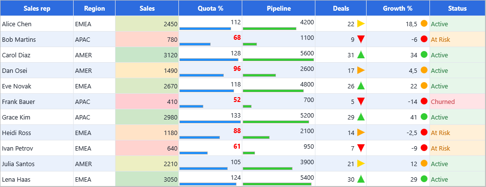
From Raw Values to Instant Insight
The new ConditionalFormatting property owns a collection of rules. Each rule defines three things:
where it applies;
when it matches;
how the matching cell or row should be presented.
Rules are evaluated automatically as the grid paints, and remain effective when users scroll, sort or filter. There is no need to repeat the same decisions in OnGetCellLayout or a custom drawing event.
The engine includes ten rule families:
cell-value comparisons;
text matching;
date conditions;
top and bottom rankings;
above- and below-average rules;
unique and duplicate values;
two- and three-color scales;
data bars;
icon sets;
custom expressions.
Start with One Line
The convenience methods make common formatting rules deliberately small. To highlight every value below 100 in the Quota % column:
with TMSFNCDataGrid1.ConditionalFormatting.AddCellValueRule(
  COL_QUOTA, gfcLess, '100') do
  Appearance.Font.Color := gcRed;
ConditionalFormatting.Enabled is enabled by default, so the rule takes effect immediately.
Color Scales: See the Range
A color scale turns a numeric column into a compact heat map. The lowest, middle and highest values receive the selected colors, with the colors in between calculated automatically.
TMSFNCDataGrid1.ConditionalFormatting.AddColorScale(
  COL_SALES,
  gcRed,
  gcYellow,
  gcLimegreen);
This is useful for sales, margins, temperatures, scores or any other measurement where relative position matters as much as the number itself.
Data Bars and Icon Sets: Compare at a Glance
Data bars show magnitude directly inside a cell while keeping the original value visible. Icon sets divide values into recognizable bands using arrows, traffic lights, stars, flags and rating symbols.
// Compare quota attainment with proportional bars.
TMSFNCDataGrid1.ConditionalFormatting.AddDataBar(
  COL_QUOTA, gcDodgerblue);

// Show the direction of growth with traffic lights.
TMSFNCDataGrid1.ConditionalFormatting.AddIconSet(
  COL_GROWTH, gisTrafficLights3);

// Turn customer satisfaction into a five-star signal.
TMSFNCDataGrid1.ConditionalFormatting.AddIconSet(
  COL_CSAT, gisStars5);
The minimum and maximum values can be detected automatically or defined as numbers, percentages or percentiles. Values can remain visible next to the bar or icon, or the visual can stand on its own.
Highlight the Rows That Matter
Some conditions should draw attention to a complete record. ApplyToEntireRow extends the appearance of a matching rule across the row while the condition itself remains tied to one column.
with TMSFNCDataGrid1.ConditionalFormatting.AddTopBottomRule(
  COL_SALES, rkTop, 5) do
begin
  Priority := 10;
  ApplyToEntireRow := True;
  Appearance.Fill.Color := gcLightgoldenrodyellow;
  Appearance.Font.Style := [TFontStyle.fsBold];
end;
This example highlights the five best sales results without calculating or updating a threshold manually.
Expressions Across Columns
For decisions that depend on more than one value, expression rules use the same expression language as the Data Grid filter builder. Column names can be combined into a readable condition that is evaluated for each row.
with TMSFNCDataGrid1.ConditionalFormatting.AddExpressionRule(
  '([Growth %] < 0) AND ([Quota %] >= 100)') do
begin
  ApplyToEntireRow := True;
  Appearance.Fill.Color := gcMistyrose;
  Appearance.Font.Color := gcRed;
end;
This makes it easy to reveal combinations that deserve attention: growth declining despite reaching quota, stock falling below the reorder level, an overdue task that is still open, or a customer whose health indicators disagree.
Combining Rules with Priority
Conditional formatting becomes especially useful when several rules work together. A sales column can use a color scale, a quota column can show data bars, growth can display an icon set, and status can apply text-based colors—all in the same grid.
When rules overlap, a lower Priority number has higher precedence. The first matching rule claims the appearance aspects it sets, while later rules can still contribute aspects that remain unset. StopIfTrue can stop evaluation of the rules that follow it.
This gives you predictable layering without moving presentation logic into paint handlers.
A Visual Editor for VCL and FireMonkey
Not every formatting rule needs to start in code. TMS FNC Data Grid 2.0 includes a visual conditional-formatting editor for VCL and FireMonkey at design time.
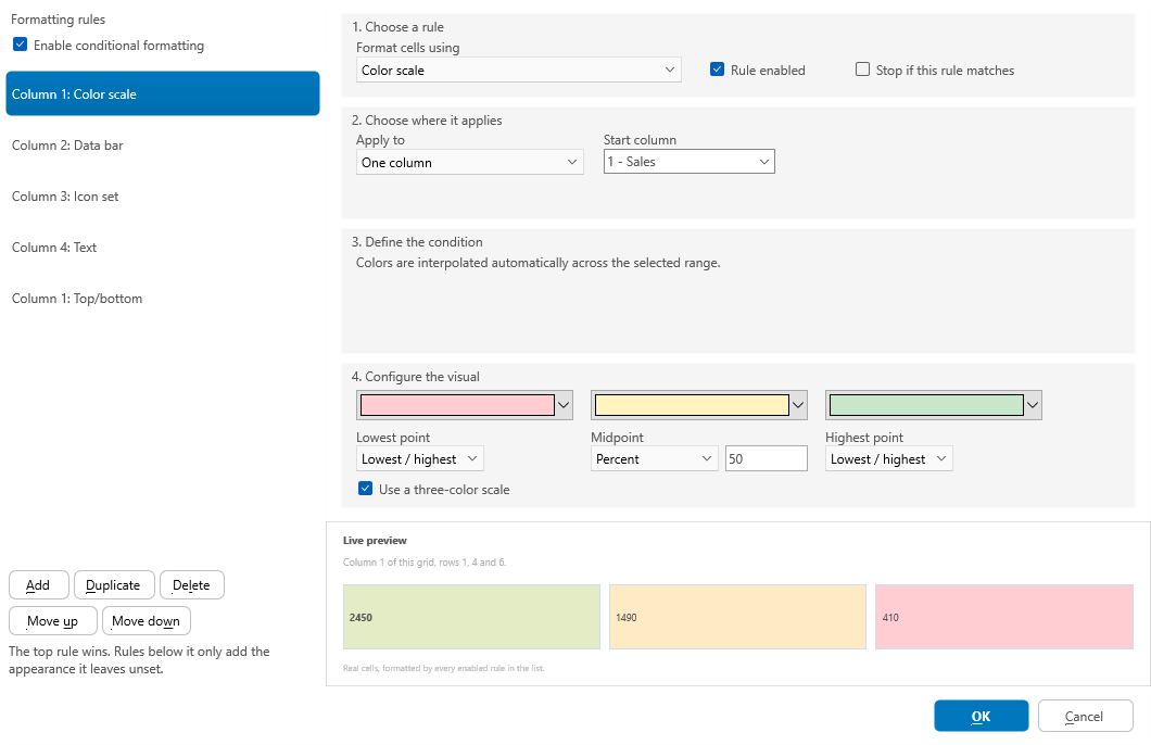
The editor lets you:
add, duplicate, delete and reorder rules;
choose a rule type and its scope;
select columns by name;
configure comparisons, values and expressions;
select fills, text colors, borders and font styles;
configure color-scale bounds, data bars and icon sets;
preview the selected rule before accepting it.
The rule collection is stored with the grid, so design-time configuration becomes part of the form just like the grid's other properties. Desktop applications can also open the same workflow at runtime with ShowConditionalFormattingEditor.
Cross-Framework by Design
The conditional-formatting engine is available in TTMSFNCDataGrid for VCL, FireMonkey and TMS WEB Core. The visual editor is available for VCL and FireMonkey, while the same rule collection and fluent helper methods can be configured in code on all three frameworks.
That means the formatting logic can travel with your application instead of being rewritten for each UI framework.
Installing TMS FNC UI Pack 7.3
TMS FNC UI Pack 7.3 is available through the modern Smart Setup based installation workflow:
tms self-update
tms install tms.fnc.*
If you are moving from the classic installers, uninstall older TMS FNC UI Pack installations from the previous setup flow first. This keeps IDE paths and package registrations clean.
You can learn more about TMS FNC UI Pack on the product page.
Conclusion
Conditional formatting in TMS FNC Data Grid 2.0 turns visual data analysis into a reusable part of the grid configuration. From one-line threshold rules to color scales, rankings, icon sets and expressions across multiple columns, the new engine makes important values stand out without custom painting code.
Together with the visual editor and the fluent runtime API, TMS FNC UI Pack 7.3 gives developers a faster way to build grids that do more than display data—they explain it.
Pieter Scheldeman
Related Blog Posts
-
Next Generation Data Grid for Delphi: Getting Started
-
Next Generation Data Grid for Delphi: Adding, Formatting & Converting Data
-
Next Generation Data Grid for Delphi: Filtering & Sorting
-
Next Generation Data Grid for Delphi: Grouping
-
Next Generation Data Grid for Delphi: Webinar Replay Available!
-
Next Generation Data Grid for Delphi: Cell Controls
-
Next Generation Data Grid for Delphi: Master-Detail
-
Next Generation Data Grid for Delphi: Calculations
-
Next Generation Data Grid for Delphi: Import & Export
-
Next Generation Data Grid for Delphi: Template
-
Next Generation Data Grid for Delphi: Filter Row
-
Next Generation Data Grid for C++: Getting Started
-
Freebie Friday: Next Generation Grid Quick Sample Data
-
Next Generation Data Grid for Delphi: Columns Editor
-
Next Generation Data Grid for Delphi: File Drag & Drop
-
Next Generation Data Grid for Delphi: Visual Grouping
-
Next Generation Data Grid for Delphi: FMX Linux Support
-
Next Generation Data Grid for Delphi: Header & Footer Buttons
-
Next Generation Data Grid for Delphi: Paging
-
Next Generation Data Grid for Delphi: Cell Classes
-
Next Generation Data Grid for Delphi: Excel Style Selection
-
Next Generation Data Grid for Delphi: AutoFill
-
Bridging FlexCel and Our Next-Gen Data Grid
-
Next Generation Data Grid for Delphi: Headless Data Layer
-
Free Database Generator Sample with our Next Generation Data Grid for Delphi
-
Make Your Data Speak: Conditional Formatting in TMS FNC Data Grid 2.0
-
Data Report with Filtering and Conditional Formatting

This blog post has not received any comments yet.
All Blog Posts | Next Post | Previous Post