Blog
All Blog Posts | Next Post | Previous Post

 Extend TMS WEB Core with JS Libraries with Andrew:
Website Tours with Shepherd
Wednesday, November 29, 2023

Does your TMS WEB Core project offer far more than the average web app? Are those awesome features neatly tucked away in a beautiful UI, so compact and efficient that nobody knows they are there? Are your users
asking for features that have already been included? Maybe it is time to add a website tour to your project. In this
post, we're going to explore how to use ShepherdJS
in TMS WEB Core projects. Shepherd is one of many JavaScript libraries that can be used to build these kinds of
tours. The great thing is that it is a quick and simple addition to our projects that can easily be tailored to address a variety of scenarios.
Motivation.
There are a few reasons why we might want to add a website tour to our project. Just like developers, users come in all shapes and sizes, with a broad range of capabilities and expectations. And while typical web apps often have familiar elements for users to interact with, occasionally they stray from the norms, particularly if they're trying to offer something unique or more interesting than the status quo. Sometimes there is a knowledge gap to be filled.
- Basic app functionality will hopefully be self-evident the majority of the time. We don't want to be teaching users how to use a browser generally, for example. But perhaps showing users how your page is organized might help them better understand how its pieces fit together.
- Certain features, like a search function, may not need much explanation. But even there, it can be helpful to indicate what scope the search function has. Is it just searching a narrowly focused domain? Or is it a more general search that encompasses all the content on your website?
- Tabbed interfaces aren't necessarily the most common (or most popular) web element, particularly when
they're a small part of a larger page, as opposed to a traditional "tabbed pages" style of UI from yesteryear.
These can be overlooked at times, particularly if the tabs aren't displayed at the very top of the page.
- Scrollable elements might not always have enough content to require scrolling, so it might not be obvious when additional content becomes available where scrolling is necessary.
- Grids or Tables are often equipped with additional features, like sorting or filtering, that are not always implemented the same way. Similarly, some offer support for adding or removing columns, performing calculations, or printing or exporting features that are hidden behind a nondescript menu button.
- While tours might introduce new users to the app, they can also inform users about newly added features.
- More in-depth tours can be crafted that are more akin to training tools rather than casual visitor tours. For example, a "help" function that describes in more detail the process of filling out a complex form - perhaps more than what might be available from individual field help buttons.
While website tours may not apply to every app, they are quick and easy to add and can help unlock some of the
value already present in more complex projects. They make for a lightweight and beneficial addition to many projects.
Getting Started.
The documentation for Shepherd is relatively good. Better than average. But for a typical TMS WEB Core project, there are likely a few things we'll want to sort out pretty quickly that are a slight departure from the most basic installation.
To start with, as is so often the case, we'll need to add the ShepherdJS library to our
Project.html file. While we're at it, we're also going to need one of the plugins. They use the Floating UI
library to help make adjustments to the positioning of their elements, so we can include that right away as
well. Here, we're using v11 of Shepherd (current as of this writing).
    <link rel="stylesheet" crossorigin="anonymous" href="https://cdn.jsdelivr.net/npm/shepherd.js@11/dist/css/shepherd.css">
    <script src="https://cdn.jsdelivr.net/npm/@floating-ui/core@1.5.0/dist/floating-ui.core.umd.min.js"></script>
    <script src="https://cdn.jsdelivr.net/npm/@floating-ui/dom@1.5.3/dist/floating-ui.dom.umd.min.js"></script>
    <script src="https://cdn.jsdelivr.net/npm/shepherd.js@11/dist/js/shepherd.min.js"></script>
Then we need to initialize the tour. If the tour isn't likely to be accessed frequently, we can put this off and just call it when needed, rather than initializing it directly in WebFormCreate as we might typically do in this kind of situation. Thinking a little ahead, let's plan on having three reasons to offer the tour.
- A new user visiting the website (or app) for the very first time.
- An existing user visiting the website after an update has been released.
- An existing user simply opting to view the tour.
Let's create a method to launch the tour, passing it a parameter to distinguish between these (or possibly
other) scenarios. In this method, we'll first create the tour, populate it with steps, and then start it.
procedure TForm1.LaunchTour(TourMode: String);
begin
  asm
    const tour = new Shepherd.Tour({
      useModalOverlay: true,
      defaultStepOptions: {
        classes: 'shadow-md bg-purple-dark',
        scrollTo: true,
        cancelIcon: {
          enabled: true,
          label: 'cancel tour'
        }
      }
    });

    tour.addStep({
      id: 'step-welcome-0',
      title: 'Welcome to Actorious!',
      text: 'It looks like this might be your first visit. Would you be interested in a quick tour?',
      buttons: [
        { text: 'No thanks', action: () => { tour.show('step-tour-0', true); }},
        { text: 'Next', action: () => { tour.show('step-tour-1', true); }}
      ]
    });

    tour.start();
  end;
end;
This is the basic structure. We'll expand it in several important ways, but the gist of it is the following.
- Create the tour JavaScript object - the top-most organization.
- Configure options at the tour level.
- Add steps to the tour - steps are the individual "pages" of the tour.
- Configure options at the step level.
- Start the tour.
The main options of interest at the tour level, initially at least, allow for a modal overlay (the dark filter
over the page), as well as the addition of the close button appearing in the header of the tour element. This
last bit is included in the stanza that sets the default options for all the steps.
In the example step provided, an ID is assigned, which we can use when referencing where a button click should
lead. The title appears at the top of the tour element, naturally, and the text fills out the bottom section.
Buttons can be readily customized, including directing where the "next" tour step is. More about buttons in a little bit.
Organize a Tour.
That gets our foot in the door, but let's consider an example of a tour for an actual TMS WEB Core project - Actorious. This project started out as a demonstration of how to use Tabulator but has continued on to an actual (arguably!) useful website. It can be a little intimidating at first, and perhaps some of its features aren't as obvious as they could be. Perfect candidate for a website tour.
In this case, we'd like to offer a tour to new visitors, whenever an update is released, or whenever they click on the tour button. If they decline the tour initially, we'd like to show them where the tour button is so they can start it later if they like.
To keep track of whether this is a new visitor or not, we can write a value to "localStorage". This value can include the current app version, so we can use it to also determine if the
current version has been updated since they last visited. This is all stuff we can do at the very end of
WebFormCreate. We'll need to add TWEBLib.Storage to our 'uses' clause to be able to access localStorage methods.
    TourVersion := TWebLocalStorage.GetValue('Actorious Tour Version');
    if TourVersion = '' then
    begin
      LaunchTour('New');
    end
    else if TourVersion <> Version then
    begin
      LaunchTour('Update');
    end;
    TWebLocalStorage.SetValue('Actorious Tour Version', Version);
To test this, particularly for a website that you visit often (your own project) one trick is to launch a "private" or "incognito" browser session and visit the same page - the localStorage for these sessions is not retained, so it will think you are a new visitor each time one of those sessions is launched. If you're using automatic versioning in your TMS WEB Core project, you'll trigger the "Update" tour each time you launch a new build from within Delphi.
In this case, the "Version" that is being compared to is defined earlier in WebFormCreate. Check out the
Initialization section of this post for details on how that works.
  // Sort out Version Information
  asm
    this.Version = window.ProjectName;
    this.Release = new luxon.DateTime.fromISO(new Date(document.lastModified).toISOString()).toFormat('yyyy-MMM-dd');
  end;
In our LaunchTour method, we use the TourMode parameter to distinguish between these scenarios. But
what do we want to do differently in the tour itself?
- New: Display a welcome page, asking if they want to take the tour. If they do, go to the first page of the actual tour. If they don't, show a second step that points to where they can find the tour button.
- Update: Display an update page, showing what has changed, and also asking if they want to take the
tour. If they do, go to the first page of the actual tour, otherwise, do nothing.
- Button: Jump to the first page of the actual tour.
This means that we have the actual tour steps, as well as potentially one of two sets of steps that precede the tour. In our LaunchTour method, we use the TourMode parameter to figure out whether to add either set of these steps and then add in the rest of the tour steps. We could wait and see whether they are interested in the tour before continuing on to add the other steps, but in this instance, there isn't really a lot of overhead so we just do it all at once.
Keeping track of the number of steps as well as the current step in the tour is going to be important if we want to display progress (we do!) so we'll get around it by just declaring the total number of tour steps ahead of time (the actual tour, not including the potential one or two initial steps). We'll use the ID of the steps to indicate what the current step number is, so we don't have to rely on the internal counting that the Shepherd library does. More on that in a little bit.
Another consideration is that, for most steps, we'll want an HTML element ID to point the step at - this HTML element will be highlighted during that step of the tour. This can be set for any of our TMS WEB Core components using the ElementID property, or just the usual id attribute of an HTML element. CSS selectors can be used to drill down into the page and find elements that don't have an ID explicitly assigned (like a particular column header for example). We can also indicate the orientation of the step with respect to that element (whether it is above, to the right, etc.).
Internally, this works by displaying an overlay that is dark and then cutting out the space for the HTML element that has been identified, thus "highlighting" the space for that element. This works best when the element being highlighted has a fixed size and position on the page.
Touring in Style.
Likely one of the most important aspects of any website tour library relates to what it looks like - its
styling. The default styling for Shepherd is decidedly (and deliberately) a little on the simple side, but
fortunately, it is laid out very well and we can apply a handful of CSS overrides to bring it up to a reasonable
level. In this example, we want to match the theme of the underlying web app while also making it visually obvious
that the tour itself is separate from the app.
The main tricky bits here have to do with rounding (see this post for more on that topic), and the layout of the
buttons. We'll get to those shortly as well, but here's what we've changed. Nothing
too dramatic. If you see something in the Shepherd styling that you want to change it is just a matter of viewing the
element in the browser developer tools, changing the CSS there, and then using the "copy rule" to copy the
changes into your own CSS file, removing the lines that you didn't actually change, to keep things a little
neater.
/* Darken the overlay */
.shepherd-modal-overlay-container.shepherd-modal-is-visible {
  opacity: 0.8;
}

/* Add a thicker, rounder border */
.shepherd-element {
  border-radius: 15px;
  border: 3px solid var(--bs-secondary);
}

/* Match rounding in header, tamp down the padding */
.shepherd-header {
  border-top-left-radius: 12px;
  border-top-right-radius: 12px;
}
.shepherd-title {
  color: white;
}
.shepherd-has-title .shepherd-content .shepherd-header {
  background: var(--bs-dark);
}

/* Adjust the footer and in particular the button arrangement */
.shepherd-footer {
  padding: 5px;
  justify-content: space-between;
}
.shepherd-button {
  background: var(--bs-primary);
  border-radius: 9px;
  margin-right: 5px;
}
/* if only one button, push it right */
.shepherd-button:last-child {
  margin-left: auto;
}

/* Adjust the close button */
.shepherd-cancel-icon {
  font-size: 3em;
  font-weight: 700;
  height: 0px;
  position: absolute;
  top: 3px;
  right: 5px;
}
With that out of the way, we can start looking at what the tour actually looks like. In the case of Actorious, we'd also like
to include the logo on the welcoming step. The titles and text included in the tour steps are all defined via
HTML, so we're free to do whatever we like here.
    var TourIcon = '<img style="position:absolute; top:5px; left:5px; height:38px; width:38px;" src="img/actorious-logo-100x100.svg" alt="Actorious Icon">';

    // Say hello if this is a new visitor
    if (TourMode == 'New') {

      tour.addStep({
        id: 'step-welcome-0',
        title: TourIcon+'<div style="padding-left:35px;">Welcome to Actorious!</div>',
        text: 'It looks like this might be your first visit. Would you be interested in a quick tour?',
        buttons: [
          { text: 'No, thanks', action: () => { tour.show('step-tour-0', true); }},
          { text: 'Yes, please', action: () => { tour.show('step-tour-1', true); }}
        ]
      });

      tour.addStep({
        id: 'step-tour-0',
        title: 'Maybe Later?',
        text: 'If you would like to take the tour at another time, just click this icon.',
        attachTo: { element: '#linkTour', on: 'right' },
        buttons: [{ text: 'Ok',action: tour.complete }]
      });
    }
In the above code, we're adding an icon to the title and using "position:absolute" so that we can brute force it into the position we want without messing up the rest of the header layout. In the step declarations, the "id" value is used when assigning the "action" property for the buttons so that we can expressly direct where the tour will go in each case. In the actual tour, we don't have to worry about this as much and we'll see in a little bit that we can use "back" and "next" without having to specify where they point each time. Here's what it looks like.
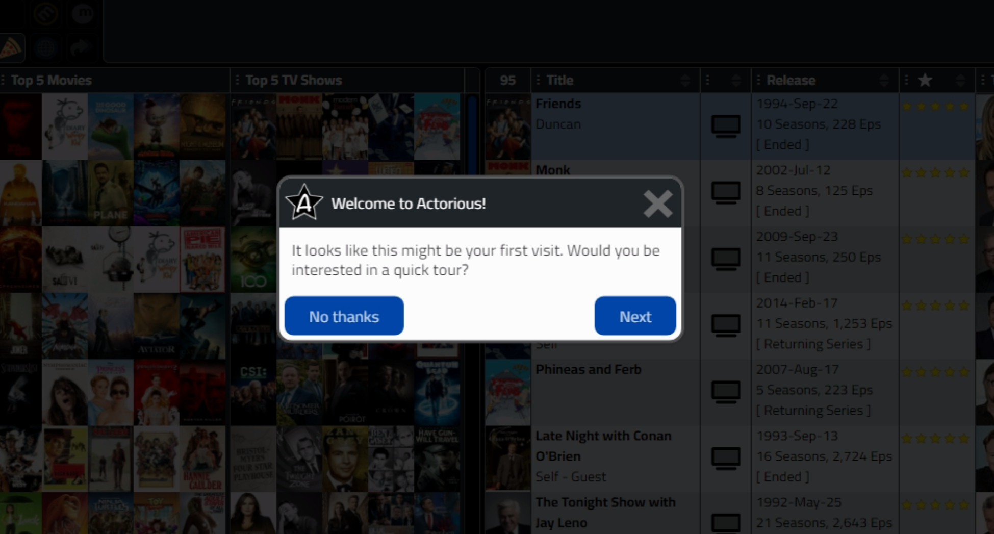
Tour for New Visitors.
If "Next" is clicked, we advance to the first step of the actual tour. If the "No thanks" button is clicked,
then an extra step is used to show where the Tour button is in our app, and then the tour ends.
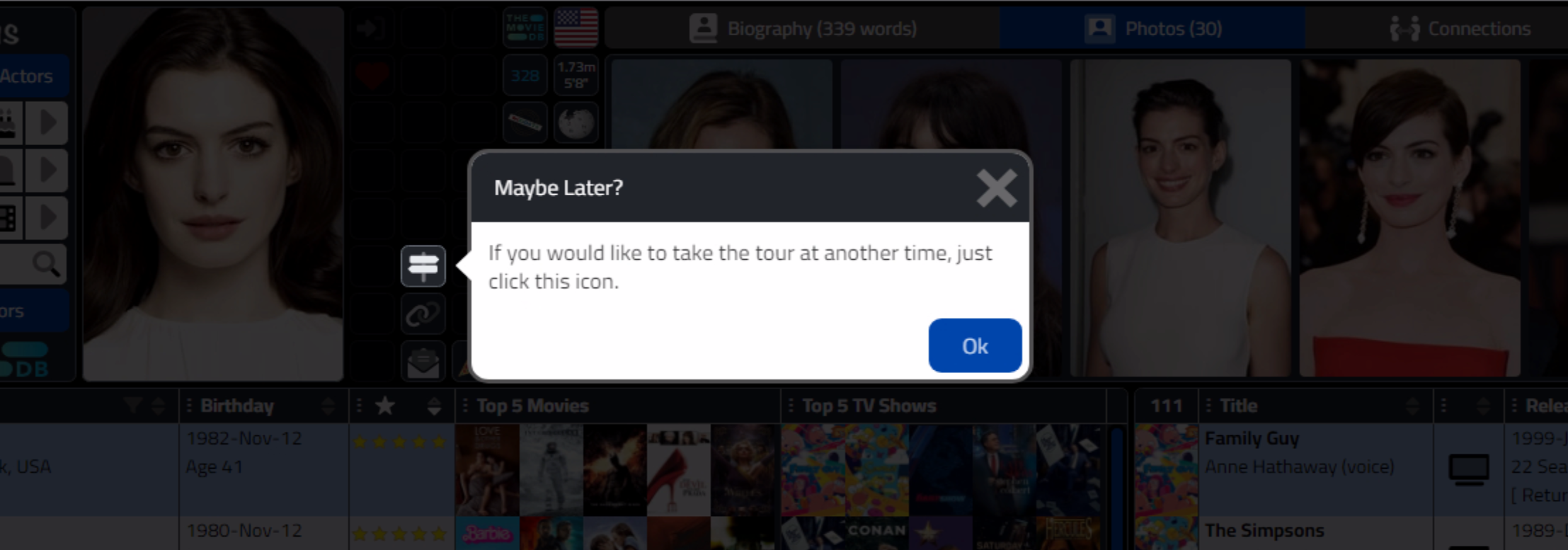
Tour Icon Step.
The same approach is taken when the visitor isn't new, but the app has been updated. If the user clicks the Tour button, we just launch directly into the actual tour.
Tour Elements.
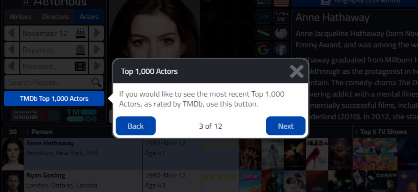
In the above screenshot, we can see how the display is anchored to the Tour button on our page. This is
configured using the "attachTo" option in the step declaration. By default, it is positioned directly beside the
element - too close, in fact. To adjust how this is positioned, the Shepherd JavaScript library uses a separate JavaScript library -
Floating UI. In order to make an adjustment, we can add another option in the original Tour declaration, under
"defaultStepOptions". Here we're just shifting the element to the right 15px.
    const tour = new Shepherd.Tour({
      useModalOverlay: true,
      defaultStepOptions: {
        classes: 'shadow-md bg-purple-dark',
        scrollTo: true,
        floatingUIOptions: {
          middleware: [window.FloatingUIDOM.offset({ mainAxis: 15 })]
        },
        cancelIcon: {
          enabled: true,
          label: 'cancel tour'
        },
      }
    });
There are a number of other parameters that can be passed to the offset function, including "crossAxis" if an offset is desired in the other (vertical) direction. The element IDs included in attachTo generally should be easy to identify, as they would normally
be either TMS WEB Core components or elements in an HTML template, and typically these have an ID attribute
assigned already. This is because that's the mechanism used to link HTML elements to TMS WEB Core components.
If
there is no HTML template used, then the ElementID property can be used to set this attribute directly on a TMS WEB Core component. Or, if it is a complex HTML element, the usual CSS selectors can be used. In the example a little later we use those to find a specific column header in a table using class names.
The element being assigned is shown without the dark mask applied to the rest of the page, so it is in effect
highlighted. When connecting tour steps to elements like buttons or other rectangular shapes, this works pretty well. Work has been done in the Shepherd project to enable cutouts for multiple elements at the same time, but this hasn't yet been merged into the current release. This might be needed to highlight an entire column or row of a table for example, depending on how the table is organized.
Tour Progress.
The current progress of the tour can be inserted dynamically into the tour element displayed. This is implemented by manually creating and inserting a new HTML <div> element with the text that describes the current progress.
As this is all done in our own code, this could be updated to include a progress bar or something more complex.
We want this to appear on most tour pages (the intro pages excluded), so we can add the code to the default
step options again. Here's what we've got. This is the same block of code we were updating previously, now with a
"when:" option that is triggered with the "show" event.
    const tour = new Shepherd.Tour({
      useModalOverlay: true,
      defaultStepOptions: {
        classes: 'shadow-md bg-purple-dark',
        scrollTo: true,
        floatingUIOptions: {
          middleware: [window.FloatingUIDOM.offset({ mainAxis: 15 })]
        },
        cancelIcon: {
          enabled: true,
          label: 'cancel tour'
        },
        when: {
          show: function () {
            const currentStep = tour.getCurrentStep();
            const currentStepElement = currentStep.getElement();
            if (currentStep.id.indexOf('-0') == -1) {
              const footer = currentStepElement.querySelector('.shepherd-footer');
              const progress = document.createElement('div');
              progress.style.cssText = 'position:absolute; bottom:13px; pointer-events:none; width:394px; text-align:center;';
              progress.innerText = currentStep.id.split('-').slice(-1)+' of '+TourSteps;
              footer.parentElement.appendChild(progress);
            }
          }
        }
      }
    });
In this case, we're populating the "X of Y" values ourselves. The X value, the current step, is determined by
whatever comes after the last hyphen in the ID assigned to the step. If it is zero, we don't display the
progress. For the Y value, we just set a TourStep
value initially. Internally, the Shepherd library does keep track of the current step number and the total
number of steps, but we've messed that up a bit by potentially having those initial steps that are not part of the actual tour.
We could instead display a progress bar, dots, or even update the buttons to show abbreviated titles rather than just
"back" and "next". We could also do something specific to a step in the individual step definitions as well. Lots of options. Here's what the
progress looks like.
Tour Progress.
Note that in the code, we're dynamically creating a new HTML element and then sneaking it into the Shepherd
element. We could've inserted it into the footer element directly, but instead have it inserted above, as a
sibling to the footer so that we don't mess up how the footer buttons are laid out. This also means we could
just as easily move the progress display into the header by repositioning it (and changing its color). Related to that, we could
also define a class for the progress and move all the CSS into our CSS file rather than adding it inline here as
we've done. Options abound!
All in, here's the LaunchTour method for Actorious.
procedure TMainForm.LaunchTour(TourMode: String);
begin
  {$IFNDEF WIN32} asm {

    // We might have extra steps at the beginning, so here we're just explicitly stating a number
    // which we can then use in the progress indicator
    var TourSteps = 16;
    var TourIcon = '<img style="position:absolute; top:5px; left:5px; height:38px; width:38px;" src="img/actorious-logo-100x100.svg" alt="Actorious Icon">';

    // This is the main tour object
    const tour = new Shepherd.Tour({
      useModalOverlay: true,
      defaultStepOptions: {
        classes: 'shadow-md bg-purple-dark',
        scrollTo: true,
        floatingUIOptions: {
          middleware: [window.FloatingUIDOM.offset({ mainAxis: 15 })]
        },
        cancelIcon: {
          enabled: true,
          label: 'cancel tour'
        },
        when: {
          show: function () {
            const currentStep = tour.getCurrentStep();
            const currentStepElement = currentStep.getElement();
            if (currentStep.id.indexOf('-0') == -1) {
              const footer = currentStepElement.querySelector('.shepherd-footer');
              const progress = document.createElement('div');
              progress.style.cssText = 'position:absolute; bottom:13px; pointer-events:none; width:394px; text-align:center;';
              progress.innerText = currentStep.id.split('-').slice(-1)+' of '+TourSteps;
              footer.parentElement.appendChild(progress);
            }
          }
          }
      }
    });

    // Say hello if this is a new visitor
    if (TourMode == 'New') {

      tour.addStep({
        id: 'step-welcome-0',
        title: TourIcon+'<div style="padding-left:35px;">Welcome to Actorious!</div>',
        text: 'It looks like this might be your first visit. Would you be interested in a quick tour?',
        buttons: [
          { text: 'No, thanks', action: () => { tour.show('step-tour-0', true); }},
          { text: 'Yes, please', action: () => { tour.show('step-tour-1', true); }}
        ]
      });

      tour.addStep({
        id: 'step-tour-0',
        title: 'Maybe Later?',
        text: 'If you would like to take the tour at another time, just click this button.',
        attachTo: { element: '#linkTour', on: 'right' },
        buttons: [{ text: 'Ok',action: tour.complete }]
      });
    }

    if (TourMode == 'Update') {

      tour.addStep({
        id: 'step-welcome-0',
        title: TourIcon+'<div style="padding-left:35px;">Actorious Updated</div>',
        text: 'It looks like there has been an update since your last visit. Would you be interested in a quick tour?',
        buttons: [
          { text: 'No, thanks', action: tour.complete },
          { text: 'Yes, please', action: () => { tour.show('step-tour-1', true); }}
        ]
      });

    }

    // Otherwise, just jump into the tour

    tour.addStep({
      id: 'step-tour-1',
      title: 'Birthdays and More',
      text: 'Use these options to select a birthday or another day to retrieve a list of People with the same birthday, Movies or TV Shows with the same release day, etc.',
      attachTo: { element: '#divMain', on: 'right' },
      buttons: [{ text: 'Next', action: tour.next }]
    });

    tour.addStep({
      id: 'step-tour-2',
      title: 'Search for People, Movies, or TV Shows',
      text: 'Enter search terms here. The search results will appear below. You can search for People (by actor name or role), Movies (by title), or TV Shows (by title).',
      attachTo: { element: '#divSearchNav', on: 'right' },
      buttons: [{ text: 'Back', action: tour.back }, { text: 'Next', action: tour.next }]
    });

    tour.addStep({
      id: 'step-tour-3',
      title: 'Top 1,000 People',
      text: 'This will retrieve the most recent list of Top 1,000 People, updated daily, as rated by The Movie Database.',
      attachTo: { element: '#btnTop1000', on: 'right' },
      buttons: [{ text: 'Back', action: tour.back }, { text: 'Next', action: tour.next }]
    });

    tour.addStep({
      id: 'step-tour-4',
      title: 'Current Selection',
      text: 'The currently selected Person (photo), Movie (poster), or TV Show (poster) appears here. Initially, this will show the most popular Person with a birthday today.',
      attachTo: { element: '#divPhoto', on: 'right' },
      buttons: [{ text: 'Back', action: tour.back }, { text: 'Next', action: tour.next }]
    });

    tour.addStep({
      id: 'step-tour-5',
      title: 'Account Buttons',
      text: 'These buttons provide access to login to Actorious, enabling access to advanced features, like favorites, lists, and more.',
      attachTo: { element: '#divLinkSet1', on: 'right' },
      buttons: [{ text: 'Back', action: tour.back }, { text: 'Next', action: tour.next }]
    });

    tour.addStep({
      id: 'step-tour-6',
      title: 'Sytstem Buttons',
      text: 'These buttons provide access to general Actorious features link Permalinks, Tours, E-Mail Ssubscriptions, and more.',
      attachTo: { element: '#divLinkSet2', on: 'right' },
      buttons: [{ text: 'Back', action: tour.back }, { text: 'Next', action: tour.next }]
    });

    tour.addStep({
      id: 'step-tour-7',
      title: 'Awards and Lists',
      text: 'These buttons provide access Awards and other lists, and changes to reflect the selected Person, Movie, or TV Show, show.',
      attachTo: { element: '#divLinkSet3', on: 'right' },
      buttons: [{ text: 'Back', action: tour.back }, { text: 'Next', action: tour.next }]
    });

    tour.addStep({
      id: 'step-tour-8',
      title: 'Resource Links',
      text: 'Links to other resources about the selected Person, Movie, or TV Show from TMDb, Wikidata, Wikipedia, Google, IMDB, Rotten Tomatoes, and more.',
      attachTo: { element: '#divLinkSet4', on: 'right' },
      buttons: [{ text: 'Back', action: tour.back }, { text: 'Next', action: tour.next }]
    });

    tour.addStep({
      id: 'step-tour-9',
      title: 'Social Media Links',
      text: 'Links to the social medial accounts of the selected Person, Movie, or TV Show.',
      attachTo: { element: '#divLinkSet5', on: 'right' },
      buttons: [{ text: 'Back', action: tour.back }, { text: 'Next', action: tour.next }]
    });

    tour.addStep({
      id: 'step-tour-10',
      title: 'Additional Information',
      text: 'These buttons lead to other content, depending on the Person, Movie, or TVS Show selected. This may include biographies, summaries, photos, video clips, and so on. The available pages change when a Person is selected vs. when a Movie or TV Show is selected.',
      attachTo: { element: '#divButtonHolder', on: 'bottom' },
      buttons: [{ text: 'Back', action: tour.back }, { text: 'Next', action: tour.next }]
    });

    tour.addStep({
      id: 'step-tour-11',
      title: 'People - Table',
      text: 'This is a list of People, selected using either the criteria from the top-left section, the bottom-right table, or the Connections found in the top-right sections.',
      attachTo: { element: '#divActorTabulatorHolder', on: 'top' },
      buttons: [{ text: 'Back', action: tour.back }, { text: 'Next', action: tour.next }]
    });

    tour.addStep({
      id: 'step-tour-12',
      title: 'People - Columns',
      text: 'The columns for this table can be sorted, filtered, or even changed using the buttons appearing in each column header. Many other columns are available.',
      attachTo: { element: '#divActorTabulator .tabulator-header', on: 'bottom' },
      buttons: [{ text: 'Back', action: tour.back }, { text: 'Next', action: tour.next }]
    });

    tour.addStep({
      id: 'step-tour-13',
      title: 'Movies and TV Shows - Table',
      text: 'When a Person is selected from the People Table, all their Movies and TV Shows are listed in this table. This may also be populated based on criteria from the top-left section.',
      attachTo: { element: '#divRoleTabulatorHolder', on: 'top' },
      buttons: [{ text: 'Back', action: tour.back }, { text: 'Next', action: tour.next }]
    });

    tour.addStep({
      id: 'step-tour-14',
      title: 'Movies and TV Shows - Columns',
      text: 'The columns for this table can be sorted, filtered, or even changed using the buttons appearing in each column header. Many other columns are available.',
      attachTo: { element: '#divRoleTabulator .tabulator-header', on: 'bottom' },
      buttons: [{ text: 'Back', action: tour.back }, { text: 'Next', action: tour.next }]
    });

    tour.addStep({
      id: 'step-tour-15',
      title: 'Select All People',
      text: 'Clicking a Movie or TV icon in this column will update the table on the left with all of the People that appeared in the selected Movie or TV Show.',
      attachTo: { element: '#divRoleTabulator .tabulator-header .MovieTVColumn', on: 'bottom' },
      buttons: [{ text: 'Back', action: tour.back }, { text: 'Next', action: tour.next }]
    });

    tour.addStep({
      id: 'step-tour-16',
      title: 'Select One Person',
      text: 'Clicking on a photo of a Person in this column will select that Person and then retrieve all the Movies and TV Shows that they have appeared in.',
      attachTo: { element: '#divRoleTabulator .tabulator-header .Top10Column', on: 'bottom' },
      buttons: [{ text: 'Back', action: tour.back }, { text: 'Done', action: tour.complete }]
    });

    tour.start();

  } end; {$ENDIF}

end;
Tour Complete.
No project download today as all the code has been directly included above. The links for the Project.html file. The CSS to override the default Shepherd styling. And the LaunchTour code that contains everything else. Relatively easy to implement given the overall potential benefit.
What do you think? Is this something that might find its way into your projects? As always, questions, comments, and any other feedback are most appreciated.
Follow Andrew on 𝕏 at @WebCoreAndMore or join our 𝕏 Web Core and More Community.
Andrew Simard

This blog post has received 11 comments.
 2. Friday, November 17, 2023 at 1:42:00 PM
Not sure, this is the first time I have heard of this being an issue? Is there an app or some other website safety-checking tool in place at your location? To my knowledge, there is nothing to download or otherwise cause issues that would trigger such a warning, but happy to help try and get it sorted.
2. Friday, November 17, 2023 at 1:42:00 PM
Not sure, this is the first time I have heard of this being an issue? Is there an app or some other website safety-checking tool in place at your location? To my knowledge, there is nothing to download or otherwise cause issues that would trigger such a warning, but happy to help try and get it sorted.
Andrew Simard
3. Friday, November 17, 2023 at 3:05:16 PM
Might be because the link is just to https://www.actorious/ this didn''t work for me until I added .com
Randall Ken
4. Friday, November 17, 2023 at 3:20:25 PM
Ah, that I can fix!
Andrew Simard
5. Friday, November 17, 2023 at 8:15:37 PM
Well, I checked the site from home, it works. But at work, using a company laptop, it does not work. It must be security setting issue.
Baykal Ertan
6. Friday, November 17, 2023 at 9:14:45 PM
I checked a few websites that are used for detecting malicious content, and they either reported no malicious content or that the site was not listed in their systems (hardly surprising - it gets almost no traffic). If you can find out more details about the service that reported this, I can follow up and see what can be done about it. Otherwise, now that you managed to get access from home, what do you think? Is this a useful addition to your toolbox for your TMS WEB Core projects?
Andrew Simard
7. Wednesday, November 29, 2023 at 10:18:22 PM
Hello Andrew,i tried to open https://www.actorious.com/ and got errors in my firefox console and was surprised to see in debug-section of firefox your hole source including webcore pas files. is this your intension to show everyone your source and the sourcode from tms? Here a litte exerp of your main.pas:
program ActoriousClient;
{$R *.dres}
uses
Vcl.Forms,
WEBLib.Forms,
Main in ''Main.pas'';
{$R *.res}
begin
Application.Initialize;
Application.MainFormOnTaskbar := True;
Application.CreateFormDirect(TMainForm, MainForm);
Application.Run;
end.
The error from firefox console: (in german language)
Fehler beim Laden von ''https://carnival.500foods.com:10999/actorious/ActorInfoService/ActorBirthDay50/?Secret=%27LeelooDallasMultiPass%27&aMonth=11&aDay=29&Progress=%27%7BC927FC10-5533-A928-3C26-5191838AE632%7D%27'' Ein ServiceWorker fing die Anfrage ab und es kam zu einem unwarteten Fehler. ServiceWorker.js:114:
Völker Oliver
8. Wednesday, November 29, 2023 at 10:44:28 PM
Indeed it is. The source code is published, and the origins of Actorious were posts in this very blog.GitHub Repository: https://github.com/500Foods/ActoriousClient
Blog miniseries on Tabulator starts here: https://www.tmssoftware.com/site/blog.asp?post=948
As a JavaScript project, the code could be obfuscated, and certainly the Delphi code could not be included, but for the purposes of illustrating how it all works, it has been left in, including in the production deployment. Even the link to the underlying XData server, as you''ve seen, can be accessed. What is hidden away is the key used to access the underlying TMDb database, which is unique and considered a secret that is not to be shared, protected behind the XData server.
Andrew Simard
9. Wednesday, November 29, 2023 at 10:49:55 PM
As an aside, was this an error that prevented the page from loading? My German(?) is non-existent but I copied and pasted the link into Firefox and it seemed to return the expected JSON without any issues.
Andrew Simard
10. Thursday, November 30, 2023 at 6:37:06 PM
Thank you, Andrew. This is something that I should tackle for my WEB Core app. Very inspiring.
Peterson Terry
11. Thursday, November 30, 2023 at 9:20:32 PM
You are very welcome! This is one of the easiest and quickest upgrades to a TMS WEB Core project.
Andrew Simard
All Blog Posts | Next Post | Previous Post
Very useful info. Thank you.
By the way, why do I get this when I try to see the page: URL:
https://www.actorious.com/
Block Reason:
Malicious content was detected
If you think this website is restricted by mistake, or for more information, please contact Servicedesk!
Baykal Ertan