Blog
All Blog Posts | Next Post | Previous Post

 Extend TMS WEB Core with JS Libraries with Andrew:
Rounded Corners and More
Tuesday, November 14, 2023

Once upon a time, an operating system's graphical user interface, if it was lucky enough to have one, consisted primarily of triangles, rectangles, simple fonts, and very few colors. This utilitarian look was necessitated as much by the hardware of the day as it was by the software. With CPU clock speeds measured in the low MHz range and no dedicated hardware to offload graphical drawing computations, this was one of the inevitable tradeoffs that needed to be made.
These days, people routinely walk around with devices containing tens of billions of transistors, and
these tradeoffs are a distant memory. Modern hardware, with the help of a great deal of software, makes quick work
of drawing even the most complex UI elements without missing a beat. So there's really little reason to stick to the
same triangles, rectangles, simple fonts, and very few colors. Today we're going to look at how to
round off those rectangles and maybe inject a bit more style into our TMS WEB Core projects.
Getting Started.
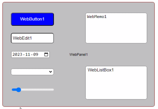
Let's begin with a standard TMS WEB Core project. Not a Bootstrap or PWA app but just the most basic application template. We can then drop a variety of components on the form, like TWebEdit, TWebListBox, and TWebPanel components, just to get a feel for what we're working with. In the IDE, we of course get the wonderfully rectangular components that have been part of Delphi since the very beginning. Comforting, perhaps, but not much else.
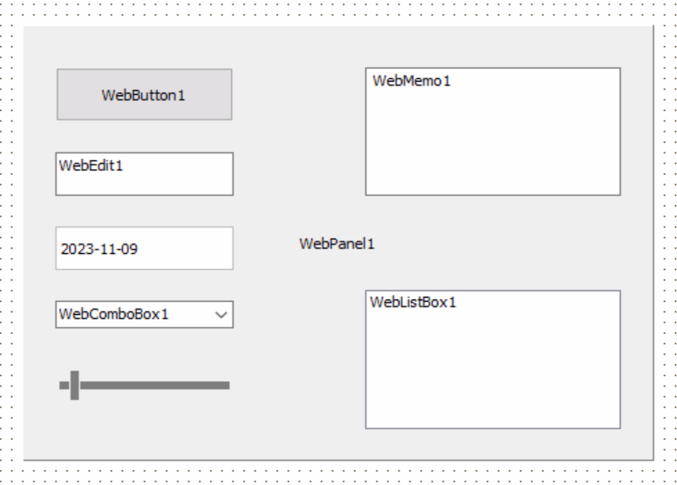
TMS WEB Core Components in the Delphi IDE.
This is just the IDE, so we don't necessarily need these to be styled in any particular way. If we were to use
TMS WEB Core in Visual Studio Code, the IDE would render HTML components natively. But using Delphi, we'll have
to run our project to see these components rendered as HTML. Here's what we've got to work with.
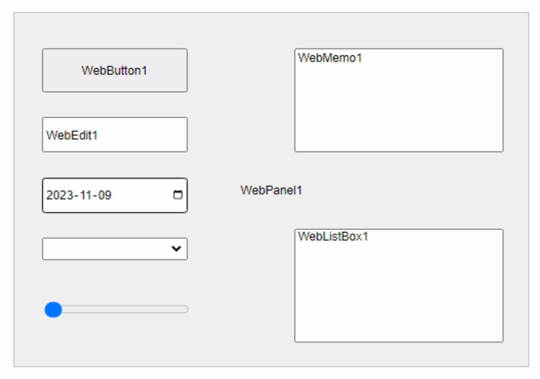
Default HTML Presentation.
Naturally, this looks largely the same as the IDE representation, as the default HTML rendering for these
components is also deliberately very simple, given that browsers have also been around a good long time. In fact, Netscape 1.0 was released a mere few months before Delphi 1.0. More
recently, various frameworks have been introduced that help bring a little bit
more style to the typical web page.
One of the most popular frameworks is of course Bootstrap, which we've used in many projects in these blog posts, most recently here. If we add Bootstrap to our project, by selecting it from the Manage JavaScript Libraries feature in the Delphi IDE or by adding links to our Project.html file, we can then add Bootstrap classes to the ElementClassName property of our components. If we had created a new TMS WEB Core project using the Bootstrap template to begin with, many TMS WEB Core components would have been created with various Bootstrap classes already added by default, when they were first dropped onto a form. Here, though, we can add similar classes ourselves.
For example, for the TWebButton component, we can add "btn btn-primary" to set it up as a default Bootstrap
primary color button. For the others, we can add the class "rounded p-1" to get rounded corners and a little
extra internal padding. For the TWebPanel component, we can also add "border border-secondary bg-light" to set a
background color and border. With minimal effort, we get the following.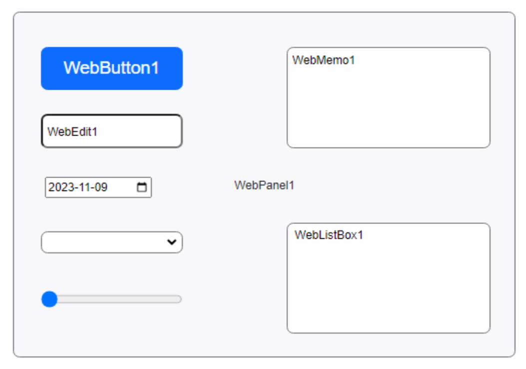
Bootstrap Presentation.
We've got lots of rounded corners already. Off to a good start. But what did we actually do here? Well,
Bootstrap classes, in this instance, are primarily just a way to apply CSS rules to elements on the page. By
adding the "rounded" class to the ElementClassName property of our components, we're essentially applying the
CSS value "border-radius: 0.375rem;" to our elements. As 1 rem is equivalent to 16px under normal circumstances,
this means we've got a border radius value of 6px that we're using.
Rounding With CSS.
With that in mind, let's say we didn't want to use Bootstrap, but rather just write the CSS ourselves. We can
remove Bootstrap from our project and then add our own CSS stylesheet. We'll have to also add it to our
Project.html file. If we just named our CSS file "Project1.CSS" we can then add the following line.
<link href="Project1.css" rel="stylesheet">
In this file, we can add the equivalent CSS rules we were using from Bootstrap, but we can just call them
whatever we like. CSS is case-sensitive, so to be sure we don't have any collisions with actual Bootstrap
classes (should we decide to add it back later), we can start all of our classes with capital letters. Here's
what we've got to start with.
.Round1 {
  border-radius: 6px;
}

.Button-Primary {
  color: blue;
}

.P1 {
  padding: 4px;
}

.Border1 {
  border: 1px solid black;
}

.Border-Maroon {
  border-color: maroon;
}

.BG-Silver {
  background-color: silver;
}

.BG-Blue {
  background-color: blue;
}

.Text-White {
  color: white;
}
We can then update the ElementClassName property of each of our components so that they use these class names instead of the Bootstrap class names. For example, our TWebButton component can be assigned the classes "Round1 BG-Blue Text-White". The TWebPanel component could be assigned "Round1 Border1 Border-Maroon BG-Blue". The other components could be assigned "Round1 P1" to get the equivalent styling.
Note that Bootstrap covers a lot more than these properties, particularly when it comes to hover colors, borders, fonts, and so on, but this gets us in the ballpark at least. Here's what it looks like with our own
CSS rather than Bootstrap.
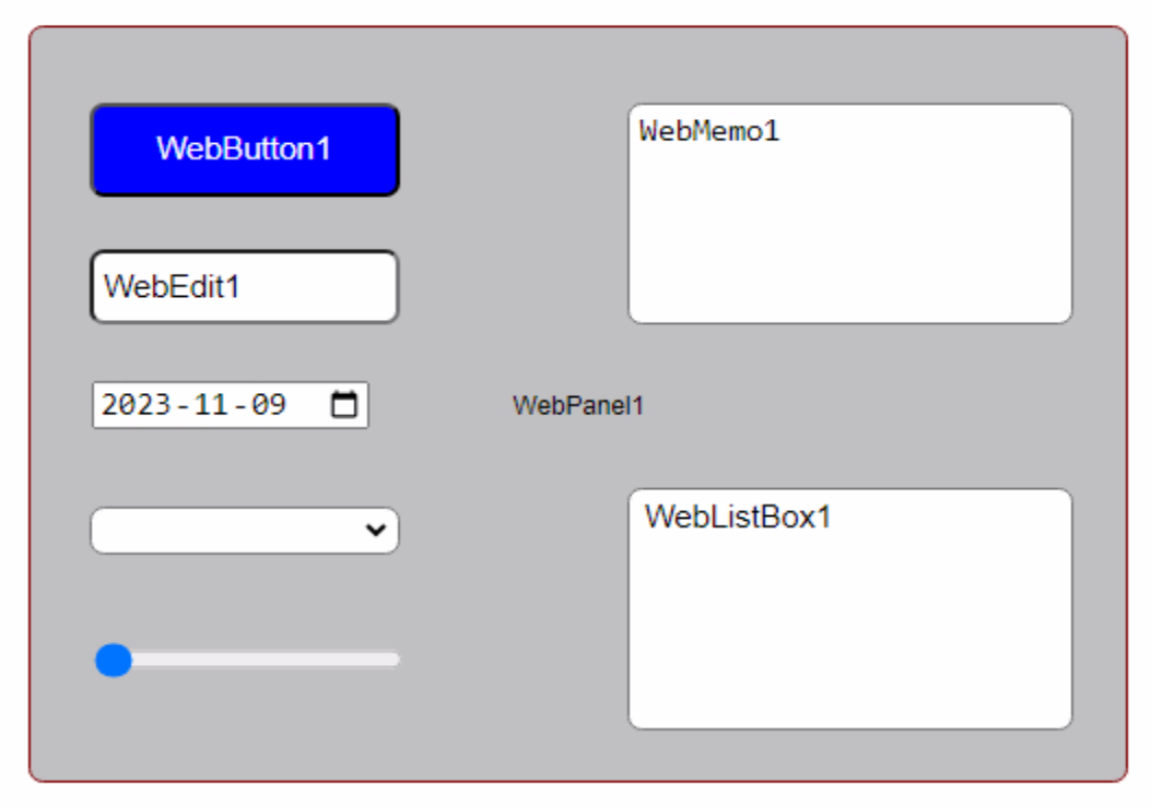
Custom CSS Styling.
This looks largely the same, with a slightly darker background color and a slightly different shade of blue for our
button. The fonts are different as well. We could get it to match exactly by pulling the same values from
Bootstrap for the colors and fonts if we were so inclined, but if we're making our own custom CSS anyway, then
it doesn't really matter - we can use whatever colors or fonts that we like. Not much point in making our own
custom CSS and then slavishly copying Bootstrap's values, after all.
CSS Variables.
Looking a little deeper into how Bootstrap defines its classes, you might notice that much of the time something other than actual values is used in their definitions. Instead of "0.375rem" for example, you might see "var(--bs-border-radius)" which, if you click on it or scroll further down the list of CSS declarations, ultimately gets resolved as "0.375rem". These are known as CSS variables and they can be used pretty much anywhere that any other CSS value is used.
To make use of these in our custom CSS, we can just declare them in a :root section, and then use them in the
same way. Let's use our own prefix of "twc" (for TMS WEB Core) and then declare some variables and apply them to
our existing CSS.
:root {
  --twc-border-radius-1: 6px;

  --twc-color-1: blue;
  --twc-color-2: silver;
  --twc-color-3: maroon;
  --twc-color-4: black;
  --twc-color-5: white;

  --twc-padding-1: 4px;
}

.Round1 {
  border-radius: var(--twc-border-radius-1);
}

.Button-Primary {
  color: var(--twc-color-1);
}

.P1 {
  padding: var(--twc-padding-1);
}

.Border1 {
  border: 1px solid var(--twc-color-4);
}

.Border-Maroon {
  border-color: var(--twc-color-3);
}

.BG-Silver {
  background-color: var(--twc-color-2);
}

.BG-Blue {
  background-color: var(--twc-color-1);
}

.Text-White {
  color: var(--twc-color-5);
}
This means that we can define the rest of our CSS rules using these variables. When we want to make a change, we can just change the original declaration rather than having to sort through all the CSS to find every occurrence of, say, border-radius.
It turns out that we can also access these CSS variables from within JavaScript. Let's wire up that TWebTrackBar to
show how this works. We can give it a range of 0 to 50. We're going to assume that we're using "px" CSS units for
everything here, but we could use something else, or with a bit more work have it support a number of units.
First, let's get the value from the CSS variable and set our trackbar position when the app first starts.
procedure TForm1.WebFormCreate(Sender: TObject);
var
  borderradius: String;
begin
  asm
    var root = document.querySelector(':root');
    var rootstyle = getComputedStyle(root);
    borderradius = rootstyle.getPropertyValue('--twc-border-radius-1');
  end;
  WebTrackBar1.Position := StrToIntDef(StringReplace(borderradius,'px','',[]),6);
end;
Then, when we change the trackbar, let's update the CSS variable accordingly.
procedure TForm1.WebTrackBar1Change(Sender: TObject);
var
  borderradius: String;
begin
  borderradius := IntToStr(WebTrackBar1.Position)+'px';
  asm
    var root = document.querySelector(':root');
    root.style.setProperty('--twc-border-radius-1', borderradius);
  end;
end;
Here's what it looks like in action.
Alright, 50px is probably a little too much rounding, but hopefully you get the idea here. We can easily make
adjustments, from within our running app, when developing our project, or perhaps if we want to
create an interface where the user can customize styles directly. We can do this for any CSS variable, which
in turn can be used for almost any CSS property. Handy.
Backgrounds.
Alright, let's look at something a little more complex. Let's say we have a data entry form of some kind, with a couple of different sections, with a couple of different types of components. We'd like to have the styling arranged to make it obvious that there are different sections.
We can start by adding more interesting
background patterns. There are many online resources for such things, but here we're using Hero Patterns again to pick up a main background and a couple of section
backgrounds. The CSS in this case involves the background-color and background-image properties. These can be
simply copied and pasted directly into our CSS file and assigned to CSS variables within the same :root section.
  --twc-background-color-1:  #eeeeee;
  --twc-background-image-1: url("data:image/svg+xml,%3Csvg width='84' height='48' viewBox='0 0 84 48' xmlns='http://www.w3.org/2000/svg'%3E%3Cpath d='M0 0h12v6H0V0zm28 8h12v6H28V8zm14-8h12v6H42V0zm14 0h12v6H56V0zm0 8h12v6H56V8zM42 8h12v6H42V8zm0 16h12v6H42v-6zm14-8h12v6H56v-6zm14 0h12v6H70v-6zm0-16h12v6H70V0zM28 32h12v6H28v-6zM14 16h12v6H14v-6zM0 24h12v6H0v-6zm0 8h12v6H0v-6zm14 0h12v6H14v-6zm14 8h12v6H28v-6zm-14 0h12v6H14v-6zm28 0h12v6H42v-6zm14-8h12v6H56v-6zm0-8h12v6H56v-6zm14 8h12v6H70v-6zm0 8h12v6H70v-6zM14 24h12v6H14v-6zm14-8h12v6H28v-6zM14 8h12v6H14V8zM0 8h12v6H0V8z' fill='%23cccccc' fill-opacity='0.46' fill-rule='evenodd'/%3E%3C/svg%3E");

  --twc-background-color-2: #777777;
  --twc-background-image-2: url("data:image/svg+xml,%3Csvg width='6' height='6' viewBox='0 0 6 6' xmlns='http://www.w3.org/2000/svg'%3E%3Cg fill='%230000ff' fill-opacity='0.49' fill-rule='evenodd'%3E%3Cpath d='M5 0h1L0 6V5zM6 5v1H5z'/%3E%3C/g%3E%3C/svg%3E");

  --twc-background-color-3: #cccccc;
  --twc-background-image-3: url("data:image/svg+xml,%3Csvg width='44' height='12' viewBox='0 0 44 12' xmlns='http://www.w3.org/2000/svg'%3E%3Cpath d='M20 12v-2L0 0v10l4 2h16zm18 0l4-2V0L22 10v2h16zM20 0v8L4 0h16zm18 0L22 8V0h16z' fill='%23999999' fill-opacity='0.2' fill-rule='evenodd'/%3E%3C/svg%3E");
Then, we can craft our own CSS classes or otherwise assign these wherever we like. In our components, we can reference them by using the same BG1, BG2, or BG3. If we want to change them, we can just make the change in the original :root declaration and we don't have to worry about the rest of our CSS. The same background will be applied wherever it was applied previously.
body {
  background-color: var(--twc-background-color-1);
  background-image: var(--twc-background-image-1);
}

.BG1 {
  background-color: var(--twc-background-color-1);
  background-image: var(--twc-background-image-1);
}
.BG2 {
  background-color: var(--twc-background-color-2);
  background-image: var(--twc-background-image-2);
}
.BG3 {
  background-color: var(--twc-background-color-3);
  background-image: var(--twc-background-image-3);
}
Moving About.
Next, let's consider that this data entry form might be a popup of some kind and that we might want to move it
around the page. We've covered the InteractJS library a few times now, so we can make quick work of it here. As
usual, we'll need a link for our Project.html file.
<script src="https://cdn.jsdelivr.net/npm/interactjs/dist/interact.min.js"></script>
And in WebFormCreate we'll need to configure InteratJS to define the class name we want it to attach itself to,
as well as what we want that class to do. Here, we're interested in both resizing and dragging the element we're
working on, so we'll add a "resize-drag" class, which is typically what we've been doing in all of the
InteractJS implementations so far. This can be added to WebFormCreate.
  asm
   interact('.resize-drag')
      .resizable({
        edges: { left: true, right: true, bottom: true, top: true },
        margin: 12, // size of resizing boundary interaction area
        listeners: {
          move (event) {
            var target = event.target
            var x = (parseFloat(target.getAttribute('data-x')) || 0)
            var y = (parseFloat(target.getAttribute('data-y')) || 0)
            target.style.width = event.rect.width + 'px'
            target.style.height = event.rect.height + 'px'
            x += event.deltaRect.left
            y += event.deltaRect.top
            target.style.transform = 'translate(' + x + 'px,' + y + 'px)'
            target.setAttribute('data-x', x)
            target.setAttribute('data-y', y)
          }
        },
        ignoreFrom: '.nointeract'
      })
      .draggable({
        listeners: { move: dragMoveListener },
        ignoreFrom: '.nointeract'
      })
      .pointerEvents({
        ignoreFrom: '.nointeract'
      });

    function dragMoveListener (event) {
      var target = event.target
      var x = (parseFloat(target.getAttribute('data-x')) || 0 ) + event.dx
      var y = (parseFloat(target.getAttribute('data-y')) || 0 ) + event.dy
      target.style.transform = 'translate(' + x + 'px, ' + y + 'px)'
      target.setAttribute('data-x', x)
      target.setAttribute('data-y', y)
    };
    window.dragMoveListener = dragMoveListener
  end;
Finally, to set some limits on resizing, we can add a class called Popup to our CSS where we supply the minimum
and maximum dimensions. This could also be defined directly in the above JavaScript code but having it in the
CSS might make it more accessible to a web designer, who might not have access to, or any interest in, modifying
the underlying JavaScript.
.Popup1 {
  min-width: 250px;
  max-width: 750px;
  min-height: 400px;
  max-height: 800px;
}
Alternatively, these could also be set up as CSS variables under the control of our app and adjusted when the app
first loads, such as might be the case if we wanted to supply a bunch of JSON parameters in a configuration file. Lots of options. Similarly, there are a lot of options related to InteractJS beyond just dragging and
resizing that we might well consider, particularly if we don't want any part of the popup hidden offscreen or
resized into a different aspect ratio. For now, this gets us moving.
Element Positioning.
Next, let's set up our data entry elements. To start, we're after some basic address information, so name and address and that kind of thing. We can use CSS flex to help with the alignment and spacing to ensure consistency. Bootstrap provides a bunch of these, but we only really need a handful here.
For those perhaps
not that familiar with CSS flex, the most interesting item is likely to be "gap" which inserts a space (horizontally or
vertically) between flex elements. Combined with the padding (or alternatively, using margins), it is possible
to get consistently spaced elements without having to worry about whether the row or column is first or last in
the set. Very handy.
.DisplayFlex {
  display: flex;
}

.FlexRow {
  flex-direction: row;
}

.FlexCol {
  flex-direction: column;
}

.P1 {
  padding: var(--twc-padding-1);
}

.G1 {
  gap: var(--twc-gap-1);
}
Another consideration is that we can tell our components to automatically size themselves vertically, using the HeightStyle property of "auto", but for width, we can use the WidthStyle property of "Percent" and set it to either 100% for full-width items, or maybe 50% to split the available space, or perhaps something else if that makes more sense. Combined with our CSS classes, backgrounds, and InteractJS, we've now got a pretty reasonable data entry form.
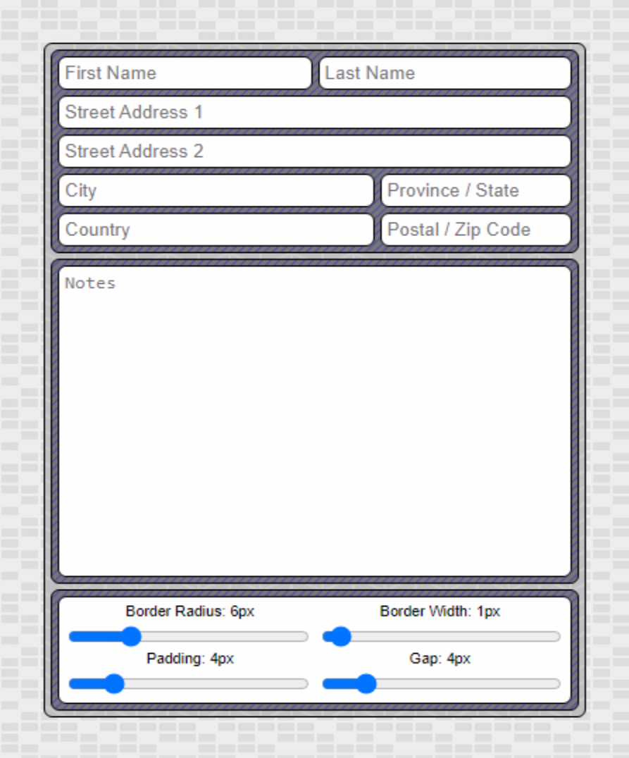
Sample Data Entry Form.
At the bottom, we've got a few more TWebTrackBar components that we can use to make adjustments. If
we go a little crazy with the rounding we can see our final item that needs attention. If you look closely,
you'll notice that the width of the outermost border (around the top block of contact information for example)
doesn't have a constant width. It kind of bulges in the corners on the outside, and then is too thin on the
inside. This is then repeated on successive levels of nesting. If we use "normal" rounding values, this isn't too offensive, but as we approach various limits, it becomes egregious and something needs to be done. But what?
Rounding Problem.
CSS Calculations.
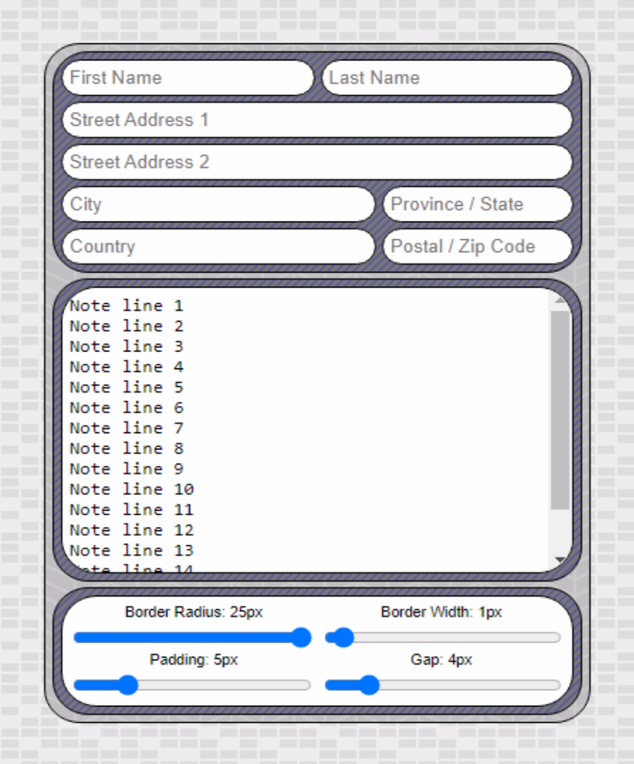
The issue arises because we're using the same border-radius value each time. We should instead be calculating
the nested values so that we properly factor in the rounding that has occurred already. In addition to CSS
Variables, CSS can also perform calculations. What we need in this case is to reduce the rounding by the amount
of padding between successive nested corners. In the :root section of our CSS we can therefore define new radius
values.
  --twc-border-radius-1: 6px;
  --twc-border-radius-2: calc(var(--twc-border-radius-1) - var(--twc-padding-1));
  --twc-border-radius-3: calc(var(--twc-border-radius-2) - var(--twc-padding-1));
To use these, we'll have to apply CSS classes based on whether it is the outermost element (Round1), one level
down (Round2), or the innermost element (Round3).
.Round1 {
  border-radius: var(--twc-border-radius-1) !important;
}
.Round2 {
  border-radius: var(--twc-border-radius-2) !important;
}
.Round3 {
  border-radius: var(--twc-border-radius-3) !important;
}
After updating the classes, things look much better.
With Calculated Border-Radius Values.
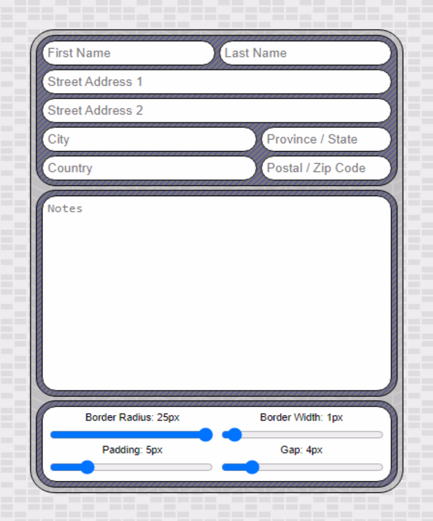
Now we can adjust all the values and we get a consistent border thickness no matter what options we choose.
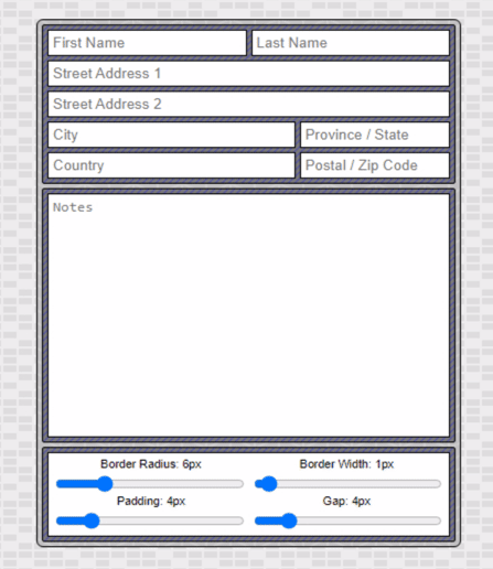
Data Entry Demo.
Well-Rounded?
And with that, we've got a completed data entry form that we can tweak in all kinds of ways. What do you think?
Will rounded corners be making an appearance in your projects? How about InteractJS? As always, questions,
comments, and other feedback are most appreciated.
Follow Andrew on 𝕏 at @WebCoreAndMore or join our 𝕏 Web Core and More Community.
Andrew Simard

This blog post has not received any comments yet.
All Blog Posts | Next Post | Previous Post