Blog
All Blog Posts | Next Post | Previous Post

 Using Bootstrap themes and runtime theme selection in TMS WEB Core applications
Wednesday, July 17, 2019

Without a doubt, Bootstrap is one of the most popular CSS libraries for web applications. Using Bootstrap, you can easily create a consistent and modern looking web application. Since its inception, TMS WEB Core is designed to be totally open with respect to using a CSS library like Bootstrap or any other CSS library.
Basically, using HTML templates for your form files, you have the full HTML/CSS power to your disposition but also when building forms via the Delphi form designer there is help to use and integrate CSS.
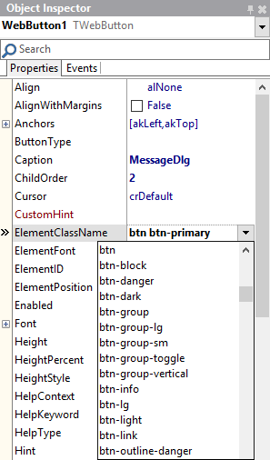
Every TMS WEB Core UI control has at least the ElementClassName property from where you can set CSS classname(s) for the main HTML elements in the control. Where multiple HTML elements are used in UI controls, often multiple Element*ClassName properties exist. The Eleent*ClassName property editor in the IDE is smart, as it provides automatically lookup of possible CSS class names. This lookup is based on CSS libraries you might have added manually or via a library to your application.
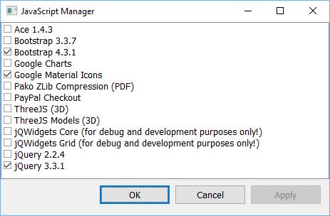
But, back to Bootstrap! Given this is such a popular & powerful library, we've gone an extra step from TMS WEB Core v1.2.4.0 facilitating the ease of use to use it from the IDE and also to allow runtime Bootstrap theme selection.. To get started with Bootstrap in your project, select from the project context menu in the Project Manager under "Managing JavaScript Libraries" jQuery 3.3.1 (since Bootstrap 4 uses jQuery) and Bootstrap 4.3.1.
Now, at form level you have a new property TWebForm.CSSLibrary = (cssNone, cssBootstrap). Default this is cssNone but when you set it to cssBootstrap, this is picked up by UI control when these are added to the form so these new UI controls get optimally preset for Bootstrap.
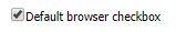
To illustrate this, when we add a new checkbox to a form with CSSLibrary = cssNone, this becomes:
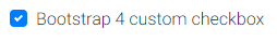
Now, when we set the form.CSSLibrary to cssBootstrap and add a checkbox, you can notice that a number of the TWebCheckBox properties got preset for optimal rendering with Bootstrap.
WebCheckBox.ElementButtonClassName = 'custom-control-input'
WebCheckBox.ElementClassName = 'custom-control custom-checkbox'
WebCheckBox.ElementFont = efCSS
WebCheckBox.ElementLabelClassName = 'custom-control-label'
When rendered, the result is:
Of course, we can further fine-tune CSS classnames after adding UI controls on the form and the form will not override any custom settings you might have done.
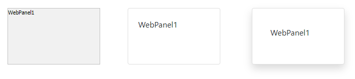
For example, below you can see a TWebPanel with a default style, a Bootstrap style and customized Bootstrap style:
The panel Bootstrap style is:
WebPanel.ElementBodyClassName = 'card-body'
WebPanel.ElementClassName = 'card'
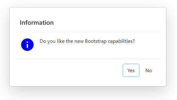
Dialogs will also automatically pickup the Bootstrap style when used on a form with CSSLibrary = cssBootstrap. Standard, the call:
begin
  MessageDlg('Do you like the new Bootstrap capabilities?',mtInformation, [mbYes, mbNo]);
end;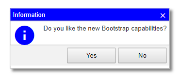
When Bootstrap is used, it automatically becomes:
Bootstrap themes
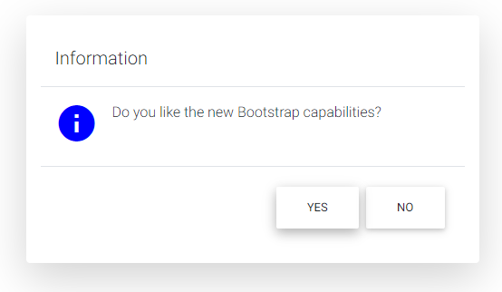
Now, we have used the standard Bootstrap CSS style and while some like it because it is so recognizable and consistent, other people prefer to create something that stands out. There are various possibilities. Given the standarization the Bootstrap CSS class names, it is easy to use libraries that build on Bootstrap like mdbootstrap for example. When we add the mdbootstrap cdn reference <link href="https://cdnjs.cloudflare.com/ajax/libs/mdbootstrap/4.8.5/css/mdb.min.css" rel="stylesheet"> to a TMS WEB Core project, it becomes:
And there is more, on the internet you will find lots of Bootstrap themes, many of which are free and open source. A nice collection can be found at: https://bootstrap.themes.guide/
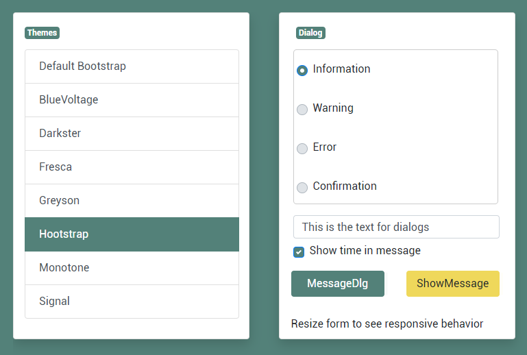
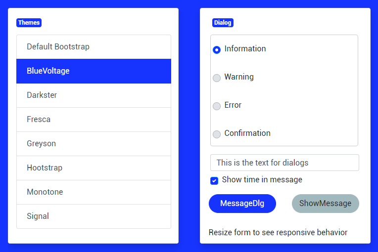
We have added a new demo that shows how you can use such themes and even how you can change the theme of your TMS WEB Core web application at runtime easily.
Basically, to use a Bootstrap theme from https://bootstrap.themes.guide/ , we need to add a theme.css after including the Bootstrap CSS library. To switch such theme at runtime, we can use the TApplication methods ChangeCSS(), InsertCSS(), RemoveCSS().
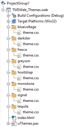
So, from the demo we have included several such theme.css files to the project
To perform the theme selection at runtime, we have added a TWebListControl that lists the available themes and from the list OnClick event, switching the theme is as easy as:
procedure TForm3.WebListControl1ItemClick(Sender: TObject;
  AListItem: TListItem);
begin
  WebListcontrol1.ItemIndex := AListItem.Index;

  if WebListcontrol1.ItemIndex = 0 then
    Application.RemoveCSS('themecss')
  else
    Application.InsertCSS('themecss',AListItem.Text+'/theme.css');
end;
In the other panel, you can see a radiogroup and a way to show messageboxes, so you can see the effect of the selected theme also on these controls and dialogs.
Something else noteworthy in the demo is the easy of use to create a responsive design. This is achieved with the TWebResponsiveGridPanel. This grid panel is used to show the two panels under each other on small devices like smartphones or portrait tables and next to each other on desktop browsers or landscape tablets.
The use of TWebResponsiveGridPanel to create such responsive design is really easy. When we double-click it, we can see the two possible layouts. When the device screen width is smaller than 700, the style is "1fr", meaning one full width column is used and for the screen width larger than 700, style is "1fr 1fr", meaning the screen width is divided in two equally wide full column widths.
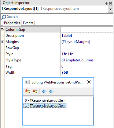
The TWebResponsiveGridPanel.WidthStyle is configured here as ssPercent and TWebResponsiveGridPanel.WidthPercent is 100%, so the TWebResponsiveGridPanel always takes the full screen width. The TWebResponsiveGridPanel.HeightStyle is set to ssAuto. This means that the height of the panel automatically adapts to the content of the panel. This means the height will be the height of the panel child controls when two columns are used and twice the height of the child panels when the panels are rendered under each other on smartphone screens.
Well, what is easier than let you see and play with the demo live from your favorite browser?
Go here for the themes demo!
Excited to go ahead and discover these and more fascinating features in TMS WEB Core that let you create web client applications with unprecedented capabilities?
You can download the trial version, go ahead with the standalone version you purchased or with TMS WEB Core and additional tools that are all included in TMS ALL-ACCESS. Our team looks forward to all your comments, feedback, feature-requests to help steering the development of TMS WEB Core to the next stages!
Bruno Fierens

This blog post has received 3 comments.
 2. Sunday, July 21, 2019 at 1:25:21 PM
Thanks José and much more in the works & coming!
2. Sunday, July 21, 2019 at 1:25:21 PM
Thanks José and much more in the works & coming!
Bruno Fierens
3. Thursday, August 22, 2019 at 1:36:12 AM
Excellent news.Congratulations.
BORGES MARCOS AURÉLIO
All Blog Posts | Next Post | Previous Post
This is getting better and better.
Well done :)
Morango Jose