Blog
All Blog Posts | Next Post | Previous Post

 Extend TMS WEB Core with JS Libraries with Andrew:
Tabulator Part 3: Viewing Data in Tabulator
Tuesday, June 21, 2022

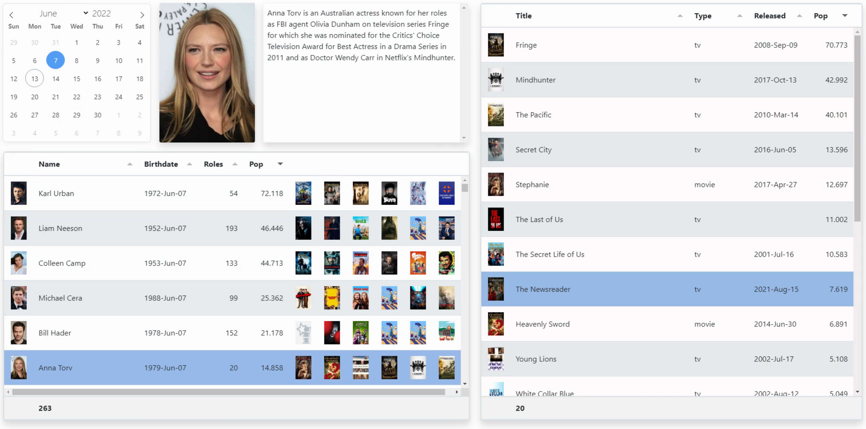
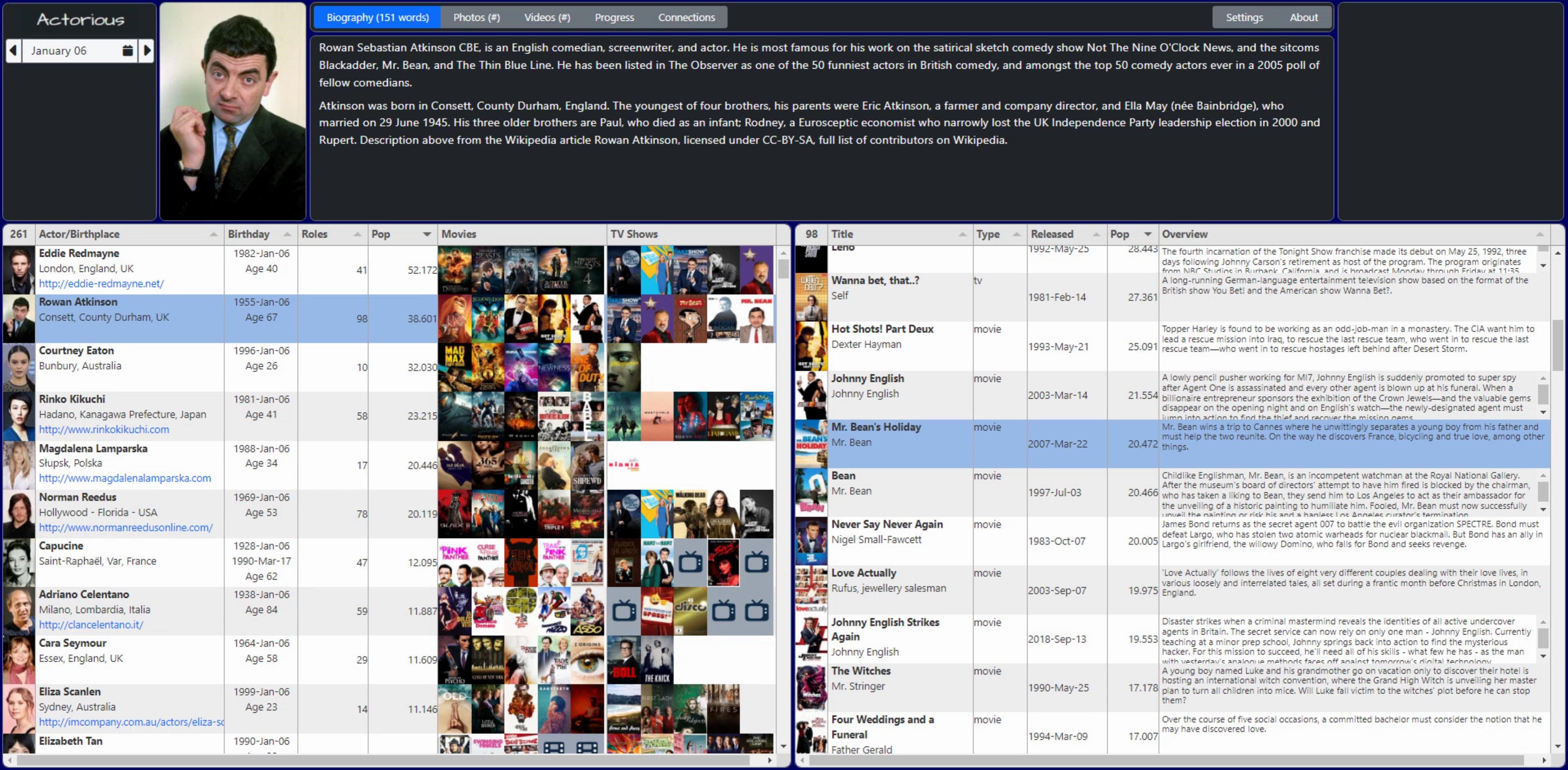
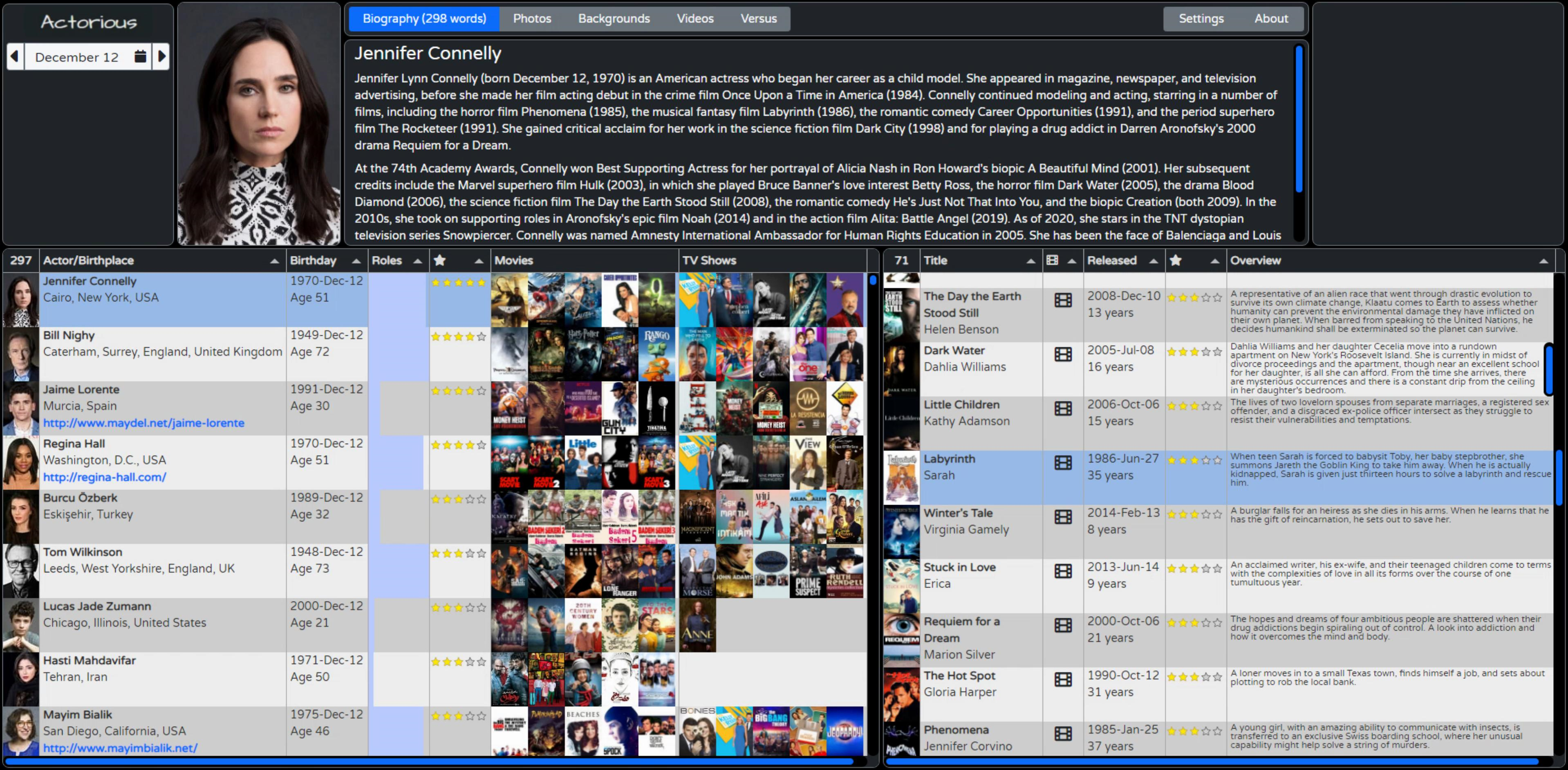
In this third stop on our Tabulator adventure, we're going to focus mostly on the options available for how data is displayed. But in order to help narrow our focus a little further, we're going to take the TMS WEB Core project from last time, what we are calling ActorInfo, and explore ways we can view the data we have available, covering many Tabulator options along the way. Styling and theming a modern web application potentially involves some amount of CSS work, so we'll cover a bit of that as well. And to keep it interesting for those not all that keen on Tabulator specifically, we'll also cover how such a TMS WEB Core app might be deployed in a production setting.
Motivation.
As we discussed in the first of these Tabulator posts, having a grid control that does what you want, as a developer, makes for an enormously powerful tool. And for web applications, what developers are often after is the ability to customize, as much as possible, anything that is visible to the user.
This may arise from a need for a responsive interface that is accessible to everyone on every device. Or it may come from a desire to apply a specific style or theme, including color, logos, iconography, and that sort of thing. Or some level of customization may be needed to address certain mechanical aspects of the interface or the underlying data. Or it can be any combination of these, or other considerations entirely. The point being, more options for customization are generally better for the developer. Better still if there are reasonable defaults to start with and a consistent approach to customization that is not overly difficult to implement.
The approach taken here is perhaps a little less organized than I'd like but reflects more accurately how this has come together. We'll start with where we ended up last time, and then systematically make changes to implement whatever customization is desired, outlining the steps and the thought process along the way. By the time we're done today, we'll have a pretty functional app, deployed, and ready for users. And while I don't expect anyone to particularly agree with my styling or theming or layout choices, the main takeaway should be, as usual, that you've got options!
Two Disclaimers.
Just a couple of things to point out before we get too immersed in our work here. First, there are countless ways a developer can choose to implement any particular bit of functionality. And the same developer, facing the same choices, in the same app, may even implement the same thing in different ways. And there are some examples of that on display here. Sometimes, this is because I learned something new and haven't gone back and updated the original code. Sometimes, it's because I'm lazy and cut and paste code where it isn't really important (code executed infrequently, say), but might spend more time on the same thing in another spot where it is more important (code executed frequently in a loop, for example). So don't be too harsh when looking at any of this code. I've tried to clean up the worst examples, but I'm sure some are lingering still.
Case in point, in the XData application, in the service endpoint, I make use of Indy's HTTP client to retrieve data from WikiData and TMDb, with the SSL headaches that that approach entails. But in MainForm, I implement the same sort of thing using Delphi's NetHTTPClient, which I'd never used previously. I'd always just used Indy for everything like that, for so very long. So I should (and maybe will) go back and remove the Indy version, but if you're using an older version of Delphi and just want to know how to use Indy to do it, that's a good example to have on-hand as well.
The second disclaimer is about the use of JavaScript vs. Delphi in the code samples. As Delphi developers, naturally, there might be a preference for seeing Delphi code in a blog about using a product (TMS WEB Core) designed for Delphi. In fact, on the pas2js website, they specifically discourage using asm ... end blocks in your Delphi code. The rationale is that they just pass this code directly, whereas Delphi code that does the same thing can be properly optimized by their compiler.
However, one of my absolute favorite things about TMS WEB Core is the ability to shift back and forth between the two languages. And as we're dealing (in this blog series, anyway) specifically with JavaScript libraries, there is a tendency to use JavaScript more than might be strictly necessary. Perhaps a future blog post will cover hints and tips about using JavaScript (or avoiding the use of JavaScript!) within TMS WEB Core applications specifically, and just how easy it is to move back and forth between the two. This post in particular, though, has a lot of JavaScript.
But enough of all that. Let's get started.
Update Layout.
Before we even get to Tabulator, let's start out by making some changes to the layout of the ActorInfo app. It works pretty well as-is, but if anyone downloaded the project, they'd have immediately noticed it was all fixed elements - nothing moved when you resized or zoomed the browser page, and not much could be changed directly. So let's do some quick layout work first and put in a few more elements to make it more production-ready.
There's nothing particularly special about any of these, just a lot of fiddling, mostly. But if you're curious about any of them, have a look at the project source or by all means post a question about it, and I'd be more than happy to elaborate. We've got many other topics to discuss in much more detail, not to worry.
- A CSS file was added specifically to hold all of our customizations.
- The top section was set up for selecting an Actor and for information about the actor selected.
- The bottom section is then for the two tables - Actors and Roles.
- The FlatPickr component was changed to a pop-up control, with a different displayed date format.
- The top-right section now includes a TWebPageControl, so we can have a Bio page, a Photos page, and so on.
- A Bootstrap button group was added as an alternative to the built-in PageControl tabs.
- The default Bootstrap 5 theme for the tables was dropped, and the regular Tabulator theme was used instead.
- CSS was added to override the default Bootstrap rounding from 0.2rem to 0.5rem.
- Section background colors were changed (Bootstrap 'dark' color).
- A border was added to all the sections (Bootstrap 'secondary' color).
- The current date is automatically selected, and the first entries in the tables are selected, at startup.
- Two TWebSliders were added (top/bottom and between tables), but they're invisible.
- Main actor photo scales with adjusting the vertical slider.
- Custom scrollbar for the Biography section.
- Lots of renaming of things internally.
Dynamic Column Titles.
Column titles can naturally be set as part of the column definitions, separate from the field names. These are normally set when the table is first created, and typically they don't change. In both our tables, the first column is an image, which doesn't really need a title, and it also doesn't make much sense to sort it. But we also have a footer, and its only real purpose is to show us the count of how many records we are looking at. So let's move that count from the footer into the first header column title. Then, when no footer calculations are defined (bottomCalc in the field definitions), no footer will be generated. Which is what we're after here.
When GetBirthdays is invoked, the ActorTabulator is populated. In this case, we just need to add an extra call to update the header. While we're at it, we'll also make sure the first row is selected and that it should kick off whatever happens when we normally click on a row - selecting an actor, showing their photo, and so on. Most of the time, Tabulator does a pretty good job of maintaining a consistent display. But if you run into artifacts or things get out of sync somehow, calling table.redraw() cleans things up. Not all that different than Delphi's repaint functionality.
  // If we're successful, load data into the table
  if good then
  begin
    asm
      var table = Tabulator.findTable("#divActorTabulator")[0];
      table.setData(JSON.parse(data))
      .then(function(){

        // update the first column header to show a count
        table.updateColumnDefinition("Photo", {title:table.getDataCount()});

        // highlight the first row, based on whatever sorting is currently in place
        table.selectRow(table.getRowFromPosition(0, true));

        // Do what we would do if we had directly clicked on that row
        window.actor_selected(null, table.getRowFromPosition(0,true));

        // Refresh it all
        table.redraw(true);
      });
    end;
  end;
When a record is selected in ActorTabulator, generally this will result in a reload of RoleTabulator as well, so we'll do something similar here to get the first column header to show the number of records (roles, in this case).
      // Get data for RoleTabulator from Work field in ActorTabulator
      var data = row.getCell('Work').getValue();
      var RoleTable = Tabulator.findTable("#divRoleTabulator")[0];
      RoleTable.setData(data)
      .then(function(){
        // update the first column header to show a count
        RoleTable.updateColumnDefinition("Poster", {title:RoleTable.getDataCount()});

        // highlight the first row, based on whatever sorting is currently in place
        RoleTable.selectRow(RoleTable.getRowFromPosition(0, true));

        // Refresh it all
        RoleTable.redraw(true);
      });
Biography Improvements.
When selecting an Actor, the RoleTabulator gets updated as above, but we also update the biography block at the same time. Nothing really to do with Tabulator here, just an example of dealing with data that isn't always in the format needed.
In this case, the biography text contains \n values to represent line breaks. One way to handle these is to replace them with <br /> tags so the line breaks are visible. Or maybe two <br /> tags so that you get a bit of paragraph spacing happening. I don't particularly like that, as then your paragraph spacing is the same as the line height. Which is quite a lot. Another way is to wrap the entire biography text with <p> and </p> and then replace \n with </p><p> - essentially making paragraphs. Then, in the CSS file, we can change <p> spacing to have maybe half the space that <br /> would give, which looks a little bit nicer. And, just for fun, let's include a word count. Just happened to run across a function that did this and thought it was interesting.
      // Load biography from ActorTabulator into DIV
      // Convert \n characters into paragraphs
      // Add word count just for fun
      var bio = document.getElementById('divBiography');
      bio.innerHTML = '<div class="w-100 h-100 ps-2 pe-2 pb-4 CustomScroll" style="overflow-y:auto; white-space:normal;"><p>'+decodeURIComponent(row.getCell('BIO').getValue()).replace("\n","</p><p>")+'</p></div>';
      var words = decodeURIComponent(row.getCell('BIO').getValue()).trim().split(/\s+/).length;
      if (words > 1) { document.getElementById('btnBio').innerText = 'Biography ('+decodeURIComponent(row.getCell('BIO').getValue()).trim().split(/\s+/).length+' words)'; }
      else {document.getElementById('btnBio').innerText = 'Biography (none)'; }
And also just for fun, let's change the scrollbars in the biography to something a little more fun. This can be done entirely via CSS.
/* Customize scrollbars
**
** Sadly Tabulator doesn't pick this up, but it does work in lots of
** other places, like the Biography text.
*/
.CustomScroll::-webkit-scrollbar {
  width: 15px;
}
.CustomScroll::-webkit-scrollbar-track {
  background-color: #f8f9fa;
  border-radius: 200px;
}
.CustomScroll::-webkit-scrollbar-thumb {
  background-color: #0d6efd;
  border-radius: 200px;
}
Image Optimization.
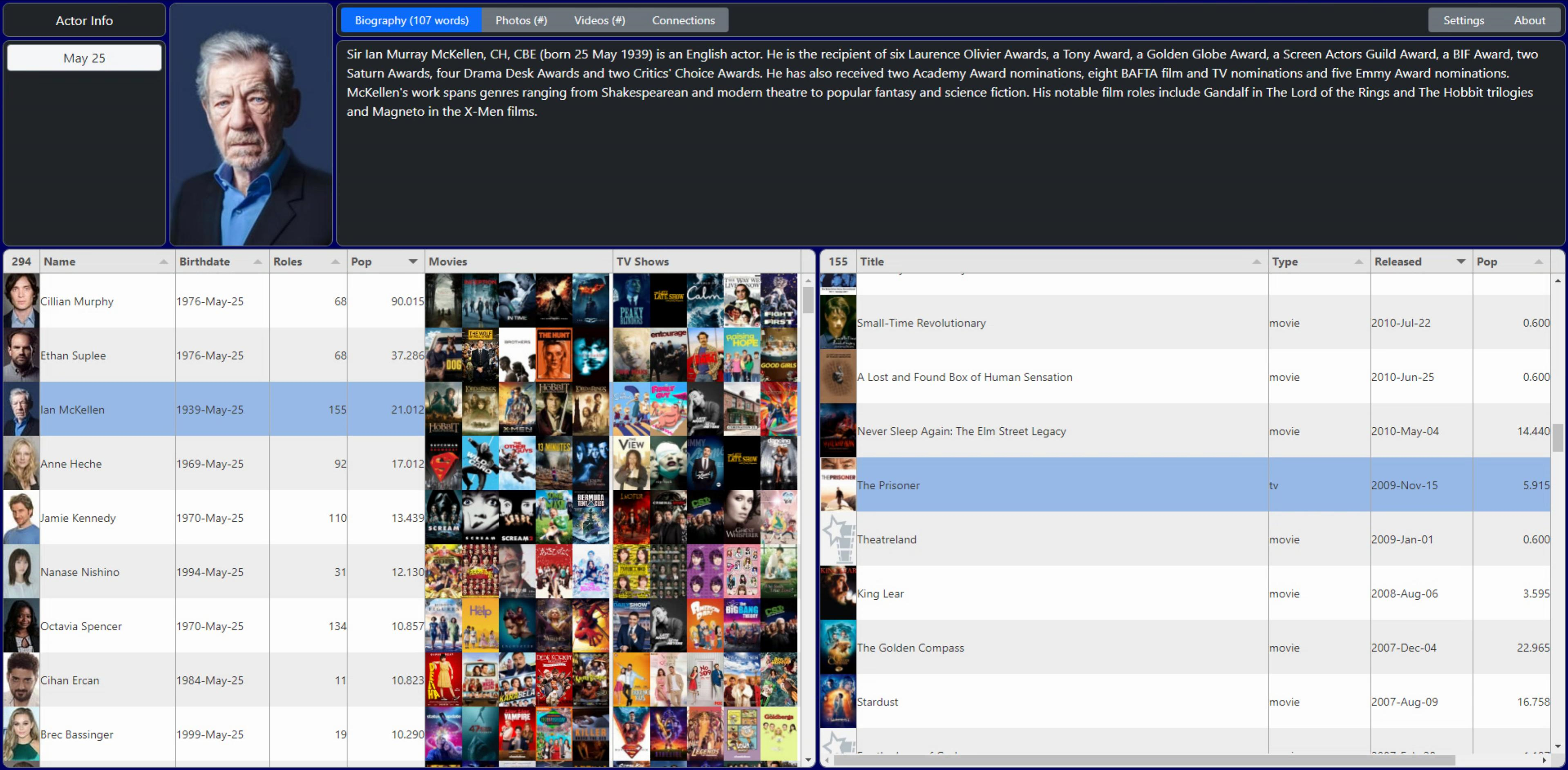
The next obvious elements that need attention are the images. The Movie Database API returns a path to an image that represents either a Person, a Movie, or a TV Show. But they have several formats (sizes, mostly) of these same images. And those are retrieved by taking the path provided by TMDb and adding different URL prefixes. Note that in this case, access to the actual images isn't hidden behind their API, so no key is needed.
We picked just one to get up and running last time, but we can do better by picking the sizes appropriate for where they are being displayed. In the Tabulator tables, for example, thumbnails are fine. But for the image at the top, we want a bit more quality. And if someone clicks on that top image, we want the best quality we can get. There may also be additional images available, or maybe even video clips as well.
Switching between image sizes is done by changing the URL prefix of the image. In our last outing, we converted the path and URL prefix in the XData server, passing the full image filename to the client. This time we'll just pass the path as we get it from TMDb and then do the work in the client to select different images. We could also do this on the server (maybe a future iteration will), but the example here is more useful with this approach.
The Tabulator image formatter has a convenient urlPrefix and urlSuffix parameters that can be used to do exactly this kind of thing. But alas, the TMDb folks don't provide image placeholders. This means we'll have to do this bit manually, and then we can insert our own placeholders where needed.
For Person images (actors), TMDb refers to these as 'profile' images, and they offer the following sizes.
- w45 (thumbnail) 45px x 68px
- w185 (small) 185px x 278px
- h632 (large) 421px x 632px
- original (may not actually be bigger)
For Movie and TV Show images, TMDb refers to these as 'poster' images and a different set of sizes is available. The list includes w92, w154, w185, w342, w500, w780 and original. Last time, we just used w185 for both. This time, we'll use the w45 profile images in the tables for the Person photos, and then the h632 profile image for the top of the page. And we'll use the w92 poster images for the Movie and TV Show posters in the tables, as that's the smallest available.
As all of the images are just passed as a path from TMDb and now from XData, we need to update them to include this URL prefix to set their size. To do this, we're going to use what Tabulator refers to as a 'mutator' function. This will permanently change the underlying data. The idea is that when we need it later, we generally don't have to do anything - it is already in its final form. Mutators are separate JavaScript functions (which could easily call Delphi functions) and they are setup by defining a Mutator in the column definition. For the very first (visible) column, the actor photo, this is what we've got.
{ title: "#",
    field: "Photo",
    width:45,
    headerSort:false,
    resizable: false,
    headerHozAlign:"center",
    hozAlign:"center",
    formatter: "image",
    formatterParams:{
      width: 45,
      height:68
    },
    mutator: checkimage,
    mutatorParams: {
      imgtype: "person"
    }
}- title refers to the column header title, which is being replaced with the table record count.
- field refers to the JSON object label that contains the profile image path (something like "/123456.jpg").
- width is how wide the column will be. The height of the row is set automatically.
- headerSort determines whether the sort icon is available, and is not needed here.
- resizable controls whether the width of the column can be resized, also not needed here.
- headerHozAlign determines the column header alignment.
- hozAlign determines the column alignment (for each row).
- formatter defines how Tabulator will attempt to display the data. In this case, an image.
- formatterParams are the parameters passed to the formatter function (the builtin-in image formatter in this case).
- mutator indicates the function (and parameters) that will adjust the data ahead of time.
- mutatorParams are the parameters passed to the mutator function (checkimage in this case).
The "image" formatter normally will just display an image by supplying its "src" attribute with whatever data is in the table. The formatterParams can specify things like width and height, as we're doing here, but also prefixURL and suffixURL. Here's a link to the Tabulator Documentation on this topic, a pretty representative sample of how well-documented everything is.
The purpose of our mutator function is to replace the data in the "photo" column with something that the "image" formatter can use directly. To make this a little more useful, we'll also pass a parameter that we just made up, "imgtype", to indicate what kind of image this is (not the format but rather the image contents). We can then re-use this mutator for all the images that we'll be dealing with, starting with "person", "movie" and "tv" for the moment.
For the mutator itself, we've got a few extra things to think about. First, we have those three types of images. And some or all may be available at any particular time. There are Persons without photos, for example, just as there are Movies and TV Shows without photos. And we also have to distinguish between a poster not being available for an existing Movie or TV Show, and a poster not being available where the Movie or TV Show itself is also not available.
And finally, when it comes to the Roles table, we have just one column for the Poster, but it could be either a Movie or a TV Show. We don't know which until we look at the data in the "Type" field. So for those images, we pass an "imgtype" of "tvmovie" and leave it to the mutator function to sort out. It looks like this.
    // Tabulator Mutator function
    // Used to convert the image URL coming from TMDb to a local placeholder
    // value if the TMDb data is missing for that particular image
    var checkimage = function(value, data, type, params, component){
      if (value == null) {
        if (params.imgtype == "person") return 'img/person-placeholder.png';
        if (params.imgtype == "movie")  return 'img/movie-placeholder.png';
        if (params.imgtype == "tv")     return 'img/tv-placeholder.png';
        if (params.imgtype == "tvmovie") {
          if (data.Type == 'tv') return 'img/tv-placeholder.png'
          else return 'img/movie-placeholder.png';
        }
      }
      else if (value.substr(0,4) == 'img/') {
        return value;
      }
      else if (value.substr(0,22) == 'https://image.tmdb.org') {
        return value;
      }
      else {
        if (params.imgtype == "person" ) return "https://image.tmdb.org/t/p/w45"+decodeURIComponent(value);
        if (params.imgtype == "movie"  ) return 'https://image.tmdb.org/t/p/w92'+decodeURIComponent(value);
        if (params.imgtype == "tv"     ) return 'https://image.tmdb.org/t/p/w92'+decodeURIComponent(value);
        if (params.imgtype == "tvmovie") return 'https://image.tmdb.org/t/p/w92'+decodeURIComponent(value);
      }
    }
The main thing to keep in mind about a mutator function is that it is being passed a field value, and it needs to return either the same field value or a "mutated" (modified) version of that field value. In the above code, we're basically looking at the current value and deciding what to do. If the value assigned is 'null' (which is what TMDb puts in its data when this situation arises) then we replace the value with one of the image placeholders. If the value already has one of the image placeholders or has a proper URL already defined, then we don't change it and return the original value. Otherwise, we append the path we've got to one of the URL prefixes and return that as the new value for the field.
We can then use this mutator for all the images in both tables. In the case where the JSON doesn't specify an image (the JSON has no object at all, rather than "Profile":null, for example) then Tabulator doesn't do anything, nothing is displayed, and the mutator function isn't called.
In the previous iteration, we displayed the Person, the three top Movies, and the three top TV Shows in one table, and the Poster in the second table. This time, we're going to bump it up to the top 5 Movies and top 5 TV Shows. To get around the issue of whitespace in the table, we'll just remove the padding from the entire Tabulator table using CSS. Tradeoffs here, though. We could add a class to the images and adjust just those. Or we could do it this way and then have to add the padding back in for the other columns. This approach is simpler and makes it easier to change the padding elsewhere as well.
/* This is used to get rid of the padding in Tabulator cells,
** which we're doing so that the images can fill to expand
** the available space and be directly adjacent to one another.
*/
.tabulator-cell {
  padding:0px !important;
}
Combining Image Columns.
In a typical spreadsheet, you can often merge cells to help make nicer headers or otherwise arrange the data in a less structured way. Not so easy here - columns are separate and for good reason. However, you can create new columns that combine data from one or more other columns. So while it would be convenient to just have a column header that could reach across all of our images, we'll instead create two new columns, one for Movies and one for TV Shows, that instead show all of the images together, and then we'll have our nice column headers. To do this, we'll essentially be creating our own HTML that just supplies the <img> tags directly. This is done using a custom formatting function. Here's what it looks like.
{field: "Poster_1",  visible: false, mutator: checkimage, mutatorParams: {imgtype: "movie"}},   // These are the top 5 movie images
{field: "Poster_2",  visible: false, mutator: checkimage, mutatorParams: {imgtype: "movie"}},   // Processed by a mutator to fill in
{field: "Poster_3",  visible: false, mutator: checkimage, mutatorParams: {imgtype: "movie"}},   // a placeholder image if data is missing
{field: "Poster_4",  visible: false, mutator: checkimage, mutatorParams: {imgtype: "movie"}},
{field: "Poster_5",  visible: false, mutator: checkimage, mutatorParams: {imgtype: "movie"}},

{field: "Poster_11", visible: false, mutator: checkimage, mutatorParams: {imgtype: "tv"}},      // These are the top 5 TV show images
{field: "Poster_12", visible: false, mutator: checkimage, mutatorParams: {imgtype: "tv"}},      // Processed by a mutator to fill in
{field: "Poster_13", visible: false, mutator: checkimage, mutatorParams: {imgtype: "tv"}},      // a placeholder image if data is missing
{field: "Poster_14", visible: false, mutator: checkimage, mutatorParams: {imgtype: "tv"}},
{field: "Poster_15", visible: false, mutator: checkimage, mutatorParams: {imgtype: "tv"}},

// This is kind of like a "calculated field" in that it doesn't exist - there is no 'field' assigned
// But it is displayed all the same.  Just that the contents have to be created out of nothing.
// Here, we're jus adding in the top 5 movies, so long as we can find a title.  Otherwise we
// are assuming that they didn't have 5 movie roles, so nothing is shown.

{ title: "Movies", width: 230, headerSort: false, resizable: false, formatter:function(cell, formatterParams, onRendered){
  var posters = '';
  if (cell.getRow().getCell('Title_1').getValue()) posters = posters+'<img src="'+cell.getRow().getCell('Poster_1').getValue()+'" width=45 height=68>';
  if (cell.getRow().getCell('Title_2').getValue()) posters = posters+'<img src="'+cell.getRow().getCell('Poster_2').getValue()+'" width=45 height=68>';
  if (cell.getRow().getCell('Title_3').getValue()) posters = posters+'<img src="'+cell.getRow().getCell('Poster_3').getValue()+'" width=45 height=68>';
  if (cell.getRow().getCell('Title_4').getValue()) posters = posters+'<img src="'+cell.getRow().getCell('Poster_4').getValue()+'" width=45 height=68>';
  if (cell.getRow().getCell('Title_5').getValue()) posters = posters+'<img src="'+cell.getRow().getCell('Poster_5').getValue()+'" width=45 height=68>';
  return posters
}},

// Same dealio here, just that this is for TV shows

{ title: "TV Shows", width: 230, headerSort: false, resizable: false,  formatter:function(cell, formatterParams, onRendered){
  var posters = '';
  if (cell.getRow().getCell('Title_11').getValue()) posters = posters+'<img src="'+cell.getRow().getCell('Poster_11').getValue()+'" width=45 height=68>';
  if (cell.getRow().getCell('Title_12').getValue()) posters = posters+'<img src="'+cell.getRow().getCell('Poster_12').getValue()+'" width=45 height=68>';
  if (cell.getRow().getCell('Title_13').getValue()) posters = posters+'<img src="'+cell.getRow().getCell('Poster_13').getValue()+'" width=45 height=68>';
  if (cell.getRow().getCell('Title_14').getValue()) posters = posters+'<img src="'+cell.getRow().getCell('Poster_14').getValue()+'" width=45 height=68>';
  if (cell.getRow().getCell('Title_15').getValue()) posters = posters+'<img src="'+cell.getRow().getCell('Poster_15').getValue()+'" width=45 height=68>';
  return posters
}}
And thus we get to our desired look for the images. Pretty fancy, I think! And surprisingly fast, all things considered. No sorting is needed on the columns and the column headers aren't restricted to the width of a single image, like previously. We left out the tooltips we had set up on the posters previously, but only temporarily. We'll get back to those later as part of the interaction coverage, with a bit more customization.
A couple of more things before we wrap up this section on images. First, the top image is updated whenever we select a row in the Actor table. Here we just use a little search and replace, taking the URL for the image found in the table and swapping w45 for h632. This works fine, and gets us what we want, but is a bit of a hack, honestly. Just be sure you don't have w45 appearing in the Person placeholder.
  // Load photo from ActorTabulator into DIV
  // Swap the w45 size for the h632size
  var photo = document.getElementById('divPhoto');
  photo.innerHTML = '<img height=100% width=100% src='+row.getCell('Photo').getValue().replace('/w45/','/h632/')+'>';
And second, while we're here, we might as well populate the photo used in the 'viewer' - a fullscreen version of the photo shown when clicking on the photo at the top. This is handled the same way, using 'original' with the idea that that is the highest quality available.
  var viewer = document.getElementById('divViewer');
  viewer.innerHTML = '<img height=100% src='+row.getCell('Photo').getValue().replace('/w45/','/original/')+'>';
To get the viewer functionality to work, we've just got another <div> on the page (at the root of the page, not part of divTop or divBottom). In the onClick event of the main photo, we then show this DIV and use a little CSS for the presentation. Clicking on the fullscreen image (or the X) will then make it disappear again.
procedure TForm2.divPhotoClick(Sender: TObject);
begin
  // display a block to cover the entire page
  divBlock.Top := 0;
  divBlock.Left := 0;
  divBlock.Width := Form2.Width;
  divBlock.Height := Form2.Height;
  divBlock.ElementHandle.classList.remove('d-none');

  // display the image nearly fullscreen.
  // NOTE: Check the HTML property for the image itself.
  divViewerHolder.Top := 20;
  divViewerHolder.Height := Form2.Height - 40;
  divViewerHolder.Width := Round(divViewerHolder.Height * 2 / 3);
  divViewerHolder.Left := Round((Form2.Width - divViewerHolder.Width) / 2);
  divViewerHolder.ElementHandle.classList.remove('d-none');
end;

procedure TForm2.divViewerHolderClick(Sender: TObject);
begin
  divViewerHolder.ElementHandle.classList.add('d-none');
  divBlock.ElementHandle.classList.add('d-none');
end;
Simple CSS is used to set what the cover looks like. Nothing special here. Note also that we're adding/removing the class "d-none" which is Bootstrap-speak for "display: none". This is something a little different than changing the visibility property but seems to work well for our purposes.
/* When clicking on an actor photo at the top, this block is used to
** cover the rest of the page.  The opacity is set to 0.9 and the color
** to black to give the shade effect we're after, and is also an element
** that can be clicked on to then hide the image.
*/
#divBlock {
  background-color: black;
  opacity: 0.9
}
Birthday Buttons.
Whew. That was a bit of adventure. So before we get back into Tabulator stuff, let's take a quick break and tweak a few other things. Using FlatPickr for our birthday selection, we've cleaned it up a little bit. The initialization now looks like this.
    // This creates a FlatPickr instance (date/time picker)
    // The displayed date is something like "January 20"
    // because we only really care about birthdays for this
    // Defaults to today's date, and launches the query right away
    var GetBirthdays = this.GetBirthdays;
    this.Birthdate = flatpickr("#divFlatPickr", {
      altFormat: "F d",
      altInput: true,
      wrap: true,
      defaultDate: new Date(),
      onChange: function(selectedDates, dateStr, instance) {
        GetBirthdays(parseInt(dateStr.substr(5,2)), parseInt(dateStr.substr(8,2)));
        pas.Unit2.Form2.CurrentDate = dateStr;
      }
    });
Nothing too strange, just that we're storing the currently selected date in the CurrentDate form variable so we can get at it more easily from Delphi later. We're adjusting the displayed date to show just the month and day (January 12, for example). And that little "wrap" option is so that it handles the generated HTML a little differently. In the TWebHTMLDiv component that we're using as the placeholder, we've now got the following added to its HTML property. This gives us the little calendar button, which can be used to open or close the FlatPickr dropdown. Other buttons (like a clear button) can be added in the same way, with fancy icons, etc. No need for any of those here though.
<div id="divFlatPickr" class="d-flex" style="width: 100%; height:100%; border:none;">
  <input type="text" class="bg-light pb-2 boder border-0"  data-input>
  <a class="input-button bg-none" style="margin: 4px 0px 0px -20px;" title="Toggle Birthday Calendar" data-toggle>
    <i class="fa-solid fa-calendar text-dark"></i>
  </a>
</div>
Instead of buttons inside of FlatPickr, I've gone with a pair of buttons on either side of it. Rounded appropriately of course. These are used to simply navigate between the previous and next dates. They take the CurrentDate value, get the previous or next date, and then pass it back to FlatPickr, which then triggers its onChange event, and everything else follows as usual. This is another example of code that has 50 different implementations, any of which might very well be better than this one. But it works and is executed infrequently, so not something I'm terribly concerned about.
procedure TForm2.divPrevBirthdayClick(Sender: TObject);
var
  NewDate: String;
begin
  // Change FlatPickr to the previous date
  NewDate := FormatDateTime('yyyy-mm-dd',EncodeDate(StrToInt(Copy(CurrentDate,1,4)),StrToInt(Copy(CurrentDate,6,2)),StrToInt(Copy(CurrentDate,9,2)))-1);
  asm
    this.Birthdate.setDate(NewDate,true);
  end;
end;

procedure TForm2.divNextBirthdayClick(Sender: TObject);
var
  NewDate: String;
begin
  // Change FlatPickr to the previous date
  NewDate := FormatDateTime('yyyy-mm-dd',EncodeDate(StrToInt(Copy(CurrentDate,1,4)),StrToInt(Copy(CurrentDate,6,2)),StrToInt(Copy(CurrentDate,9,2)))+1);
  asm
    this.Birthdate.setDate(NewDate,true);
  end;
end;
More Column Combinations.
Alright. Let's have a look at some of the other fields. Because we want the images to at least potentially be recognizable, we've got rows that are 68px high, which is the native resolution of the TMDb Person images. This would be a giant waste of space for typical rows of text. Fortunately, we've got a lot more data available, and we can put that space to productive use.
But as with the image groupings, we can't just "merge" columns here. Well, that's actually exactly what we're doing, we're just creating new columns and then creating the HTML that goes into them. Note that this has a little bit of an issue in that we're just crafting HTML here without much sanitizing going on. So if there's a field we're using that has the potential for containing nefarious HTML, you might want to tread more carefully.
For the actor's name column, we can also add a line for their birthplace and a link to their homepage, if available. For their birthday, we can add an extra line for their age, or when they passed away. And in the Role table, under Title, we can slip in the name of their character. We'll also have the text in that column wrap differently, as there are some shows with really long names.
For each of these, the process is the same - create a new column definition, and in its formatter code, create the HTML directly that we want to see, using any combination of any other data that we have available to make it all work. This is all JavaScript and HTML so if that's not your thing, now might be a good time to look the other way :-)
Kidding aside, it turns out that one of the most annoying things to try and do is calculate an accurate age, given two dates. I'm sure this is ridiculously over-engineered, calling Luxon several times, and a separate Delphi function on top of that, but it gets us to where we needed to be. And a good example of just how easily you can mingle these different types of code. For better, but likely for worse in this case. Not what you want to hand off to someone else!
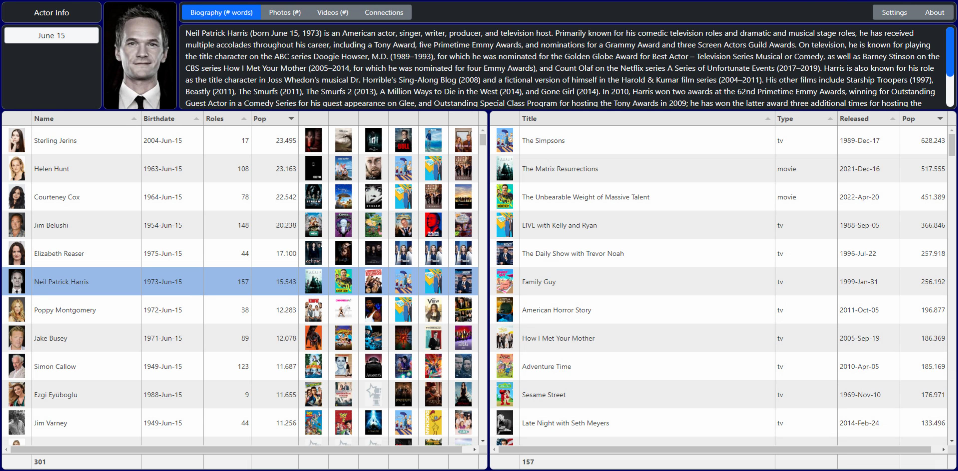
{ title: "Actor/Birthplace", field: "Name", minWidth: 230,
    formatter:function(cell, formatterParams, onRendered){
      var actor = '<div style="padding:4px;"><strong>'+cell.getRow().getCell('Name').getValue()+'</strong>';

      var birthplace = cell.getRow().getCell('BP').getValue();
      if (birthplace == null) { birthplace = '<br />'}
      else {birthplace = '<br />'+birthplace };

      var homepage = cell.getRow().getCell('Home').getValue();
      if (homepage == null) { homepage = '<br /></div>' }
      else {homepage = '<br /><a style="text-decoration:none;" href="'+decodeURIComponent(homepage)+'" target="_blank">'+decodeURIComponent(homepage)+'</a></div>'};

      return actor+birthplace+homepage;
    }
},

{ title: "Birthday", field: "DOB", width: 110,
    formatter:function(cell, formatterParams, onRendered){
      var dob = cell.getRow().getCell('DOB').getValue();
      var dod = cell.getRow().getCell('DOD').getValue();
      var age = 0;
      if (dod == null) { return  '<div style="text-align: center; padding:4px;">'+luxon.DateTime.fromISO(dob).toFormat('yyyy-MMM-dd')
                                +'<br />'
                                +'<br />Age '+getage(luxon.DateTime.fromISO(dob).toFormat('yyyyMMdd'), luxon.DateTime.now().toFormat('yyyyMMdd'))+'</div>'}
      else             { return  '<div style="text-align: center; padding:4px;">'+luxon.DateTime.fromISO(dob).toFormat('yyyy-MMM-dd')
                                +'<br />'+luxon.DateTime.fromISO(dod).toFormat('yyyy-MMM-dd')
                                +'<br />Age '+getage(luxon.DateTime.fromISO(dob).toFormat('yyyyMMdd'),luxon.DateTime.fromISO(dod).toFormat('yyyyMMdd'))+'</div>'}
    }
},
A few more notes about this. In Tabulator, when you use a formatter function (a custom formatter in these instances) you're basically outputting whatever you want. Much like a calculated field. So even though there is a field for each of these, we sort of pretend there isn't and go about our business. However, in order for sorting to work properly, they still have to be linked to a field. There are other more complex mechanisms available for custom sorting, but if you just want to display a set of values and have the sorting determined by, say, the first thing in the combined field, this is one way to go about it. Another way is to just not allow sorting in the first place.
We're also using Luxon explicitly here to handle some of the date conversions, and getage() refers to a Delphi function I dug up somewhere that does the actual age calculation. You'd think there would be an easier way to do this, or that Luxon would add it to their library, but alas, that doesn't seem to be the case. No matter, we've got something that works and can happily move on to other things. Probably the most complicated part of the whole project!
function TForm2.GetAge(BirthDate, CurrentDate: String): Integer;
var
    y1, m1, d1: Word; //born
    y2, m2, d2: Word; //today

begin
     Result := 0;

     y1 := StrToInt(Copy(BirthDate,1,4));
     m1 := StrtoInt(Copy(Birthdate,5,2));
     d1 := StrToInt(Copy(BirthDate,7,2));

     y2 := StrToInt(Copy(CurrentDate,1,4));
     m2 := StrtoInt(Copy(CurrentDate,5,2));
     d2 := StrToInt(Copy(CurrentDate,7,2));

    //Fudge someone born on the leap-day to Feb 28th of the same year
    //strictly for the purposes of this calculation
    if ( (m1=2) and (d1=29) )
            and
        ( not IsLeapYear(y2) ) then
    begin
        d1 := 28;
    end;

    Result := y2-y1; //rough count of years
    //Take away a year of the month/day is before their birth month/day
    if (m2 < m1) or
            ((m2=m1) and (d2<d1)) then
        Dec(Result);
end;
For the Roles table, we're doing the same kind of thing for the Title column, combining Title and Character fields, if the Character field exists. The default style for fields is to have "white-space: nowrap" so that, well, the text doesn't wrap. But in this case, we want it to wrap so that we can have a narrower column.
Character names aren't terribly long, usually, but really long names for TV Shows are fairly common. Somewhere along the way, we also picked up the "Overview" field from TMDb, and here we're trying to squeeze as much as we can into a field in the table. The same white-space value is applied here, as well as a 1-point smaller font, and scrollbars when the content doesn't fit. It works, but how good it looks will depend largely on how much screen space the user has available.
{ title: "Title", field: "Title", minWidth: 150,
    formatter:function(cell, formatterParams, onRendered){
      var title = cell.getRow().getCell('Title').getValue();
      var character = cell.getRow().getCell('Character').getValue();
      if (character == null) {character = '<br /></div>'}
      else {character = '<br />'+character+'</div>'};
      return '<div style="padding:0px 4px; white-space:normal"><strong>'+title+'</strong>'+character;
    }
},
{ title: "Overview", field: "Overview",
    formatter:function(cell, formatterParams, onRendered){
      return '<div style="height:68px; white-space:normal; padding: 2px 4px; line-height:1; overflow-y:auto;""><small>'+cell.getValue()+'</small></div>';
    }
}
Other Formatters.
There are quite a number of built-in field formatters included with Tabulator. We've used a few already (check the Documentation for more) but we've got a few columns left to address still, and some of these could use a different approach.
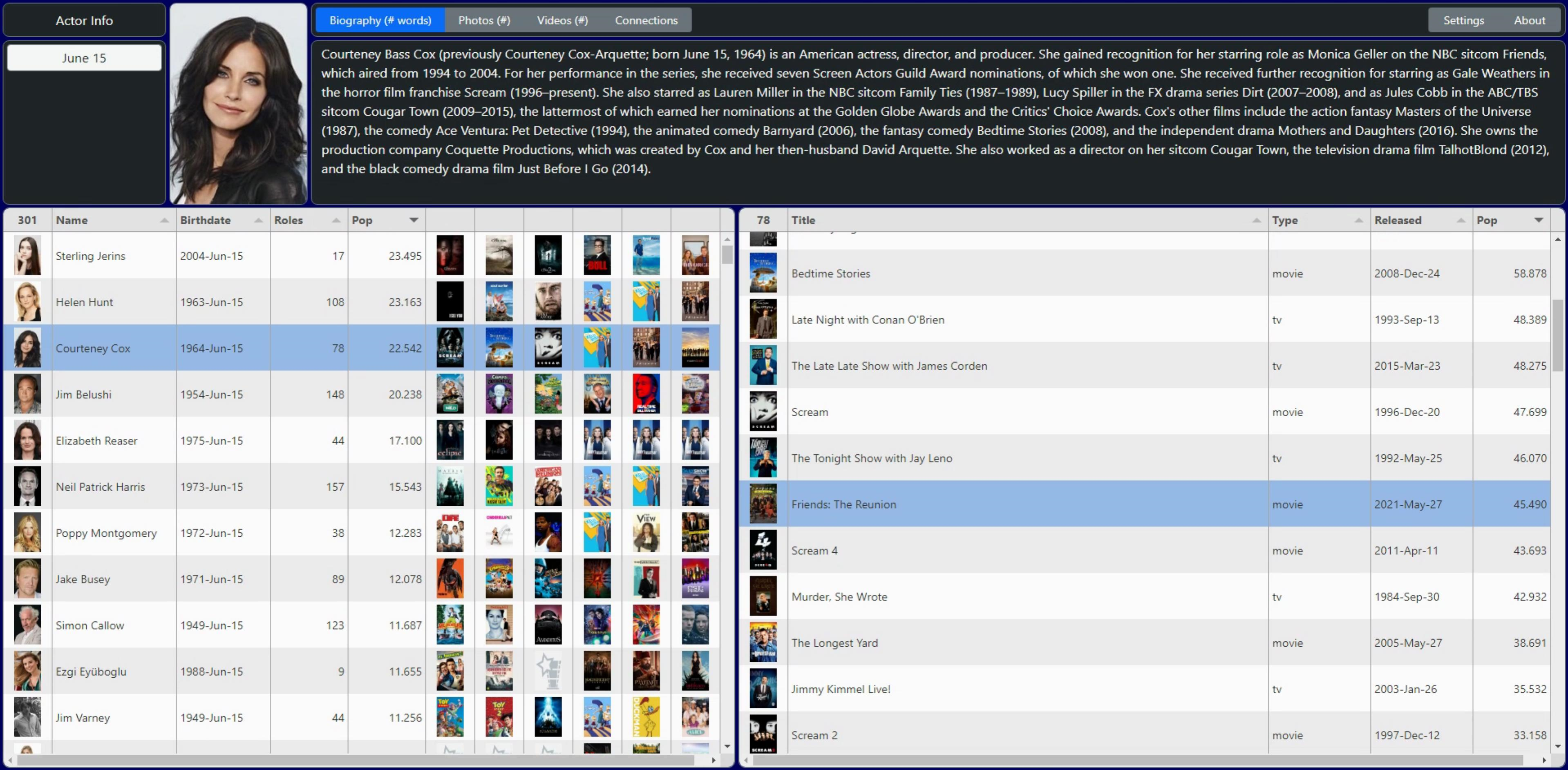
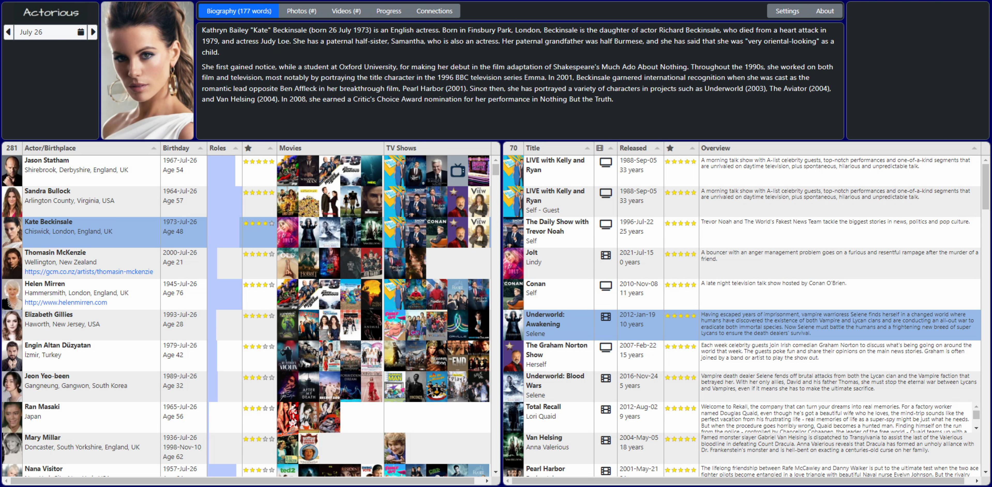
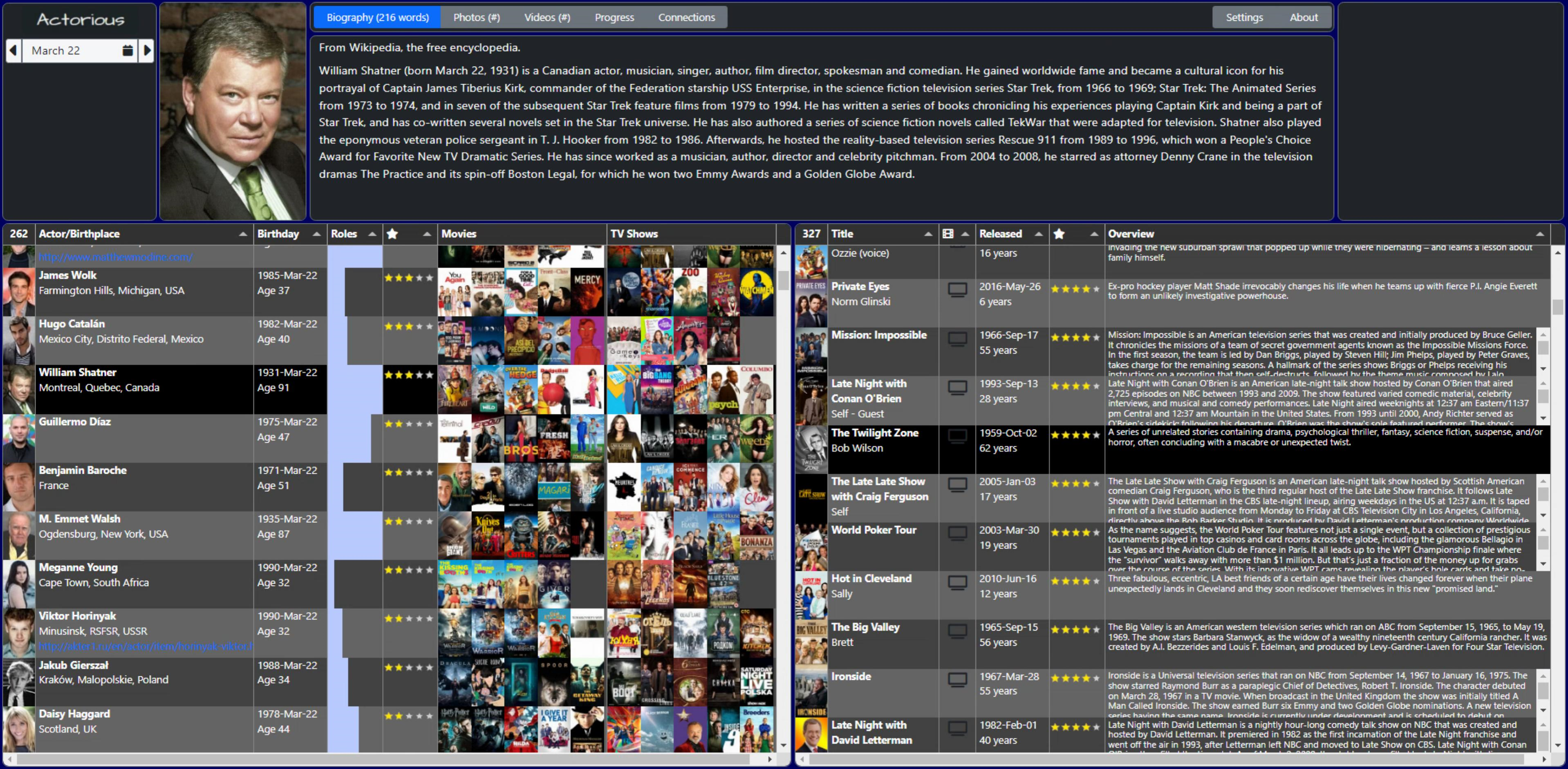
First is the "Pop" column. This is a bit of an odd one. It ranks the "popularity" of the items, and it uses different scales for People, Movies, and TV Shows. Next time out, we'll split these up more specifically to deal with sorting Roles where TV Shows are typically ranked higher than Movies. But for right now, the question is more about how to display this. Having a number is OK, but maybe something more eye-catching would help. And if it could use up less space, that would also be a bonus. The natural choice here is probably to use some kind of star-rating. Let's try it out and see how it looks.
Tabulator already has this as one of its formatters, but it is expecting an integer value, representing the number of stars. So we'll use a mutator to get the values into a separate field when the table is loaded, and then use that formatter to do the work. This is another way to approach this. In the case of the multiple images in one field, we used a formatter instead. We could do the same here, but this way our column definition is more typical and the details are hidden in a mutator. If you can format the data coming into the table, you don't even need to use a mutator. Which we could also do. And might do, as having a lot of mutators and extra processing in the client is less than ideal. Remember - options abound! But for now, let's see how this looks.
First, we've got to define the mutator function. What ranges correspond to a reasonable number of stars? Good question. This works OK for People. Less accurate for Movies and TV Shows. And note that when you sort on this column, the extra precision is lost. Will be much easier to handle filtering though. Tradeoffs. Options.
    // Another Tabulator Mutator function
    // Used to convert the Popularity value (float) into an integer
    // number of stars, stratified in some fashion
    var PopularityInt = function(value, data, type, params, component){
      // This isn't actually a field, so we pull in data from an actual field
      var starcount = parseInt(data.Pop);
      if ( starcount  <= 2) return 0;
      if ((starcount  >  2) && (starcount <=  5)) return 1;
      if ((starcount  >  5) && (starcount <= 10)) return 2;
      if ((starcount  > 10) && (starcount <= 20)) return 3;
      if ((starcount  > 20) && (starcount <= 40)) return 4;
      if ( starcount  > 40) return 5;
    }
Our pop field, which was a float, can be hidden and now the stars field shown. Note also that we can display icons in the column header simply by passing in the same kind of HTML tags we do elsewhere. Font Awesome is being used here, but likely any other font library would work as well.
// Actor Table: Original Popularity Value - now hidden
{ title: "Pop", field: "Pop",width:95, sorter:"number", hozAlign: "right",vertAlign:"middle",  visible: false,
    formatter:"money",
    formatterParams:{
      decimal: ".",
      thousand:",",
      symbol:"",
      symbolAfter:"",
      precision: 3
    }
},

// Pop as Stars
{ title: "<i class='fa-solid fa-star'></i>", field:"PopInt", width:75,
    formatter: "star",
    formatterParams: {stars: 5},
    mutator: PopularityInt
},
And we can do the same thing for the Pop field in the Roles table. Literally, copy & paste. And note, when we look at the table, the default sorting is still the original Popularity value (even though it is hidden) so it still works the way we want.
// Role Table: Original Popularity Value - now hidden
{ title: "Pop", field: "Pop",width:95, sorter:"number", hozAlign: "right",vertAlign:"middle",  visible: false,
    formatter:"money",
    formatterParams:{
      decimal: ".",
      thousand:",",
      symbol:"",
      symbolAfter:"",
      precision: 3
    }
},

// Pop as Stars
{ title: "<i class='fa-solid fa-star'></i>", field:"PopInt", width:75,
    formatter: "star",
    formatterParams: {stars: 5},
    mutator: PopularityInt
},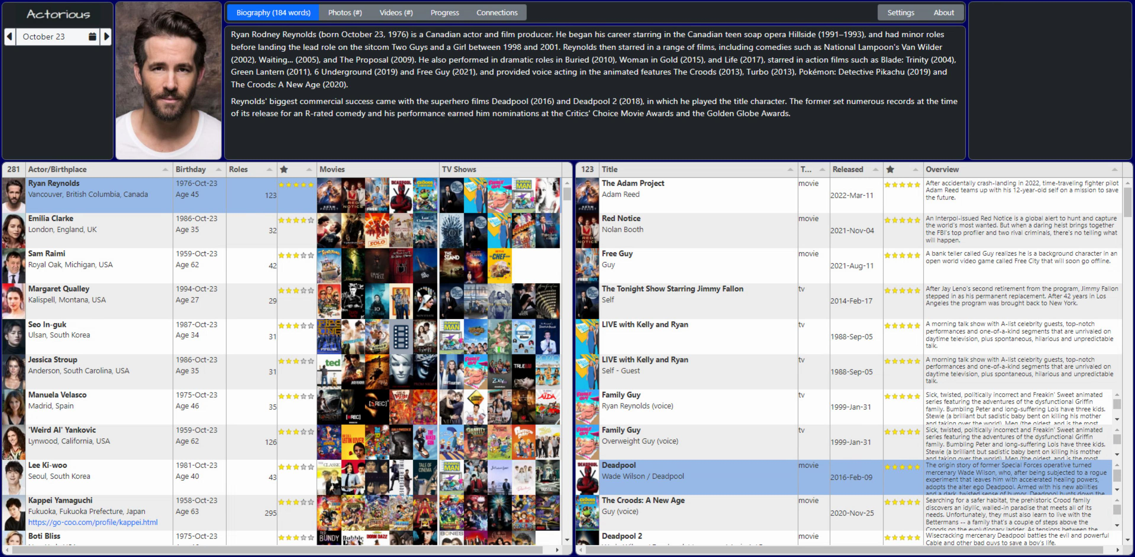
That doesn't look terrible, but we'll likely have to have a different scale for the Role table, not very meaningful with the same scale as Person. And with Movies and TV Shows having different popularity calculations, those will have to be split out if they're to be useful. Part of the problem, though, is the data. It isn't calculated in a way that has an upper limit, so this kind of calculation becomes a little more difficult.
On the TMDb website, they just list people according to their ranking, and therefore it doesn't matter much. But this will do for the moment. Maybe instead of five separate stars, we'll display a larger star with five points, and color the points instead? Or some other shape? Lots of ideas, just need to pick a few and try them out.
So now we're down to the last three columns. In the Actor table, we're left with the number of roles. We've got another plain integer to deal with. Not very flashy at all. But let's use a "progress" formatter and see how that looks. This is just a bar that fills the cell, and you can set various parameters for it, like whether a text label is included or not. Here's our column definition.
{ title: "Roles", field: "Roles", width:75, verticalAlign:"middle",
    formatter:"progress",
    formatterParams:{
      min: 0,
      max: 75,
      color: "#bbccff",
      legend: "",
//      legend: true,
//      legendColor: "#000000",
//      legendAlign: "left",
    }
},
In the Roles table, we've got a Type column that indicates whether it is a Movie or TV Show. Let's just use a custom formatter to display an icon for each. Some extra bootstrap classes were added to help tweak the positioning a little bit. And the Font Awesome 6 Free icon set doesn't include the retro TV option so we'll just use a generic one instead.
{ title: "<i class='fa-solid fa-film'></i>", field: "Type", width: 50,
    formatter:function(cell, formatterParams, onRendered){
      if (cell.getValue() == 'tv') return "<i class='fa-solid fa-tv fa-xl pt-3 w-100 text-dark text-center'></i>";
      if (cell.getValue() == 'movie') return "<i class='fa-solid fa-film fa-xl pt-3 w-100 text-dark text-center'></i>";
    }
},
And finally, we've got the Release Date column. In the Actors table, we calculated an Age, so what the heck, might as well do that here as well. The same nightmarish scenario as before was made a little easier by having only one date to contend with.
{ title: "Released", field: "Released", width: 100,
    formatter: function(cell, formatterParams, onRendered){
      if (cell.getValue() == null) { return ""; }
      else return '<div style="padding:0px 4px;">'+luxon.DateTime.fromISO(cell.getValue(), {zone: "utc"}).toFormat('yyyy-MMM-dd')
                 +'<br>'+getage(luxon.DateTime.fromISO(cell.getValue(), {zone:"utc"}).toFormat('yyyyMMdd'), luxon.DateTime.now().toUTC().toFormat('yyyyMMdd'))+' years</div>';
    }
},
And with that, we've completed our first run-through of all of the columns in our two tables. With a few adjustments to some default column widths, and we've got something that looks like a decent starting point for the rest of the work we still have to do.
More Theme Work.
While the current theme/styling seems pretty reasonable, I'm going for a bit of a darker theme generally. It is possible to use one of the other default themes with Tabulator. For example, switching to the Tabulator-supplied 'midnight' theme involves changing one line in the Project.html file, to point at a different CSS file. Only one CSS file needs to be loaded, so swapping back and forth is as easy as uncommenting one and commenting the other. The results are good, but not necessarily better than we had before.
     <link rel="stylesheet" href="https://cdn.jsdelivr.net/npm/tabulator-tables@5/dist/css/tabulator.min.css">
<!-- <link rel="stylesheet" href="https://cdn.jsdelivr.net/npm/tabulator-tables@5/dist/css/tabulator_midnight.min.css"> -->
Instead, I'd rather just tweak a few of the elements from the default theme. I like the darker column headers, for example. And a little darker zebra-striped rows, but maybe not so dark that the text needs to be white everywhere. And on the Tabulator website, their 'site' theme has different scrollbars. Next to rounded corners, scrollbars are quickly becoming one of the design elements that I like to tinker with. Time to add a bunch more rules to our existing set of CSS overrides.
/*
** Tabulator
**
** NOTE: Tabulator scrollbars are set above
*/

/* This is used to get rid of the padding in Tabulator cells,
** which we're doing so that the images can fill to expand
** the available space and be directly adjacent to one another.
*/
.tabulator-cell {
  padding:0px !important;
}

/* Tabulator background color */
.tabulator-tableholder,
.tabulator {
  background-color: #212529;  /* Bootstrap 5 Dark */
}

/* Column Headers */
.tabulator-header,
.tabulator-col {
  background:  #212529 !important;  /* Bootstrap 5 Dark */
  color: #dddddd;
}

/* Odd rows, replaces white, darker than even rows with #efefef */
.tabulator-row {
  background-color: #cfcfcf;
}
For the scrollbars, here's one approach. This doesn't work in all browsers (I don't know that Firefox even shows scrollbars anymore?) but in the current version of Chrome on Windows, this works great.
/* Customize scrollbars */

::-webkit-scrollbar {
  width: 14px;
  height: 14px;
}
::-webkit-scrollbar-corner {
  background-color: #212529;  /* Bootstrap 5 Dark */
}
::-webkit-scrollbar-track {
  background-color: black;
  border-radius :200px;
}
::-webkit-scrollbar-thumb {
  background-color: #0d6efd;
  border-radius: 200px;
  border: 3px solid black;
}
Fonts are also good candidates for customization, though a bit tricky at times to find one (or a set) that looks good across different elements, like we're doing here. Perhaps a little experimentation might be in order. Using Google Fonts, it isn't too hard to try something different. Let's go with Varela Round, just some random font that looks nice, not too widely spaced, and not overly thick or thin. In Project.html, we'll need to add the following (copied & pasted from the Google Fonts site).
    <!-- Google Fonts -->
    <link rel="preconnect" href="https://fonts.googleapis.com">
    <link rel="preconnect" href="https://fonts.gstatic.com" crossorigin>
    <link href="https://fonts.googleapis.com/css2?family=Varela+Round&display=swap" rel="stylesheet">
And then in our CSS file, we can add this at the beginning.
body {
 font-family:"Varela Round", sans-serif;
}
Column Sort Icons.
A minor thing perhaps, but the default column icons could use a little bit more exploration. There are a handful of Tabulator properties that can be used to change how they work. There are quite a few options related to sorting, but here are a handful that I've found to be useful.
- initialSort (Table) sets the sorting when the table is first initialized. For our Actors table, this looks like initialSort:[ {column:"Pop", dir:"desc"} ]
- columnHeaderSortMulti (Table) controls whether you can sort by multiple columns. By default, Tabulator only sorts one column at a time. But if this is set to true, you can shift-click to select multiple columns. There's no visual indication of the order, however.
- headerSortElement (Table) is used to control what icons are displayed for the sort elements. See below for details.
- headerSort (Column) determines whether the column can be sorted at all. We've turned it off for the columns with images, for example, as well as the Overview column as it doesn't make a lot of sense to try and sort those.
- headerSortStartingDir (Column) determines what the sort order will be when first clicked. For fields like names or titles, the default is probably fine. But for fields like popularity or star ratings, generally, the reverse sorting is a better default choice.
- headerSortTristate (Column) provides the ability to essentially turn off sorting. I can't recall having this as an option in other grids. While not terribly useful, it is kind of novel, at least. As an example of where this can be useful, the JSON we're importing into our table isn't sorted in any particular way, but we sort by Popularity by default. If we turn off that sort, we'll see the data in the same order as the underlying JSON. Which can be helpful when troubleshooting tags and that sort of thing.
To change the actual icons used, the headerSortElement is what we're after. To start with, this element controls how many different variations of the sorting elements are available. For example, if you just wanted one direction sorting, you could have just one icon here. But we're after the up/down/off sort of arrangement, so in the table definition, we'll need to start with this. We've got a block of code for common Tabulator default options, so we'll just add this to the list.
Tabulator.defaultOptions.headerSortElement = "<span><i class='fa-solid fa-sort'></i><i class='fa-solid fa-sort-up'></i><i class='fa-solid fa-sort-down'></i></span>";
But in order for this to make it into the table, we've got to add some CSS. This is all explained on the Tabulator website Documentation on this topic, complete with the example code. Note that you can also set the colors via this mechanism.
If you happen to have access to FontAwesome Pro, there's a duotone equivalent set of icons where the up and down triangles are always visible, and just the top or bottom is filled in, which looks a little bit nicer. Also, if you're using one of their SVG+JS kits, the CSS code is a little different as internally it doesn't use tags in the same way. Not difficult to figure out though.
/* Hide all sort icons by default */
.tabulator-col .tabulator-col-sorter i{
    display: none;
}
/* Display the fa-sort icon when the column is not sorted */
.tabulator-col[aria-sort="none"] .tabulator-col-sorter i.fa-sort{
    display: inline-block;
    color:#444;
}
/* Display the fa-sort-up icon when the column is sorted in ascending order */
.tabulator-col[aria-sort="ascending"] .tabulator-col-sorter i.fa-sort-up{
    display: inline-block;
    color:#fff;
}
/* Display the fa-sort-down icon when the column is sorted in descending order */
.tabulator-col[aria-sort="descending"] .tabulator-col-sorter i.fa-sort-down{
    display: inline-block;
    color:#fff;
}
Column Visibility.
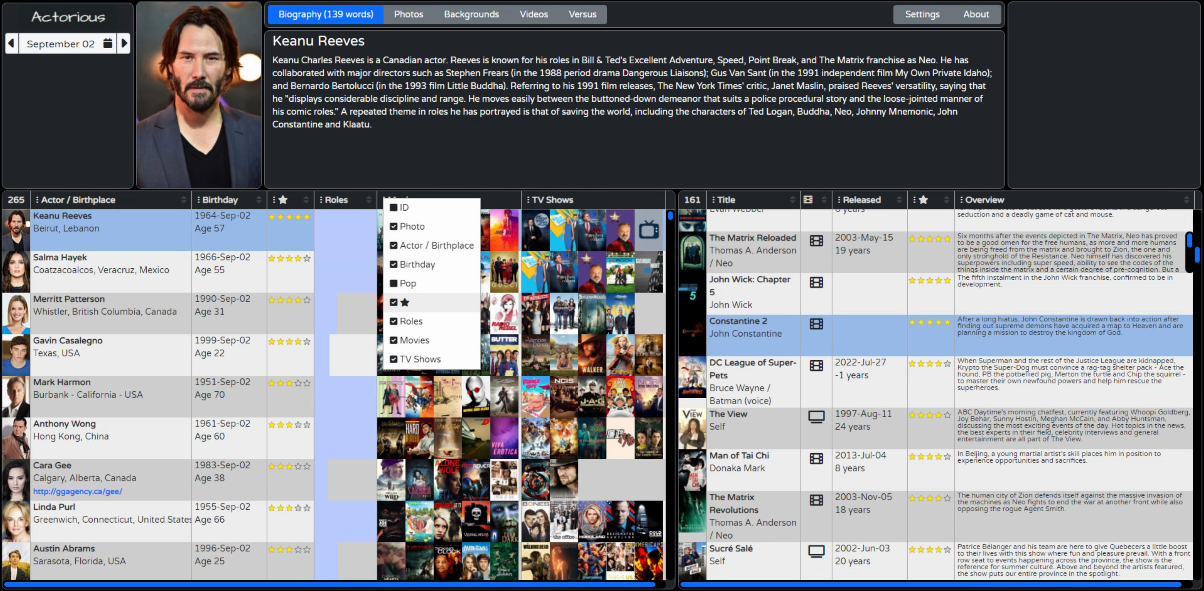
We've had several examples already where columns are added to the Tabulator tables but are not shown. In part, this is so that we can access the values in those columns from other columns, like within mutators and formatters. But what if the user wants to show or hide columns? Tabulator has some tools to help. Quit e a few, in fact.
For now, we're just going to look at a specific one, adding a column selection button, what Tabulator refers to as a column header menu. For the columns where we want this to appear, we can add a headerMenu:headerMenu to the column definition. Or we can add it to the Tabulator defaults section and then add headerMenu:false where we don't want this to appear. Let's go with that.
The idea is that this is a single type of menu to appear, but others could be added as well. For the header menu to work, we also have to add a block of JavaScript (the actual headerMenu function). The code listed in the documentation can be used directly, so just copy & paste right before the Tabulator defaults section.
It is possible to customize this further, of course. For example, we don't really want ALL columns included. Some are hidden and we'll want them to remain hidden. We do that here by just skipping over any columns that have no Title defined. The default code also assumes that all the Title values are simple text strings. We've got some that are icons, so we can change how the menu is constructed to incorporate HTML directly using <span>.innerHTML instead of <span>.textContent.
Be mindful that if your column headers are user-generated, you might want to sanitize them first. Also, we've got a couple of columns where the title is a number, and we don't really want that number to appear as our menu item. So we check the field value and, if it is something we recognize, we use that instead. We could customize it further still by changing the check and uncheck icons, but we'll stick with what we've got for now.
// Tabulator: http://tabulator.info/docs/5.2/menu
// Tabulator: http://tabulator.info/docs/5.2/menu
// define column header menu as column visibility toggle
var headerMenu = function(){
var menu = [];
var columns = this.getColumns();
for(let column of columns){
if (!(column.getDefinition().title == null)) {
//create checkbox element using font awesome icons
let icon = document.createElement("i");
icon.classList.add("fas");
icon.classList.add(column.isVisible() ? "fa-check-square" : "fa-square");
//build label
let label = document.createElement("span");
let title = document.createElement("span");
if (column.getDefinition().field == 'Photo') {
title.innerHTML = ' ' + 'Photo';
}
else if (column.getDefinition().field == 'Poster') {
title.innerHTML = ' ' + 'Poster';
}
else {
title.innerHTML = ' ' + column.getDefinition().title;
}
label.appendChild(icon);
label.appendChild(title);
//create menu item
menu.push({
label:label,
action:function(e){
//prevent menu closing
e.stopPropagation();
//toggle current column visibility
column.toggle();
//change menu item icon
if(column.isVisible()){
icon.classList.remove("fa-square");
icon.classList.add("fa-check-square");
}else{
icon.classList.remove("fa-check-square");
icon.classList.add("fa-square");
}
}
});
}
}
return menu;
};And for some reason, there's a ton of padding around the icon that is generated. Easily fixed with a little CSS.
/* Tamp down the padding around the header menu icons */
.tabulator-header-popup-button {
  padding: 0px 2px !important;
}
Updates to the XData Application.
While working through the various improvements to the client application, the XData service ended up with a few improvements as well, some of which have been mentioned already. This isn't really our focus today, but worth mentioning a few things. As usual, check out the source code for details if you're particularly curious.
- The name of the JSON object for the profile photo was changed to 'Photo' and just the path is now returned instead of the full URL. The extra step of adding the URL is now done on the client so that it can choose which size of image for the various places where images are used.
- A Timer was added to automatically refresh the Birthday and Birthday Extended cache. Beware of January 1st, though. While other days typically have 300 birthdays or so, January 1st naturally has something like 13,000, which is a problem.
- The SPARQL query now has a 500 record limit on it, to help with this. But which 500 are returned? Likely not the 500 we're most interested in.
- Note that this is an example of the NetHTTPClient approach, and we're using it to... call itself. Sure, why not.
- Actors with a birthday in WikiData but who don't have any linked roles are now excluded. About 5-10 per day, typically.
- Other exclusions were added for non-family-friendly content. Note that this isn't done with WikiData queries.
- Tons more error checking, general cleanup of how errors are reported, and the general XData server UI end of things.
- Progress reporting system. Not implemented in the client yet.
That last one is perhaps something to discuss in more detail. Some of these queries take a very, very long time. So on the client, it would be nice to see what is going on and know that something is happening and it is not just broken. When making such long requests, there's not really a mechanism, within that request, to report progress.
What we're doing instead is passing an identifier (just a GUID) as part of the BirthdaysExtended request. A common set of progress reports (a TStringList) is then updated by the various XData threads while they work away on their respective requests. At the moment we can check on the progress using a button in the XData server. Next time out we'll spend a little more time with XData and wire up a mechanism to report this back to the client. We'll have some other queries as well which might be more interesting and will take some time to complete.
Ideally, all these long-running requests would be cached ahead of time so nobody is left waiting for 5 minutes to find out who shares their birthday, but the same kind of progress-reporting mechanism could be used for other long-running requests. Like if you're perhaps maybe thinking about possibly someday building a reporting tool and some of the reports take longer to run.
Monetization.
You might have noticed that somewhere along the way a blank rectangle appeared at the top-right corner. Nothing to do with Tabulator at all. Just a side jaunt into another topic. When publishing apps publicly, particularly free apps, there's often a desire to find a way to monetize them. Generate revenue. Pay the bills. That sort of thing. The bigger the app, or perhaps more importantly, the bigger the cost to develop and run the app, the more important this becomes. Tragically, somewhere along the way we collectively decided that advertising was the very best way to do this. Very best for whom, I wonder?
And, well, people are lazy. Getting them to sign-up for anything these days is a tremendous hurdle, and that's when it is entirely free. Getting someone to sign up and actually pay is another challenge entirely. Free-to-play games are classic examples of this, where the worst examples having players spending more time watching ads than actually playing the game.
For an app like this, the general idea is to just stick some kind of ad on the page somewhere and wait for the big bucks to roll in. Or not. The rectangle is the placeholder for whatever this looks like. Maybe a login form. Maybe a Google ad. Maybe something else. In order to make this a useful example for our project, the content of that rectangle will be set to one of two things. Naturally, if you download this project (via GitHub or wherever) you're entirely free to remove that block altogether or change it to suit your specific needs. Not intended to be an impediment or enforcement mechanism of any kind, just an example of how it could be used.
- If the app is run from 'localhost' or anywhere other than one particular domain, the block is updated to show the "Buy Me A " link that is found at the bottom of all of my GitHub repositories. And if you're finding this project (or this blog series) valuable to you in terms of actual money or time saved, and you have the means to do so, this is something you might consider. Just for fun, a different image is used based on the time of day.
- If it is run from one particular domain, then it will show Google ads linked to the Google account associated with that domain. Which won't work properly if run from another domain anyway. So think of this more as an example of how to add this code to your project, updated with your own Google identifiers, or with your own choice of advertising partner.
I'm no fan of Google particularly, but that seems to be where the game is being played. Of course, if your project is being directly sponsored or funded, then that would also be a great place to promote that partner. This check is just done at the very beginning, in WebFormCreate.
  // Figure out our Advertising Partner situation
  if (pos('actorious.com', lowercase(window.location.href)) > 0) then
  begin
    // Production mode.  Display Google Adwords for actorious.com

    // Don't need this anymore
    divPizza.Destroy;

    // Size to fit div
    divGoogle.Top := 0;
    divGoogle.Left := 0;
    divGoogle.WidthStyle := ssPercent;
    divGoogle.HeightStyle := ssPercent;
    divGoogle.HTML.Text := '<script async src="https://pagead2.googlesyndication.com/pagead/js/adsbygoogle.js?client=ca-pub-6909565059510865" crossorigin="anonymous"></script>'+
                           '<!-- Actorious -->'+
                           '<ins class="adsbygoogle"'+
                           '     style="display:inline-block;width:300px;height:250px"'+
                           '     data-ad-client="ca-pub-6909565059510865"'+
                           '     data-ad-slot="3841529083"></ins>'+
                           '<script> (adsbygoogle = window.adsbygoogle || []).push({}); </script>';
  end
  else
  begin
    // Test / Development mode.  Display Pizza link

    // Don't need this anymore
    divGoogle.Destroy;

    // Size to fit div
    divPizza.Top := 0;
    divPizza.Left := 0;
    divPizza.WidthStyle := ssPercent;
    divPizza.HeightStyle := ssPercent;

    // Display an image link
    if (Now - Today) > 0.5
    then divPizza.HTML.Text := '<a href="https://www.buymeacoffee.com/andrewsimard500" target=_blank><img width="200px" height="200px" src="img/pizza.png"></a>'
    else divPizza.HTML.Text := '<a href="https://www.buymeacoffee.com/andrewsimard500" target=_blank><img width="200px" height="200px" src="img/coffee.png"></a>';
  end;
Deployment.
Alright. So we've got a client app. And an XData server. And they're working well and look like what we want them to look like. So how does such a system actually get deployed for everyone to see? Well, a complex topic for sure, largely because there are plenty of different web servers around and lots of ways to configure every single one of them.
The short version is that you just take the contents of the Debug or Release folders from your projects, and slide them over to a web server somewhere, and voila! You're up and running. The reality is slightly different, but once you have a system in place, that is in fact typically how updates are done. Nothing fancy at all. But getting there can be a bit of a challenge. I'll outline what I've done.
First off, I've got two Virtual Private Servers (VPS) set up. The first runs Ubuntu Linux, uses VirtualMin for its administration, and Apache as its web server. This is what I use to serve up web applications generally, as well as run things like Drupal, mail servers, and so on. TMS WEB Core applications can be served up pretty easily with Apache in this environment, either as an app under an existing domain (www.xyz.com/mytmswebcoreapp) or under its own name (www.mytmswebcoreapp.com) depending on whether this is just a test project or something worth registering a domain for.
The second is a Windows VPS that primarily runs XData servers. Why? Well, it keeps them separate for one thing, which is not a bad idea generally. The two servers can then be scaled differently if needed. But the more important reason is that I have XData servers that use a bunch of VCL stuff (like Digital Metaphor's ReportBuilder). And while it is entirely possible to compile an XData server to run under Linux, I don't know that I can do that for a VCL app with all the components that I'm using. Each XData server is set to run under the same domain name but with its own port, which is then incorporated into the web client apps so they know where to find it.
To set up this project in my production environment, I've then done the following.
- Come up with a creative and catchy name for the project.
- I've gone with "actorious.com" as a portmanteau of "actor" and "victorious".
- Register the domain name.
- Tell the domain registrar's nameserver that this should resolve to my Linux VPS.
- In VirtualMin, add a new "actorious.com" virtual server.
- In VirtualMin, configure a LetsEncrypt SSL key so we can use http://www.actorious.com as our main URL.
- Build "Release" versions of both projects (client and XData).
- Update the XData connection in the client to point at my Windows VPS service and port for this project.
- Configure the XData server to use the same port number.
- Enable compression in the XData server.
- Copy the Release folder contents of the client to the Linux VPS server (into the new 'public_html' folder
- Rename Project.html to index.html. Because I'm that lazy!
- Copy the Release folder contents of the server to the Windows VPS server (a spot just for XData servers)
- Run the XData service application, and make accommodations for it to start after the server reboots.
- Add the Port to the Windows VPS firewall and to the TMS HTTPSConfig tool (SSL already set up here).
- Test the client application. Make sure the Google stuff is working.
- Test the Swagger UI connection.
Next Up: Interacting with Tabulator.
I had hoped to get through everything to do with viewing data in Tabulator in one post. Originally, I had envisioned this to also include interacting with Tabulator. But as we're already at a length well beyond what any self-respecting post should be, we'll instead have an extra post just to cover all the Tabulator interactive stuff before we get to editing data, which is really just a specific case of interaction.
There's no project file attached this time as a few things are still in flux but I'll be sure to include the project files next time. The GitHub repository will also be updated with a "v2" release. After a bit more fiddling with the layout, more FontAwesome icons, some logos, and other finishing touches, this is where we've ended up. I think we managed to touch on customizing virtually every element shown!
Related Posts:
Tabulator Part 2: Getting Data Into Tabulator
Tabulator Part 3: Viewing Data In Tabulator
Tabulator Part 4: Interacting With Tabulator
Tabulator Part 5: Editing Data In Tabulator
Tabulator Part 6: Getting Data Out Of Tabulator
Tabulator Part 7: Performance
Follow Andrew on 𝕏 at @WebCoreAndMore or join our 𝕏 Web Core and More Community.
Andrew Simard

This blog post has received 2 comments.
2. Thursday, June 23, 2022 at 8:24:31 PM
Take your time! I am in a bit of a rush to get through all of the Tabulator material as this is the TMS Software blog and not the Tabulator blog after all. Butt I did still want to be thorough. Some of these posts have a lot of material that will serve more as a reference for when you are looking for examples, rather than casual morning reading :-)
Simard Andrew
All Blog Posts | Next Post | Previous Post
Borbor Mehmet Emin