Blog Options
Archive
<< March 2026 >>-
Saturday 28
- TMS VCL UI Pack 13.6: ARM, PDF Forms, and Practical VCL Improvements -
Friday 27
- The Next Evolution of Charting in Delphi: Data Binding -
Thursday 26
- TMS Custom Consultancy Projects -
Monday 23
- Simplify Mapping Across Platforms with TMS FNC Maps -
Wednesday 18
- The Next Evolution of Charting in Delphi: Look & Feel -
Monday 16
- Better Delphi Code from AI Agents with TMS Skills -
Friday 13
- TMS Training Days 2026 - Community Evening -
Wednesday 11
- The Next Evolution of Charting in Delphi: Data Import & Export -
Monday 9
- Meet Gjalt Vanhouwaert at TMS Training Days 2026 -
Friday 6
- Meet Pieter Scheldeman at TMS Training Days 2026 -
Thursday 5
- Enabling TLS 1.3 in TMS MQTT and TMS FNC Products -
Wednesday 4
- Meet Antonio Zapater at TMS Training Days 2026 -
Tuesday 3
- The Next Evolution of Charting in Delphi: Getting Started -
Monday 2
- Meet José Leon Serna at TMS Training Days 2026
- Meet Dennis Roehner at TMS Training Days 2026
- Meet Bradley Velghe at TMS Training Days 2026
- Unlock PDF Interactivity in Delphi with TTMSFNCPDFLib Form Fields
Authors
- Bernard Roussely (3)
- Wagner Landgraf (98)
- Dennis Röhner (1)
- Roman Yankovsky (2)
- Bart Holvoet (42)
- Aaron Decramer (83)
- Pieter Scheldeman (135)
- Nancy Lescouhier (32)
- Adrian Gallero (34)
- Bruno Fierens (451)
- Marcos Douglas B. Santos (5)
- Bernard (4)
- Bradley Velghe (36)
- Andrew Simard (86)
- Holger Flick (15)
- Gjalt Vanhouwaert (44)
- Tunde Keller (37)
- Masiha Zemarai (117)
Blog
All Blog Posts | Next Post | Previous Post

 Using the TMS Advanced Office Graphics Control Pack
Wednesday, January 21, 2009
TMS Advanced Office Graphics Control Pack offers a range of controls that seamingless integrate with the Office 2007 / Office 2003 toolbars. It includes components for most common toolbar actions such as font, fontsize, color, textcolor, bruhstyle, penstyle, penwidth, tablesize, tableborder, gradientdirection, shadowdirection, characters ... selection. With the included generic TAdvOfficeToolSelector it is possible to build any custom selector component using selections defined by imagelist images or even custom drawn items. The TMS Advanced Office Graphics components implement the TAdvFormStyler, AdvAppStyler interfaces. This means the extensive appearance control of the components will automatically adapt to the TAdvFormStyler or TAdvAppStyler setting used. Alternatively, there is also a right-click menu from where the various Office 2003 & Office 2007 appearances can be selected.There are two categories of components: the components that with a combobox-like behaviour and dropdown selector components that descend from a TAdvGlowButton.
Combobox style components
The components that descend from a combobox are : TAdvOffficeFontSelector, AdvOfficeFontSizeSelector, AdvOfficeSelector. These components have Office 2007 / Office 2003 dropdown button appearance, Office 2007 selection color capability, GDI+ anti aliased font rendering, recently used item list.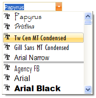 The combobox style components very much operate
like a standard combobox. The TAdvOfficeFontSelector & AdvOfficeFontSizeSelector
have a built-in compatibility to automatically fill the items to select from
with the available fonts or applicable font sizes. The TAdvOfficeSelector has an
Items stringlist to add the items to and the ItemIndex to get or set the
selected item. The display of recently selected items can be enabled by setting
DisplayRecentSelection to true. The items that have been recently selected can
be programmatically accessed via the stringlist
AdvOfficeSelector.RecentSelection: TStringList.
The combobox style components very much operate
like a standard combobox. The TAdvOfficeFontSelector & AdvOfficeFontSizeSelector
have a built-in compatibility to automatically fill the items to select from
with the available fonts or applicable font sizes. The TAdvOfficeSelector has an
Items stringlist to add the items to and the ItemIndex to get or set the
selected item. The display of recently selected items can be enabled by setting
DisplayRecentSelection to true. The items that have been recently selected can
be programmatically accessed via the stringlist
AdvOfficeSelector.RecentSelection: TStringList. An additional feature compared to regular comboboxes is the built-in lookup capability. When Lookup is set to true, automatic lookup completion while typing is activated.
DropDown selector components
 All dropdown selector components consist of a
button (descends from TAdvGlowButton for Office 2007 glow effects) and a
dropdown selector panel. The selector panel can be floating or not. This is
controlled with the property AllowFloating. When true, a drag grip appears
either at top or bottom of the panel (setting DragGripPosition). The selections
in a selector panel are defined by the Tools collection that is a collection of
TAdvSelectorItem instances. The organisation of the selector items in the
selector panel is based on the nr. of columns that can be set with the
ButtonsPerRow property. The TAdvSelectorItem class has following public
properties:
All dropdown selector components consist of a
button (descends from TAdvGlowButton for Office 2007 glow effects) and a
dropdown selector panel. The selector panel can be floating or not. This is
controlled with the property AllowFloating. When true, a drag grip appears
either at top or bottom of the panel (setting DragGripPosition). The selections
in a selector panel are defined by the Tools collection that is a collection of
TAdvSelectorItem instances. The organisation of the selector items in the
selector panel is based on the nr. of columns that can be set with the
ButtonsPerRow property. The TAdvSelectorItem class has following public
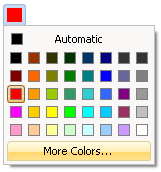
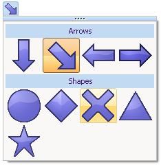
properties:BackgroundColor: color used for color selectors
Caption: text that can be included with items
CaptionAlignment: text alignment
Enable: when true the item is enabled for selection
Hint: hint for the item
ImageIndex: index of the image for the item in the ToolImages imagelist
ItemType: sets the type to itAutoSizeButton, itCaption, itFullWidthButton
Tag: integer value that can be associated with the item
Value: integer value that can be associated with the item
With the ItemType property, any item in the tools collection can be set as a normal autosizing button in the selector, a full width button or a non selectable caption. In the screenshots above, the selections "Automatic" & "More Colors..." are items of the type itFullWidthButton. The array of 8x5 colors are 40 items of the type itAutoSizeButton. In the graphics object selector screenshot, the items "Arrows" & "Shapes" are non selectable items of the type itCaption. itCaption items are automatically drawn full width in the selector. Other items are itAutoSizeButton items in a selector with ButtonsPerRow set to 4 and connected to the ToolImages imagelist with image size set to 48x48.
TMS Advanced Office Graphics components come with predefined selectors for colors, pen width, pen style, brush style, gradient direction, shadow type, characters but using the tools collection, it is very easy to use it for any kind of selection needed in the application. This code snippet shows how easy it is to use it as a simple text selector component:
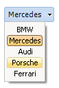
AdvOfficeToolSelector2.ShowCaption := true;
AdvOfficeToolSelector2.DropDownButton := true;
with AdvOfficeToolSelector2.Tools do
begin
  Clear;
  Add.Caption := 'BMW';
  Add.Caption := 'Mercedes';
  Add.Caption := 'Audi';
  Add.Caption := 'Porsche';
  Add.Caption := 'Ferrari';
end;

procedure TForm1.AdvOfficeToolSelector2Select(Sender: TObject; Index: Integer;
Item: TAdvSelectorItem);
begin
  AdvOfficeToolSelector2.Caption := Item.Caption;
end;
 It is equally possible to create a tool
selector with custom drawn tool items. This is done through the OnDrawTool event
that is triggered for every item. Where for a normal selectors, the size of a
button in the panel is derived from the ToolImages imagelist width & height, for
a custom drawn selector, this is set with OwnerDrawWidth & OwnerDrawHeight. Here
is a sample of a custom tool selector with full code:
It is equally possible to create a tool
selector with custom drawn tool items. This is done through the OnDrawTool event
that is triggered for every item. Where for a normal selectors, the size of a
button in the panel is derived from the ToolImages imagelist width & height, for
a custom drawn selector, this is set with OwnerDrawWidth & OwnerDrawHeight. Here
is a sample of a custom tool selector with full code: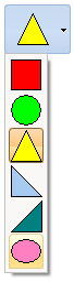
procedure TForm1.InitSelector;
var
  ATI: TAdvSelectorItem;
begin
  AdvOfficeToolSelector1.OwnerDrawToolWidth := 32;
  AdvOfficeToolSelector1.OwnerDrawToolHeight := 32;
  AdvOfficeToolSelector1.ButtonsPerRow := 1;
  with AdvOfficeToolSelector1.Tools do
  begin
    Clear;
    ATI := Add;
    ATI.Hint := 'Rectangle';
    ATI.BackGroundColor := clRed;
    ATI := Add;
    ATI.Hint := 'Circle';
    ATI.BackGroundColor := clLime;
    ATI := Add;
    ATI.Hint := 'Triangle';
    ATI.BackGroundColor := clYellow;
    ATI := Add;
    ATI.Hint := 'Left triangle';
    ATI.BackGroundColor := clSkyblue;
    ATI := Add;
    ATI.Hint := 'Right triangle';
    ATI.BackGroundColor := clTeal;
    ATI := Add;
    ATI.Hint := 'Ellipse';
    ATI.BackGroundColor := $00C080FF;
  end;
end;

procedure TForm1.AdvOfficeToolSelector1DrawTool(Sender: TObject;
  Canvas: TCanvas; ItemIndex: Integer; R: TRect);
var
  ar: array[0..2] of TPoint;

begin
  if ItemIndex >= 0 then
  begin
    Canvas.Brush.Color :=
AdvOfficeToolSelector1.Tools[ItemIndex].BackGroundColor;
    Canvas.Pen.Color := clBlack;
    InflateRect(r, -2, -2);

    case ItemIndex of
    0: Canvas.Rectangle(R);
    1: Canvas.Ellipse(R);
    2: begin
         ar[0] := Point(R.Left + ((R.Right - R.Left) shr 1), R.Top);
         ar[1] := Point(R.Right, R.Bottom);
         ar[2] := Point(R.Left, R.Bottom);
         Canvas.Polygon(ar);
       end;
    3: begin
         ar[0] := Point(R.Left, R.Top);
         ar[1] := Point(R.Right, R.Bottom);
         ar[2] := Point(R.Left, R.Bottom);
         Canvas.Polygon(ar);
       end;
    4: begin
         ar[0] := Point(R.Right, R.Top);
         ar[1] := Point(R.Right,R.Bottom);
         ar[2] := Point(R.Left, R.Bottom);
         Canvas.Polygon(ar);
       end;
    5: begin
         InflateRect(R,0,-3);
         Canvas.Ellipse(R);
       end;
     end;
  end;
end;
We hope this helps understanding how the selector components work and what can be done with the components. We look forward to hearing about your exciting and creative use of the flexibility and range of capabilities the selector components offer.
Bruno Fierens

This blog post has not received any comments yet.
All Blog Posts | Next Post | Previous Post