VCL
TMS Labels & Buttons Pack
A collection of labels & buttons to make your applications stand out from the rest
Feature overview
TAdvHighLightLabelVia AdvHighLightLabel.Highlighting collection, the words to be highlighted can be added and for each word to be highlighted, a specific highlight color/textcolor can be set.
TAdvDataLabel & TAdvDBDataLabel
- Label that shows both caption and data
- Data can be integer, float, string, date, time, datetime
- Different formatting control for different data types
- Control of alignment of label value and data value independently of each other
- Optional automatic ellipsis display for label or data text that doesn't fit
- Optional hint for data value
- Data URL value can behave as hyperlink
- Data-aware version included, the data value is retrieved via TAdvDBDataLabel.DataSource / TAdvDBDataLabel.DataField
TAdvBadgeButton, TAdvBadgeLabel, TAdvBadgeSpeedButton & TAdvBadgeGlowButton
- Regular label, button, speedbutton and glowbutton with optional attached badge label
- Customizable badge color & badge text color
- Badge size automatically adapts to badge text size
- Badge automatically disappears when badge text is empty
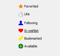
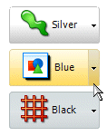
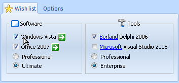
TAdvGraphicCheckLabel & TDBAdvGraphicCheckLabel
- Checkbox with configurable picture & font for the checked, unchecked as well as checked hover and unchecked hover state.
- Built-in presets for common selections: Like, Favorite, Follow, Available, Checked,...
- Checkmark glyph can be bitmap, JPEG, GIF but also PNG with alpha transparency
- Data-aware version included
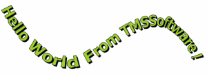
TAdvFancyLabel & TAdvCurve
- Label with text flowing along a Bezier curve
- Bezier curve drawing and editor
- Optional customizable handles, curve lines and control point lines
- Base class TAdvCurve for custom development
- Customizable font, font size and font color
- Text fill and border color
TAdvGlassButton
- Translucent button control
- Antialiased button text rendering support
- Supports PNG images with alpha transparency
- Supports different rounded corner styles
- Built-in symbols
- various options for aligning pictures & text in button
TAdvGlowButton
- Office style, Windows Vista style button
- Complex gradients support
- Soft button state transition painting
- Antialiased button text rendering support
- Main caption and Notes text in different font
- PNG with alpha transparency + bitmap + ImageList button glyph support for normal, hot & disabled states
- Bottom or right aligned dropdown button support
- Full color & gradient customization support
- Full Unicode button caption support
TAdvOfficeButtons
- Office checkbox & radiobutton appearance
- Transparent
- TAdvCheckGroup, TAdvRadioGroup can have customizable caption position, rounded corners, image in caption, custom border color
- Captions can have HTML formatting
TAdvReflectionLabel
- Label with built-in automatic reflection display
- Support for HTML formatted text. See mini HTML reference for details
- Configurable reflection effect
- Office 2007 style hint support
- Can save generated reflection in various formats to file

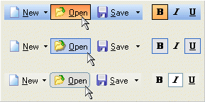
TAdvToolButton
- Speedbutton in Flat, Windows XP, Office style and others
- Normal, hot, down, border down, border hot colors and gradients support
- Normal, hot, down and disabled glyph support (Not all state glyphs required)
- Automatic Office XP-like shade generation for hot state
- Dropdown button capability
- Rounded corners
- Checkbox type button capability
- Works with free and full GlyFX glyph sets that provide XP style normal, hot & disabled glyphs
TDateLabel
TDateLabel is a label component which displays and stores the date of the last form edit. Can be used to automatically show the release or compile date of your software. The format of date and time can be set through the DateTimeFormat property. Source code is included.
TEllipsLabel
A label that can show text with end or path ellipsis when too long to fit. Ellips type can be controlled with new EllipsType property
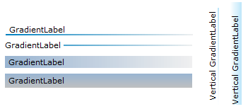
TGradientLabel
Label with various gradient effects
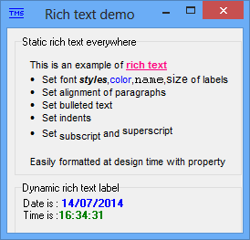
TRTFLabel
TRTFLabel is a label that has the full rich text capabilities. Rich text can be edited at design time using a built-in rich text property editor.
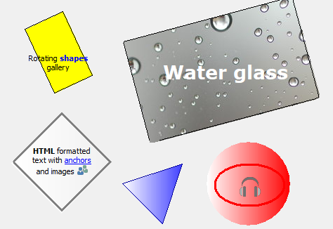
TAdvShape
Advanced shape control with gradient or bitmap background, rotation and HTML formatted text
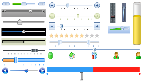
TAdvTrackBar, TDBAdvTrackBar, TAdvRangeSlider
- Office 2003, 2007, 2010, 2013 style trackbar/rating control, DB-aware trackbar & range slider
- Includes optional + / - buttons
- Extensive control over appearance
- Gallery with various predefined trackbar styles including capability to add custom style to the gallery
- Fully configurable background, slider, thumb, buttons with extensive color config or customization with images
- Standard or custom drawn tickmarks with support for image tickmarks, rotated text tickmarks etc..
- Configurable slider with appearance for completed / uncompleted part
- Slider is configurable as rating control
- Track hints & optional track label
- Compatible with TAdvFormStyler
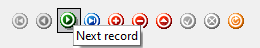
TDBAdvGlowNavigator
- Extended DBNavigator component with glyphs states, included automatic glyph shade generation
- Office style buttons
- Normal, hot and disabled glyphs used with optional automatic disabled/down glyph generation
- Normal, hot and pressed button gradient colors
- Large, small & custom button style
- Horizontal & vertical button orientation
- Extra search, set bookmark & get bookmark button added
- Compatible with TMS TAdvFormStyler / TAdvAppStyler
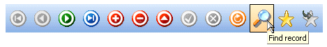
TDBAdvNavigator
- Extended DBNavigator component with glyphs states, included automatic glyph shade generation
- Auto XP Theme adaption
- Normal, hot and disabled glyphs used with optional automatic disabled/down glyph generation
- Normal, hot and pressed button gradient colors
- Large, small & custom button style
- Horizontal & vertical button orientation
- Extra search, set bookmark & get bookmark button added
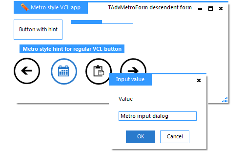
TMS Metro Controls
- TAdvMetroCategoryList: Metro style category list control
- TAdvMetroForm: Metro style form with easy synchronisation of Metro style with other UI controls on form
- TAdvMetroTaskDialog, TAdvInputMetroTaskDialog: Metro style task dialog / input task dialog
- TAdvMetroScrollBox: Metro style scrollbox with flat scrollers
- TAdvMetroButton, TAdvMetroToolButton: Transparent button automatically turning Metro symbols in proper Metro colors
- TAdvMetroHint: Turns all hints on the form in Metro style flat hints
- TAdvMetroProgressBar: Flat Metro style progress bar
- TAdvMetroTile: Tile in Windows 8 style with support for HTML formatted text, picture/text with layout control, zoom on hover, auto coloring of monochrome symbols
- TAdvFormStyler, TAdvAppStyler: Form-wide & application wide Metro style setting
- Functions: direct replacements for ShowMessage,ShowMessageFmt,MessageDlg in Metro style
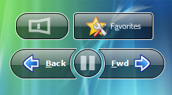
TMS W7 Controls
- TW7ToolBar: Toolbar that you can see in the top part of the Windows Explorer window.
- TW7ToolButton: Button located on TW7ToolBar. This button can be placed on any other object.
- TW7InformationBar: Panel containing any kind of information.
- TW7PageSelector: These objects can be used as switches between different pages of your program.
- TW7ProgressBar: ProgressBar used for displaying the free disk space in Windows Explorer.
- TW7ActiveLabel: This object works best if used as a hyperlink or an internal link.
- TW7ListViewItem: An empty ListView Item that can be used as a container for other components and can be placed on any object.
- TW7TaskItem: Based on TW7ListViewItem, this component should be used for selecting a task that the user must complete.
- TW7NavigationButton: Button used for back/forward navigation.
- TW7NavigationFrame: Graphic object for framing TW7NavigationButton.
- TW7LeftPanel: Panel usually located in the left and containing links to additional actions.
- TW7CaptionPanel: Panel that usually contains a title and is located at the top.
- TW7SpeedButton:Button used, for example, in the Windows 7 calculator.
- TW7Image: TW7Image is identical to TImage, but contains a number of useful properties.
- TW7Panel: Panel that has a number of styles, including the style of the digits display window in Windows calculator and iPhone style.
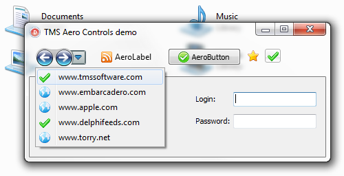
TMS Aero Controls
- TAeroWizardButton: Forward, backward or combined forward/backward button and optional dropdown button for Aero glass based wizard forms
- TAeroButton: Aero glass compatible button with optional imagelist image
- TAeroBitButton: Aero glass compatible TBitButton equivalent
- TAeroSpeedButton: Aero glass compatible speed button
- TAeroLabel: Label with blurred Aero text drawing and support for imagelist image left or right from text
- Works as regular controls on operating systems older than Windows Vista or Windows 7
- Direct replacements for regular VCL label, button, speedbutton with Aero glass compatibility
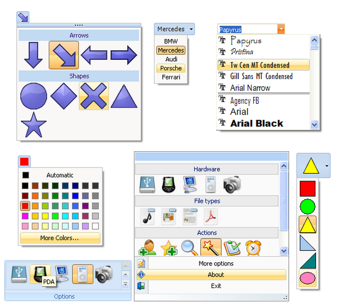
Advanced Office Graphics Controls
- Office 2016, 2013, 2010, 2007 or 2003 styled flexible components for selecting various typical properties of graphic elements.
- Selector can optionally be floating
- Font name selector with recently used indication option, lookup, font preview
- Font size selector with automatic list of available font sizes
- Generic combobox with recently used control & lookup
- Color selector in 3 styles : discrete, color cube, color spectrum
- Text color selector : Outlook 2010, 2007 style text color selector
- Pen width selector
- Pen style selector
- Brush selector
- Shadow selector
- Border selector
- Gradient style selector
- Scroll selector
- Generic tool selector with owner draw capability or simple text select capability
Help
Trial Downloads
Site license
unlimited developers in the company
€ 510 yearly renewal *
€ 1275

Compatibility
- Delphi 7, 2007, 2010, 2009, XE, XE2, XE3, XE4, XE5, XE6, XE7, XE8, 10 Seattle, 10.1 Berlin, 10.2 Tokyo, 10.3 Rio, 10.4 Sydney, 11 Alexandria, C++Builder 2007, 2009, 2010, XE, XE2, XE3, XE4, XE5, XE6, XE7, XE8, 10 Seattle, 10.1 Berlin, 10.2 Tokyo, 10.3 Rio, 10.4 Sydney, 11 Alexandria, DXE15, CXE15 (Professional/Enterprise/Architect)
Licensing
- Licensing FAQ
- License for commercial use: Single developer license, Small team license, Site license
- Includes full source code
- Ask questions to our engineers related to purchased product via Support Center
- Free 1 year updates and new releases
- After 1 year, a discount renewal is offered for a 1 year extension. *
* offer valid for 30 days after end of license. Discount price is subject to change.
Bookmarks
×
![]()