Charts Data

Hi,

I am facing a problem that a chart does not take all the records that is produced by a table. I study Chart Example, at your charts.template.xls on sheet <#Categories.CategoryName> you have a chart that has no data area, but has series and axis. Unfortunately I can't do this, when I set series and axis data area appears, and when I delete it, series and axis also deleted. As a result no chart appears, and if I don't delete them only the first row shows in excel.

Is there a specific workaround to fill a chart with data from a table that has dynamically number of rows?

Regards,
Nikos

Hi,

The "Chart Data Range" you see at the top of the "Select Data" dialog doesn't really exist: The only things that get stored in the file are the axis and series. If the series are all contiguous (say first series is A1:A5, second is B1:B5 and so on), then Excel automatically calculates and shows a chart data range. If the series are more complex, then Excel won't show a chart data range. Also, when you set a chart data range, what happens internally is that Excel automatically creates series and axis.

In our charts example, indeed the series are too complex for Excel to show a data range, but if you for example remove one of the series, you'll see that the chart data range appears. Or if you prefer, you can look at the demo "20.Reports\51.Intelligent Page Breaks In Reports" which has a chart data range.

So don't worry about the chart data range: It is just there to help you understand the data of the chart, but it really doesn't exist.

Now about the question itself: I am not sure what the exact issue here is, but FlexCel expands the data range of the charts when you insert rows, that's the full idea. What it doesn't do is to add new series (one for each inserted row) but that's something you normally want, because you want to minimize the number of series, and having a different series for every row will normally result in unreadable charts.

The first thing I would try is when you are defining the chart (the one you defined and shows only 2 rows), is to press the "Switch Row/Column" button and try again. My guess is that it will work. If it doesn't then normally the simplest way to have a chart working is to create a dummy chart with 2 rows of real data, not tags like <Mydb.field>. Type real numbers on there, and have Excel figure out the chart (Excel normally guesses wrong if you want to create a chart in cells where there is text and no numbers, because it can't figure out where the data is). Once the chart is done and fine, go and change the dummy numbers by the <#mydb.field> tags.

If you still can't make it work, please send me the template you are trying to make work to adrian@tmssoftware.com and I'll take a look.
Adrian thanks for enlighten me.

Actually the behavior that I want is the one that you mention, create a new series for each inserted row. It won't be unreadable in my occasion because It will be no more than 5 to 6 series.

Any idea for this behavior?

I've sent you email with the template and the produced excel file.

Hi,

Thanks, I got the file. Sadly getting a new series for every row in a report is not something we currently support, even if it has been an idea from the very start (back in 1996... it was one of the first problems I saw with the "report" approach). 

The reasons it was never done were on one side technical: You are writing a chart in a template: How do you tell FlexCel if you want to expand series or ranges? I've actually tried with some solution back in the FlexCel 2 times with OLEAdapter, where you named a chart in a special way to tell FlexCel to add series instead of expanding the range. But when we removed OLEAdapter in FlexCel 3, at that time there was no way to add series with the XlsAdapter API, so the feature was dropped. 

And, this is the second reason it was not redone: nobody really cared. I didn't got a single email of anyone asking about that lost feature, and I get emails about every little thing that changes all the time. Because in all but really rare cases, you really want to expand ranges, not add series. That's also what Excel recommends (and automatically does) for doing charts: minimize the number of series. The series on your chart should be the dimension that has less data. 

Anyway, this is something that might be implemented soon with the new xlsx chart API (but it will likely only working xlsx templates and result files). 

But going back to your case: I just want to make sure we are speaking about the same when we say "series". You mention "Now only one series is shown", but the chart you sent me is showing 5 series. If you look at the legend at the bottom of test.xls (or if you edit the data), those series are named "2", "10.00", "20.00", "20.00" and "20.00". 

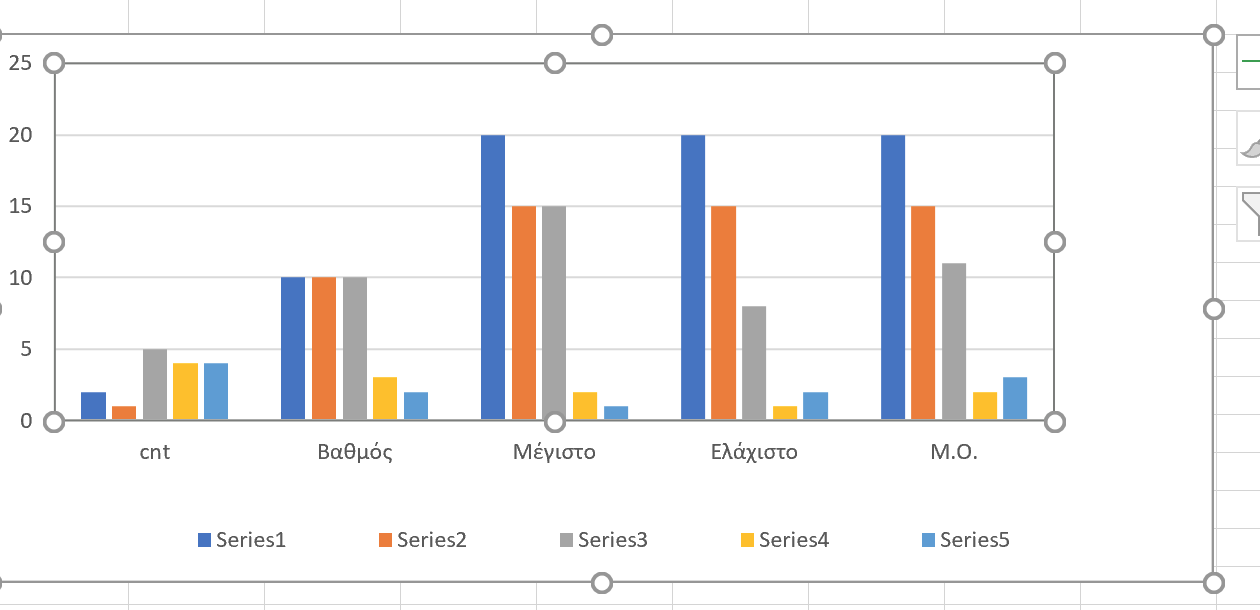
To make it more clear, this is how your chart would look wit a couple of more rows added when we implement the feature to add series per row and you make each row a different series(I've also moved the plot area up so it doesn't overlap the legend):


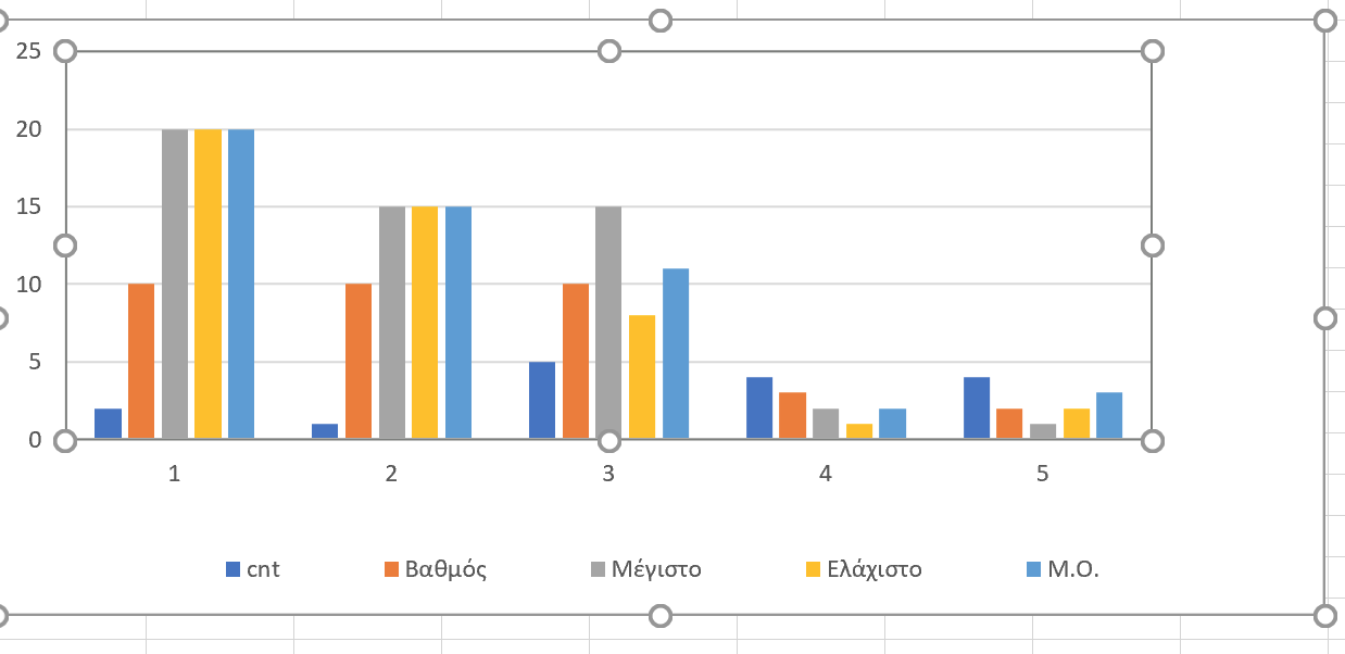
This on the other hand is the chart you can do now by using each column as a series (instead of each row)


Both possibilities are of course valid, but I'd like to verify that the "one series per col" chart isn't what you really want. In both cases, there is something that isn't clear: In chart1 it is the legend, in chart 2 is the x axis. That is, what is what you are plotting in each row?

You are right, what I need is the 2 chart. I'll try it and I'll come back.

Works great now! Thanks again Adrian