TAdvStringGrid
Example 81 : The edDetailDropDown and edGridDropDown inplace editors
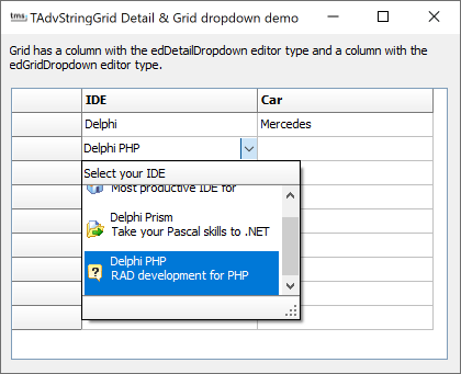
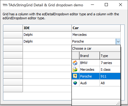 As a combobox is very limited, ie. it can only display the actual value that can be selected, TAdvStringGrid features two more feature-rich dropdown selectors. The first is the edDetailDropDown that can be considered as a combobox where each item can have an image, caption and some additional notes explaining the item. The item can have multiline text and the dropdown can optionally be resized. The second control is the edGridDropDown. Here, the dropdown consists of a grid. One column of the grid is set to contain the editable value of the control and other columns can contain an image, additional information, ...
 These two built-in dropdown editors can be accessed via grid.DetailPickerDropDown and grid.GridDropDown. A dropdown control can have a header and footer as well. The header and footer can contain additional informational text or can have buttons for specific actions. The dropdown footer and header can be customized with grid.ControlLook.DropDownHeader and grid.ControlLook.DropDownFooter. To have different dropdown header and/or dropdown footer for different inplace editors or for different cells, the header and footer of the dropdown control can also be set from the event OnGetEditorProp.
To select these editors as inplace editor for a specific column or cell, the event OnGetEditorType is used:
// selects the inplace editor
procedure TForm2.AdvStringGrid1GetEditorType(Sender: TObject; ACol,
  ARow: Integer; var AEditor: TEditorType);
begin
  case ACol of
  1: AEditor := edDetailDropDown;  // column 1 uses the detail dropdown
  2: AEditor := edGridDropDown;    // column 2 uses the grid dropdown
  end;
end;

// selects the inplace editor
procedure TForm2.AdvStringGrid1GetEditorProp(Sender: TObject; ACol,
  ARow: Integer; AEditLink: TEditLink);
begin
  case ACol of
  1: AdvStringGrid1.DetailPickerDropDown.DropDownHeader.Caption := 'Select your IDE';
  2: AdvStringGrid1.GridDropDown.DropDownHeader.Caption := 'Choose a car';
  end;
end;
Caption: string: sets the value of the item
Notes: string: sets additional information for the item
ImageIndex: integer: sets an optional image for the item when value is >= 0.
The code to setup the detail dropdown is:
procedure TForm2.InitDetailDropDown;
var
  di: TDetailItem;
begin
  AdvStringGrid1.DetailPickerDropDown.Images := ImageList1;
  AdvStringGrid1.DetailPickerDropDown.ItemHeight := 40;
  AdvStringGrid1.DetailPickerDropDown.DropDownWidth := 200;
  AdvStringGrid1.DetailPickerDropDown.DropDownHeader.Caption := 'Select your IDE';

  AdvStringGrid1.DetailPickerDropDown.Items.Clear;
  di := AdvStringGrid1.DetailPickerDropDown.Items.Add;

  di.ImageIndex := 0;
  di.Caption := 'Delphi';
  di.Notes := 'Most productive IDE for Win32 development';

  di := AdvStringGrid1.DetailPickerDropDown.Items.Add;
  di.ImageIndex := 1;
  di.Caption := 'Delphi Prism';
  di.Notes := 'Take your Pascal skills to .NET';

  di := AdvStringGrid1.DetailPickerDropDown.Items.Add;
  di.ImageIndex := 2;
  di.Caption := 'Delphi PHP';
  di.Notes := 'RAD development for PHP';
end;
property Width: Integer: sets the width of a column
property Color: TColor: sets the background color of a column
property Alignment: TAlignment: sets the alignment of a column
property Ellipsis: boolean: when true, text that does not fit in a column is displayed with ellipsis
property Font: TFont: sets the font for a column
property ColumnType: TColumnType: sets the column type to either text or image
property Header: string: sets the column header text
property Wordwrap: Boolean: when true, the text is displayed with wordwrapping
property AutoSize: Boolean: when true, the width of the column is automatically adapted to the text width
The rows are added via the collection grid.GridDropDown.Items. A TDropDownItem has an ImageIndex property to set an imagelist picture for a column with ColumnType set to ctImage and the Text: TStringList property contains the text for each column. To initialize the grid in this sample, following code was used:
procedure TForm2.InitGridDropDown;
var
  dc: TDropDownColumn;
  di: TDropDownItem;
begin
  AdvStringGrid1.GridDropDown.Images := ImageList1;

  // configure the columns
  dc := AdvStringGrid1.GridDropDown.Columns.Add;
  dc.Header := '';
  dc.ColumnType := ctImage;
  dc.Width := 30;
  dc := AdvStringGrid1.GridDropDown.Columns.Add;
  dc.Header := 'Brand';
  dc.ColumnType := ctText;
  dc := AdvStringGrid1.GridDropDown.Columns.Add;
  dc.Header := 'Type';
  dc.ColumnType := ctText;

  // add the items
  di := AdvStringGrid1.GridDropDown.Items.Add;
  di.ImageIndex := 0;
  di.Text.Add('');
  di.Text.Add('BMW');
  di.Text.Add('7 series');

  di := AdvStringGrid1.GridDropDown.Items.Add;
  di.ImageIndex := 1;
  di.Text.Add('');
  di.Text.Add('Mercedes');
  di.Text.Add('S class');

  di := AdvStringGrid1.GridDropDown.Items.Add;
  di.ImageIndex := 2;
  di.Text.Add('');
  di.Text.Add('Porsche');
  di.Text.Add('911');

  di := AdvStringGrid1.GridDropDown.Items.Add;
  di.ImageIndex := 3;
  di.Text.Add('');
  di.Text.Add('Audi');
  di.Text.Add('A8');

  // specifies that the text of the first column will be used as edited text
  AdvStringGrid1.GridDropDown.LookupColumn := 1;
end;
Delphi project & source files for downloading included in the main demos distribution for Delphi
×
![]()