Tips and Frequently Asked Questions

 Adding different items
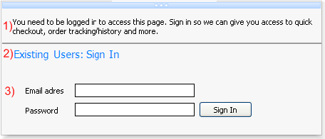
1) This is a section menu item with itemtype itNormal. The text property has been set with no extra functionality.
2) This is a section menu item with itemtype itHeader. The text property has been set with a different font and color. The difference between item number 1 and 2 is that an item with itemtype itHeader does not respond to hovering or selection. Between item 1 and 2 there is a thin line that separates item 1 and 2. This is a section menu item with itemtype itLineSeparator. The fill of this separator can be changed in the itemappearance of a section.
3) This is an item with no text, and only the control property has been set. The controls are bundled in a panel container and the panel is used in the control property of an item.
Below is the code to add those three items:
with Items.Add do
begin
  Text.Text := 'You need to be logged in to access this page. Sign in so we can give you access to quick checkout, order tracking/history and more.';
  ItemType := itNormal;
end;

Items.Add.ItemType := itLineSeparator;

with Items.Add do
begin
  Text.Text := 'Existing Users: Sign In

';
  ItemType := itHeader;
end;

with Items.Add do
begin
  ControlType := ctControl;
  Control := Panel1;
end;
Creating and saving new themes
The AdvSmoothMegaMenu component look and feel can easily be changed with default appearance properties. There are default properties for a top layer item, a section item, and a section. When you change these default properties, the new item that is added will take over those settings.
This way you must not change the properties for each toplayer, section or section item in a menu. When setting default properties, these properties can be saved to theme‟s. By default there are a few sample theme‟s that are built-in. To save your theme use this code below:
var
  sd: TSaveDialog;
begin
  AdvSmoothMegaMenu1.ApplyMenuItemDefault(0, 0, 0);
  sd := TSaveDialog.Create(Application);
  sd.Filter := 'Mega Menu Theme files (*.MMProp)|*.MMProp';
  if sd.Execute then
begin
  AdvSmoothMegaMenu1.SaveToFile(sd.FileName);
end;
  sd.Free;
end;
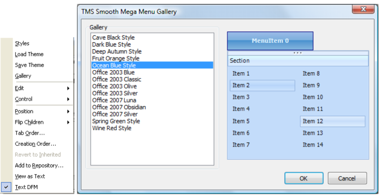
You can Load and Save theme‟s by right clicking on the AdvSmoothMegaMenu component. The sample theme‟s can also be chosen from the gallery.
Adding TWinControl descendent components to a menu item
There is an extra user definable type to insert your own TWinControl descendant controls to the item of the sub menu. Set ControlType to ctControl and Assign a TWinControl descendant to the Control property of an item.
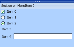
Adding built-in controls to an item
Each item has a ControlType property. When you want to quickly customize a large amount of checkboxes, radiobuttons or edit controls you can choose the corresponding control type and the mega menu will automatically add the control of your choice.
When choosing ctCheckBox or ctRadioButton the event OnMenuSubItemCheckChanged can be used to determine which items are checked / unchecked.
For the ctRadioButton a GroupIndex property is added to the section item to allow the radiobutton to act as a radiogroup with other items of the same groupindex. The last built-in type you can choose is a ctEdit type and can only be indented with the ControlIndent property. To get the text of the ctEdit textbox use the OnMenuSubItemEditChanged event.
Visual organisation of TAdvSmoothMegaMenu
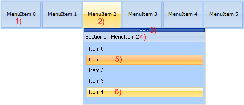
1) Root menu item. The root menu item can contain images, multiline text, HTML formatted text. The root menu items can be organized vertically or horizontally.
2) Selected root menu item with its menu dropdown: This menu dropdown can contain sections, top layer items, each root menu item has a separate fill for normal, hovered, selected and disabled state.
3) Tear-off strip: When the tear-off functionality is enabled you can “tear-off” the sub menu from the root menu item. After tear-off, the menu dropdown remains fully functional. To hide the sub menu click on the corresponding root menu. Multiple menus of a TAdvSmoothMegaMenu can be in “tear-off” state.
4) Section: The section caption has a separate fill and can be switched on/off. The section height and width can be set or can be automatically calculated. The menu dropdown can contain multiple sections and sections can be positioned vertical or horizontal.
5 - 6) Section items: Each section can be populated with feature-rich items. Items can contain HTML text, controls, images and have a normal, hovered, selected or disabled fill appearance. Items can have a different type depending on the needed functionality. These item types are: Normal, Header, Separator, LineSeparator, Break, LineBreak.
Connection a detail item to a top layer item
Drop a new TAdvSmoothMegaMenu on the form, start the editor of the first root item to edit the sub menu. You will see a default section with 5 items.
We will need to make the section width larger to add a top layer. When the section size increases the item width will also increase, so first add an item and set the ItemType to itBreak to split the section in 2 columns.
After the section has been divided, add a new top layer item and place it in the empty column.
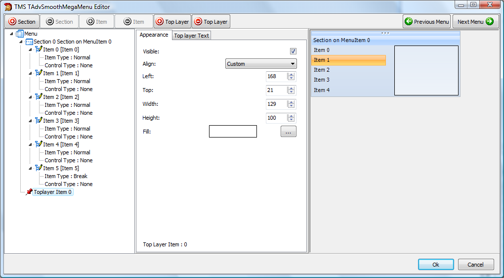
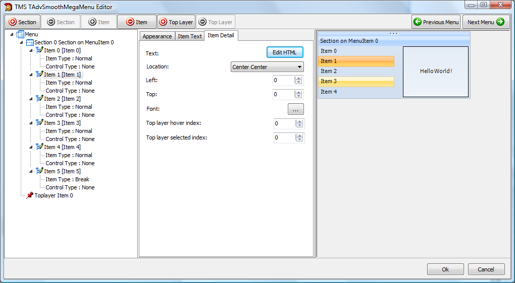
Click on an item that needs to display detail information. In the Item detail tab, the correct top layer item and text can be selected to display in the top layer item. There are two important ways that can be used to display the information. You can display the detail text when hovering the item or when the item is selected.
Change the Top layer hover index or top layer selected index to the correct top layer. Multiple items can point to the same top layer.
When setting the detail text property of the item, the result will be:
As you change properties, layout, items, sections and top layer items, the default TAdvSmoothMegaMenu can be completely different after the project is finished. Below is an example that combines the picturecontainer, sections, section items, controls and top layer items.
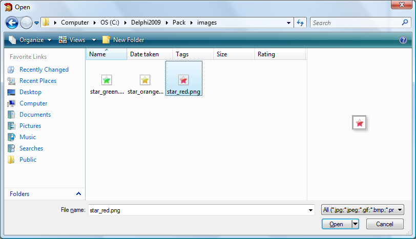
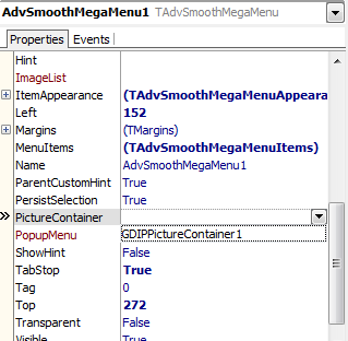
Adding and connecting picturecontainer images to section items
Drop a TGDIPPictureContainer on the form, and add three items, named red, orange, green.
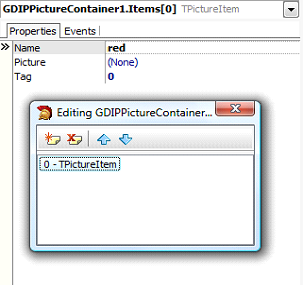
Add an image for each item in the picturecontainer list.
Drop a TAdvSmoothMegaMenu on the form and connect the PictureContainer with the TAdvSmoothMegaMenu component.
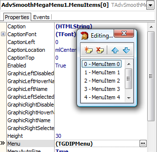
Choose the first menu item by selecting the MenuItems collection and starting the TGDIPMenu editor by clicking on the Menu property.
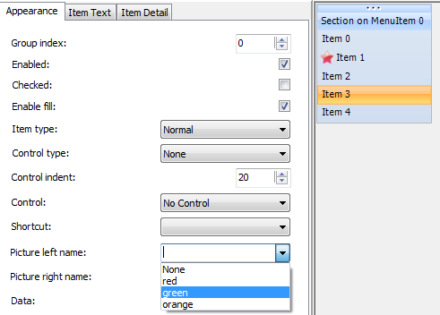
When the menu editor is started, select an section item and change the graphic left or right to the image name you have set in the collection of images.
Adding Sections and Items
Adding a root menu with a section and 5 items
  with AdvSmoothMegaMenu1.MenuItems.Add do
  begin
    Caption := 'Hello World !';
    with Menu.Sections.Add do
    begin
      Caption := 'Section 0';
      Items.Add.Text := 'Item 1';
      Items.Add.Text := 'Item 2';
      Items.Add.Text := 'Item 3';
      Items.Add.Text := 'Item 4';
      Items.Add.Text := 'Item 5';
    end;
end; with AdvSmoothMegaMenu1.MenuItems.Add do
begin
Caption := 'Hello World !';
Menu.SectionLayout := slHorizontal;
// Menu.SectionLayout := slVertical;
for I := 0 to 1 do
begin
with Menu.Sections.Add do
begin
Caption := 'Section ' + inttostr(I);
Items.Add.Text := 'Item 1';
Items.Add.Text := 'Item 2';
Items.Add.Text := 'Item 3';
Items.Add.Text := 'Item 4';
Items.Add.Text := 'Item 5';
end;
end;
end; with AdvSmoothMegaMenu1.MenuItems.Add do
begin
Caption := 'Hello World !';
with Menu.Sections.Add do
begin
Caption := 'Section 0';
Items.Add.Text := 'Item 1';
Items.Add.Text := 'Item 2';
Items.Add.Text := 'Item 3';
Items.Add.Text := 'Item 4';
Items.Add.Text := 'Item 5';
Items.Add.ItemType := itBreak;
Items.Add.Text := 'Item 1';
Items.Add.Text := 'Item 2';
Items.Add.Text := 'Item 3';
Items.Add.Text := 'Item 4';
Items.Add.Text := 'Item 5';
end;
end;
 RAD Studio