TAdvStringGrid
Example 83 : Using the component TAdvGridDropDown
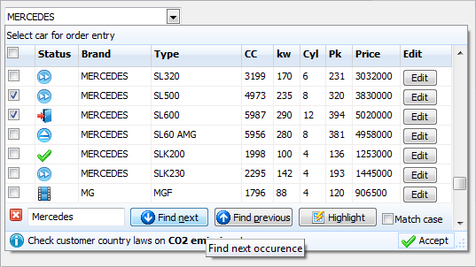
Introduction TAdvGridDropDown is an edit control with dropdown button showing a TAdvStringGrid control in its dropdown window.
This means that the full feature set of TAdvStringGrid is available to present information in the dropdown list.
This goes from all graphic capabilities in TAdvStringGrid to its search, edit, narrow down, sort, column sizing,
column moving, controls in cells etc...
You can easily see TAdvGridDropwn as a multi column combobox on steroids. TAdvGridDropDown descends from TAdvCustomDropDown. This means that the control's dropdown inherits the optional header and footer and that you can set text, image & buttons in the header and the footer, just like with all other dropdown controls. This is configurable in a straightforward and intuitive way via the AdvGridDropDown.DropDown* properties.
Access to the grid
The grid on the dropdown is accessible via AdvGridDropDown.Grid: TAdvStringGrid. This way, you can access all properties, events and methods of the grid via code. Note that the most important and useful events of TAdvStringGrid are exposed on TAdvGridDropDown level, for example events like OnGridGetAlignment, OnGridGetCellColor and many more. The equivalent events on TAdvStringGrid level are OnGetAlignment, OnGetCellColor. For full details on the functionality of these events, please refer to the TAdvStringGrid developers guide.
Data in the dropdown
The data displayed in the dropdown grid can be setup in two ways. This is selected with the AdvGridDropDown.UseItems property. When this is false, data is directly set in the grid, ie. via AdvGridDropDown.Grid.Cells[col,row]: string or the many functions TAdvStringGrid exposes like using AdvGridDropDown.Grid.LoadFromCSV() or also setting number of columns and rows via AdvGridDropDown.Grid.ColCount / AdvGridDropDown.Grid.RowCount. Alternatively, when AdvGridDropDown.UseItems is true, all data displayed in the dropdown is configured by adding the number of required columns via the collection AdvGridDropDown.Columns and adding the data for the rows in the grid via AdvGridDropDown.Items. Following code snippet fills the grid with 5 columns and 50 rows:
var
  i,j: integer;
begin

  AdvGridDropDown1.Columns.Clear;
  for i := 1 to 5 do
  begin
    with AdvGridDropDown1.Columns.Add do
    begin
      Header := 'Header ' + inttostr(i);
    end;
  end;
  AdvGridDropDown1.Items.Clear;

  for i := 1 to 50 do
  begin
    with AdvGridDropDown1.Items.Add do
    begin

      for j := 1 to 5 do
      begin
        Text.Add('C'+IntToStr(i)+ ' row '+inttostr(i));
      end;
    end;
  end;
end;
Data lookup relationship
The relationship between the text in the edit control and the data dislayed in the dropdown grid is set with AdvGridDropDown.LookupColumn. The LookupColumn determines what column in the grid the text in the edit control corresponds to and vice versa. By default, the lookup method is lmLookup. This means when the dropdown grid is displayed, the grid performs a lookup on the (partial) text typed in the column set via AdvGridDropDown.LookupColumn. Note that case sensitivity for this lookup is set with AdvGridDropDown.CaseSensitive.
Following example demonstrates simple lookup:
begin
  AdvGriddropDown1.Columns.Clear;
  AdvGriddropDown1.Columns.Add.Header := 'Number';
  AdvGriddropDown1.Columns.Add.Header := 'Name';
  AdvGridDropDown1.Grid.FloatFormat := '%.0f';
  AdvGridDropDown1.LookupMethod := lmLookup;
  AdvGridDropDown1.Items.Clear;
  AdvGridDropDown1.BeginUpdate;
  AdvGridDropDown1.Items.Add.Text.CommaText := '1,Monday';
  AdvGridDropDown1.Items.Add.Text.CommaText := '2,Tuesday';
  AdvGridDropDown1.Items.Add.Text.CommaText := '3,Wednesday';
  AdvGridDropDown1.Items.Add.Text.CommaText := '4,Thursday';
  AdvGridDropDown1.Items.Add.Text.CommaText := '5,Friday';
  AdvGridDropDown1.Items.Add.Text.CommaText := '6,Saturday';
  AdvGridDropDown1.Items.Add.Text.CommaText := '7,Sunday';
  AdvGridDropDown1.EndUpdate;
  AdvGridDropDown1.LookupColumn := 1;
end;
When typing 'T', the dropdown grid selects the first day with 'T', ie. 'Tuesday'. When typing 'h' next, the grid automatically selects 'Thursday';
An alternative lookup method is the lmNarrowDown method. With this method, the content of the dropdown grid narrows down to rows that match the entered values. It is important to note that in order to use the lmNarrowDown method, the data in the grid must be filled via AdvGridDropDown.Grid and not via Items. To setup the same sample but with narrow down lookup, following code can be used:
AdvGriddropDown1.Columns.Clear;
AdvGriddropDown1.Columns.Add.Header := 'Number';
AdvGriddropDown1.Columns.Add.Header := 'Name';
AdvGridDropDown1.Grid.FloatFormat := '%.0f';
AdvGridDropDown1.UseItems := false;
AdvGridDropDown1.Grid.RowCount := 8;
AdvGridDropDown1.Grid.ColCount := 2;
AdvGridDropDown1.Grid.Cells[0,0] := 'Number';
AdvGridDropDown1.Grid.Cells[1,0] := 'Name';

AdvGridDropDown1.Grid.Rows[1].CommaText := '1,Monday';
AdvGridDropDown1.Grid.Rows[2].CommaText := '2,Tuesday';
AdvGridDropDown1.Grid.Rows[3].CommaText := '3,Wednesday';
AdvGridDropDown1.Grid.Rows[4].CommaText := '4,Thursday';
AdvGridDropDown1.Grid.Rows[5].CommaText := '5,Friday';
AdvGridDropDown1.Grid.Rows[6].CommaText := '6,Saturday';
AdvGridDropDown1.Grid.Rows[7].CommaText := '7,Sunday';
AdvGridDropDown1.LookupColumn := 1;
AdvGridDropDown1.LookupMethod := lmNarrowDown;
Accessing grid and setting up grid properties
TAdvGridDropDown exposes 3 configuration class properties directly, ie: AdvGridDropDown.MouseActions, AdvGridDropDown.Navigation, AdvGridDropDown.SearchFooter. With these properties, the dropdown grid's mouse interaction, keyboard interaction and search footer can be directly configured. This affects the dropdown grid's behavior in exactly the same way as in the TAdvStringGrid. The TAdvStringGrid documentation can as such be consulted for all information concerning these properties. Further detailed configuration can be done by directly accessing the TAdvStringGrid in the dropdown via AdvGridDropDown.Grid. Some further commonly used grid properties are exposed on AdvGridDropDown level:
- ColumnMoving: When true, columns can be reordered with drag & drop
- ColumnSizing: When true, column sizes can be changed by dragging
- GridEditable: When true, inplace editing in the grid is enabled
- RowMoving: When true, rows can be reordered with drag & drop
- RowSizing: When true, row sizes can be changed by dragging
- RowSelect: When true, unit of Selection in the grid is per row, otherwise, per cell
- SelectionColor, SelectionColorTo,SelectionTextColor: Color of selected cell or row in the grid
- Sorting: Set to gsSingleColumn, gsMultiColumn to enable sorting on single column / multi column by click on the header in the grid
×
![]()