helpLooking for TMS FMX UI Pack?
arrow_downwardDiscover the new and improved TMS FNC UI Pack below! arrow_downward
arrow_downwardDiscover the new and improved TMS FNC UI Pack below! arrow_downward
extension
Full compatibility with VCL, FireMonkey and TMS WEB Core
electric_bolt
Single high-performance multi-platform codebase

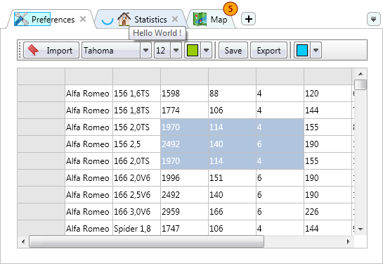
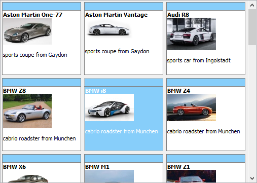
Feature-rich & high performance grid
Take your application to the next level with data visualization features such as filtering, sorting and multi-column, multi-level grouping. Use the easy data binding functionality supporting master-detail relationships as well as the ability to export to PDF, HTML and XLS.


Other included components
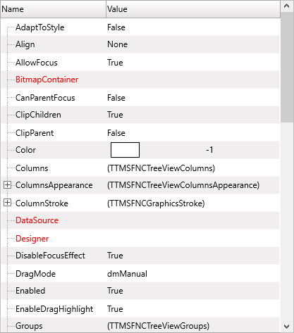
Object Inspector
Runtime object inspector with various editors
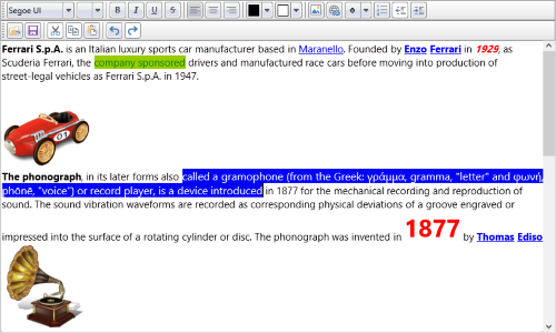
Rich Editor
Compact light-weight WYSIWYG editor for formatted text
PageControl & Panels
Feature-rich TabSet, PageControl and Panels
Edits
A collection of supercharged edit controls
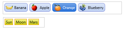
Lists
A collection of supercharged list controls
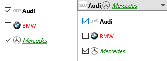
Pickers & Selectors
A collection of highly styleable and customizable pickers and selectors
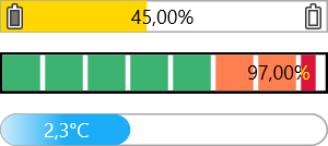
Progress & Ratings
Progress bars & rating controls

Compatibility


Pricing
Single Developer License
Small Team License
Site License
TMS FNC UI Pack
€ 395
€
195
yearly renewal
license for 1 developer
Includes
check
Full source code
check
Access to the TMS Support Center
check
Free updates and new releases
check
TMS FNC Core
MOST POPULAR
TMS FNC Component Studio
€ 895
€
375
yearly renewal
license for 1 developer
Includes
check
Full source code
check
Access to the TMS Support Center
check
Free updates and new releases
check
TMS FNC UI Pack
check
All TMS FNC products
more_horiz
Discover more
BEST VALUE
TMS ALL-ACCESS
€ 1,795
€
595
yearly renewal
license for 1 developer
Includes
check
Full source code
check
Access to the TMS Support Center
check
Free updates and new releases
check
TMS FNC UI Pack
check
All TMS FNC products
check
All TMS products
more_horiz
Discover more
All prices excl. VAT. Renewal price is subject to change and only valid up to 30 days after license has expired. After renewal period a discount price is offered to renew the license.
Free Trial
Start a free TMS FNC UI Pack evaluation today!Please enter a valid email address
Download started. Your trial key will be provided by email!
By entering your email address you agree to receive email messages from TMS Software.
 RAD Studio
 Visual Studio Code
- The FNC trial version is limited to WEB Core, FMX and VCL. For mobile device deployment, the trial version supports deploying in release mode only
- FNC trial versions can only be evaluated one product at a time and are not compatible with other registered FNC products due to technical limitations
Supported Development Environments
 RAD Studio 13 Florence
RAD Studio 12 Athens
RAD Studio 11 Alexandria
RAD Studio 10.4 Sydney
RAD Studio 10.3 Rio
RAD Studio 10.2 Tokyo
RAD Studio 10.1 Berlin
RAD Studio 13 Florence
RAD Studio 12 Athens
RAD Studio 11 Alexandria
RAD Studio 10.4 Sydney
RAD Studio 10.3 Rio
RAD Studio 10.2 Tokyo
RAD Studio 10.1 Berlin
 Visual Studio Code