TMS Advanced Toolbars & Menus
Office 2003 / VS.NET 2005 / Office 2007 style docking toolbars & menus
TMS Advanced ToolBars & Menus support Office 2003 style docking toolbars & menus as well as Office 2007 ribbon style toolbars. Building applications with Office 2003 style docked toolbars starts by using TAdvDockPanel which is the component that holds one or more toolbars. For Office 2007 ribbon style toolbars, the toolbar container component is TAdvToolbarPager.Creating Office 2003 style applications
Getting started
To start creating an Office 2003 application, drop a TAdvDockPanel and TAdvToolbarOfficeStyler component on the form. Right-click on the TAdvDockPanel and choose "Add toolbar". By default the toolbar has a grip (left dots to drag the toolbar on the TAdvDockPanel or to undock the toolbar from the TAdvDockPanel) and a right handle. Different grip styles can be choosen from the TAdvToolbarOfficeStyler with the property DragGripStyle. The right handle, from where you can show an options or customize menu, can be shown with the toolbar property ShowRightHandle.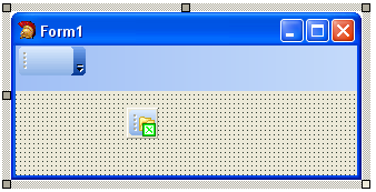 A TAdvDockPanel can be positioned on the four sides of the form. The position is
set with TAdvDockPanel.Align (can be daLeft, daRight, daTop, daBottom). A
toolbar can also be programmatically created. This code snippet will create a
toolbar on the dockpanel:
A TAdvDockPanel can be positioned on the four sides of the form. The position is
set with TAdvDockPanel.Align (can be daLeft, daRight, daTop, daBottom). A
toolbar can also be programmatically created. This code snippet will create a
toolbar on the dockpanel:begin atb := TAdvToolbar.Create(advdockpanel1); atb.Parent := advdockpanel1; end;
Adding controls
The TAdvToolBar supports by default a number of different controls: TAdvToolBarButton, TAdvToolBarMenuButton, TAdvToolBarSeparator, TDBAdvToolBarButton, TAdvContainer. These default controls can be inserted by right-clicking the toolbar and selecting the desired control. Each TAdvToolBarButton can have a caption and
an image. The image is either taken from the toolbar imagelist when
TAdvToolBarButton.ImageIndex is different from -1 or images can be separately
set for the various status of the button with properties Glyph, GlyphChecked,
GlyphDisabled, GlyphDown, GlyphHot. A TAdvToolBarButton can have 2 styles :
Each TAdvToolBarButton can have a caption and
an image. The image is either taken from the toolbar imagelist when
TAdvToolBarButton.ImageIndex is different from -1 or images can be separately
set for the various status of the button with properties Glyph, GlyphChecked,
GlyphDisabled, GlyphDown, GlyphHot. A TAdvToolBarButton can have 2 styles : tasButton or tasCheck. In tasButton style, the toolbar button simply triggers the associated action or the OnClick event when clicked. With the style tasCheck, the button behaves as a checkbox. The checkbox state can be get or set with the Down property. Multiple toolbarbuttons can also behave as a radiobutton. To group buttons that should behave as radio buttons, set the GroupIndex to a value different from 0.
Controls can be easily programmatically inserted on the toolbar. This code snippet adds two TAdvToolBarButtons and a combobox on a TAdvToolBar and sets the behaviour to a radiogroup behaviour:
var
  atb: TAdvToolBarButton;
  combobox: TComboBox;
begin
  atb := TAdvToolBarButton.Create(Advtoolbar1);
  atb.Caption := 'Option 1';
  atb.ShowCaption := true;
  atb.GroupIndex := 1;
  advtoolbar1.AddToolBarControl(atb);
  atb := TAdvToolBarButton.Create(Advtoolbar1);
  atb.Caption := 'Option 2';
  atb.ShowCaption := true;
  atb.GroupIndex := 1;
  advtoolbar1.AddToolBarControl(atb);
  combobox := TComboBox.Create(AdvToolBar1);
  advtoolbar1.AddToolBarControl(combobox);
end;
The toolbar controls can be easily accessed with the property TAdvToolBar.ToolBarControls[controlindex]. The total number of controls on the TAdvToolBar is returned by ToolBarControlCount.
Adding a menu
By default a TAdvToolBar layout is preset to hold controls. A toolbar can also be used to host a menu. Typically, in Office 2003 style applications, the toolbar holding the menu automatically uses the full dockpanel width (or height for a vertically oriented dockpanel). To design such toolbar with a menu, set TAdvToolBar.FullSize = true. To add the menu, drop a TAdvMainMenu component on the form and design the menu with the design time menu designer. By default, the IDE will have attached the menu to the form. As the menu will be used by the toolbar, remove AdvMainMenu from the Form's Menu property and assign AdvMainMenu to TAdvToolBar.Menu. To use a styler component for the menu as well, drop a TAdvMenuOfficeStyler component on the form and assign it to the TAdvToolBarOfficeStyler.AdvMenuStyler property.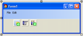 Programmatically changing or extending the menu
is very similar to using a normal menu. To update the toolbar menu after all
changes to the menu have been applied, call TAdvToolBar.UpdateMenu as this
sample code snippet shows:
Programmatically changing or extending the menu
is very similar to using a normal menu. To update the toolbar menu after all
changes to the menu have been applied, call TAdvToolBar.UpdateMenu as this
sample code snippet shows:var rootmnu, mnu: TMenuItem; begin rootmnu := TMenuItem.Create(AdvMainMenu1); rootmnu.Caption := 'New'; AdvMainMenu1.Items.Add(rootmnu); mnu := TMenuItem.Create(AdvMainMenu1); mnu.Caption := 'New item'; rootmnu.Add(mnu); AdvToolBar1.UpdateMenu; end;
Creating Office 2007 style applications
Getting started
For Delphi 7, Delphi 2006, Delphi 2007 a wizard gets you started right-away. Choose File, New, Other and under "TMS Wizard", pick "TMS ToolBar Application Wizard". This will create a new application for you with a TAdvToolBarPager, TAdvPage, TAdvToolBar, TAdvPreviewMenu, TAdvShapeButton. This is generated in a form descending from TAdvToolBarForm that takes care of border size, painting, caption.To start an Office 2007 ribbon style toolbar application manually, drop the TAdvToolBarPager container and TAdvToolBarOfficeStyler component on the form.
Assign the TAdvToolBarOfficeStyler to TAdvToolBarPager.ToolBarStyler.
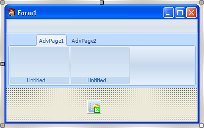
Right-click on the TAdvToolBarPager and choose "New Page" to insert pages in the pager. On the page, right-click and select "Add toolbar" to insert a toolbar.
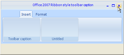
 Note that the TAdvToolBarPager consists mainly of three parts : a caption, an area for page
tabs and pages. The caption can be used to host other controls (like shortcut
buttons), to show a caption text and will also show grouped page tabs. The
caption can be optionally hidden. Set TAdvToolBarPager.Caption.Visible = false
to hide the caption area. The TAdvToolBarPager is further very similar to a
standard TPageControl. Pages can be inserted, an active page can be set by the
property TAdvToolBarPager.ActivePage, a page can be temporarily hidden by
setting TAdvPage.TabVisible to false.
Note that the TAdvToolBarPager consists mainly of three parts : a caption, an area for page
tabs and pages. The caption can be used to host other controls (like shortcut
buttons), to show a caption text and will also show grouped page tabs. The
caption can be optionally hidden. Set TAdvToolBarPager.Caption.Visible = false
to hide the caption area. The TAdvToolBarPager is further very similar to a
standard TPageControl. Pages can be inserted, an active page can be set by the
property TAdvToolBarPager.ActivePage, a page can be temporarily hidden by
setting TAdvPage.TabVisible to false. Programmatically creating pages, toolbars, changing toolbars etc.. is made easy with a couple of TAdvToolBarPager methods. This code snippet programmatically inserts a new page and creates a new toolbar and sets the toolbar caption in the inserted page:
begin
  with AdvToolBarPager1 do
  begin
    AddAdvPage('New page');
    ActivePage := AdvPages[AdvPageCount - 1];
    AdvPages[AdvPageCount - 1].CreateAdvToolBar;
    AdvPages[AdvPageCount - 1].AdvToolBars[0].Caption := 'New toolbar';
  end;
end;
Using the TAdvToolBarPager to move, close, minimize and maximize a captionless form
 The TAdvToolBarPager can be used to replace a regular form caption, ie. it allows to
move the form, close, minimize or maximize it. To achieve this, set
TAdvToolBarPager.CanMove = true and enable the buttons that should be visible in
the caption under TAdvToolBarPager.CaptionButtons. To have a rounded border,
descend your form from TAdvToolBarForm.
The TAdvToolBarPager can be used to replace a regular form caption, ie. it allows to
move the form, close, minimize or maximize it. To achieve this, set
TAdvToolBarPager.CanMove = true and enable the buttons that should be visible in
the caption under TAdvToolBarPager.CaptionButtons. To have a rounded border,
descend your form from TAdvToolBarForm. Adding controls
TAdvToolBar supports a number of built-in controls that can be added on the toolbar. The Office 2003 toolbar controls can be used but for closer Office 2007 appearance, it is recommended to use the new TAdvGlowButton, TAdvGlowMenuButton, TDBAdvGlowButton controls. Inserting controls is done by right-click on the toolbar and choosing "Add AdvGlowButton", "Add AdvGlowMenuButton", ... The position of the controls in the TAdvToolBar are by default automatically controlled by the TAdvToolBar itself and will be inserted starting from left in the toolbar. To disable this automatic position control, set TAdvToolBar.AutoPositionControls = false. The controls can in this mode be positioned at exact coordinates in the toolbar.The TAdvGlowButton or TAdvGlowMenuButton are two control types that can be added to the TAdvToolBar and that can be used in different ways:
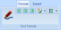
 In the screenshot above, the first TAdvGlowButton (with pen picture) is used in
transparent mode. The button will only highlight when the mouse hovers or clicks
the button. The align buttons are default TAdvGlowButton controls but to make
the three align buttons appear as a group, the first left align button Position
property was set to bpLeft, the middle center alignment button Positon was set
to bpMiddle, the right align button Position was set to bpRight. The GroupIndex
of the three buttons was set to 1 and this way the buttons automatically behave
as radiobuttons. Finally, two TAdvGlowButton controls were added with
DropDownButton = true. For the first button, DropDownSplit is set to false to
let the component behave as a single button. For the second button,
DropDownSplit is set to true. The button acts as a dual button control, one for
the main button and one for the dropdown part. OnClick is triggered for a click
on the main button, OnDropDown is triggered for a click on the dropdown part.
In the screenshot above, the first TAdvGlowButton (with pen picture) is used in
transparent mode. The button will only highlight when the mouse hovers or clicks
the button. The align buttons are default TAdvGlowButton controls but to make
the three align buttons appear as a group, the first left align button Position
property was set to bpLeft, the middle center alignment button Positon was set
to bpMiddle, the right align button Position was set to bpRight. The GroupIndex
of the three buttons was set to 1 and this way the buttons automatically behave
as radiobuttons. Finally, two TAdvGlowButton controls were added with
DropDownButton = true. For the first button, DropDownSplit is set to false to
let the component behave as a single button. For the second button,
DropDownSplit is set to true. The button acts as a dual button control, one for
the main button and one for the dropdown part. OnClick is triggered for a click
on the main button, OnDropDown is triggered for a click on the dropdown part.Tab groups
Toolbars that are in multiple pages that functionally belong together can be grouped with tabgroups. Tabgroups are managed on the level of the TAdvToolBarPager via the TabGroups property.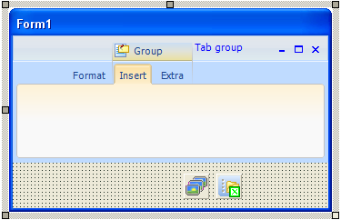 A TabGroupItem can be inserted in the TAdvToolBarPager.TabGroups property and
this TabGroupItem controls which tabs belong to the same group. This is set with
the property TabGroupItem.TabIndexStart (zero based index of the first tab that
belongs to the group) and TabGroupItem.TabIndexEnd. In the example image, the
TabIndexStart is set to 1, the TabIndexEnd is set to 2. A group indicator will
be displayed on top of the tabs that belong to the same group with a caption
text set by TabGroupItem.Caption and optionally an image set by
TabGroupItem.ImageIndex. By default, the tabs that belong to a tabgroup are
displayed with the TAdvToolBarOfficeStyler.GroupAppearance.TabAppearance
settings. In the sample screenshot, the tab of a group is shown in light orange
while other tabs and displayed with a soft blue. The same applies for the
TAdvPage background. When there is a need to have different colors for different
groups, the colors for each group can be customized under
TabGroupItem.GroupAppearance.
A TabGroupItem can be inserted in the TAdvToolBarPager.TabGroups property and
this TabGroupItem controls which tabs belong to the same group. This is set with
the property TabGroupItem.TabIndexStart (zero based index of the first tab that
belongs to the group) and TabGroupItem.TabIndexEnd. In the example image, the
TabIndexStart is set to 1, the TabIndexEnd is set to 2. A group indicator will
be displayed on top of the tabs that belong to the same group with a caption
text set by TabGroupItem.Caption and optionally an image set by
TabGroupItem.ImageIndex. By default, the tabs that belong to a tabgroup are
displayed with the TAdvToolBarOfficeStyler.GroupAppearance.TabAppearance
settings. In the sample screenshot, the tab of a group is shown in light orange
while other tabs and displayed with a soft blue. The same applies for the
TAdvPage background. When there is a need to have different colors for different
groups, the colors for each group can be customized under
TabGroupItem.GroupAppearance.Compact mode toolbars
By default, a toolbar on a TAdvPage shows all controls on the toolbar. However, when a window gets too small to show all toolbars with all controls, a toolbar switches to compact mode. In this compact mode, a toolbar reverts to a single AdvGlowButton from where a click displays the full toolbar. The screenshots below show this in action. The first window is sufficiently wide to show all toolbars. When the window becomes smaller, the Find toolbars reverts to compact mode:
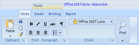 Finally, for a very small window, all toolbars have reverted to compact mode and
the Clipboard compact toolbar button is clicked for access to the full toolbar:
Finally, for a very small window, all toolbars have reverted to compact mode and
the Clipboard compact toolbar button is clicked for access to the full toolbar: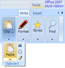 Using compact toolbars is very easy as everything is done automatically in
TAdvToolBar. All that is required is to set the property
TAdvToolBar.CompactCaption and TAdvToolBar.CompactPicture. This is the caption
and picture that is used for the dropdown button from where the full toolbar is
displayed when the toolbar is in compact mode.
Using compact toolbars is very easy as everything is done automatically in
TAdvToolBar. All that is required is to set the property
TAdvToolBar.CompactCaption and TAdvToolBar.CompactPicture. This is the caption
and picture that is used for the dropdown button from where the full toolbar is
displayed when the toolbar is in compact mode. Office 2007 hints
All controls that are part of the advanced toolbars & menus feature an extended Office 2007 style hint. Office 2007 hints are more sophisticated than regular Delphi hints. An office 2007 hint has a title, an optional picture, help text and an optional help line.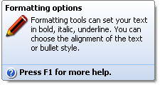 To make use of the new hint style, drop the component TAdvOfficeHint on the main form and use the
OfficeHint property of the components to set hint subject, picture, notes and
help line. The regular Hint property is no longer used when a control has an
OfficeHint property. Set ShowHint to true when the hint is enabled for a
control. Controls that are not part of the TMS Advanced Toolbars & Menus can be
extended with Office 2007 hints as well. It is sufficient for this to add the
property OfficeHint:TAdvHintInfo to the control and TAdvOfficeHint will
automatically start using this instead of the regular Hint property.
To make use of the new hint style, drop the component TAdvOfficeHint on the main form and use the
OfficeHint property of the components to set hint subject, picture, notes and
help line. The regular Hint property is no longer used when a control has an
OfficeHint property. Set ShowHint to true when the hint is enabled for a
control. Controls that are not part of the TMS Advanced Toolbars & Menus can be
extended with Office 2007 hints as well. It is sufficient for this to add the
property OfficeHint:TAdvHintInfo to the control and TAdvOfficeHint will
automatically start using this instead of the regular Hint property.
×
![]()